

Greg Harbour
@GregHarbour
Followers
166
Following
27K
Media
109
Statuses
2K
Expert simplifier
Joined June 2009
There’s no golden rule on icon vs icon+text. If the functions are familiar enough to your audience that they’ll get – expect – the abstraction, speed their journey.

I know many designers think this But there was some study that shows if you only use icons, it takes ages for your brain to understand what it does If you do a text label, it's way faster That's why I prefer [ icon + label ] in my interfaces
0
0
0
Flipping to another tenant must’ve been in the architect brief
0
0
0
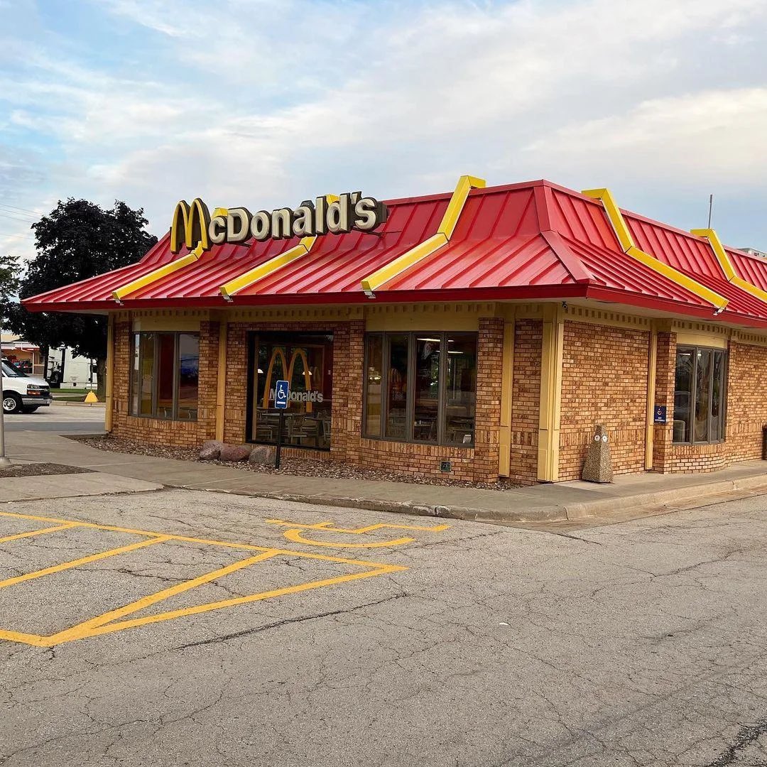
The test: if any QSR logo could just as smoothly feature on this building, then there’s more you could do to make it McDonalds Somewhere between as unique as the red mansard roof, and a generic corporate template with some yellow strips

New @McDonalds design just dropped/approved in Milkwaukee. I think it looks super sharp. Yes, you can have nostalgic memories of the old red building & l love it but you can’t seriously tell me that the red mansard design looks better than our modern prototype. Let me hear it

1
0
0
Be clear, compelling, actionable. And cohesion helps make you compelling.

Here’s a science-backed truth that might surprise you: 𝘁𝗵𝗲 𝘄𝗮𝘆 𝘆𝗼𝘂 𝗳𝗿𝗮𝗺𝗲 𝗽𝗿𝗼𝗱𝘂𝗰𝘁 𝗯𝗲𝗻𝗲𝗳𝗶𝘁𝘀 𝗰𝗮𝗻 𝗺𝗮𝗸𝗲 𝗼𝗿 𝗯𝗿𝗲𝗮𝗸 𝘀𝗮𝗹𝗲𝘀. According to research, products with multiple benefits can boost sales by 𝟰𝟮%—but only if those benefits make
0
0
3
Given culture becomes the brand, use brand to attract the candidates you want

Fun fact, if your brand looks cool, cool people want to work for you. The people who say iT oNlY MaTtErS iF ItS fUnCtIoNaL in shambles
0
0
2


Opening notes of Ghostbusters theme


0
0
0
Having designed a bunch of full page ads to appear opposite the glowing editorial profile of the ad buyer I then typeset, for a bunch of newspapers and magazines over the decades, this is standard periodical business

Video game journalists have always been mostly scum. When I was at MicroProse (1988-1993) gaming magazines would literally phone us and ask for bribes for reviews. By the end of the 90s, they covered it very slightly by saying something like, "We're planning to review Age of
0
0
0

Pretty excited about these; advance copies of ‘Snow’s and the Golden Age of Australian Department Stores’ 🎉📚 A great collaboration with Elizabeth Lane, Louise Lane, Fiona Kells and publisher Hardie Grant, beautifully designed by Pfisterer + Freeman #Snows @HardieGrant


3
8
21
If you’re not the target of a campaign, does your personal opinion of it even matter?


0
0
1
Meta legit terrifies me
Today in “you can’t make this stuff up,” Meta has suspended my Facebook account because they suspect me of impersonating someone noteworthy
0
0
1
Mandating MRE milspec vibe to convey deadliness is having unintended consequences

All nicotine products in Norway have to use the same standardized packaging

0
0
0
Faultless execution. Will see if the strategy pays off.
Cracker Barrel, 2025 Now on Brand Archive: https://t.co/Vfti53INPx
#logos #branding #design #crackerbarrel #brandarchuve


1
0
3
Absolute squander of unattainable provenance. Refine, stylise the original, sure. Oodles to work with. But to blink at challengers’ bluff is bananas. And the kerning suuucks.


1
0
0
Compliance-perception-first clients can require some active listening to get basic stuff over the line and progress with, *when* the juice is worth the squeeze

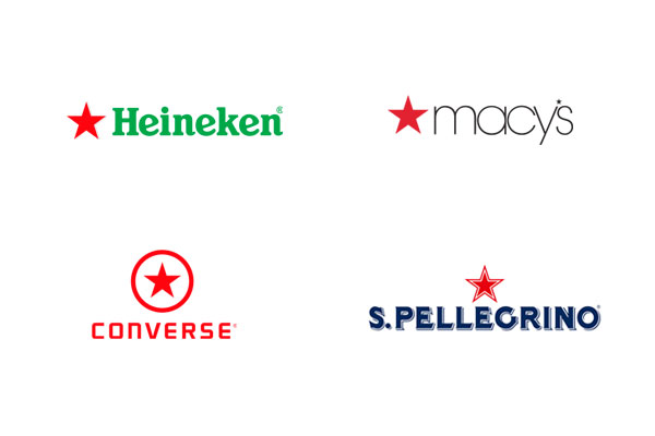
anytime i have a client that loves a logo concept but is hung up on the fact that it "looks like ____'s logo", i show them this:
0
0
1
Product design is table stakes, relevant to every user. Art direction that accurately, successfully targets your identified audience validates their choice of you and encourages further engagement.

1. Product design is more about how things work and art direction is more about how they feel. 2. Product design relies a lot of universal patterns and flows which can make experiences feel repetitive or soulless. With art direction baked into the process, you can craft a mood,
0
0
2
Misinterpreted requests now powering which ads hound you

BREAKING: Apple is now in exploratory discussions with Google about using Gemini to power a revamped version of Siri.
0
0
0
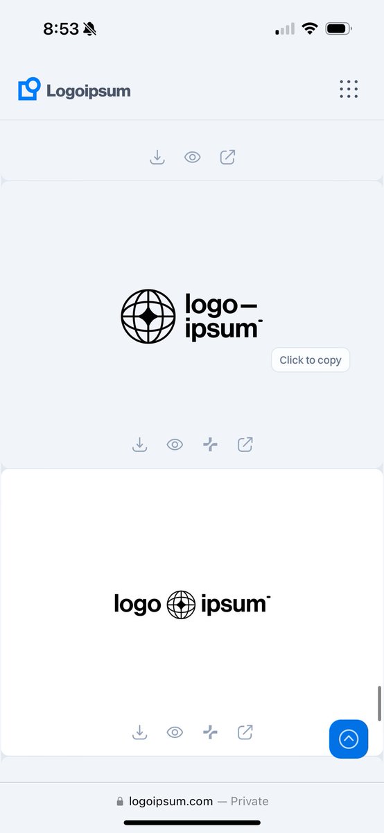
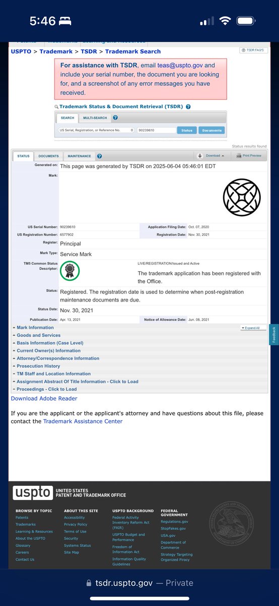
Are they different enough? No, it’s just rotated 45° Is it a generic shape? Yep 🌐 it’s everywhere

0
0
0
The spelled-out name is awkwardly engineered to justify the initialism that’s only two-letters different to its original and all its equity. But My Source is too charismatic, confusing and distracting from the initialism.

0
1
1

One issue with corporate comms is there’s too much “how to build a boat” and not enough “why you should should yearn for the vast and endless sea”
42
65
816