
stuart mcdonald
@ActuaryByDay
Followers
21,481
Following
1,281
Media
1,564
Statuses
19,575
MBE. Partner @LCP_Actuaries . Deputy Chair CMI. Chair @COVID19actuary . Own views. Life expectancy, mortality, health, pensions, insurance, inequalities, climate.
London
Joined June 2011
Don't wanna be here?
Send us removal request.
Explore trending content on Musk Viewer
#LCDLF4
• 254445 Tweets
Renzo
• 149067 Tweets
Costello
• 114398 Tweets
Romeh
• 72945 Tweets
#WWERaw
• 70030 Tweets
SAROCHA REBECCA ON RED CARPET
• 64909 Tweets
Maripily
• 50376 Tweets
Lupillo
• 50217 Tweets
FELIX ENAMORA A BARCELONA
• 35647 Tweets
BLINDAJE FURIOSO
• 32592 Tweets
#ฤดูฝนนี้ไทยทึเมมีน้องสมบัติ
• 31376 Tweets
STRAY KIDS HITS HOT100
• 28518 Tweets
Scarlett Johansson
• 27715 Tweets
MADAME FIGARO X GULF
• 24290 Tweets
定額減税
• 21934 Tweets
Kingdom Hearts
• 20666 Tweets
Fani Willis
• 20358 Tweets
梅雨入り
• 20227 Tweets
Birds Nurturing
• 17701 Tweets
給与明細
• 14249 Tweets
#Canucks
• 13449 Tweets
Gunther
• 13056 Tweets
金額明記
• 12279 Tweets
Amber Rose
• 11949 Tweets
Lyra
• 11807 Tweets
#ゴンチャの新作
• 11136 Tweets
Keys For Healthy Life
• 11002 Tweets
Otis
• 10003 Tweets


Pinned Tweet

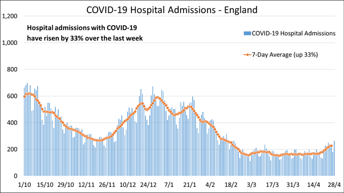
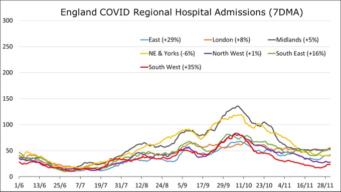
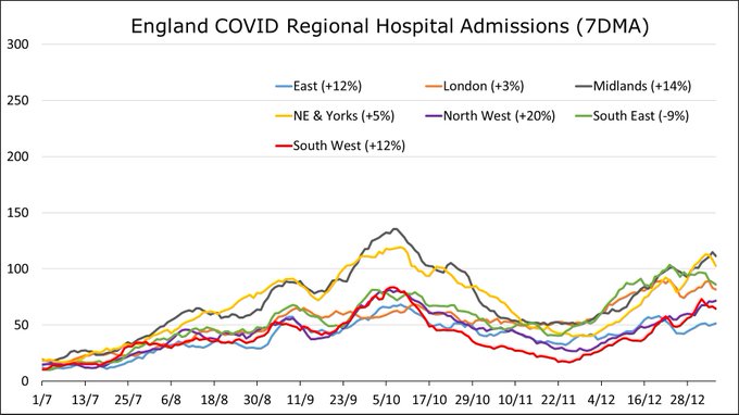
Hospital admissions with Covid in England increased by 33% in the last week of April, having been low and stable for a month.
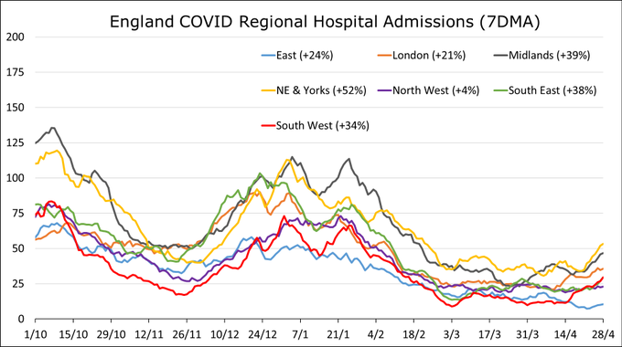
Most regions saw significant in-week increases. The fasted increases were in NE+Yorks (+52%), Midlands (+39%) and South East (+38%).
7
88
153
There’s been a bit of an unpleasant and inaccurate narrative over recent days that the majority of COVID-19 deaths were people who were “at death’s door” in any case. That they died “with” rather than “of” the disease. I want to address that. 1/8
127
2K
3K
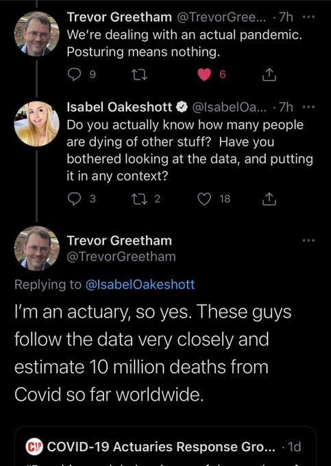
“Do you actually know how many people are dying of other stuff” asks Isabel, condescendingly.
“I’m an actuary” replies Trevor, politely.
Marvellous! 👏🏻
62
432
2K
Ok, gather round, it’s time for todays statistics lesson. This week we are covering Simpson’s Paradox. I promise it won’t take long.
Simpson's Paradox when a relationship appears within individual groups of data but disappears or reverses when the groups are combined.

59
539
2K
On
@BBCMoreOrLess
this morning I was delighted to have the opportunity to debunk the most ludicrous claim I’ve yet been asked to address!
John Campbell shared a video with his 2.9 million followers with claims of over 150,000 excess deaths compared to if no-one was vaccinated.
135
462
1K
This rhetoric is divisive and unhelpful, particularly the headline.
It’s correct to say we are experiencing significant excess deaths. It’s also correct that much of the excess didn’t arise directly from COVID.
But I disagree with calling these deaths “lockdown effects”. 🧵
145
440
1K
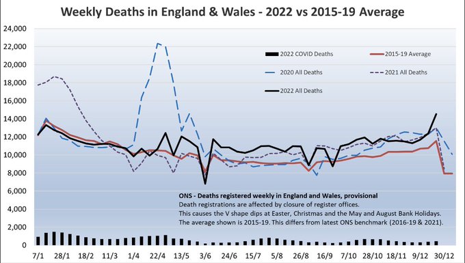
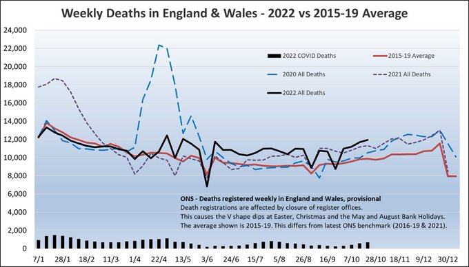
ONS deaths data has been released for week ending 23 Dec.
2,982 more deaths were recorded in-week compared to the 2015-19 average. That’s 26% more, the largest excess we’ve seen all year.
Year-to-date there have been 567,379 deaths recorded which is 8% more than 2015-19 avg.
48
677
1K
Our new commentary published in
@LancetRH_Europe
discusses the ongoing excess deaths in the UK, and for the first time provides granular analysis by age, place and cause.
Excess deaths now highest for middle-aged adults, driven by cardiovascular causes.

132
574
1K
Hopefully this goes some way to addressing the false narrative that these people would have died soon anyway, and we’ll hear rather less of it from journalists and commentators who ought to know better. 8/8
47
258
900
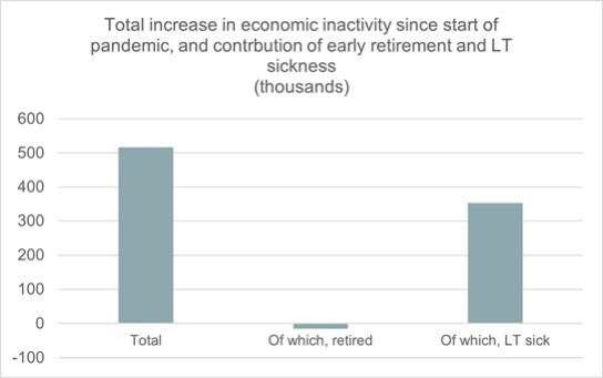
An important new report from my
@LCP_Actuaries
colleagues shows that most of the increase in the number of economically inactive people during the pandemic can be explained by long term sickness.
This runs counter to the “great retirement” narrative.
19
397
766
Important as this is, a reminder that is has no effect whatsoever on excess deaths, which is the definitive way to measure the impact of the pandemic. In fact it’s just this sort of recording issue that is why excess deaths are the gold-standard.

BREAKING ....
Matt Hancock calling "urgent review" into a staggering fiasco at Public Health England.
They are counting people who die of natural causes as coronavirus deaths if they tested positive at any time previously.
Not clear how many deaths were recorded in this way
2K
3K
8K
36
305
723
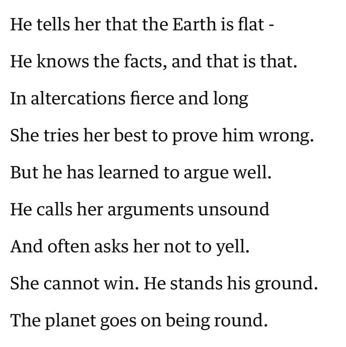
I was reminded of this earlier. Useful to keep in mind when deciding when to engage on here.
‘He tells her’ by Wendy Cope
10
177
687
Fine. Those of us analysing death data have been ignoring daily updates for mnths. They significantly undercounted on the way up; have slightly overcounted on the way down.
ONS will continue to release reliable deaths data each week, from which we can determine excess deaths.

Government to 'pause' publishing UK daily coronavirus death figures
365
345
309
14
292
640
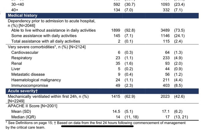
The first thing that jumps out from the medical history section of Table 1 is that 93% of those critically ill with COVID-19 were “able to live without assistance in daily activities” prior to developing the disease. That typically suggests reasonable health. 3/8
29
262
629
Updated odds of catching COVID-19:
Mar 1-in-4600
Apr 1-in-140
May 1-in-5
Jun 1-in-2
Jul 1-in-12
Aug 1-in-150
Assumes continue current trajectory, without radical interventions.
Hopefully this gives context to Govt comments about timing interventions right.
46
389
628
ONS deaths data has been released for week ending 13 Jan. 2,837 more deaths were recorded in-week compared to the 5-year average. That’s 20% more - another significant excess.
Year-to-date there have been 32,364 deaths recorded, 17% more than the 5-year average.
25
318
594
“Since it was announced in January 2023 that 5000 new beds would be made available by winter, there has been a decrease of 2,675 beds”

📢RCEM: ‘This is the start of another extremely difficult winter, and we don’t have the beds that we desperately need’
@RCEMpresident
Our response to today's A&E performance figures, which show some appalling trends.
Read our full statement here:
2
98
119
8
378
508
Secondly, just 7% of 2,124 intensive care admissions had “very severe comorbidities”. That’s significantly less than typical viral pneumonia patients (as illustrated in table 1)👆
So 19 out of 20 were free of the most severe life-limiting conditions. 4/8
7
160
486
Today’s Twitter nonsense includes:
- people trying to educate me about mortality forecasting
- people trying to educate me about the long-term effects of Spanish flu
And the pièce de résistance, someone telling me I need to read a paper in the Lancet which I co-authored.
22
47
504
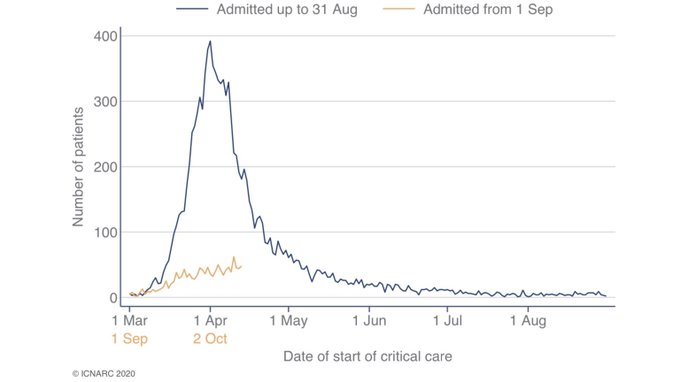
It’s been a week since THAT thread using Critical Care data (from ICNARC) to challenge the narrative that those getting very seriously ill or dying from COVID-19 were already “at death’s door”.
There’s a new report out (and I’m a glutton for punishment) so let’s dive back in. /1
20
281
487
So what are the underlying causes? I think three main factors:
1. elevated cardiovascular risks after covid infection
2. current delays for urgent treatment in the NHS
3. missed and delayed diagnoses early in the pandemic
55
81
487
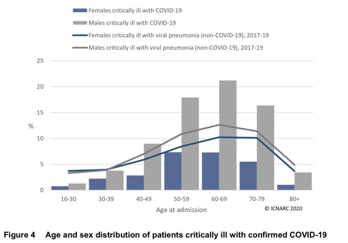
Lastly, for now, the age distribution. Most critical cases are aged between 50 and 80.
People of this age, without severe comorbidities, could reasonably have expected to have years of life ahead of them before they contracted this disease. 5/8
21
156
472
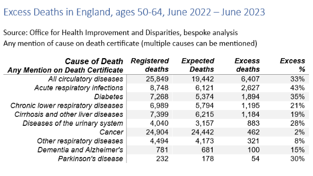
For ages 50-64, deaths involving cardiovascular diseases such as heart disease and stroke were 33% higher than expected.
Other causes with significant excess deaths at ages 50-64 were acute respiratory infections (43% excess) and diabetes (35% excess).
19
218
481
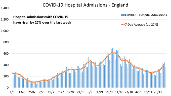
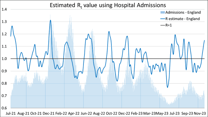
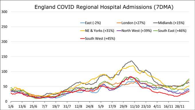
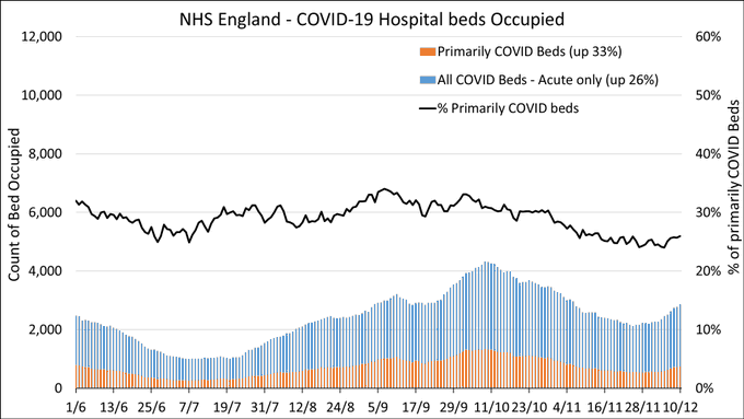
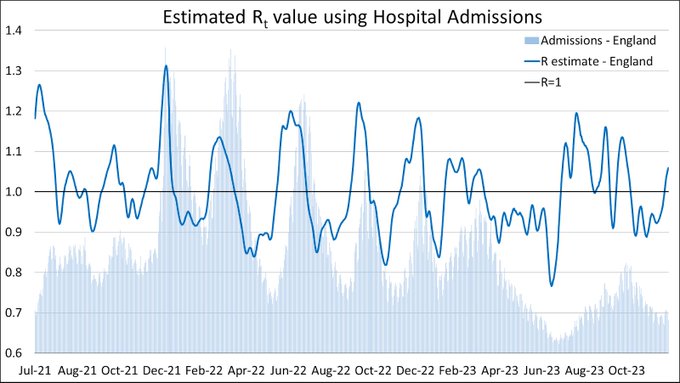
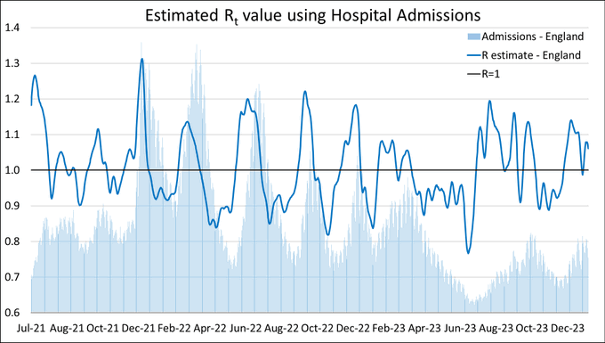
Hospital admissions with COVID in England increased by 27% in-week.
R-estimate incresed to 1.15.
Admissions were flat in the East (-2%) but rose sharply elsewhere. Largest increases in the South East (46%) and the South West (45%).
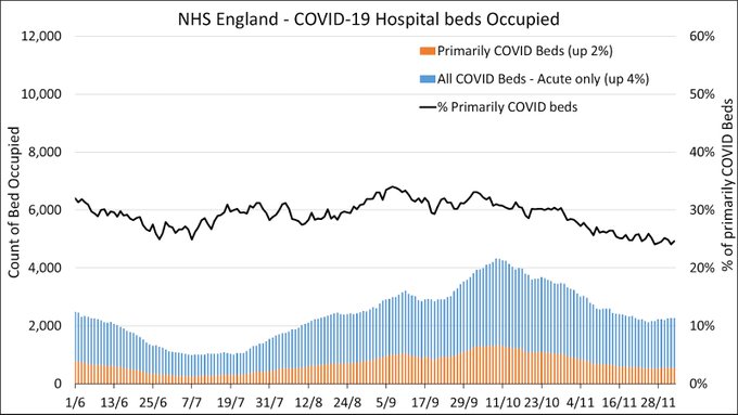
Acute bed occupancy is up by 26%.
24
282
461
Getting the train into London for the first time in a while. I’m one of the few people wearing a mask. Am trying to ignore the coughs and sniffles all around me. Why are so many people travelling when symptomatic?
291
35
452
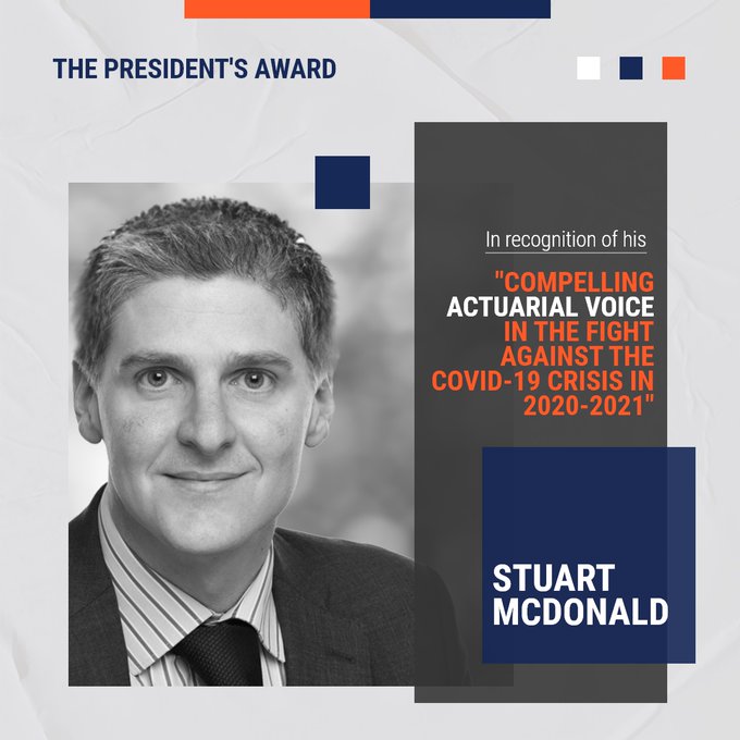
I know it’s shameless self-promotion but I’m very proud to receive this professional recognition for my COVID work over the last 18 months.
I know I’m quieter of late (busy dayjob and we’re in for the long haul) but grateful to my
@COVID19actuary
colleagues for sharing the load.

The IFoA's President’s Award was presented to
@ActuaryByDay
for being the compelling actuarial voice in the fight against the COVID-19 crisis in 2020-2021. Read the full story here.
1
9
63
47
17
428
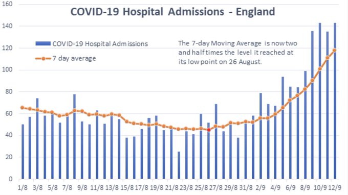
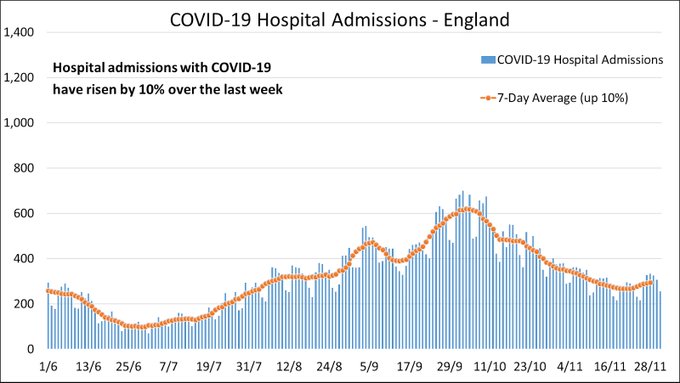
Updated chart of COVID-19 hospital admissions now including the newly published data from the last three days.
Admissions in England are rising sharply.
The 7-day moving average is now two and a half times the level it reached at its low point on 26 August.
57
300
406
A lot of people have asked for a
@COVID19actuary
view on this thread. I’ll give a personal reply for now, though others I’ve spoken to concur.
Big picture: broad agreement that the recent excess mortality is concerning and we need to better understand root causes. Detail below.

🧵on excess deaths. Concerning picture TLDR;
-excess deaths for 11 consecutive wks
->1000 excess deaths/wk
- ~500-800 excess deaths/wk at home
-excess in all ages including children & young people
-Almost all excess in hospitals explained by COVID
-What's causing home deaths?
75
1K
2K
16
156
412
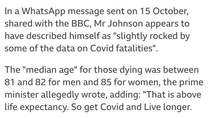
Oh Boris!
There’s a lot wrong with this. For one thing he compared median to mean, but crucially he’s wrongly using life expectancy (LE) at birth.
LE at age 80 is 9yrs for men and 10yrs for women
LE at age 90 is 4yrs for men and 5yrs for women
ONS 👉
27
165
390
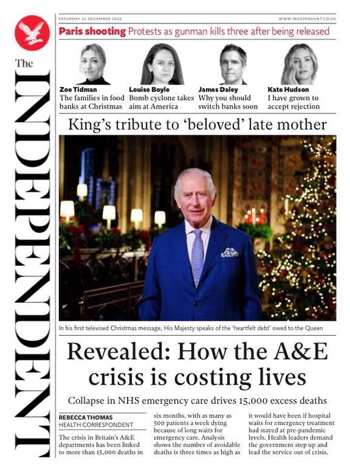
Analysis by
@LCP_Actuaries
for
@Independent
shows that the crisis in A&E can be linked to more than 15,000 deaths in the last six months.
Up to 500 patients a week are dying because of long waits for emergency care.
21
267
382
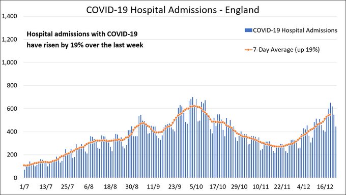
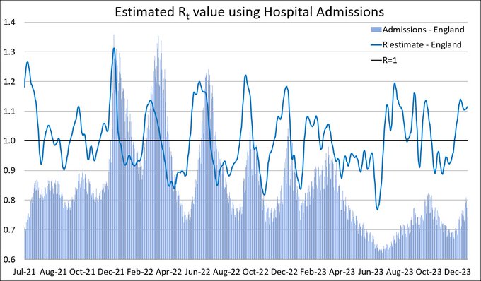
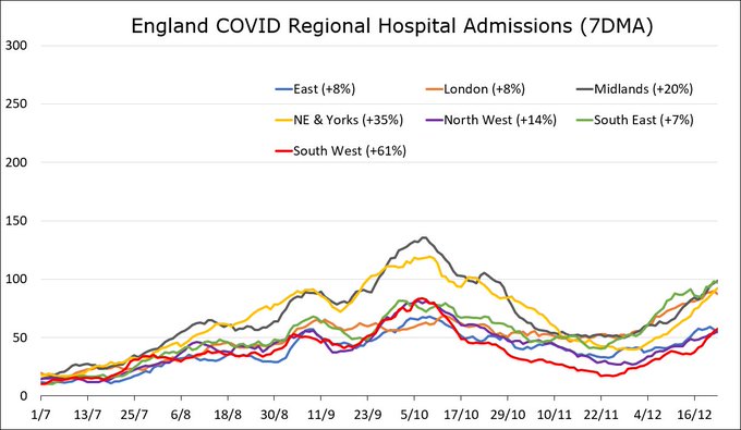
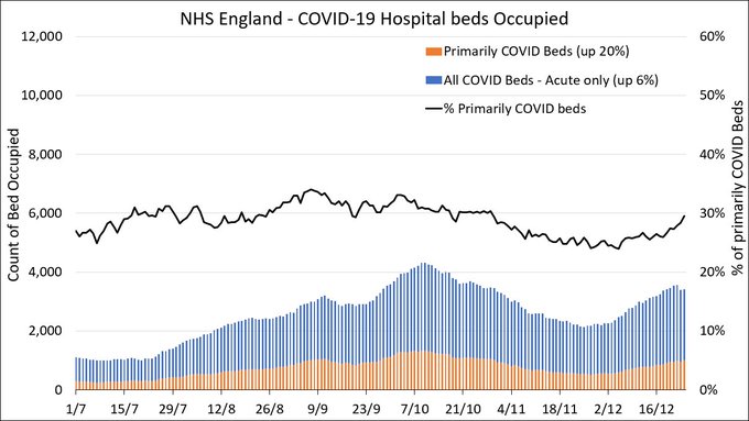
Hospital admissions with COVID in England increased by 19% in-week.
R-estimate is stable at 1.12.
Admissions rose in all English regions. Largest increases in the South West (61%) and NE&Yorks (35%).
Acute bed occupancy is up by 6%.
22
224
383
ONS deaths data has been released for week ending 16 June.
1,008 more deaths were recorded in-week compared to the 5-year average. That’s 10% more, which is a significant excess.
Year-to-date there have been 289,993 deaths recorded, 8% more than the 5-year average.
14
182
361
There‘s a danger of drawing conclusions from ICU admissions that I ought to bring out. Given capacity limits there will inevitably be some triage going on, ie admitting those with the best chance of survival. This will skew the data to some extent. 6/8
14
80
350
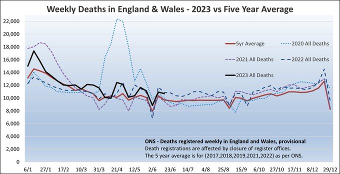
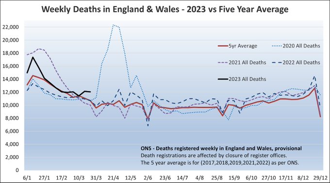
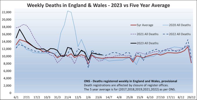
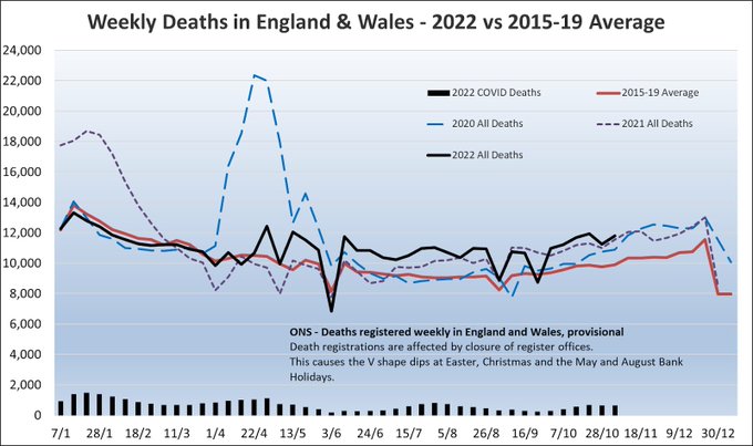
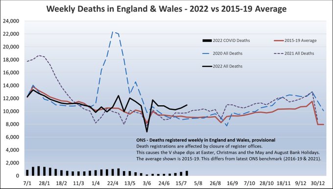
Are we seeing significant excess deaths in England and Wales at the moment? Yes, absolutely. Death rates have been around 11% above pre-pandemic over the last 8 weeks.
So why might skeptics suggest otherwise? If acting in good faith then they don’t fully understand the data 🧵
13
144
351
ONS deaths data has been released for week ending 24 Mar.
1,361 more deaths were recorded in-week compared to the 5-year average. That’s 13% more, a higher excess than seen in recent weeks.
Year-to-date there have been 160,016 deaths recorded, 7% more than the 5-year average.
14
184
340
Popping in to the twittersphere just briefly to say a HUGE thank you to everyone who has been in touch to congratulate me on the MBE. 🙏
I hope the excited kids and puppy will allow me a bit more time later to thank more people in person. 😊
40
4
336
Over 40s can now rebook earlier second jabs (from 8 weeks after first dose).
I just brought mine forward by 3 weeks (and moved it to a location I can walk to).
Via link below and “Manage my appointments”.
38
177
327
There are factual inaccuracies and misleading statements in this short thread - disappointing from a former Secretary of State
@DavidDavisMP
. Let’s quickly walkthrough them to set the record straight if possible.

In this video, Dr John Campbell provides an excellent summation of an FOI request answered by the ONS last month, disentangling the statistics of people who have died with Covid and those who died solely because of Covid. (1/4)
219
65
206
8
152
325
The actuarial profession is beginning to express a view on the extent to which the legacy of the pandemic will affect life expectancy.
The CMI is consulting on the next version of its mortality projection model. The proposal would reduce life expectancy of retirees by 6 months.
16
100
327
A significant proportion of the age-standardised excess are deaths with COVID.
However, a similar number are not. It is these non-covid deaths that
@sarahknapton
’s article focuses on, calling them “lockdown effects”. This attribution is speculative and I’d say it’s inaccurate.
14
39
318
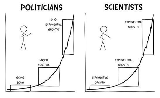
Despite what we experienced in March a lot of people still don’t really grasp exponential growth. I’m getting challenged about why I’d talk about admissions doubling when average “has only gone from 50 to 100”.
If conditions don’t change the pattern goes 100, 200, 400, 800, ...
31
84
317
Hospital admissions with COVID in England increased by 10% in-week.
Our R-value has increased to 1.06.
Admissions rose in all regions except NE&Yorks (-6%). Largest increaes in the South West (+35%) and the East (+29%).
Acute bed occupancy is up by 4%.
14
172
321
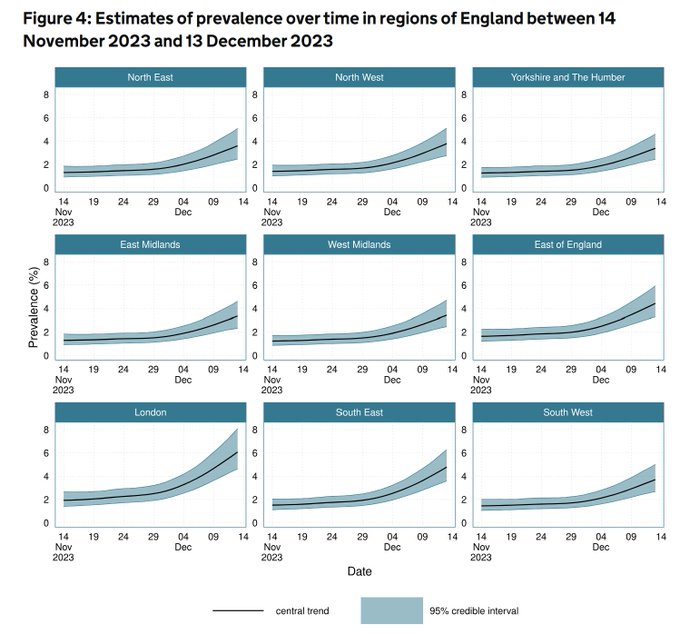
Somewhere between 1-in-12 and 1-in-22 people in London has Covid.

Prevalence is estimated to be highest in the London area, at just over 6% across the population. Note though that confidence intervals are wider due to lower sample sizes than in previous studies.
3/
3
17
60
21
182
315
No sign of a slowdown in the rate at which hospitalisations with COVID are increasing.
Whatever precautions you chose to take in the January and March waves, you should consider taking now. The only things that’s substantially different is the media coverage.

The last update of hospital data for the week shows admissions growing at 41% per week, which if maintained would suggest a doubling time of approximately 14 days.
With the daily average now 962, a further doubling would take us close to the BA.2 peak shown.
1/
11
194
324
25
179
312
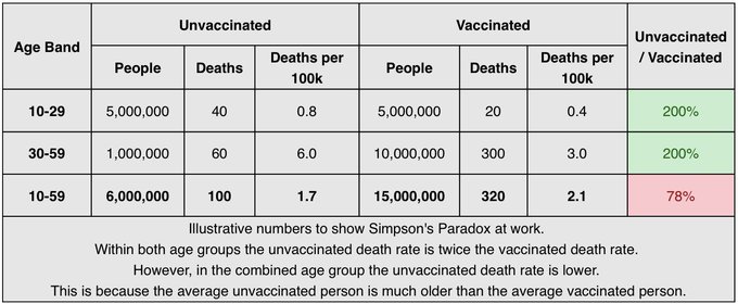
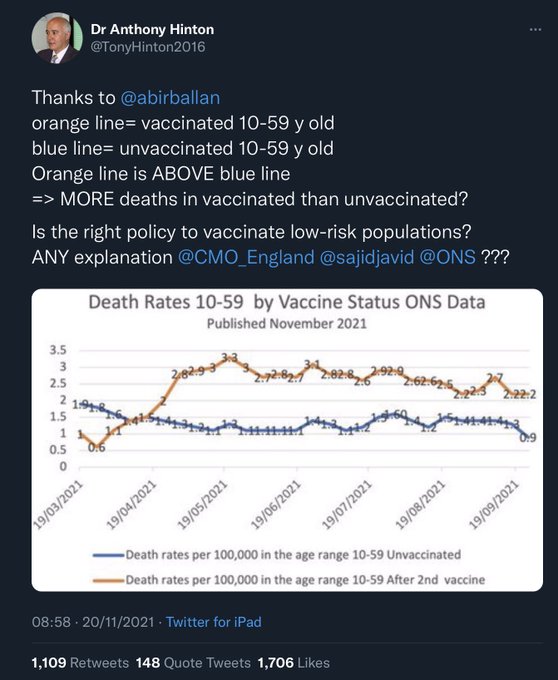
So what the chart above is really showing is that within the 10-59 age band the average unvaccinated person is much younger than the average vaccinated person, and therefore has a much lower death rate. Any benefit from vaccines is swamped by the increase in death rate with age.
1
40
307
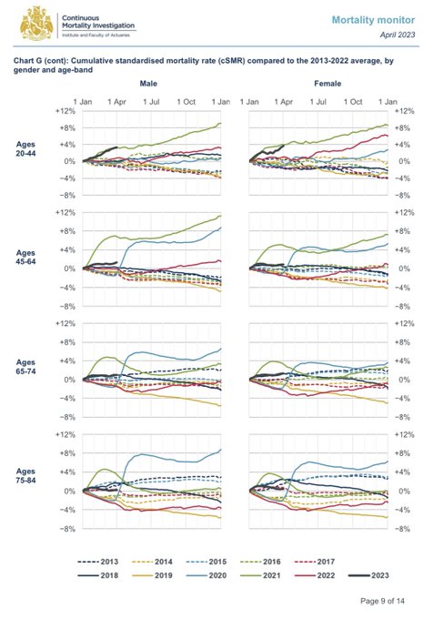
Today CMI released its quarterly mortality monitor for Q1 2023.
The analysis of mortality by age is fascinating but grim reading. Death rates are relatively high for all ages but especially high for young adults. Death rates at age 20-44 are as bad as the second wave in 2021.
18
191
308
In the next week there will be a bulletin on this from one of the team at
@COVID19actuary
but for now some brief thoughts from me.
I’ll refer to yesterday’s update from the Intensive Care National Audit and Research Centre (ICNARC). 2/8
Full report:
9
86
300
Still, this data covers all admissions from the start of the epidemic until 3 April. For much of that period we are told that spare capacity was available so this data should not be skewed too much away from the typical critical case. 7/8
3
72
306
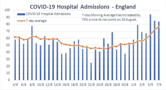
I’ve again updated my chart of COVID-19 hospital admissions to include the latest numbers.
Admissions in England are rising. The 7-day moving average has increased by 70% since its low point on 26 August.
This is the first sustained increase in admissions since March/April.
28
305
298
I have mocked up some illustrative numbers below to hopefully show this in action. I’ve split 10-59s into 10-29 and 30-59. Within each group the death rate for unvaccinated people is twice as high as for vaccinated people. But within the combined group it is lower!
12
43
305
I laughed and laughed before it slowly dawned on me that the author isn’t in on the joke. And presumably most of the RTs aren’t either.

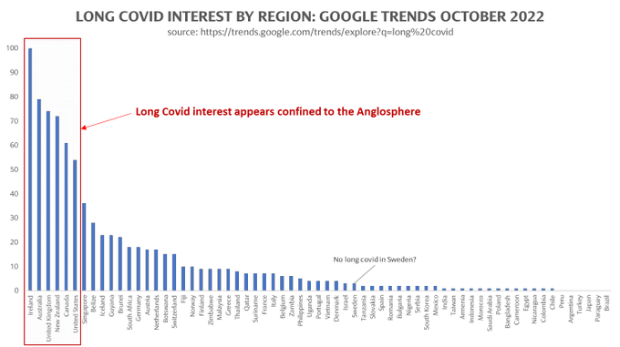
Based upon google searches, it appears that "long covid" only exists in the anglosphere nations: Ireland, Australia, UK, Canada, New Zealand, and the USA.
Does covid somehow know if you speak English?
Why no interest in long covid in Japan or Sweden or Italy or Brazil?
961
647
2K
13
34
305
Let’s go through the claims one by one.
1. ONS data clearly shows that death rates are lower among vaccinated people than unvaccinated. This chart shows age-standardised death rates from all causes.
Source:
25
58
306
Excess deaths arise directly and indirectly from the Covid pandemic. This includes:
- increased pressure on NHS urgent care services, resulting in poorer patient outcomes
- direct effects of Covid-19 infection
- disruption to chronic disease prevention, detection and management.
27
88
302
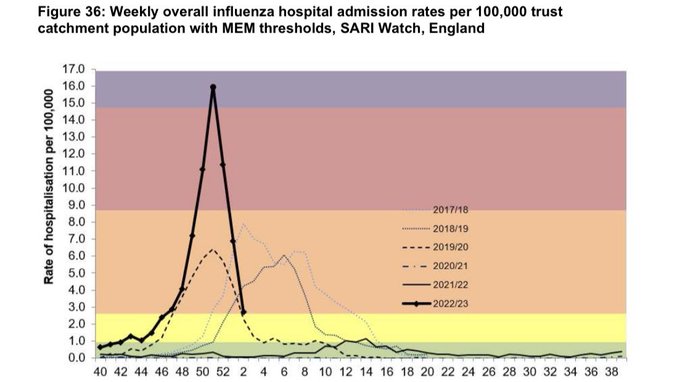
Both Covid and flu admissions to hospitals increased in the last two weeks. Flu up 33% this week, with more admissions than from Covid, which is up 8%.
Concurrent waves of Covid and flu are piling pressure onto a hospital system which appears not to have the capacity to cope.
21
137
295
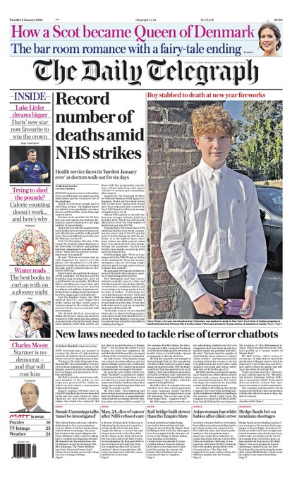
This analysis on
@telegraph
front page is fundamentally flawed.
It compares death counts in 2023 with the 2015-19 average, concluding that there have been 53,000 excess deaths.
But around half of that is explained by the ageing population which means deaths increase each year.

The front page of tomorrow's Daily Telegraph:
'Record number of deaths amid NHS strikes'
#TomorrowsPapersToday
Sign up for the Front Page newsletter
43
19
25
28
124
283
So that’s Simpson’s Paradox in a nutshell.
Hopefully the explanation above is clear and will be helpful, at least until we have updated data to conclusively prove the case.
With luck, this latest bit of vaccine misinformation will do a disappearing act!
15
19
276
Latest modelling of the Omicron wave by
@cmmid_lshtm
suggests the following for England:
🦠 21 - 35 million infections
🏥 175 - 492 thousand hospitalisations
💀 25 - 75 thousand deaths
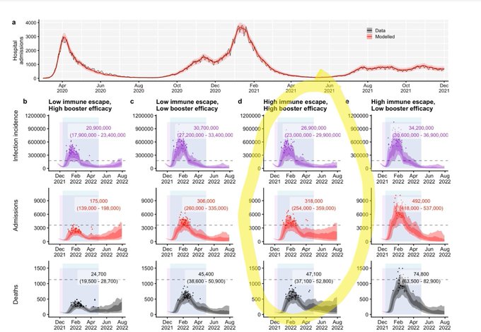

26
171
273
Thank you to
@richardvadon
@TimHarford
and all the team at
@BBCMoreOrLess
for addressing this misinformation. John Campbell demanded “thorough peer review by academics around the world”. I was happy to oblige, as were
@d_spiegel
@AdeleGroyer
and others.
2
26
278
It is only this third element that can reasonably be called “lockdown effects”. Even here though, many would argue that with no restrictions an overwhelmed NHS would have led to more missed or late diagnoses, as well as more short-term deaths.
7
22
268
To state the obvious, we have not been in lockdown for a long time. It is over a year since the last restrictions were lifted. We saw excess deaths after restrictions were lifted last July and we are seeing them again now.
So what are the causes of the “non-covid” excess deaths?
9
40
269
ONS deaths data has been released for week ending 30 Dec.
1,563 more deaths were recorded in-week compared to the 2015-19 average. That’s 20% more. Bank holidays make this week harder to interpret.
Year-to-date there have been 576,896 deaths recorded, 8% more than 2015-19 avg.
15
141
269
@toadmeister
Good morning Toby.
50,000 deaths from 5m and infections is a 1% infection fatality rate. That’s much more lethal than seasonal flu.
10
26
263
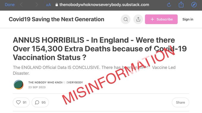
In the video John repeated and endorsed incorrect claims made in an anonymous blog by “the nobody who knows everybody” that there have been over 150,000 excess deaths as a result of people getting vaccinated.
Here is how and why we can be certain this is completely false. 🧵
6
50
265
Today on
@BBCMoreOrLess
I will be debunking the most ludicrous claim I’ve been asked to look at! Though that didn’t stop
@Johnincarlisle
sharing it with his 3 million
@YouTube
followers.
9am on
@BBCRadio4
. Thread to follow!
26
53
264
For those who have queried it, when we talk about the "direct effects of Covid-19 infection" we refer to both acute Covid-19 illness and to elevated cardiovascular risk post-infection (which is now well established).
15
92
263
The latest
@ICNARC
intensive care weekly report has been published. A short thread to summarise, including a link to the full report. The report covers critical care admissions to 15 October and compares the second wave (1 Sep onwards) to the first. 1/10
10
149
253
I and others have written to ONS, alerting them to the concerns that this data is causing. It appears from a new blog they have released that they are aware of the issue and will use narrower age bands in the next release.
2
26
252
Wait a minute! This would imply that the trickledown economics idea of bankers wandering their local streets, looking for worthy people to share their huge bonuses with, might not be entirely accurate.

A year ago, I asked
@FinancialTimes
readers about bonus expectations:
💰 40% got a six-figure payout
💷 Most intended to invest all the money and not spend a penny
🏠 13% said they’d pay lump sum off mortgage
😱 7% bought crypto
2023's survey is here:
15
17
44
13
63
259
Newly published data from
@OHID
shows that, from June 2022 to June 2023, excess deaths were highest for ages 50-64, at 15% above normal.
In comparison, excess deaths were 11% higher than expected for under 25s and 25-49s, and were 9% higher for over 65s.
3
82
249
ONS deaths data has been released for week ending 30 June.
918 more deaths were recorded in-week compared to the 5-year average. That’s 10% more - another significant excess.
Year-to-date there have been 310,838 deaths recorded, 8% more than the 5-year average.
15
127
249
1. This recent article by
@saimamaysidik
in
@Nature
gives a good summary of concerns around post-COVID cardiovascular risk:
“studies suggest that the risk of cardiovascular problems, such as a heart attack or stroke, remains high even many months after a SARS-CoV-2 infection”
Elevated cardiovascular risks following COVID infection.
2
13
30
10
46
247
NEW - Data for December has just been published and paints an even worse picture.
2,200 additional deaths associated with A&E delays in December alone. That is 500 per week.
Method as per linked blog.
Are A&E pressures really leading to hundreds of additional deaths each week?
@ActuaryByDay
and colleagues
@LCP_Actuaries
crunch the numbers and conclude that a significant number of patients could be dying because of long delays accessing emergency care.
12
132
194
15
161
245
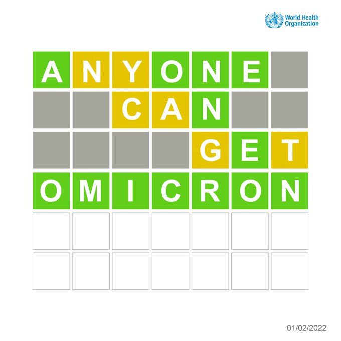
Helpful public health messaging but I can’t get past the complete lack of awareness of the rules of Wordle.

8
16
243
Some ‘interesting’ replies. It doesn’t matter whether I think lockdowns are ever necessary. Point is, lockdowns are a tool Governments will use when hospital capacity is threatened. If we want to avoid them we should think twice before opposing other measures (eg masks, wfh, vax)
@AlistairHaimes
Even 18 months in it still astounds me that most so-called “lockdown skeptics” vocally oppose any and all measures which might prevent lockdowns from becoming necessary.
25
10
87
14
25
231
This is a perfectly reasonable question.
#VaccinesWork
and the UK vaccination effort has been incredible, so why do so many people, including me, feel that unlocking on June 21 is just too much of a risk right now? 🧵 (TLDR: Delta/India variant, cases 📈)

Can anyone answer this basic question:
If the
#CovidVaccine
works against the Delta/Indian Variant, as it seems to, then people may get Covid but they won't be seriously ill or die.
Which means a rise in cases won't overwhelm the NHS.
So why not unlock on 21/6 as planned?
1K
592
5K
38
79
234
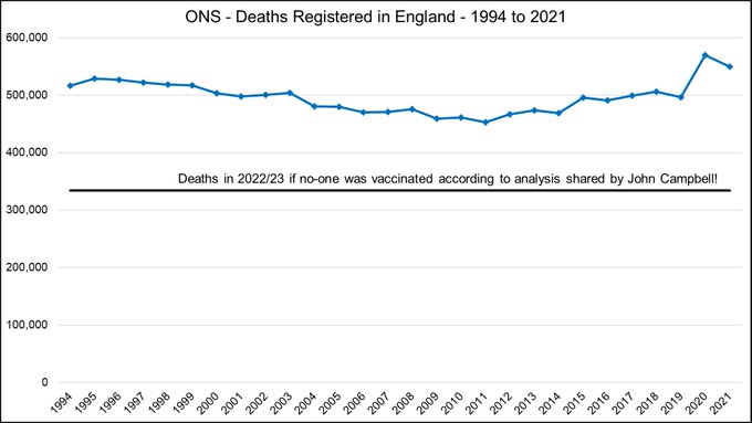
2. The claim that if no-one was vaccinated there’d have been under 340,000 deaths in England in a 12 month period is incredible! Anyone with relevant expertise should know straight away that this must be false.
There have been over 450,00 deaths a year for the last 25 years!
5
30
235
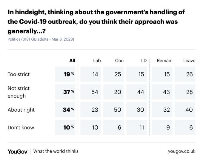
Interesting and quite different from the impression you might get from (social) media. Around twice as many say handling of covid was “not strict enough” versus “too strict”.

In hindsight, do you think the government’s handling of the Covid-19 outbreak was…
All Britons
🟰 About right: 34%
✖️ Not strict enough: 37%
❌ Too strict: 19%
Con voters
🟰 50%
✖️ 20%
❌ 25%
Lab voters
🟰 23%
✖️ 54%
❌ 14%
332
117
263
27
84
236
I've been poring over today's NHS data releases and the picture for emergency care isn't pretty.
Last year I estimated 400 additional deaths a week arising from A&E delays, Sep-Nov.
This year looks just as bad, despite less Covid and flu - so far!

18
121
234
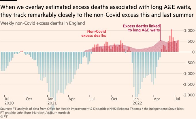
Analysis by
@jburnmurdoch
shows a fairly strong association between A&E waits and excess deaths this summer and last.

3
50
230
I am deeply skeptical about the headline conclusions from this new Oxford uni study. A more considered response will follow but brief thoughts now on why I don’t believe the conclusion that over half the UK has had the virus. 1/9

fascinating, counter-intuitive research from Oxford University suggesting that coronavirus may have already infected half of UK population
@FT
via
@financialtimes
162
505
819
18
125
228
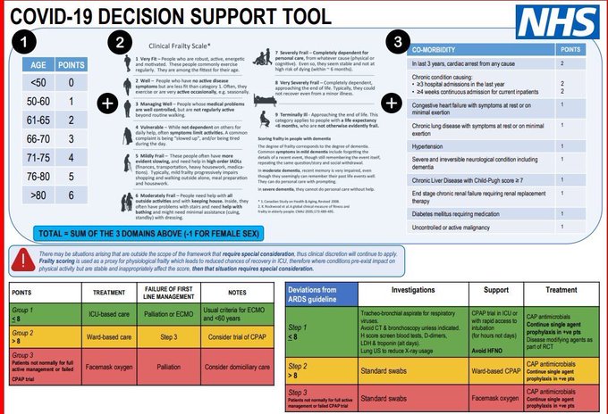
@chrischirp
Agree entirely. There is no doubt whatsoever that clinicians on the ground were making tough triaging decisions about where to direct their limited resources.
A note on triage. Here‘s the Decision Support Tool which aids clinicians deciding who to admit to ICU. I don’t know how long this has been in effect - I’ve been sent it a few times in last 24hrs but not before that.
If total score is 9 or more the guidance is not to admit. /14
5
27
52
9
59
229

Great show of support for vaccination from the intensive care community yesterday! Follows TV coverage of an anaesthetist with unusual views.
There are individuals with fringe views in every profession. Problems arise when they get disproportionate visibility on (social) media.
9
28
225
I’ve gained around 800 followers today - very unusual. Thank you to those who RTd or recommended me - it is much appreciated.
It’s usually a bad sign when people are interested in what a mortality expert has to say - sadly this time is no exception. Still, welcome new followers!
6
9
227
Across all ages, deaths in a private home were 22% higher than expected compared with 10% in hospitals, no excess deaths in care homes, and 12% fewer deaths than expected in hospices.
Deaths from cardiovascular causes in private homes were 27% higher than expected.
7
56
226
ONS deaths data has been released for week ending 21 Oct.
2,073 more deaths were recorded in-week compared to the 2015-19 average. That’s 21% more, which is another significant excess.
Year-to-date there have been 459,819 deaths recorded which is 7% more than the 2015-19 avg.
13
116
219
Flu arrived early and hit pretty hard this year. But it’s all over bar the shouting. Hospital admissions with flu have plummeted in the last 3 weeks.
14
57
221
@richardvadon
@TimHarford
@BBCMoreOrLess
@d_spiegel
@AdeleGroyer
Thanks also to
@UncleJo46902375
@DrSusanOliver1
@tylerblack32
and others who debunked this claims on various platforms before today’s show was broadcast.
More great peer review from around the world!
4
20
220
A classical example of Simpson’s Paradox is currently doing the rounds on social media. I’m always loathe to share misinformation, but at this point it is probably fair to say that this chart is already very much “out there”, so here it is.
14
79
214
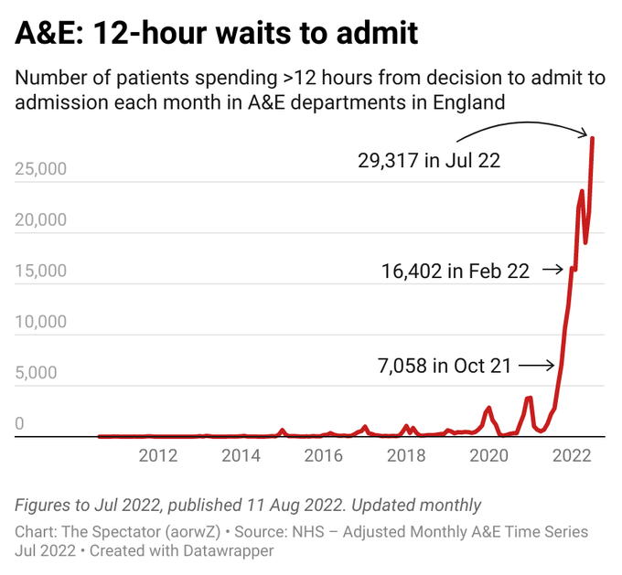
2. Current delays for urgent NHS care are extraordinarily long.
See chart below for those waiting >12 hours in A&E for example. Ambulance waiting times and other statistics are equally concerning.
Staffing levels, ability to discharge patients and demand are all relevant here.

🚨 BREAKING | Nearly 30,000 waited more than 12 hours in English A&Es last month - a record high.
47
350
523
2
34
216
@richardvadon
@TimHarford
@BBCMoreOrLess
@d_spiegel
@AdeleGroyer
@UncleJo46902375
@DrSusanOliver1
@tylerblack32
You can listen to today’s show here - the last episode in the current series. It’s always a pleasure to work with the
@BBCMoreOrLess
team!

6
36
218
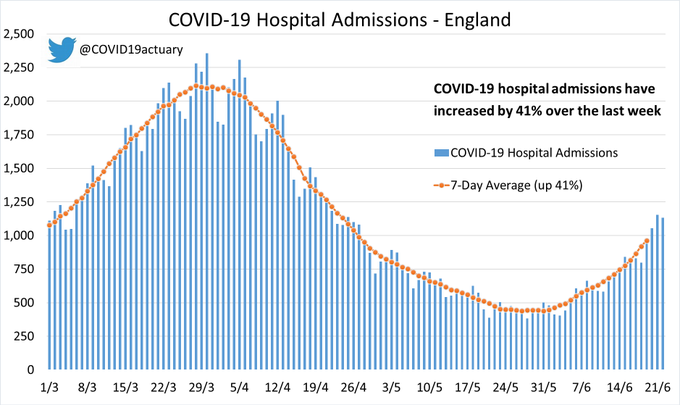
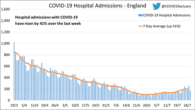
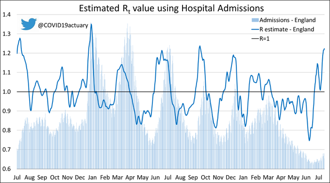
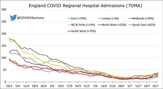
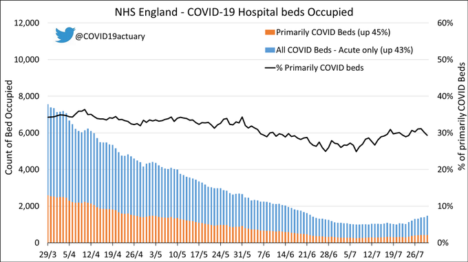
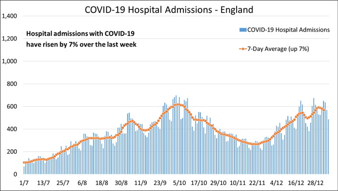
Sharp increase in hospital admissions with Covid this week. Up 41%.
Hospital admissions with COVID in England increased sharply, up 41% in-week.
Our R estimate increased to 1.20.
Admissions slightly fell in London (-4%), but rose in all other English regions. The largest increase was 82% in the South East.
Acute bed occupancy increased by 43%.
24
347
568
13
122
215
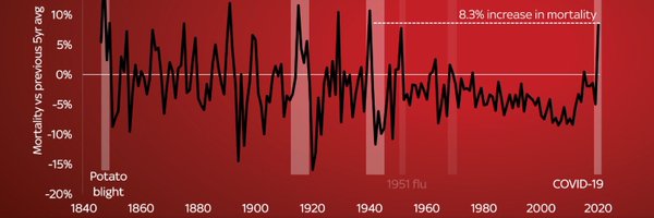
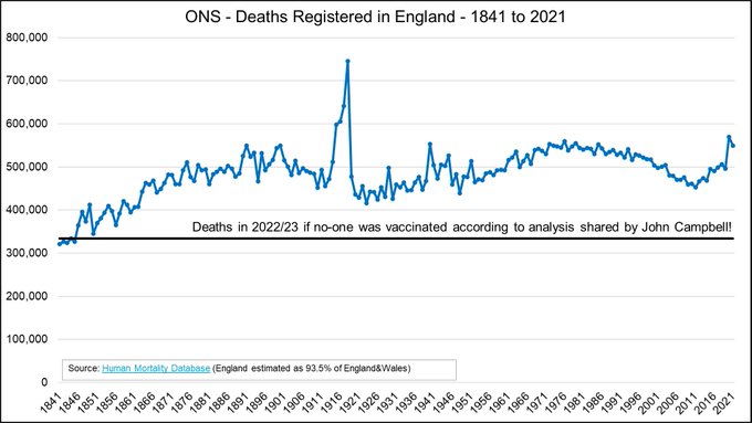
In fact, we can go back further… much further.
You would have to go back to the 1840s, when the population of England was much smaller, so see so few deaths in one year! If it wasn’t so serious these claims endorsed by John Campbell would be laughable.
3
32
214
Hospital admissions with COVID in England increased by 7% in-week.
R-estimate volatile at the moment, currently 1.06
Admissions fell in the South East (-9%) but rose elsewhere. Largest increases in the North West (20%) and the Midlands (14%).
Acute bed occupancy remained flat.

20
94
209
ONS deaths data has been released for week ending 4 Nov.
1,904 more deaths were recorded in-week compared to the 2015-19 average. That’s 19% more, which is another significant excess.
Year-to-date there have been 482,859 deaths recorded which is 8% more than the 2015-19 avg.
12
116
212
@TonyHinton2016
@abirballan
@CMO_England
@sajidjavid
@ONS
Using such a broad age group (10-59) is highly misleading. Most of the unvaccinated people are young. Most of the vaccinated people are older. Since death rates increase sharply with age the protective effect of the vaccines can’t be seen here.
This chart is deception!
18
10
207
When John Campbell describes the stitching together of the data as “a really clever way to look at this” he is completely wrong.
This statistical bodge job gives estimated death rates for unvaccinated people which are about half what they should be.
1
23
210
ONS deaths data has been released for week ending 22 July, the week of the heatwave.
1,885 more deaths were recorded in-week compared to the 2015-19 average. That’s 21% more.
Year-to-date there have been 320,980 deaths recorded which is 4% more than the 2015-19 average.
8
110
208