

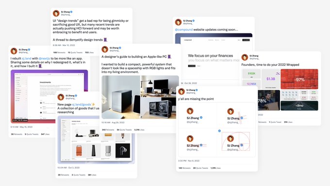
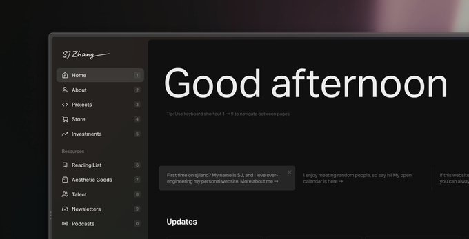
SJ Zhang
@sjzhang_
Followers
3,738
Following
396
Media
89
Statuses
568
Explore trending content on Musk Viewer
Rafah
• 435839 Tweets
Xavi
• 317530 Tweets
Travis
• 125341 Tweets
Ten Hag
• 105341 Tweets
سلمان
• 78283 Tweets
Memorial Day
• 73604 Tweets
#تتويج_الهلال
• 69881 Tweets
QSMP
• 48709 Tweets
Coutinho
• 41889 Tweets
Haiti
• 37954 Tweets
Sokak Köpekleri Toplatılsın
• 31858 Tweets
Super Size Me
• 31246 Tweets
Morgan Spurlock
• 30875 Tweets
Neto
• 27805 Tweets
Ergin Ataman
• 27478 Tweets
Gove
• 25378 Tweets
Karoline
• 23683 Tweets
#التتويج_حديث_العالم
• 23066 Tweets
Militão
• 22330 Tweets
Yunan
• 20407 Tweets
Mourão
• 20354 Tweets
Cecília
• 18987 Tweets
Tyga
• 18392 Tweets
القادسية
• 16918 Tweets
#KızılcıkŞerbeti
• 16490 Tweets
الدوري الاقوي
• 14743 Tweets
Datti
• 13872 Tweets
نيمار
• 13388 Tweets
Girona
• 12494 Tweets
Guarani
• 12475 Tweets
Kelce
• 12412 Tweets


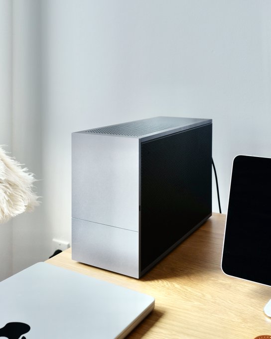
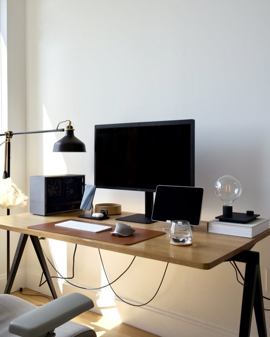
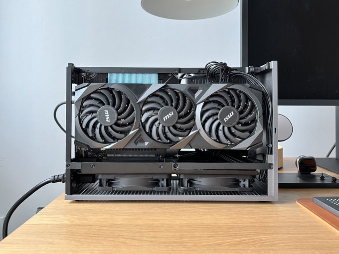
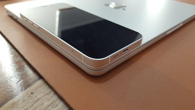
A designer's guide to building an Apple-like PC 🧵
I wanted to build a compact, powerful system that doesn't look like a spaceship with RGB lights and fits into my living environment.
34
230
3K
UI “design trends” get a bad rep for being gimmicky or sacrificing good UX, but many recent trends are actually pushing HCI forward and may be worth embracing to benefit end users.
A thread to demystify design trends 🧵
17
102
674
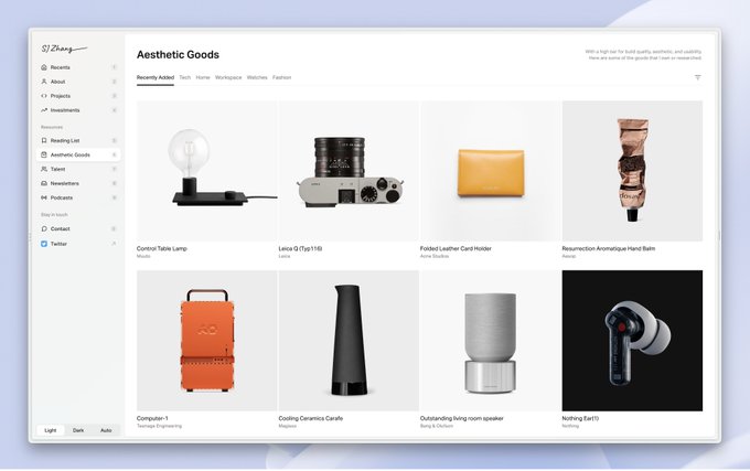
New page ✨
A collection of goods that I use or spent time researching
15
19
365
pipe's new website menu in slow motion:
interesting use of :transform on the fonts for a resizing transition

Big changes are coming to Pipe starting today!
We’re excited to share the new , fully redesigned! We love our customers, and we want to continue to help them grow on their terms.
Flexible access to capital with a whole new look.
Check it out!
50
80
1K
4
6
270
among all the shiny lighting effects, this cta on feels so fresh
3
15
238
Shipped a new web page today 👀
18
4
182
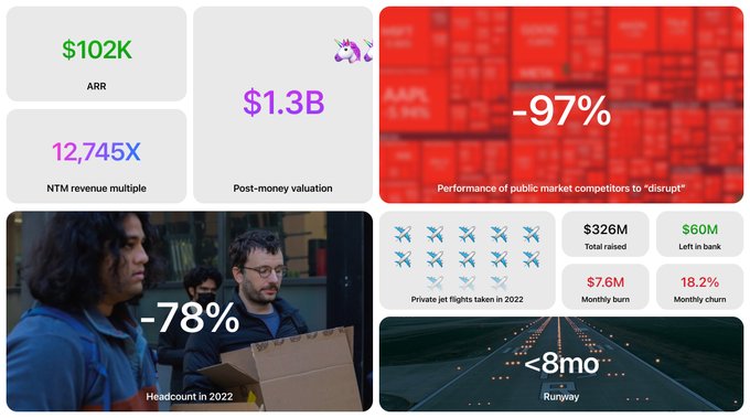
After 4 incredible years at Compound, I'll be taking on a new challenge soon.
Incredibly proud of the team we've assembled and what we've built together: the brand, the software, and $1.5B+ in AUM📈
Team is in its best position ever to continue reaching new heights!

26
2
137
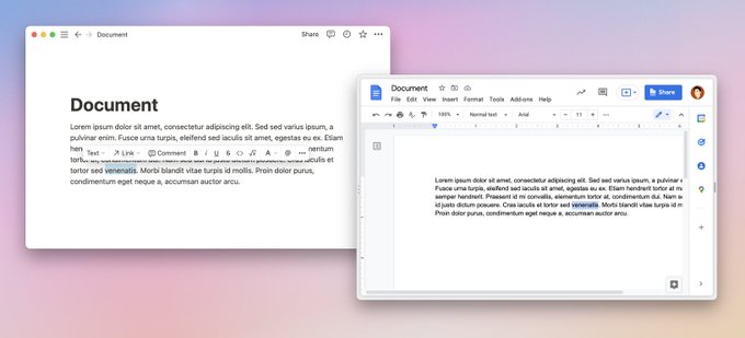
2.2) More applications are trending towards revealing relevant controls only WHEN you try to interact. (You want to delete a table row, hover your mouse over it, and a trash can appears.) The step-by-step reveal process reduces the initial cognitive load for users.
2
3
86
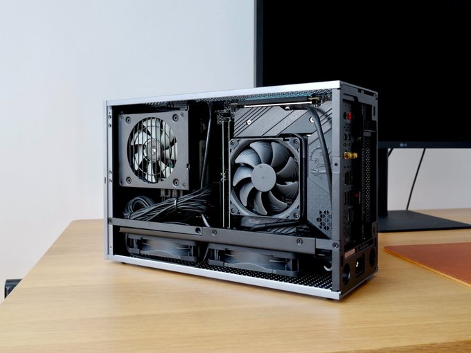
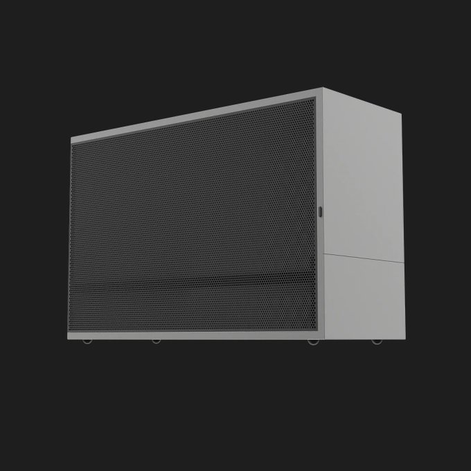
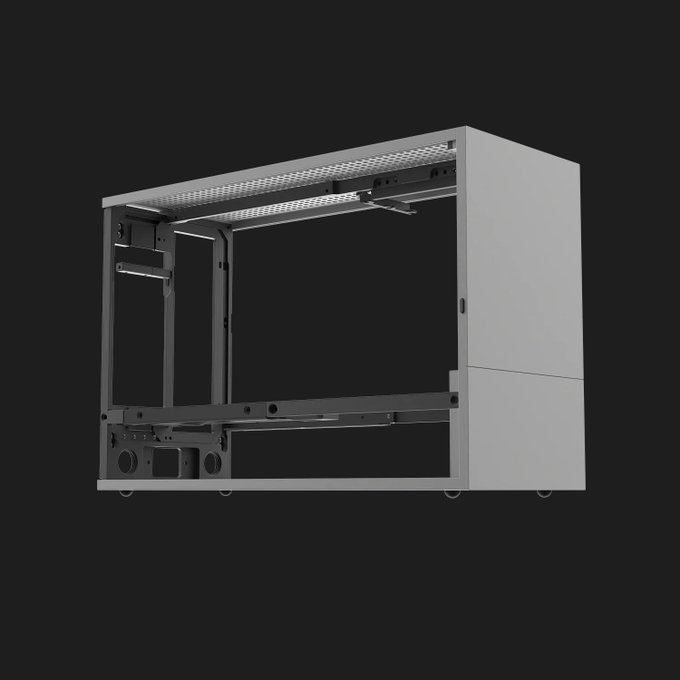
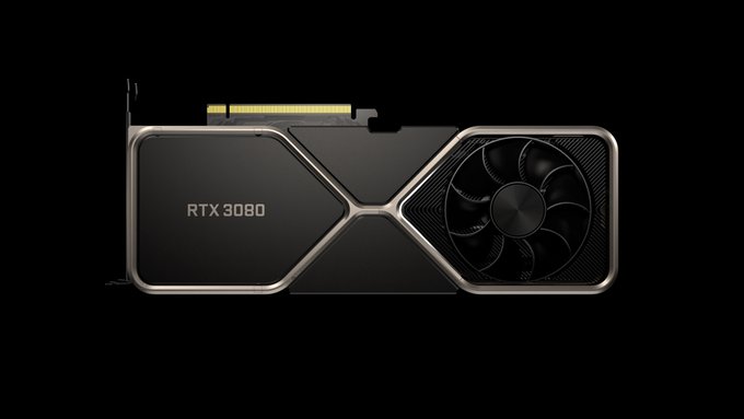
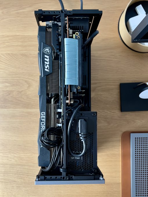
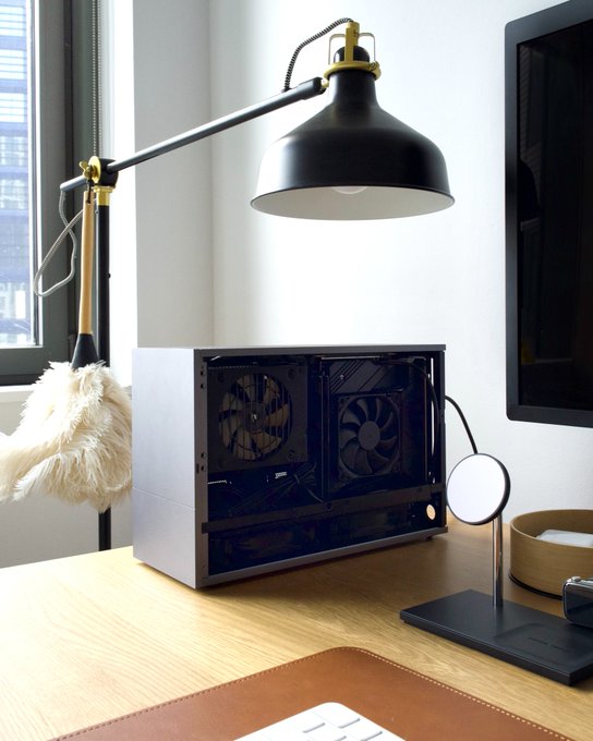
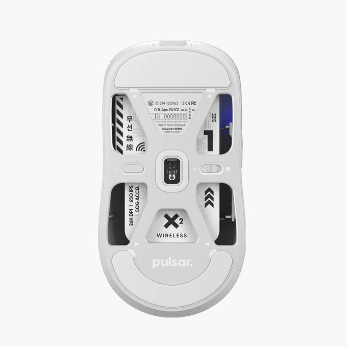
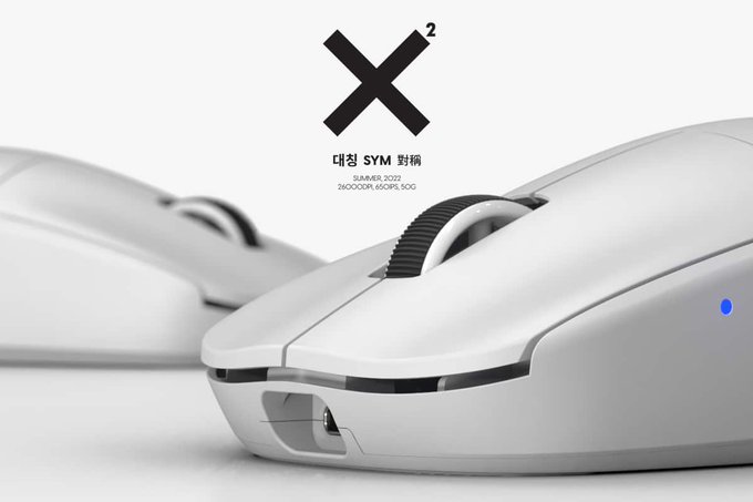
This is build that I got running:
- RTX3080 GPU
- Thunderbolt monitor compatible with daisy chaining
- Intel Alder Lake processor, DDDR5 memory and 7,000MB/s in SSD speed
All in a compact 9.95L case (feels like 2 Mac Studios in size)

5
3
81
New friends👋
If you found me recently, here's a fun(hopefully) timeline overviewing what I share here: design, code, tech culture, investing, and my work.
6
2
75
@alexcbruno
i5 12600
MSI MEG Z690I Unify
MSI RTX 3080 LHR 10GB
Noctua NH-L9i-17xx
Crucial RAM DDR5 4800MHz CL40
WD_BLACK SN850
Corsair SF750
Noctua NF-A12x25 PWM
3
6
73
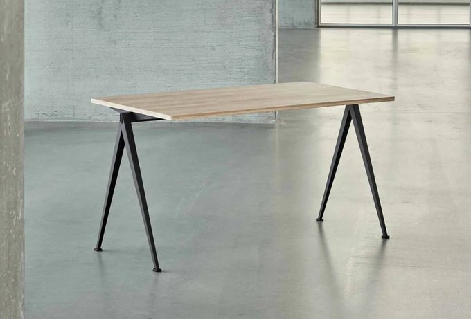
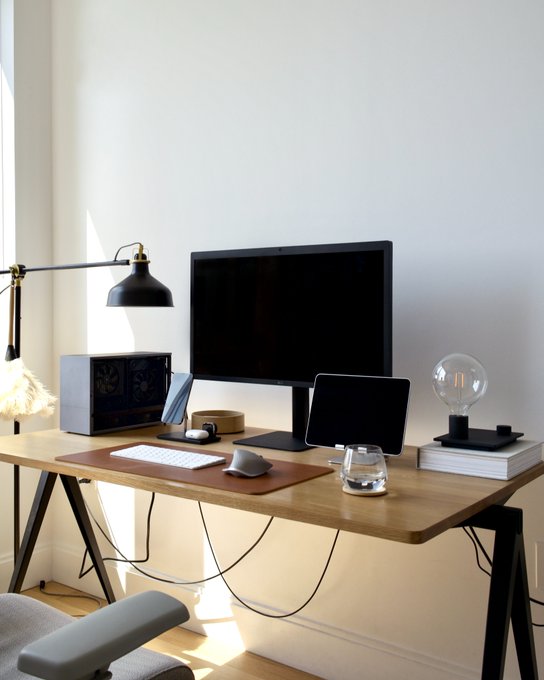
What set the tone for the entire build is the case. I discovered the Formd T1 from
@OptimumTechYT
's channel, a sub 10L aluminum ITX case. It's no unibody, but very well machined.
The "Titanium" colorway is somewhere between Apple's Silver and Space Gray on Macs.
1
2
63
As designers, we shouldn’t shy away from design trends. Instead, if we think deeply about what makes them popular and apply them in the right contexts, we can push HCI forward and make better software.
1
5
56
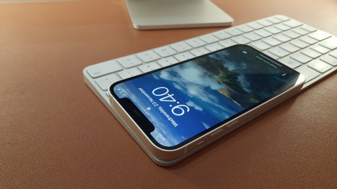
Very satisfying to turn it on without the side panel.
And yes I did mine $1 worth of Bitcoin on it.
5
3
52
2.1) In Context Controls: The most obvious example of this is Notion vs. Google Docs. Notion presents editing options around your cursor, while Google Doc has all of the toggles in the utility bar.
2
2
51
A huge aesthetic compromise was not being able to find a Founder's Edition 3080 from a trustworthy seller.
I ended up buying a third-party 3080 that is 3.25 slot (HUGE and THIC). Amazingly I was able to sacrifice some CPU cooling height for the bigger GPU.
1
1
38
Shipping Polished Interfaces: coming later this year by yours truly

I spend every day obsessing over how designers can learn and grow...
And now I get to teach alongside people I've looked up to for years 🤯
I'm beyond excited to officially launch
@joindiveclub
— where the best designers never stop learning.
Here's the vision for the future👇
39
47
368
3
0
37
Junior designers tend to blindly follow visual trends in hypothetical mockups (they are rarely shipped) like neumorphism 🤢
1
0
36
Both examples are UI design trends that fit into a broader trend in software of allowing users to “stay in context and focus on content”.
1
0
36
1.2) It also makes it easier for a new user to get started. Without hovering over unknown icons in the toolbar and reading every tooltip, a user can simply type keywords into the command bar and hit enter.
Here’s a neat one we built
@compound

I had a ton of fun building the command menu
@Compound
and thought I'd share some technical details about it 🧵
17
45
798
1
3
34
1.1) Command Bar: Power users love keyboard shortcuts, but they’re hard to remember if you don’t use the same app all day. A command bar satisfies users with fast keyboard actions without needing the upfront dedication to memorize combos.
2
1
28
half of junior designer resumes:
✨Google UX Design Professional Certificate
3
0
28
I also spent time researching motherboard compatibilities with Thunderbolt-only, Mac-specific displays. It has to work with the LG 5K that I have today and hopefully the Pro Display II when it comes out (120hz🙏)
2
0
23
Landed on an MSI Z690I motherboard - it still needs an extra cable between 2 DisplayPorts on its panel, but it connects to my LG 5K with just one Thunderbolt cable after some BIOS tweaking.
Audio, Camera, and Thunderbolt daisy chaining are all fully working ⚡️
2
0
22
A trend often comes from one successful experiment with a shipped product, causing other designers to follow suit, making it a trend. So most of the time, design trends are the latest HCI (Human-Computer Interaction) best practices proven by hundreds of products.
1
1
21
As an added bonus: Once these design trends become widespread enough, you can use them and avoid having to educate users because other software apps have already done the work for you.
1
2
22

3.4 Content is managed in Notion, pulled in from
@NotionAPI
, and pre-rendered at deployment. When new discoveries are added on the go,
@vercel
automatically regenerates the content without manual redeployment.
2
1
21
In contrast, experienced designers scoff at “design trends”, thinking the notion of following a trend undermines the scientific aspects of UX.
1
1
20
For example, two of the hottest “design trends” that have popped up recently are 1) the Command Bar and 2) In Context Controls
1
1
19
@joshpuckett
@Zoom
seems to me, like Uber did in 2017ish, Zoom decided they can never *own* the video camera icon as an logo, however the name Zoom (like Uber) is their biggest brand asset, so they made the wordmark the only version of their logo.
1
0
17
(Once you learn how to use a command bar in one app, you understand intuitively how to use them in different apps and become more efficient!) The end result: your users get a better experience without needing to learn anything new.
1
1
17

@pitdesi
i worked in fashion. so the material and labor luxury brands use are very often proportionally more expensive. left over fabric of louis vuitton used to cost me €50-120 euro per yard. italian and french seamstresses make €50+/hr, and *real* luxury brands use them.
2
0
16
@primalanomaly
I think most the "real" aesthetic trends in UI that I've been seeing have also been driven by real usability needs.
Rounder buttons: help with visual separation
White spaces: help you focus
Background blur on sticky elements: hint on content and add breathing space in height
1
0
16
3.2.1 I designed a productivity-app-like sidebar navigation to encourage exploration, in the belief that clicking on a tab requires lower phycological commitment than clicking on a link (not anticipating a full page load).
I then added hotkeys to make page jumping even easier.
2
0
14
Google Cloud Console: cobbled-together mess of 152 buttons, tabs and drop-downs with “delightful” clicking ripples
Prime example of a design system encouraging laziness → resulting in bad design
3
0
15

Friends in
@ycombinator
just launched a "Superhuman for calendar". Launching meetings with keyboard shortcuts will save me so much clicking...

2
1
15
When I was making a 3D point cloud generator with openFrameworks and a depth camera, I captured me waving a hand to use as a greeting on my portfolio site.
See it live at
0
2
12
That is it for 2022 release!
I'm super excited by this new scalable format: will be adding more resources in the coming weeks and months.
Finally, I kept past iterations online at and .
0
0
12
Yesterday, I was interviewing a designer for
@kp_fellows
and they asked how I stay on top of design trends. I responded initially, “I don’t,” but then clarified. I think the term “design trend” is often misunderstood.
1
0
12
@jose_goncalves_
It's surprisingly cool for how small my cpu cooler is.
See how the sandwich case here runs cooler than the exposed one:

0
1
11
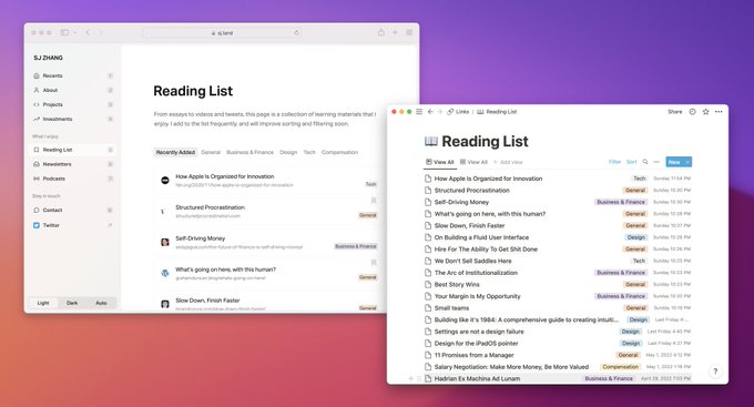
1.1 I am a designer by trade. Like many others, my site had always been a portfolio of projects.
As I now spend more time reading and investing, also inspired by
@brian_lovin
and
@stammy
, I decided that this new site should shed light on some of my other interests.
2
0
11
2.1 In this release, I want to highlight a few new sections:
: A collection of links that I enjoy. If you are not simultaneously deep in design, tech, finance, and VC twitter, you may discover something new and hopefully valuable.
1
0
11
we'll also stop using periods or capitalizing first letter of sentences in official communications

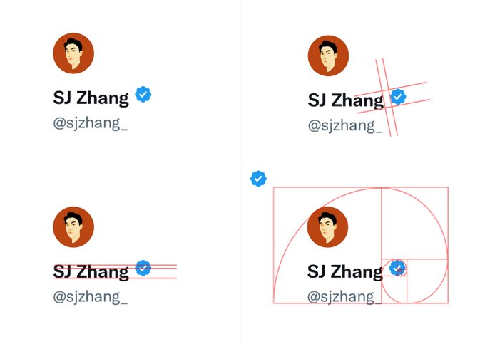
we’ll begin replacing that “official” label with a gold checkmark for businesses, and later in the week a grey checkmark for government and multilateral accounts
247
608
4K
0
0
11
Great read (visual) on context menus. Safe triangle is particularly interesting. Hope some library provide this out of the box soon.
0
0
10
@Ridderingand
@Stammy
@Cron
@copilotmoney
@linear
@raycastapp
@columnbank
think you missed a tag
@Compound
:)
3
0
10
3.3 The contact form is in a modal that can be called anywhere.
While consuming content, a visitor may want to send a quick note. A traditional contact page will take them out of context and make it harder to get back into consuming content. Modals are powered by
@radix_ui
❤️
1
0
10
Every HCI student watched Bret Victor's “Inventing on Principle”
@Callmevlad
did too and built a $4B company
More importantly,
@webflow
proved how a well built tool can inspire creativity. It even raised the bar of how websites should look, feel and function today
0
0
9
Algorithmically generating colors and shadows in UI is such dangerous territory.
Material You led to the gmail debacle, even apple can't get it right.
1
0
9
the whole reason to hire intelligent people is that you can trust their intuition

Have interviewed so many PMs and Designers recently who undervalue intuition and make a point out of being heavily data driven or mostly looking for quantifiable metrics.
Product development is both a science AND an art. Trusting your gut is an under appreciated skill.
43
62
864
0
0
8
0
1
9
Let’s back up a bit and demystify how design trends are actually formed.
1
0
9
@zhayitong
This.
Only when we spend more time outside "product design" as we understand today, can more designers see business opportunities and moats.
Right now, design founders are mostly still doing design or productivity tools. We need to expand beyond that.

Instead, maybe what we need is for more cases of design-driven business moats.
And because strict UX moats don't exist, we'll need a class of designers who are able to reason about subjects far outside of what we currently understand to be "product design" – designers who...
3
3
36
0
0
8
idk what phone he has but the radius isn’t all consistent even in most of the recent apple products, and they shouldn’t be.
Product sizes are different. Radius should find a balance between respecting the size of the individual product and the size of human hands.

Look at the consistency of corner radius across different apple products - that's the level of design tokenisation I dream of in design systems🔥
201
2K
17K
2
0
8