
UI “design trends” get a bad rep for being gimmicky or sacrificing good UX, but many recent trends are actually pushing HCI forward and may be worth embracing to benefit end users.
A thread to demystify design trends 🧵
17
102
673
Replies
Yesterday, I was interviewing a designer for
@kp_fellows
and they asked how I stay on top of design trends. I responded initially, “I don’t,” but then clarified. I think the term “design trend” is often misunderstood.
1
0
12
Junior designers tend to blindly follow visual trends in hypothetical mockups (they are rarely shipped) like neumorphism 🤢
1
0
35
In contrast, experienced designers scoff at “design trends”, thinking the notion of following a trend undermines the scientific aspects of UX.
1
1
20
Let’s back up a bit and demystify how design trends are actually formed.
1
0
9
A trend often comes from one successful experiment with a shipped product, causing other designers to follow suit, making it a trend. So most of the time, design trends are the latest HCI (Human-Computer Interaction) best practices proven by hundreds of products.
1
1
22
For example, two of the hottest “design trends” that have popped up recently are 1) the Command Bar and 2) In Context Controls
1
1
19
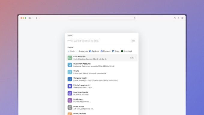
1.1) Command Bar: Power users love keyboard shortcuts, but they’re hard to remember if you don’t use the same app all day. A command bar satisfies users with fast keyboard actions without needing the upfront dedication to memorize combos.
2
1
28
1.2) It also makes it easier for a new user to get started. Without hovering over unknown icons in the toolbar and reading every tooltip, a user can simply type keywords into the command bar and hit enter.
Here’s a neat one we built
@compound

I had a ton of fun building the command menu
@Compound
and thought I'd share some technical details about it 🧵
17
45
799
1
3
34
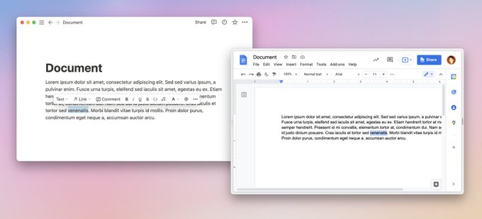
2.1) In Context Controls: The most obvious example of this is Notion vs. Google Docs. Notion presents editing options around your cursor, while Google Doc has all of the toggles in the utility bar.
2
2
51
2.2) More applications are trending towards revealing relevant controls only WHEN you try to interact. (You want to delete a table row, hover your mouse over it, and a trash can appears.) The step-by-step reveal process reduces the initial cognitive load for users.
2
3
86
Both examples are UI design trends that fit into a broader trend in software of allowing users to “stay in context and focus on content”.
1
0
36
As an added bonus: Once these design trends become widespread enough, you can use them and avoid having to educate users because other software apps have already done the work for you.
1
2
22
(Once you learn how to use a command bar in one app, you understand intuitively how to use them in different apps and become more efficient!) The end result: your users get a better experience without needing to learn anything new.
1
1
17
As designers, we shouldn’t shy away from design trends. Instead, if we think deeply about what makes them popular and apply them in the right contexts, we can push HCI forward and make better software.
1
5
56


@sjzhang_
There does feel like a difference here between aesthetic trends and functionality trends. Improved functionality is always good! Aesthetic changes may be completely arbitrary or even detrimental.
1
0
10
@primalanomaly
I think most the "real" aesthetic trends in UI that I've been seeing have also been driven by real usability needs.
Rounder buttons: help with visual separation
White spaces: help you focus
Background blur on sticky elements: hint on content and add breathing space in height
1
0
16
