
Elizabeth Goodspeed
@domesticetch
Followers
22,600
Following
1,561
Media
2,468
Statuses
14,510
Independent designer, writer & casual archivist—US editor-at-large for @itsnicethat (she/her)
Providence & NYC
Joined January 2011
Don't wanna be here?
Send us removal request.
Explore trending content on Musk Viewer
Rio Grande do Sul
• 181351 Tweets
Madonna
• 125006 Tweets
NO RDM COM CAIO E LUAN
• 107515 Tweets
Tottenham
• 76497 Tweets
Bardella
• 70169 Tweets
Spurs
• 69184 Tweets
Leverkusen
• 57740 Tweets
Palmer
• 54819 Tweets
#CHETOT
• 53101 Tweets
Hayer
• 36328 Tweets
Boris Johnson
• 29005 Tweets
Ange
• 27421 Tweets
Aston Villa
• 27034 Tweets
bruno mars
• 26551 Tweets
Ole Miss
• 23292 Tweets
Cucurella
• 17179 Tweets
$AAPL
• 16514 Tweets
Kaizer Chiefs
• 16003 Tweets
Chalobah
• 15753 Tweets
憲法記念日
• 15612 Tweets
#SVGala9
• 15027 Tweets
Miri
• 14779 Tweets
Mudryk
• 14713 Tweets
Xabi Alonso
• 12893 Tweets
Caicedo
• 12777 Tweets
Last Seen Profiles


Pinned Tweet

I'm so excited about this role and the chance to carve out a new space to discuss visual trends and all the weird realities of being a designer today!
As a vehement generalist, I'll of course still be maintaining my freelance design practice the other half of my time as well 😈

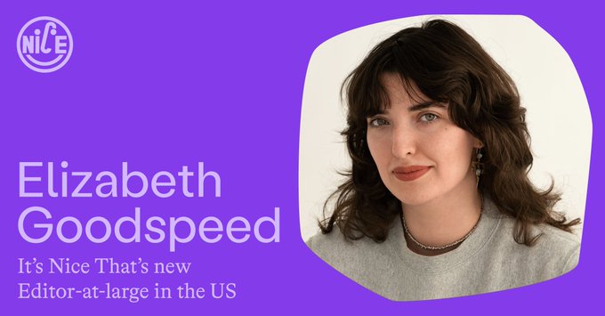
We are beyond excited to announce that the writer, designer and art director Elizabeth Goodspeed (
@domesticetch
) has joined It’s Nice That as our first Editor-at-large in the US!
27
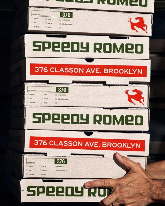
11
376
73
13
919
Someone asked to share my table at a coffee shop and then asked me to leave the table because they have a meeting??? Am I in an episode of Seinfeld??
959
5K
155K
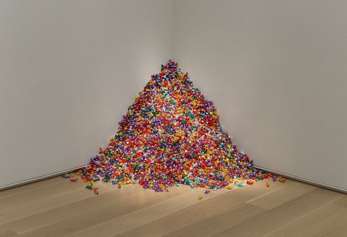
I cannot believe no one told me that KITH ripped off Félix González-Torres's piece about his partner dying of AIDS for a drop celebrating ****the 60th anniversary of the X-Men franchise****
121
2K
38K
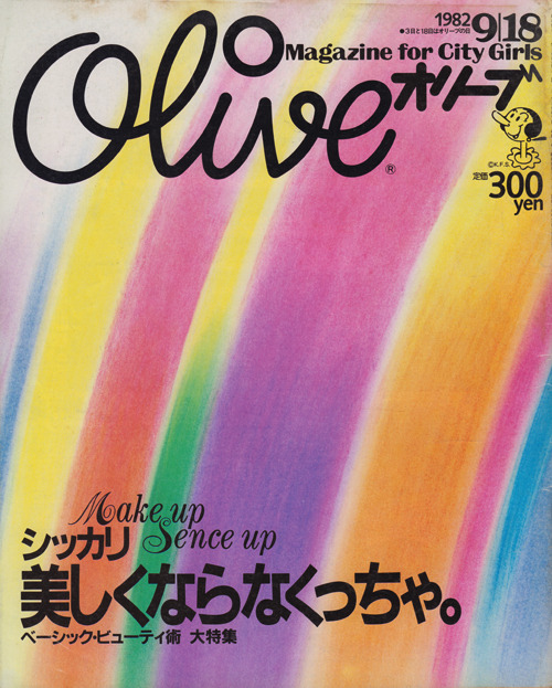
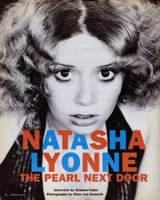
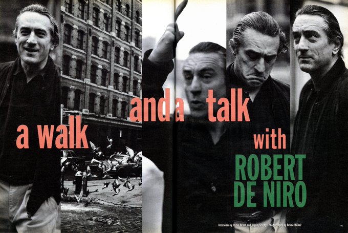
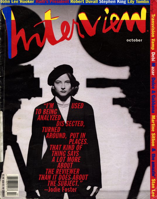
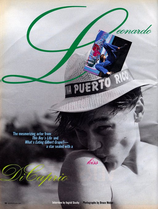
Having a bit of a love affair with ’90s Interview Magazine editorial design
38
2K
19K
@jakedugard
No I took the Jerry route (letting him have it but complaining to everyone about it)
41
165
18K
Now accepting name suggestions for this music video typography trend


154
3K
15K
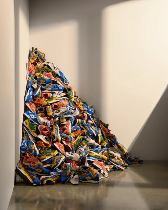
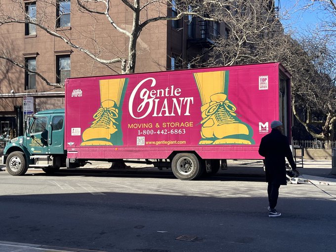
Not to mention the other major cultural implications of a pile of shoes like this... please say sike!!!!

13
136
9K
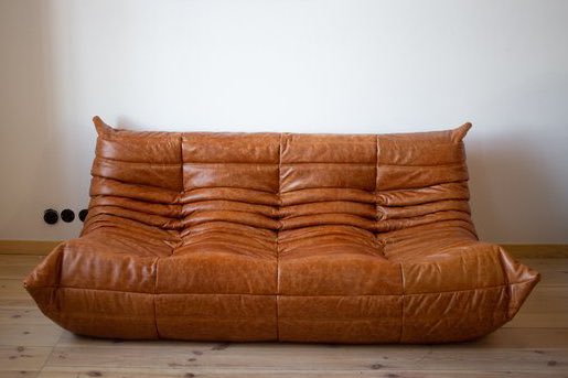
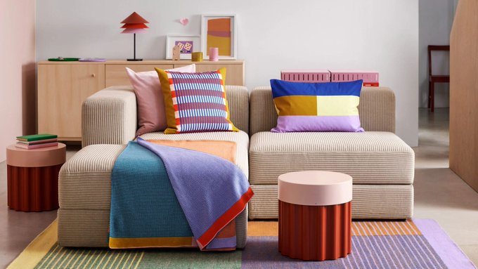
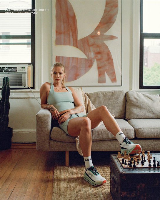
time for me to speak my truth: I think these couches are hideous
276
132
7K
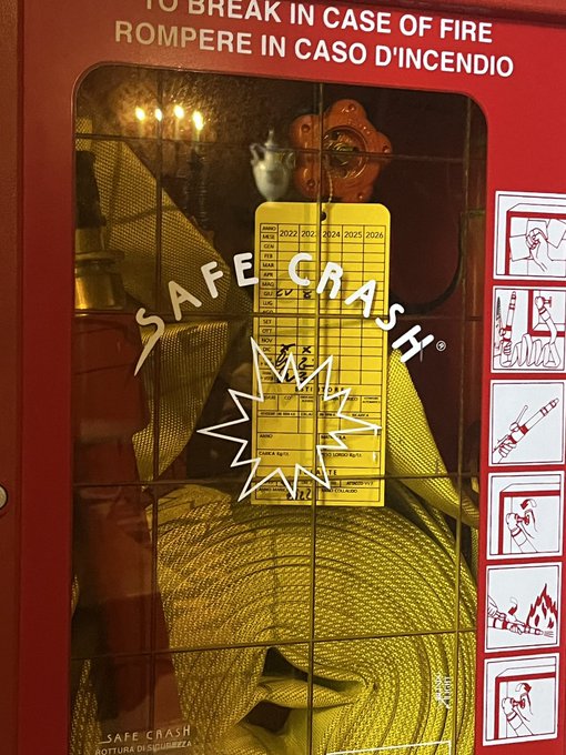
Does anyone here know why the typography on Italian fire emergency glass is so damn good? How did this happen?

22
451
7K
We've officially moved on from retro-style mascots to "weird little guys"

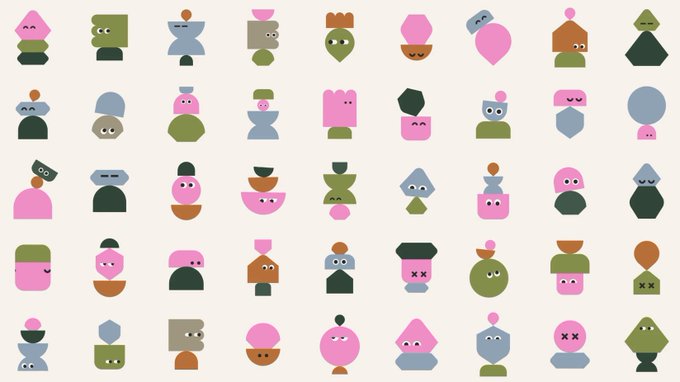
52
616
6K
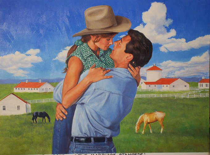
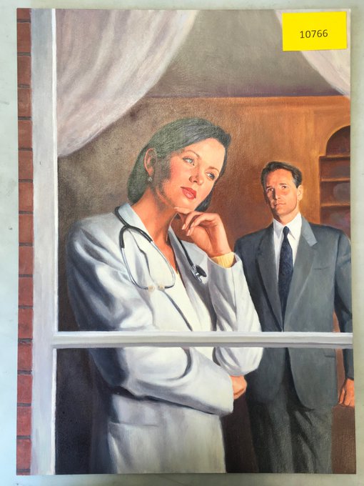
Oh my god, I just found a gallery in Canada that sells original paintings used for the covers of 1980s and 90s romance novels for only $120—the way I NEED one
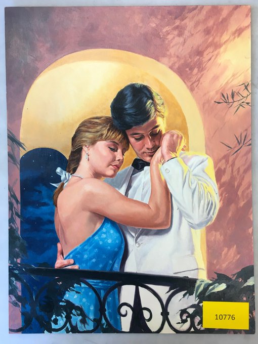
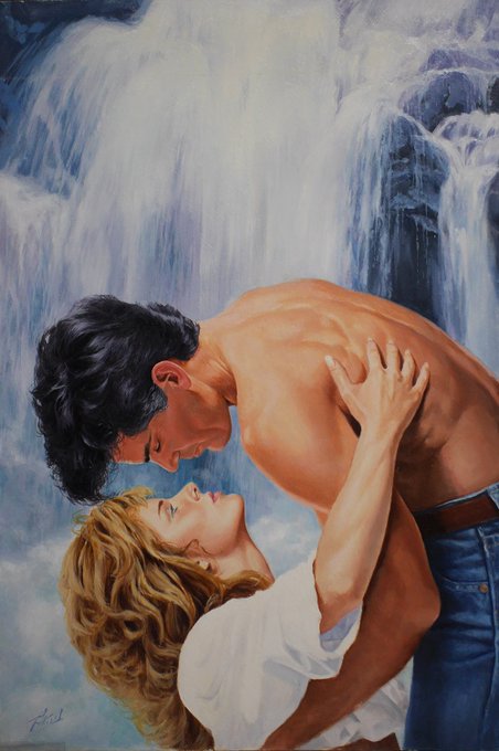
94
599
6K
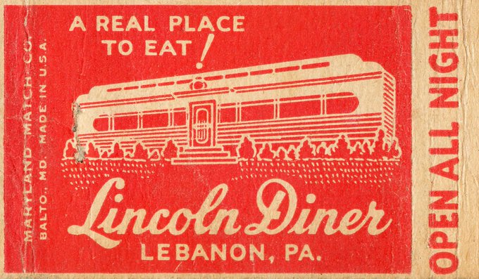
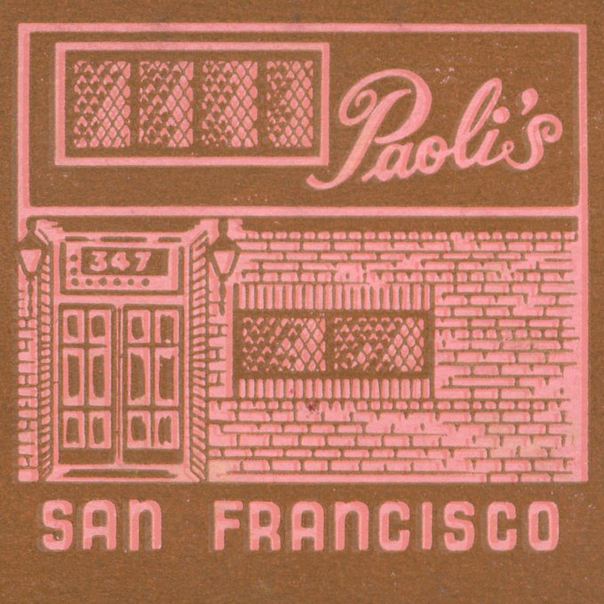
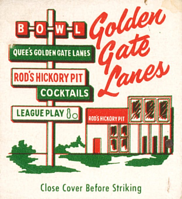
I think we should bring back matchbooks that show teeny tiny drawings of the place they're from

20
655
5K
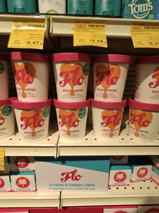
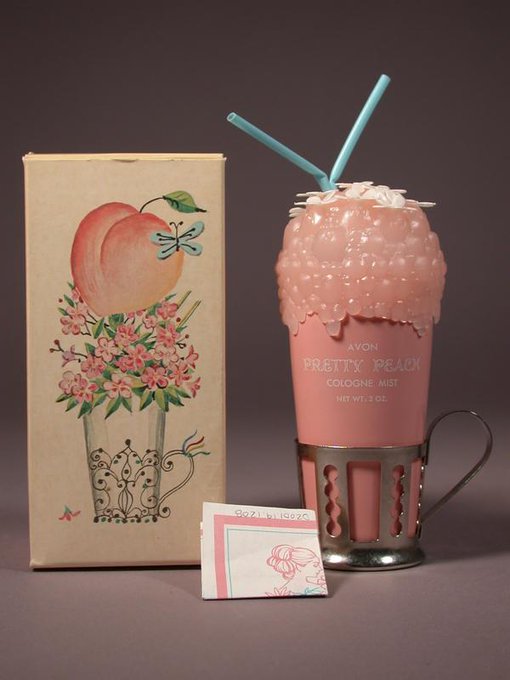
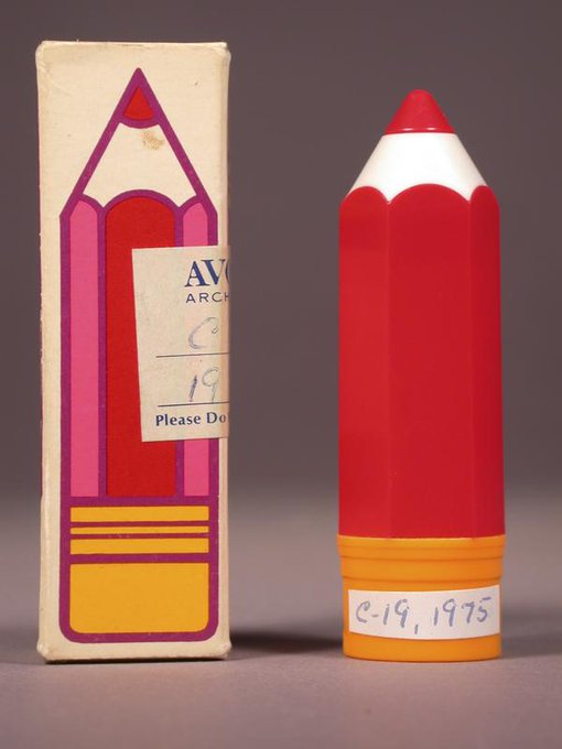
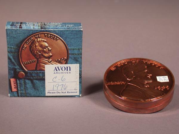
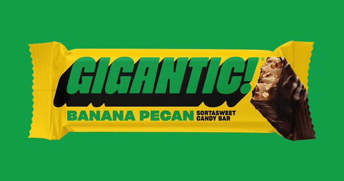
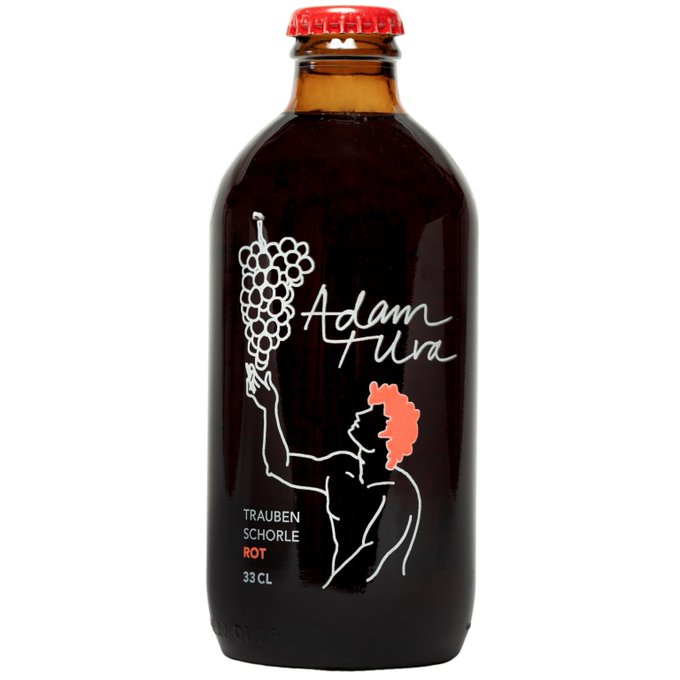
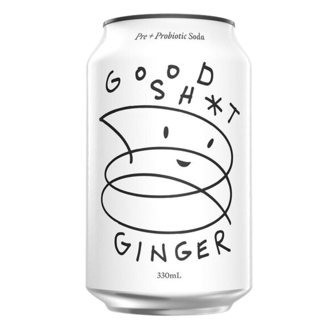
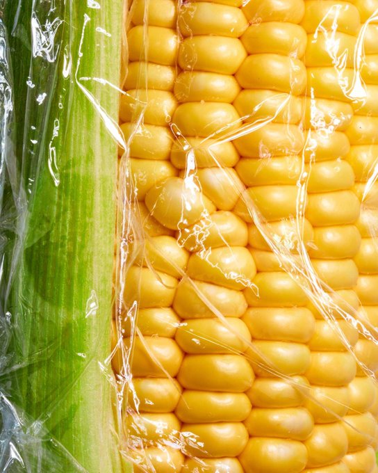
I'm obsessed with Michael's theory of chaos packaging! Maybe it also explains why everything is in a jug now?
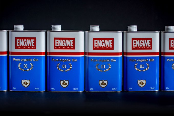
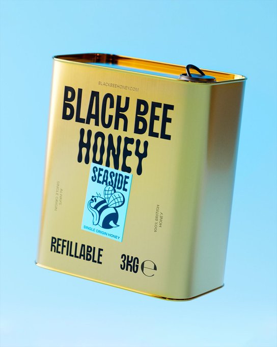
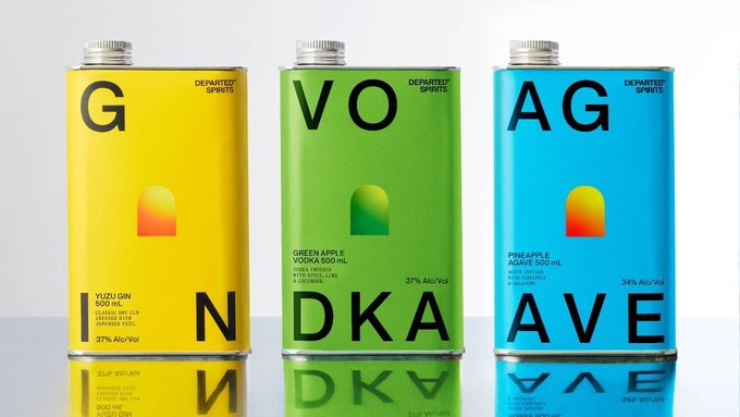

I’m calling this trend “Chaos Packaging” until someone comes up with something better.
52
336
5K
18
368
5K
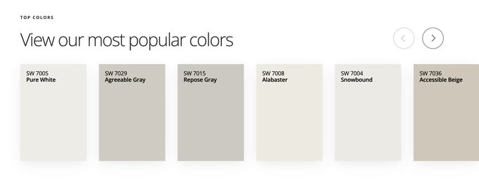
Looking at paint colors for our house and this module on the Benjamin Moore website sent me into an immediate state of depression
125
234
5K
@MarlowNYC
How do celebs keep messing this up so badly? Stop making this about yourself and donate $1 million each to a local organization helping Black people!!!!!
115
196
4K

reject modernity, embrace tradition
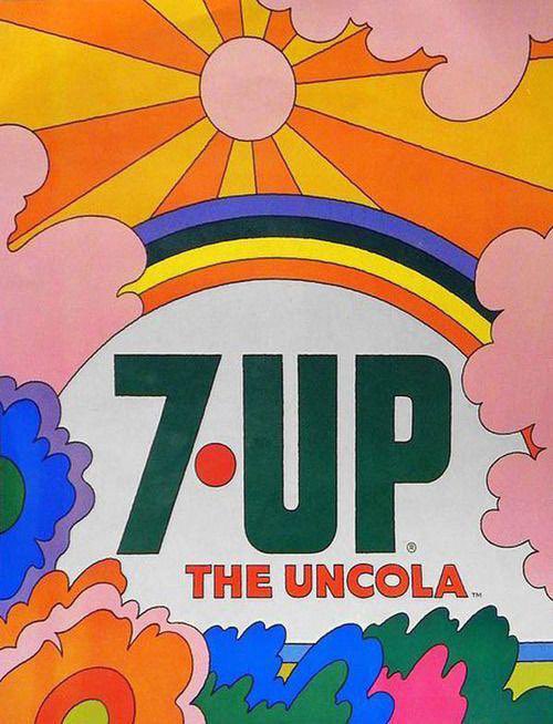
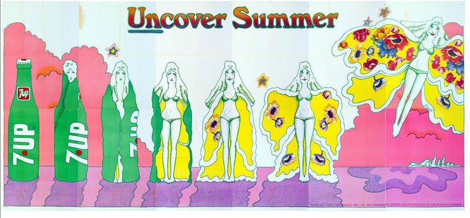
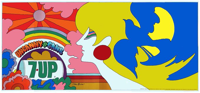

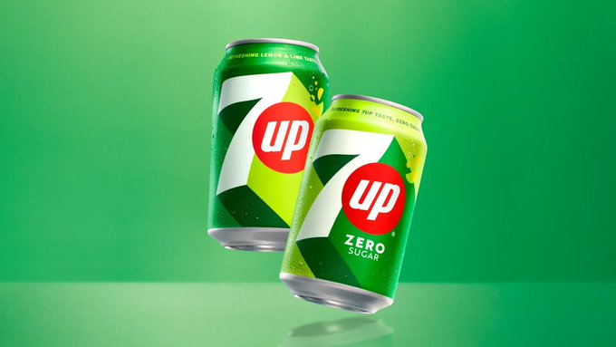
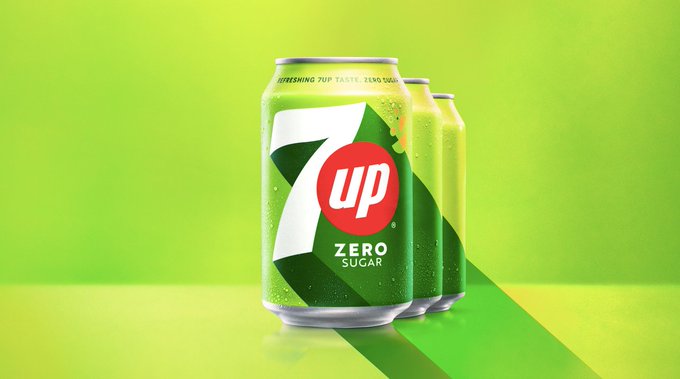
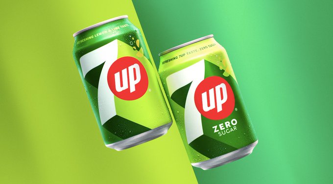
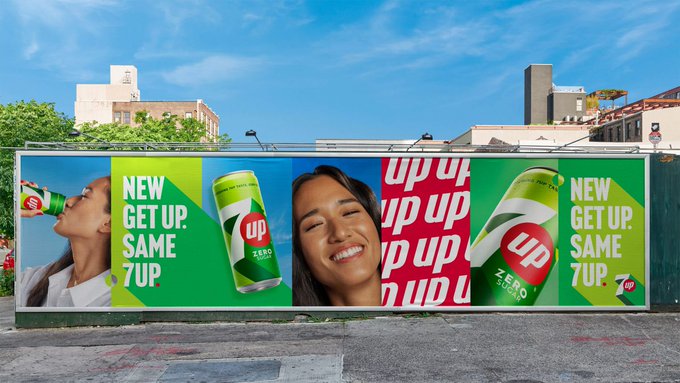
Today, PepsiCo unveiled the international refresh of the lemon-lime soda power brand 7UP. What do you think? ?
72
152
2K
23
249
4K
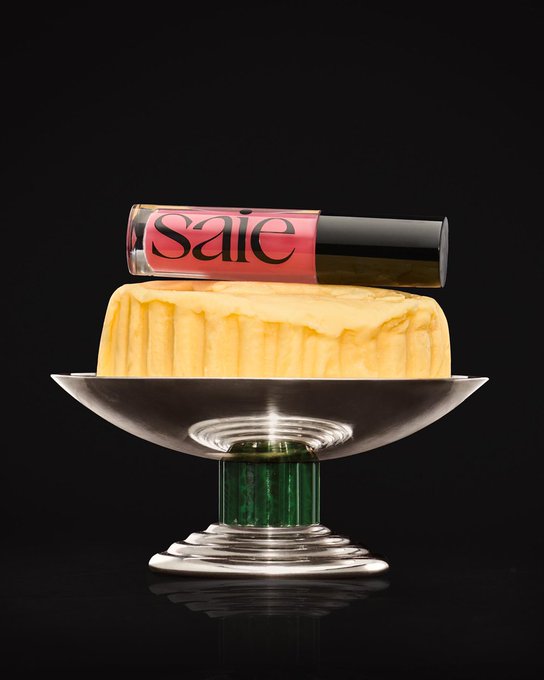
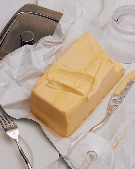
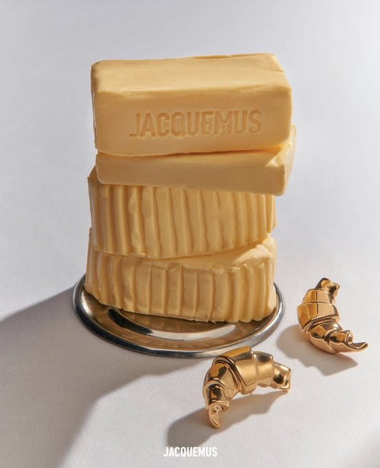
Hottest prop in editorial styling right now? Butter.

25
255
3K

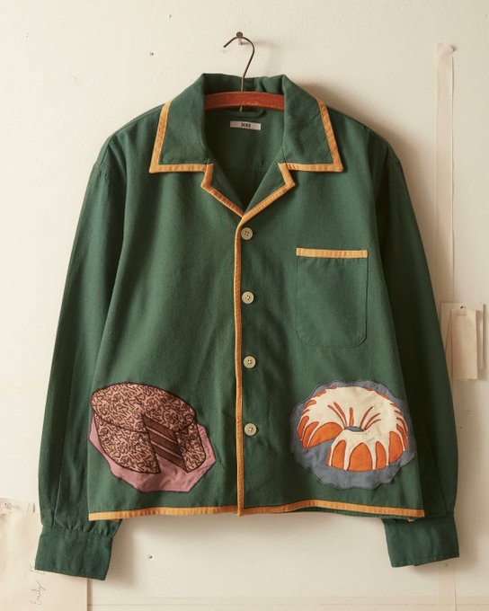
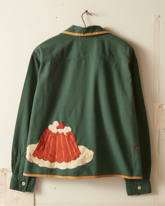
Only Bode could have me considering spending $600 on a shirt "inspired by an oven mitt from the 1940s"
19
86
3K
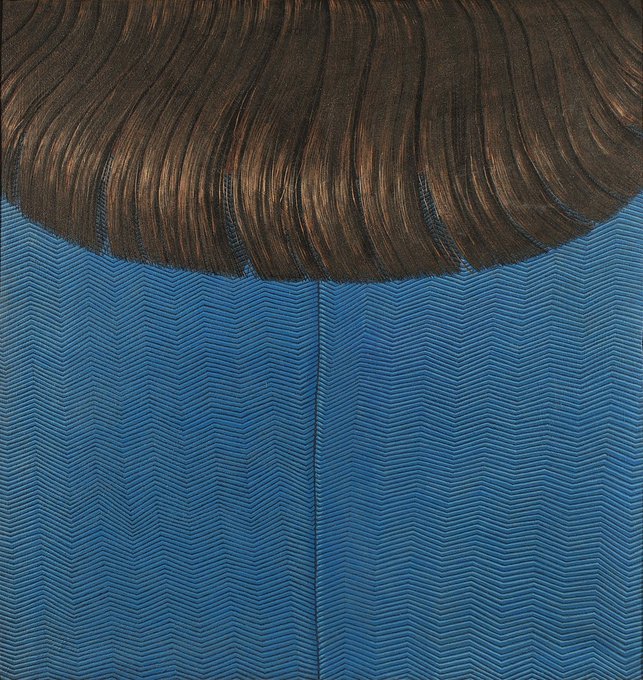
incredible paintings of clothing details by midcentury Italian artist Domenico Gnoli 🎀


5
397
3K
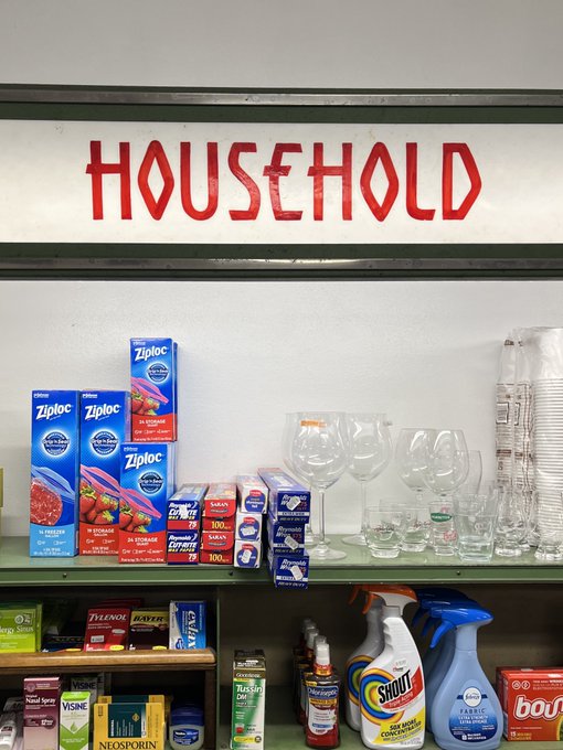
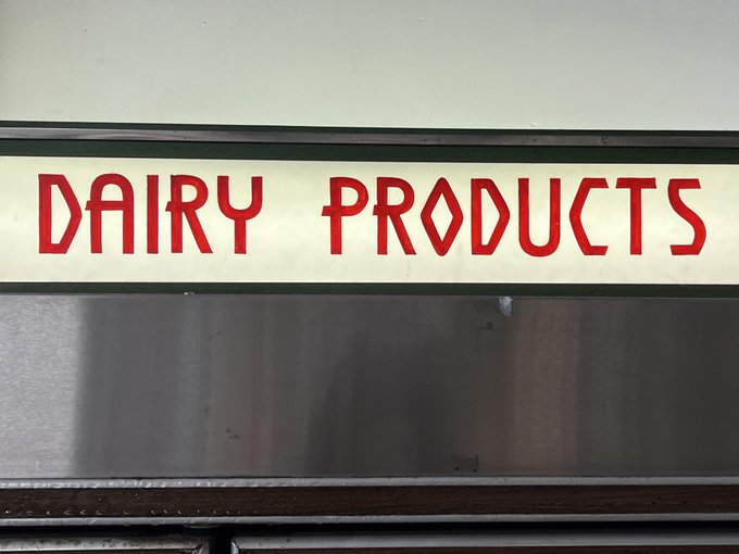
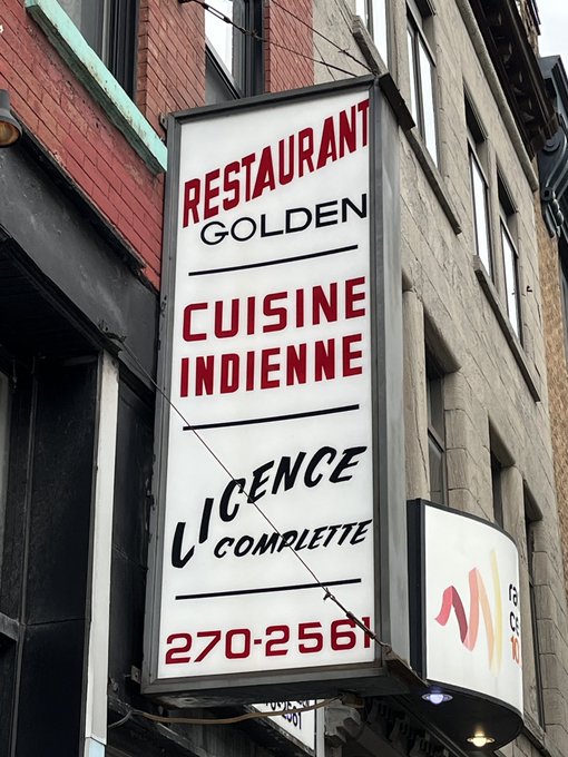
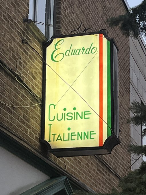
Truly obsessed with the hand lettered signage at this old provisions store in Great Barrington


14
168
3K
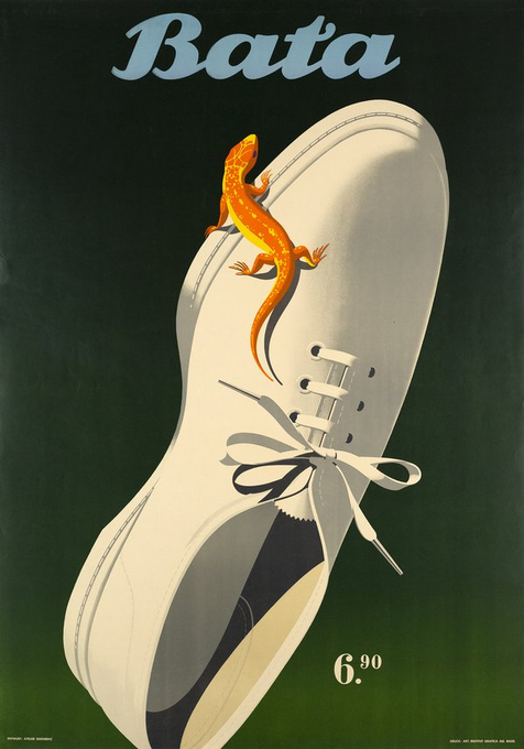
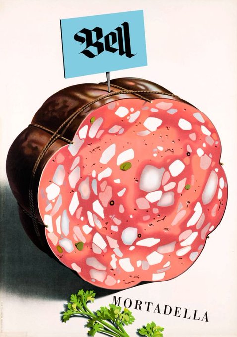
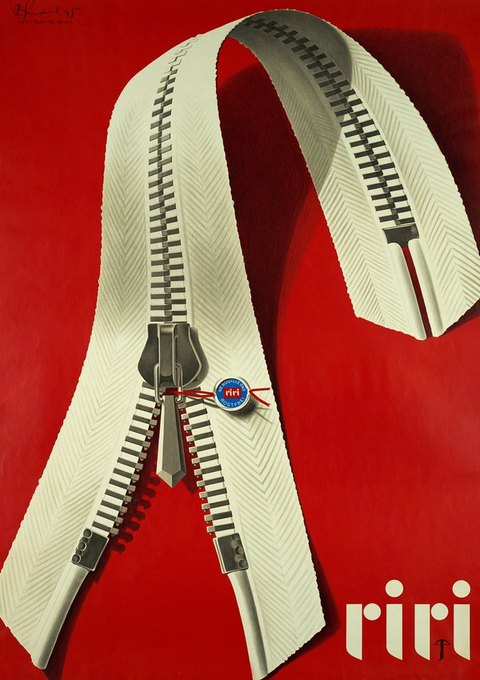
I think contemporary brands should start making illustrated object posters again.
36
241
3K
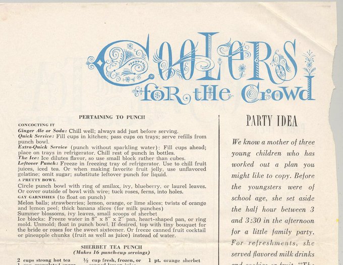
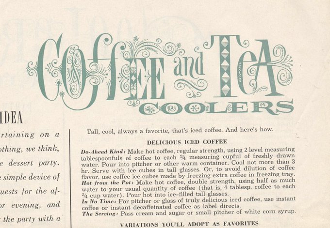
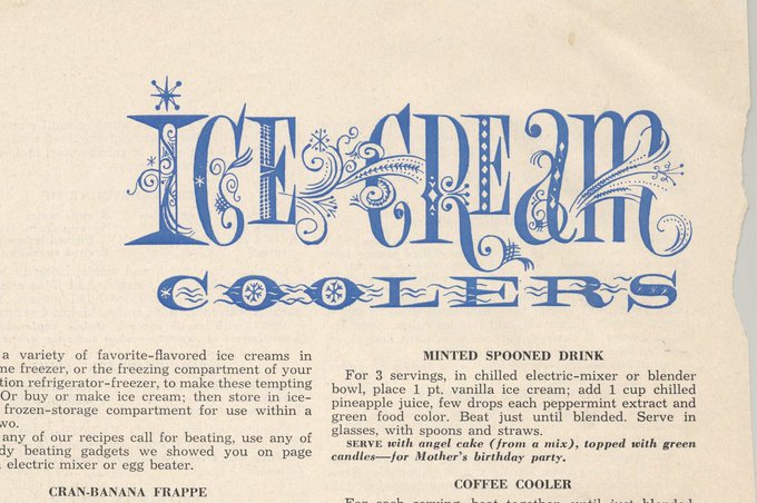
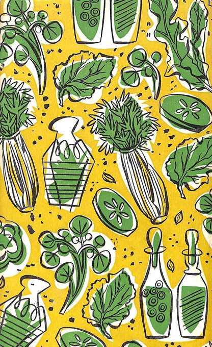
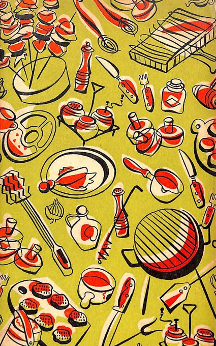
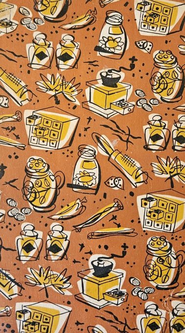
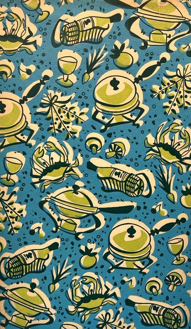
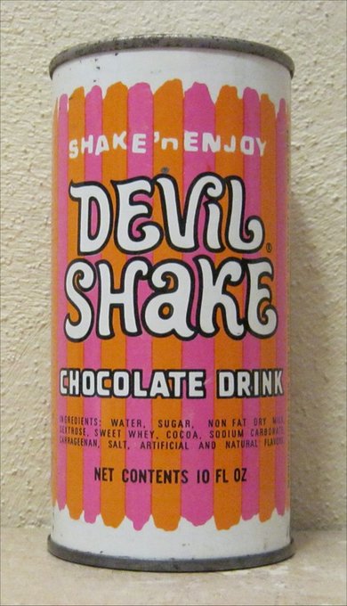
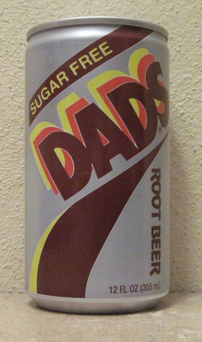
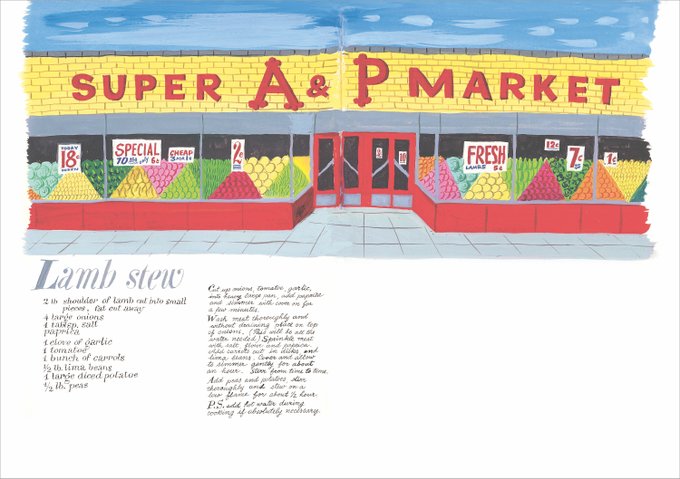
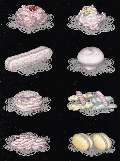
Extremely into the ornamental headlines in this 1958 Good Housekeeping recipe pamphlet on cold drinks

14
294
2K
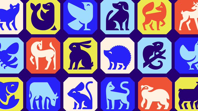
I guess we've come full circle from the "chunky outline" era of icon design
6
105
2K
IKEA does HAY


12
84
2K
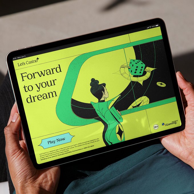
My hot (?) take is that I think designers should feel bad about themselves for using contemporary aesthetics to make gambling look cool.

Sons & Daughters ID show us how to brand contemporary gambling in their identity for Let’s Casino →
7
1
107
48
107
2K
graphic designers be like

16
213
2K
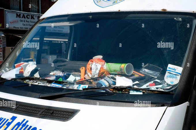
Loewe going for the rare "contractor van dashboard-core"

6
127
2K
Ok, I saw Barbie, and I have lots of thoughts, but mostly I'm shocked I haven't seen anyone else on the timeline discussing the extended Chevy ad placement halfway through the movie??
54
57
2K
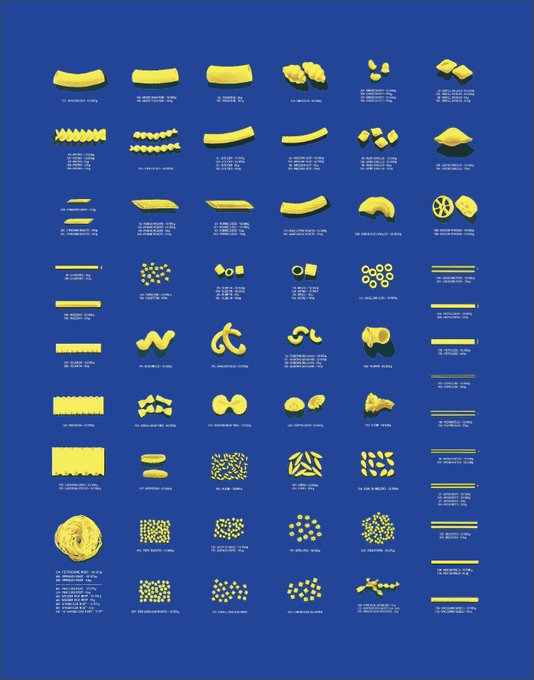
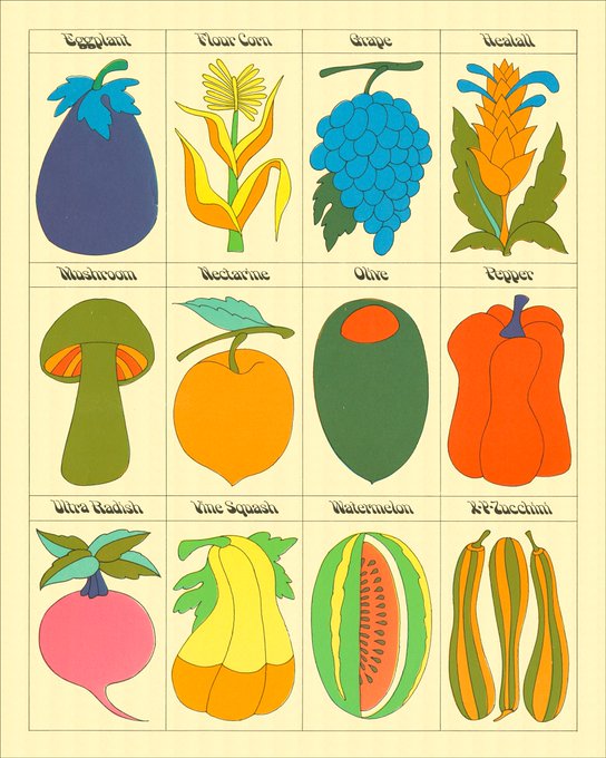
A few months ago I picked up a $5 pamphlet with some pasta recipes because it had an amazing index in the back of classic pasta shapes—finally took the time to scan and remap all the illustrations into a poster for our new kitchen!
24
94
2K
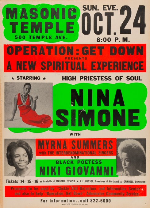
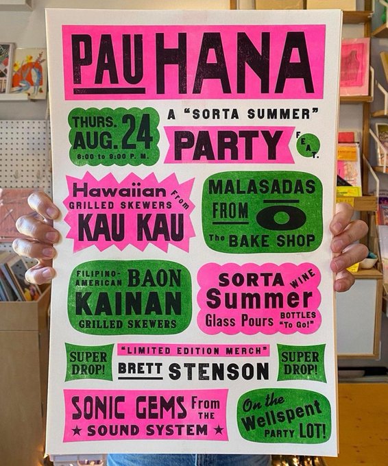
Nina Simone Concert Poster, 1971 / Sorta Summer Party Poster by Brett Stenson, 2023
10
165
2K
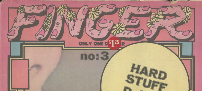
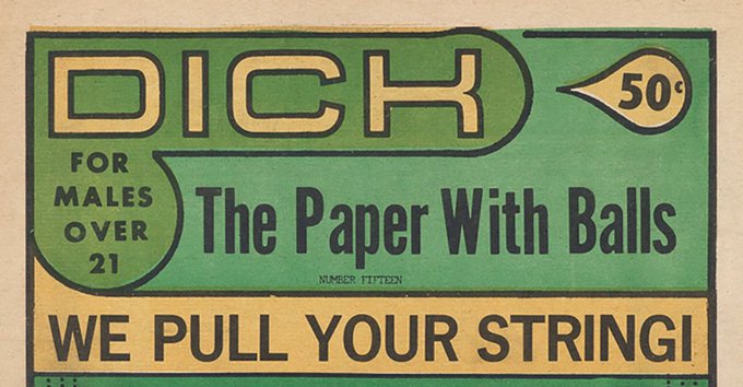
I try to keep my feed relatively PG-13 but I also need everyone to know that old porn magazines have the best mastheads
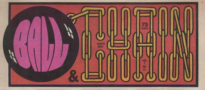

21
206
2K
I doubt this was intentional, but I don’t think that makes it any better—still a massive oversight that no one thought of / knew either visually similar reference, both of which have important context and intense emotional meaning. Inept moodboarding or media illiteracy at best!
3
13
2K
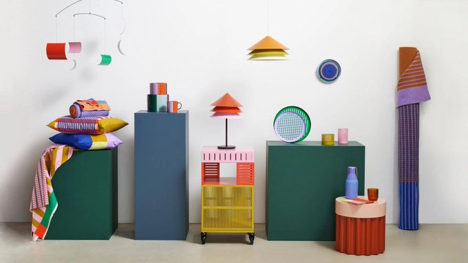
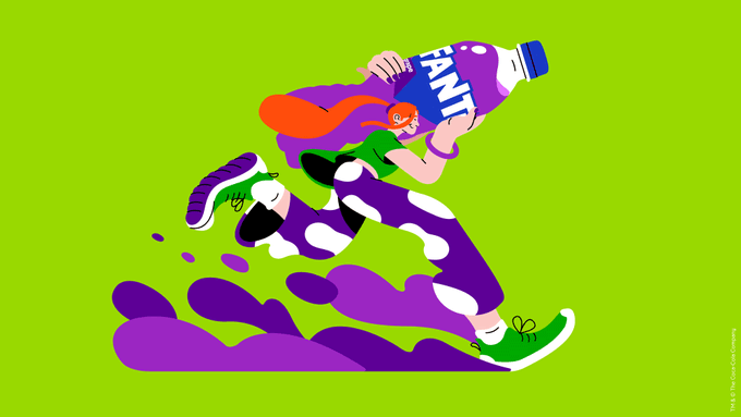
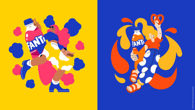
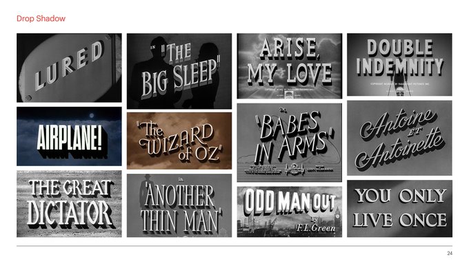
At the risk of being insufferable with too many ongoing trend spots: I was looking at this rebrand again today and a lightbulb went off in my head that it actually includes a whole other resurgent design trope I hadn't noticed until now: ridiculously giant drop-shadows!!!!
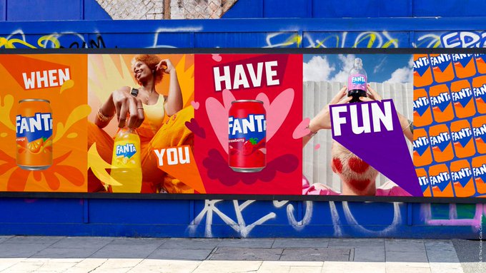
Fanta rebrand leaning heavily into this illo style + a bunch of other zeitgeisty trends like wide angle perspective / imagery shot from below and macro photography 👀

6
10
183
17
100
2K
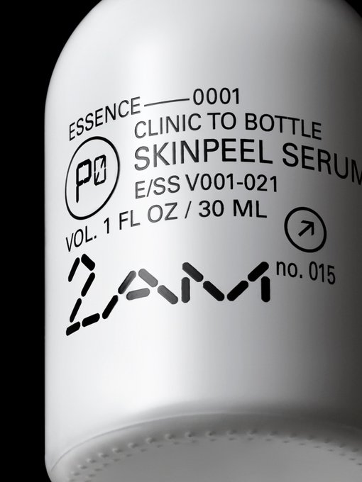
2am Skincare Bottle / Land Rover Front Passenger Side Window Glass

13
75
1K
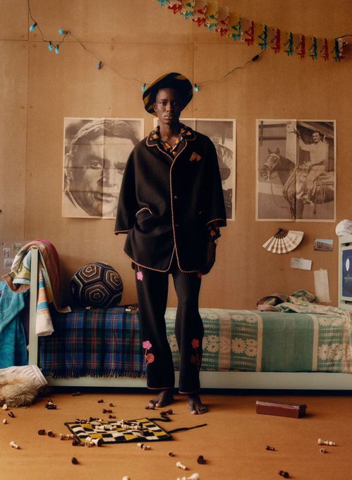
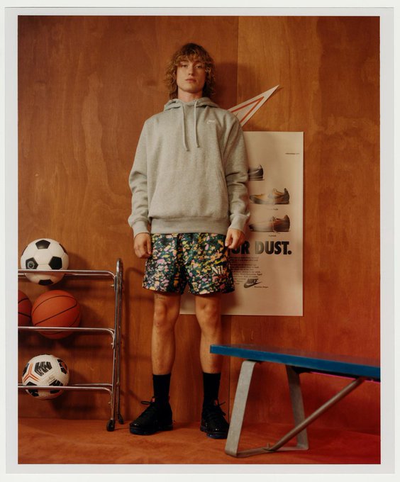
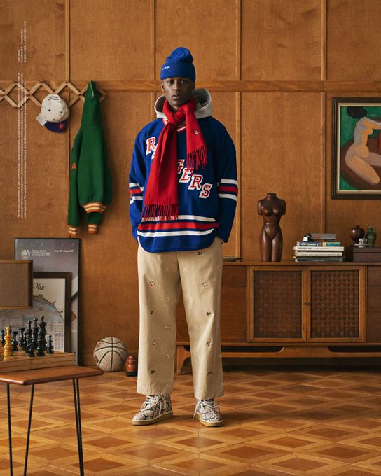
calling this AD style "grandpa's lake house" from now on (Bode, Nike, ALD, J Crew)
24
70
1K
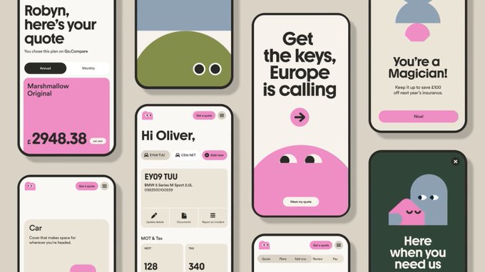
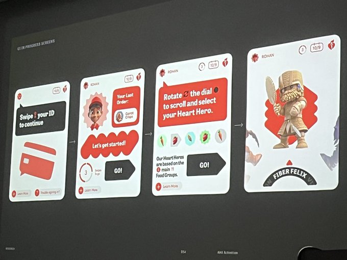
IMO a trend that's sort of related to this whole "apple keynote format as studio case study" is the rise of identity systems that actually bring traditional UX/UI elements (like pill shaped buttons) INTO branding so that product design + brand design feel more apples to apples


14
86
1K
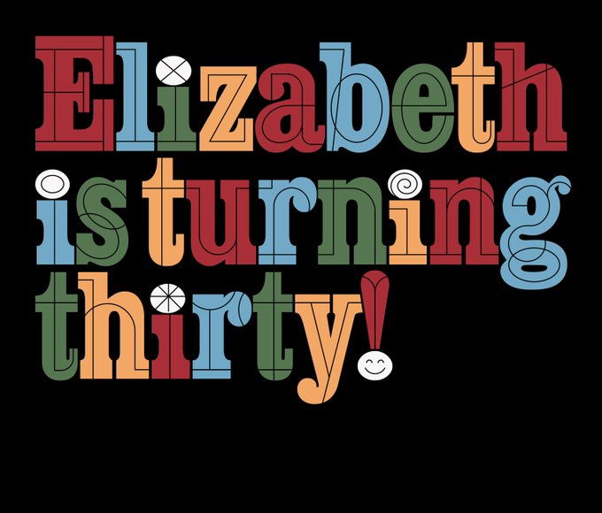
I so rarely get to make things with no concept "just because"—this little type lockup for my upcoming birthday this month was a nice exception <3
23
16
1K
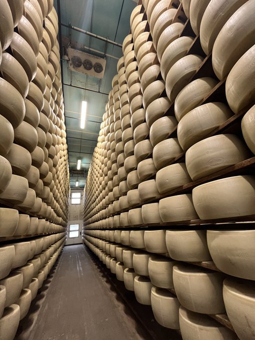
Another entry in my cheese tourism book: I visited the limestone caves in Missouri where they used to store government cheese!
18
62
1K
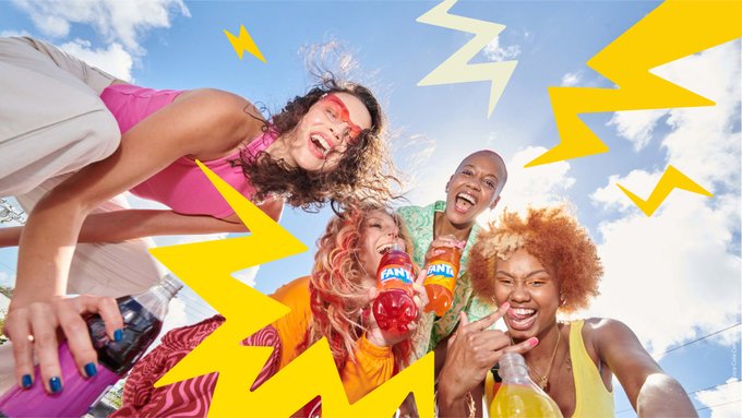
Really intrigued by the way that macro photography has totally taken over brand AD in the last year—I wonder how much of it is aesthetic (full bleed close ups feel high end + editorial) and how much is logistic (easier to shoot cheaply without a full studio setup, stylist, etc.)
11
67
1K
Checking in a year later... it seems like hyper-geometric sans are continuing to dominate type right now, though we've edged away from the overall softness of Zaft and Pimpit (think of them as a bridge from the Goopers) into faces where extra sharp edges meet super round counters
Pimpit and WT Zaft competing to be the next Gooper
1
31
498
5
86
1K

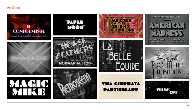
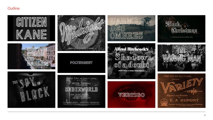
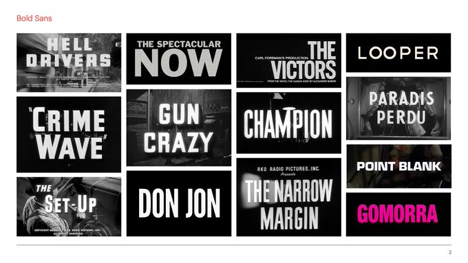
Anyways, this whole trend mostly just gives me flashbacks to the time I decided to arrange over 800 movie title cards into niche categories as research for a project
17
60
1K
I'm writing about this! Please share any and all hot takes and feel free to slide into my DMs—especially curious about Wellness brands using this aesthetic... 👀

Does anyone know a name for this aesthetic? (Stefyloret on Insta)

38
60
609
48
80
1K
Commes Des Garcons, 2018 / Sister Corita Kent, 1965
1
110
1K
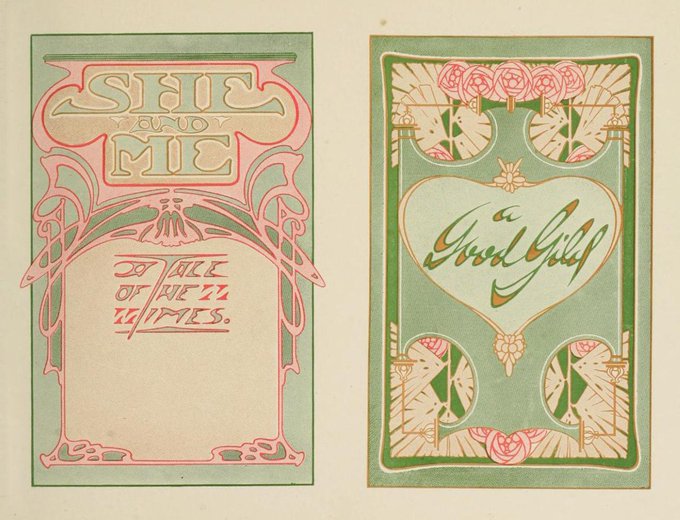
Art Nouveau compositions by Charles Jay Strong and Lawrence Stewart Strong, 1917
1
117
1K


I can't explain it but this new Bandit Running campaign set in a random Brooklyn apartment is just a trickle down from Bode and ALD shooting at a cabin in the Poconos
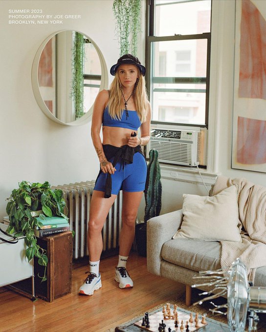
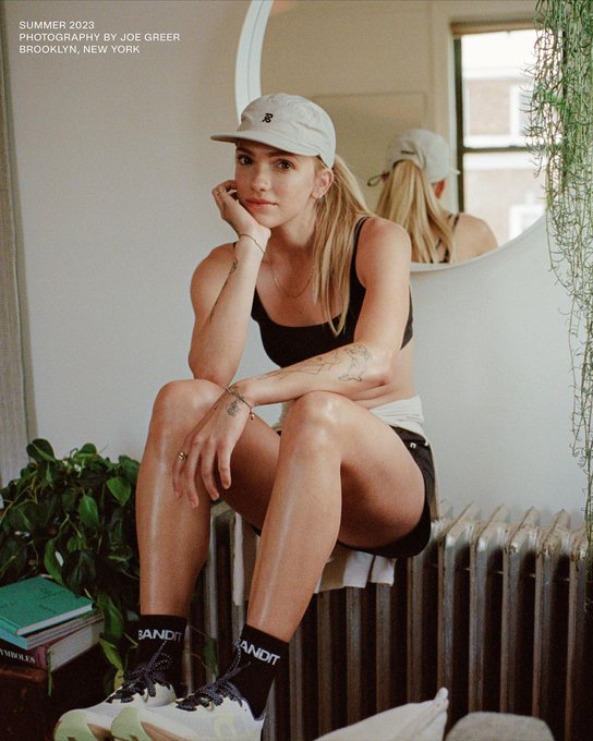
calling this AD style "grandpa's lake house" from now on (Bode, Nike, ALD, J Crew)
24
70
1K
29
34
1K
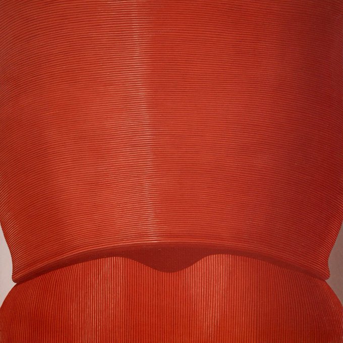
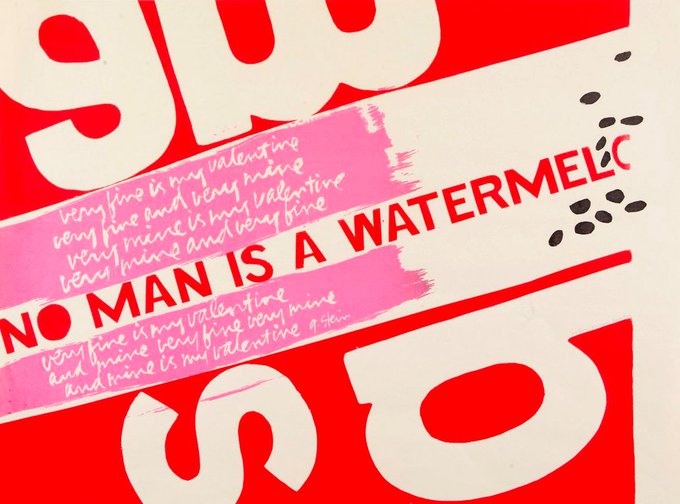
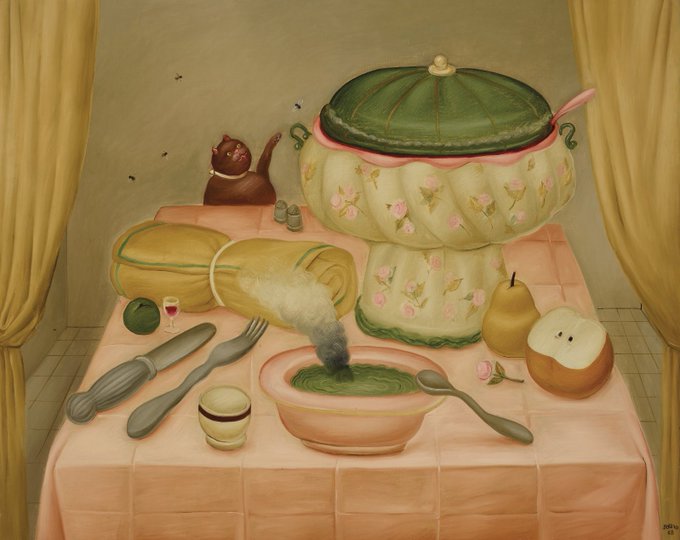
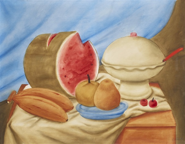
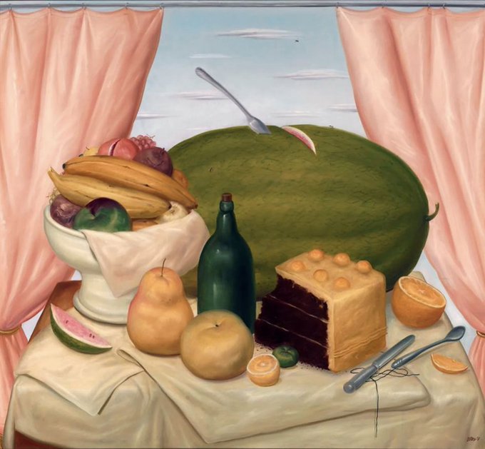
Forever in love with Fernando Botero's watermelons and cakes

3
135
983
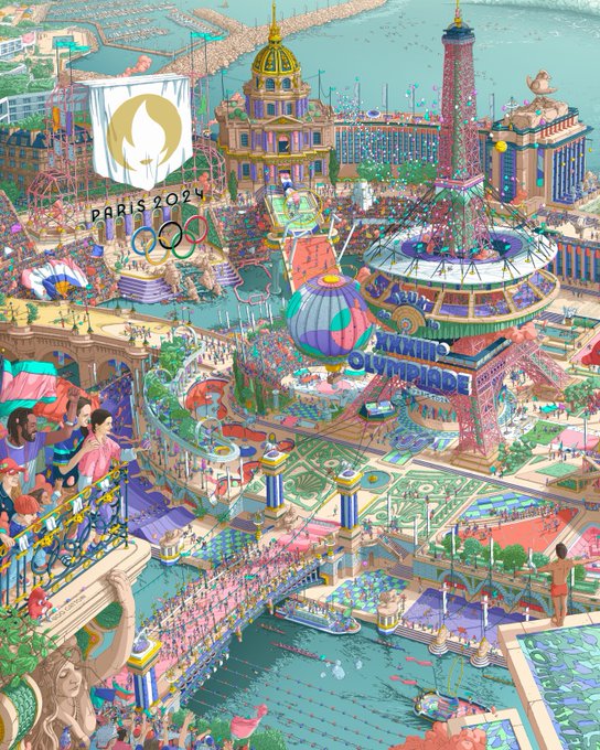
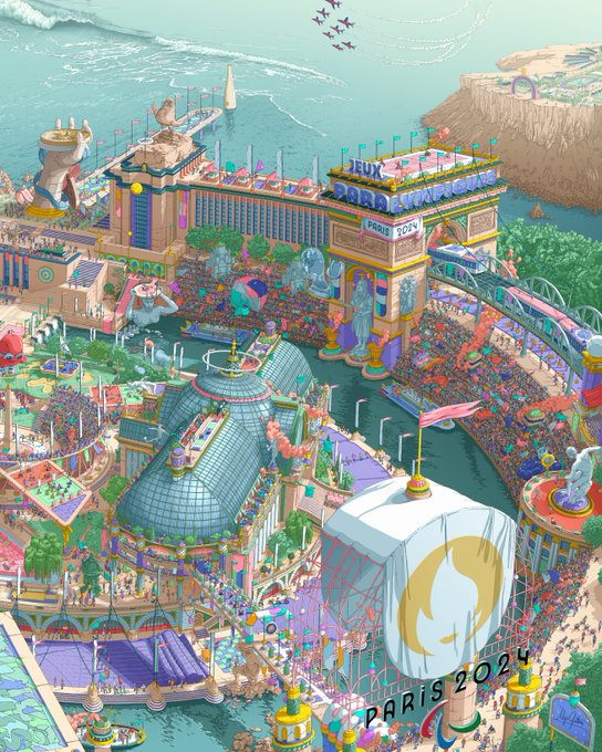
These Olympic posters remind me *so* much of the work of early 2000's pixel art collective eBoy!
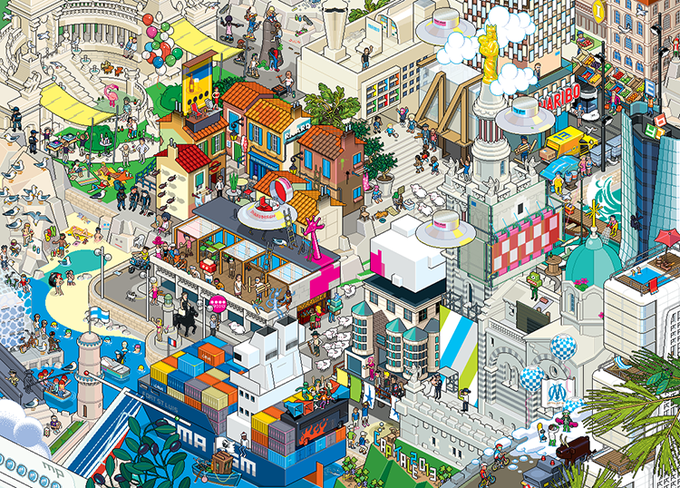

Olympic posters often are minimalistic.
Paris 2024 said "not today".
33
175
2K
11
54
984
Still true!

My favorite thing to do on vacation is get a fancy little iced drink and look for good covers at a used bookstore
7
11
350
1
71
948
Why does this video made to advertise a rug company's new collection look like Jodorowsky reshot The Fall
8
89
930
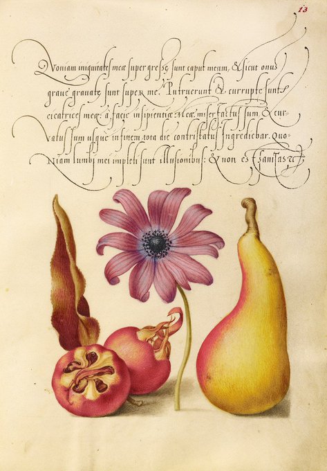
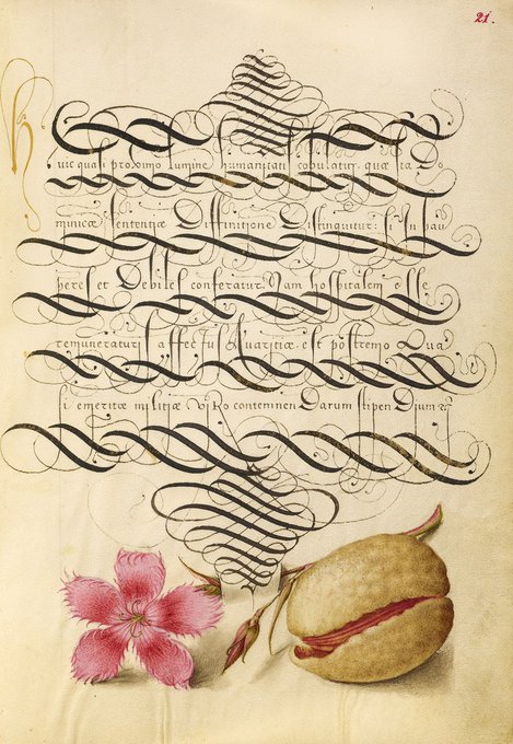
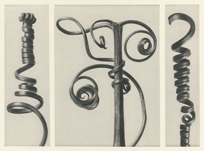
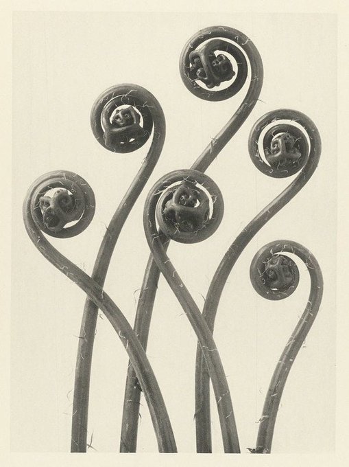
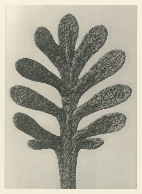
Macro botanicals by German photographer and sculptor Karl Blossfeldt (1865-1932)

5
159
901
Where do folks go to look for emerging / more junior illustrators these days? I have a few fun editorial print projects right now with small-medium budgets and am really coming up dry! (Also: if YOU are an illustrator down for this kind of work feel free to drop a link!)
304
134
901
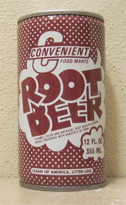
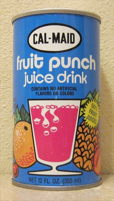
Don't mind me, just smoking a joint and then spending two hours looking at a website from 2002 about can collecting
9
59
884
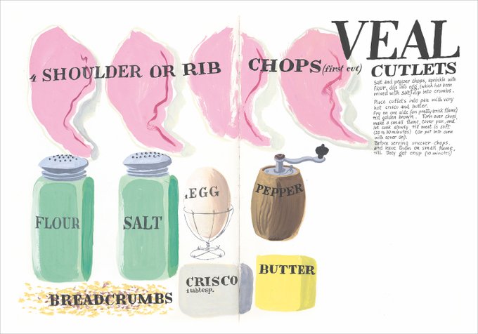
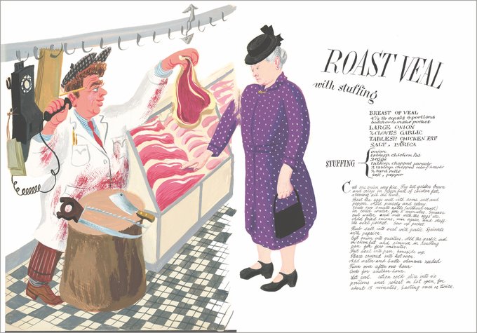
Recipe pages designed and illustrated by a favorite of mine, Cipe Pineles, in the 1950s. Cipe was born to Orthodox Jewish parents in Vienna and went on to become art director at Glamour in the US (and later, at Seventeen)—making her the first woman AD at an American magazine!

2
121
876

Cover art from Mattel’s fortune-telling line “Mystique” (1969)
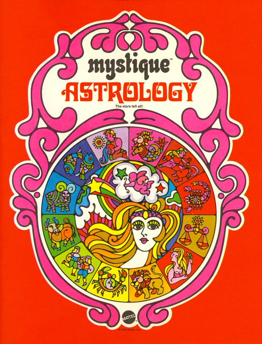

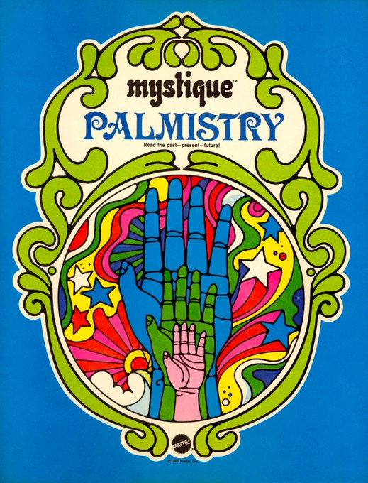
1
150
836
Bought a book from the 1930s about cake + candy making and it's basically perfect
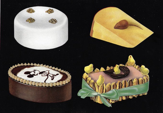
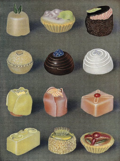
12
93
832
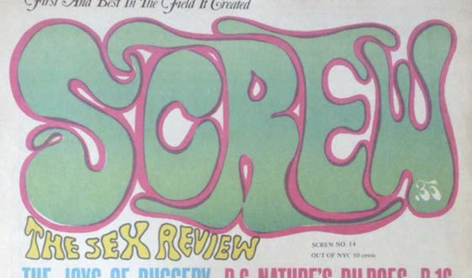
Once again reminding you that old porn magazines have the best mastheads
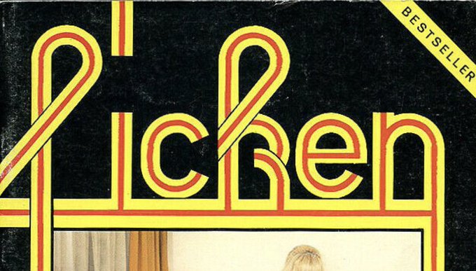
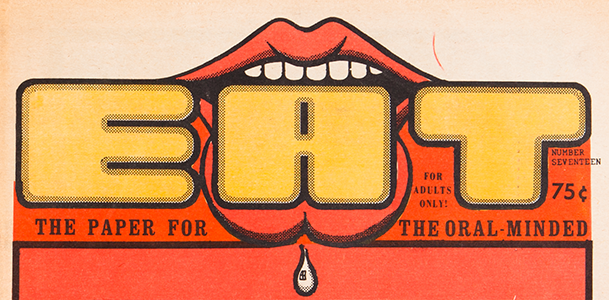
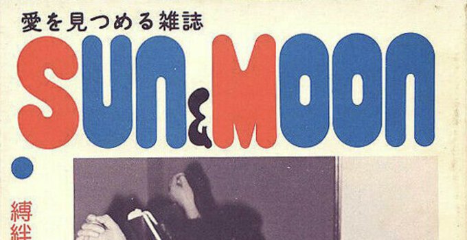
8
92
815
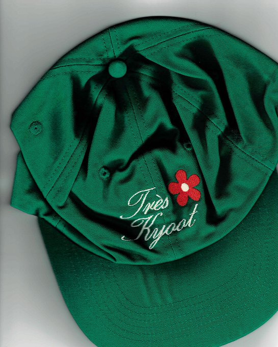
Scanning is back (Fara Homidi, Tiermarq, Kyoot, Monastery)


12
60
794
Slowly assembling a collection of curriculum appropriate memes

4
52
791
Embarassed by the number of moodboards I have put this random book cover on
18
27
793
While I'm on the subject of old posters... a periodic reminder that I've been maintaining an open-source spreadsheet of design archives, ephemera, etc. since 2019! Lots of fun stuff like this in there and always looking for more recs to add <3

I think contemporary brands should start making illustrated object posters again.
36
241
3K
13
92
739
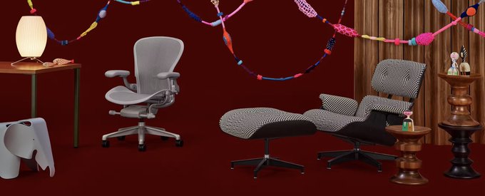
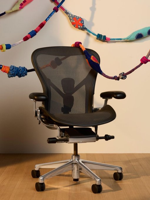
I did the art direction and editorial design for
@HermanMiller
's holiday campaign + catalog this year! Truly a dream project, especially getting to spend time at their amazing warehouse <3
19
12
741
I collaborated with
@HighTideNY
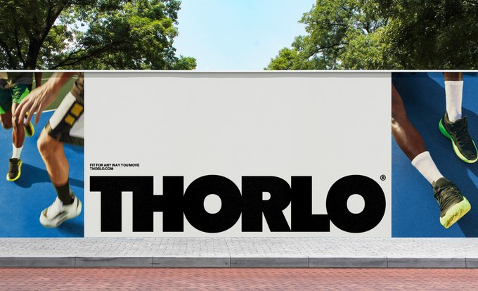
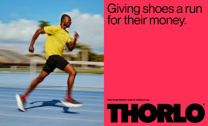
this year on a super fun rebrand for legacy sock (!!!) company Thorlo. The best part was getting to do my take on the ideal logo—huge, bold, and all caps (see: Ilford, Jil Sander, Ebbs, etc.)
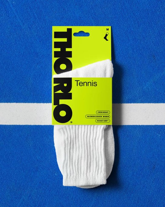
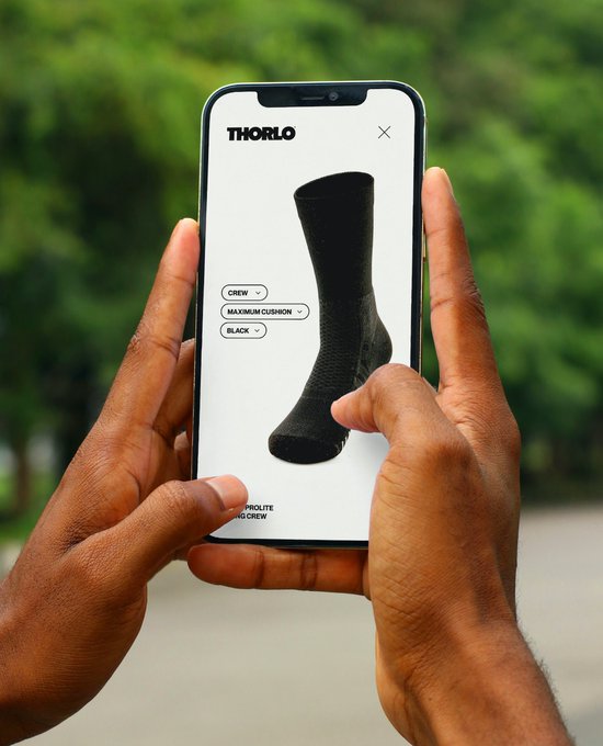
24
24
724
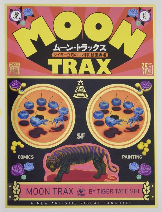
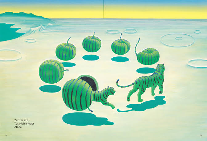
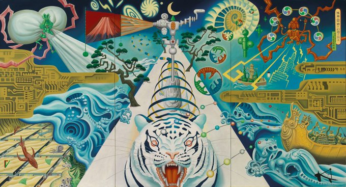
I've really been enjoying the work of Japanese painter and comic artist Tiger Tateishi recently—he has such an amazing grasp of color and a unique approach to what it means to make "sequential" art (discovered via the ever-excellent curation of
@50WattsDotCom
!)

7
102
714
Still seeing a LOT of quirky geometric frames showing up in branding—curious if we're past the peak or still getting to it...
16
26
706
Apropos of nothing, I'm feeling pretty pleased with myself after going through a deck I made for a client in January 2023 and seeing how many of my misc trend predictions were pretty close to accurate

8
33
707
Some of my students were struggling to find internships, so I made this master list of studios for them to reach out to and figured I'd share it here too! It skews more towards the US + branding (my own bias) but I welcome any additions / nominations 💙
19
115
700

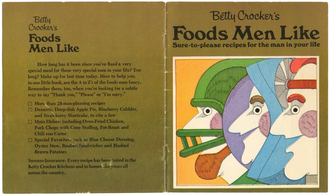
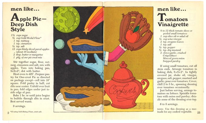
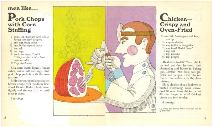
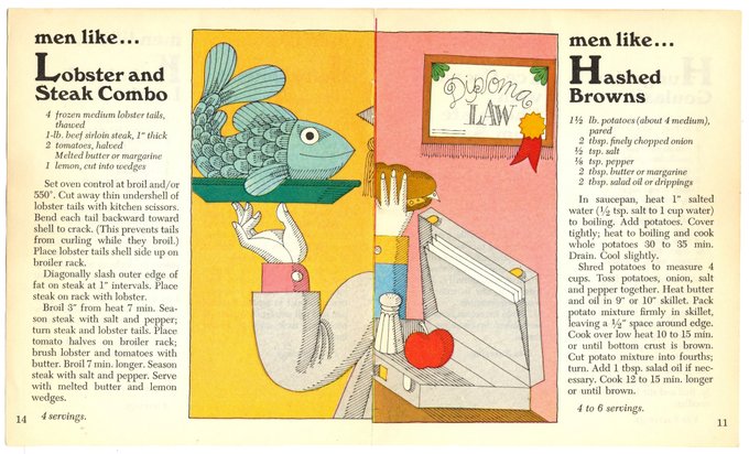
Obsessed with this 1970 Betty Crocker cookbook called "Foods Men Like"
12
80
681
While we're talking about AI... I wrote about developing taste in the era of sharing, inspiration sites, and automation 🖥️

16
115
669