
Dieline
@TheDieline
Followers
57K
Following
6K
Media
13K
Statuses
32K
Dieline is a bespoke creative platform that exists to serve the packaging community.
Los Angeles, CA
Joined February 2009
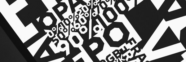
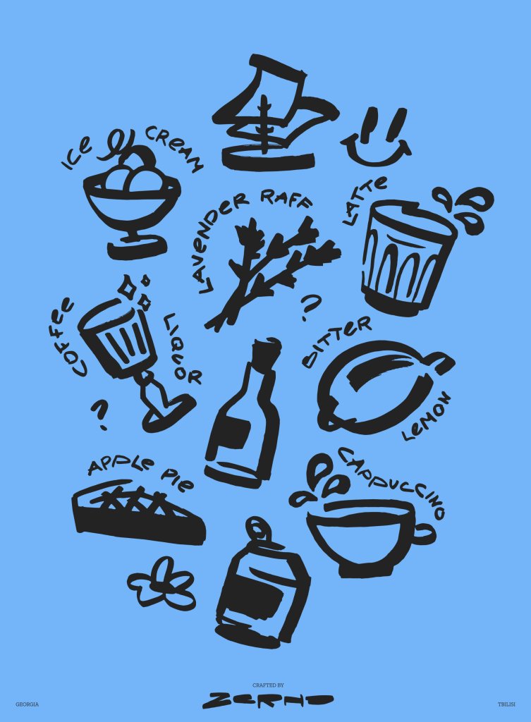
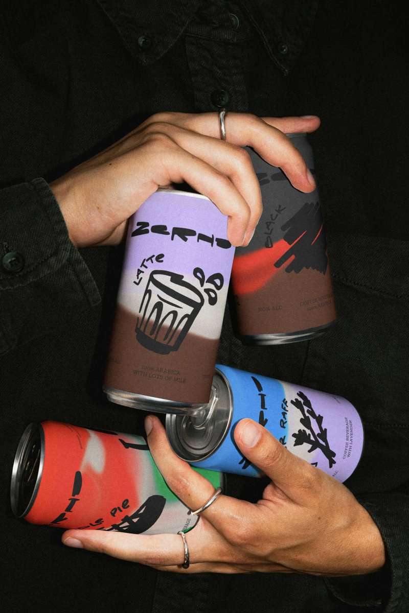
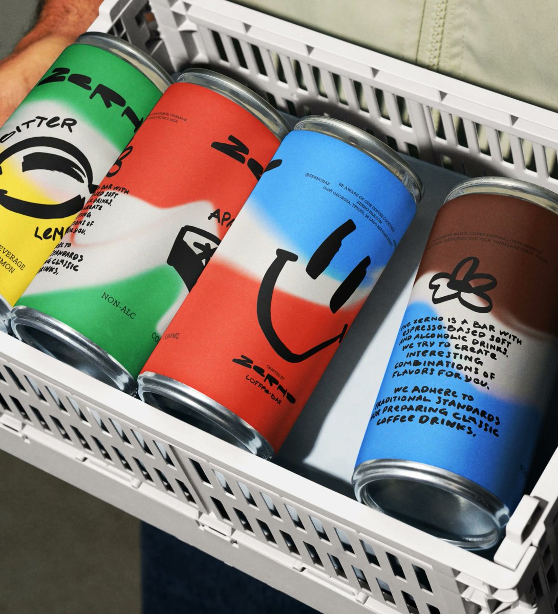
Zerno’s packaging, designed by otten agency, feels perfectly balanced between playful doodle art and your typical grocery aisle canned beverage.
0
0
8


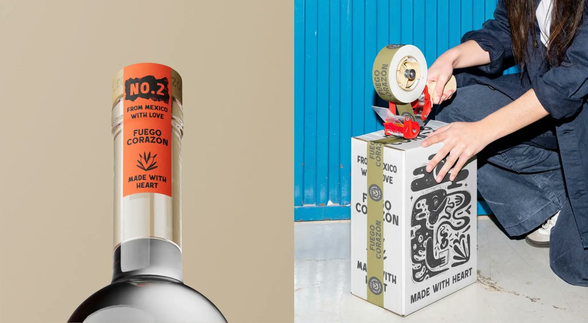
Studio Fen’s packaging for Fuego Corazón turns mezcal into a visual system.

1
0
1
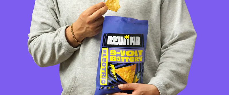
Branding and packaging design for Rewind are equally nostalgic, with a strong 90s-00s aesthetic, especially the typography.
0
0
1
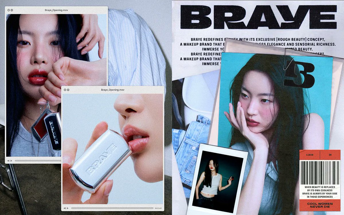
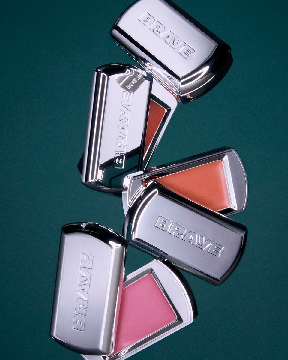
Brave's typography is bold, high-contrast, and unforgiving. It’s not overly done, but it’s bold minimalism, a design aesthetic that stops you in your tracks.
0
0
1
BRAVE’s packaging, designed by Triangle-Studio, skips the frills and leans into industrial precision. A chrome-plated dog tag meets cute with a compact case and doubles as an accessory and container.


0
0
1
A matching flyer drenched in red tomatoes feels more like a gig poster than a food promo, and yes, they even made a co-branded stain remover pen, because why not think ahead?


0
1
0
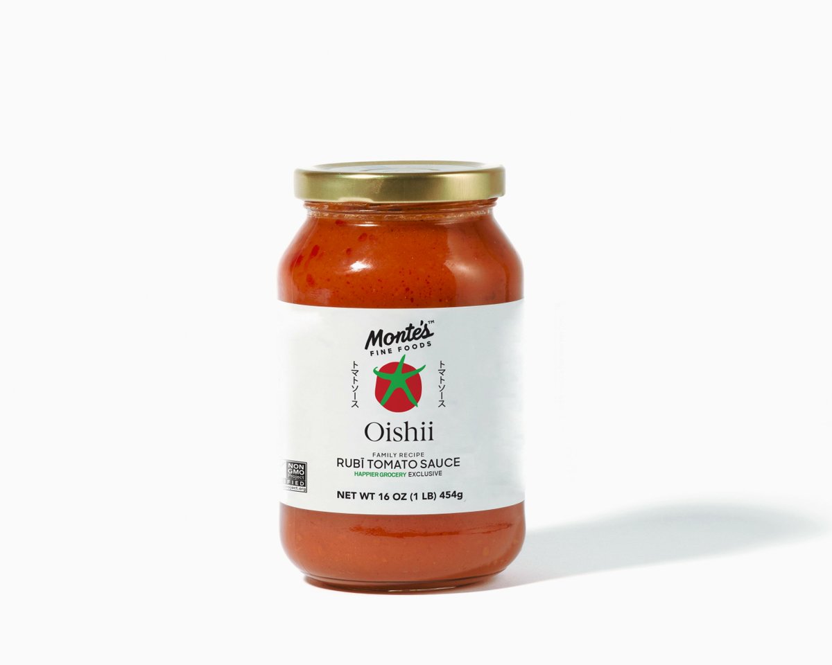
The Monte’s x Oishii collaboration is designed exclusively for Happier Grocery, the jar pairs clean, serif typography with a stylized tomato graphic that doubles as a logo and pattern
1
1
1
As it turns out, one surprising source of microplastics is coming from where you’d least expect it—metal bottle caps.

0
0
0
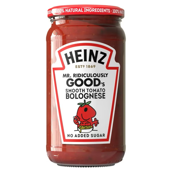
Heinz joins forces with Mr. Men Little Miss for Mr. Ridiculously Good's Smooth Bolognese Pasta sauce. Read and see more on The Dieline >>>
0
0
3
Recently, the creative agency McKinney, in partnership with the Wildlife Conservation Society, launched a campaign to raise awareness about the proposal to save the Hudson Canyon.

0
0
0
Isa D’Aniello’s packaging for Tejas Tonic’s Orange Sunshine splits the layout into two graphic zones with radiating sunbursts up top and electric blue water squiggles below. Read and see more on The Dieline >>>

0
0
0
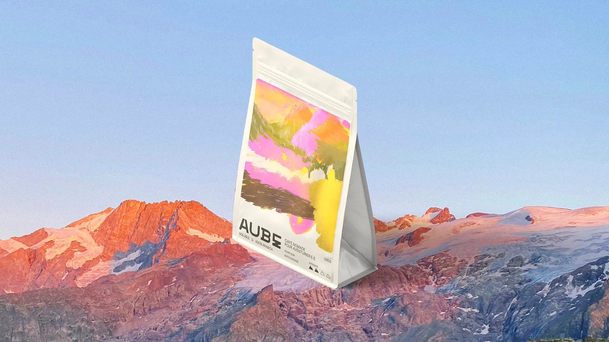
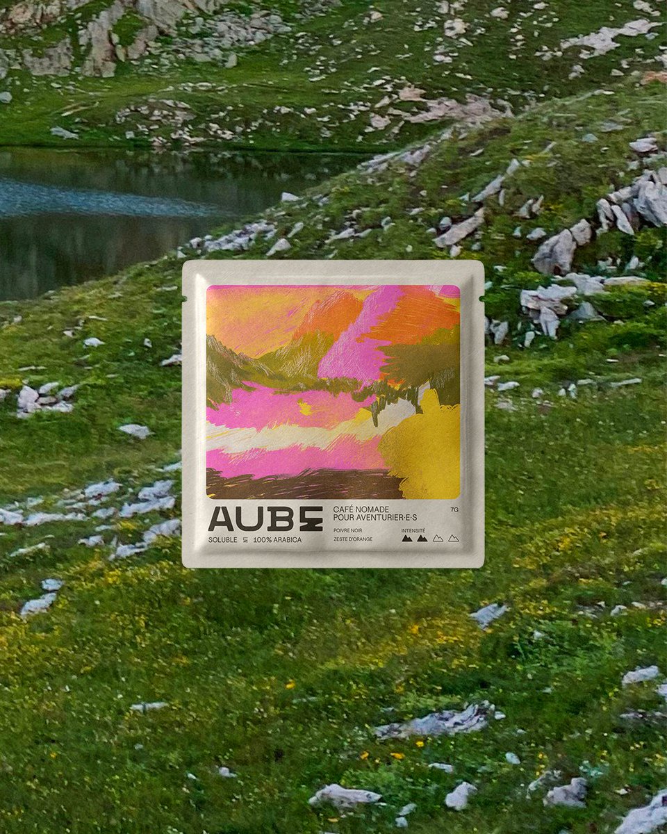
Léna Labarussias designed Aube Café, and the packaging drops a brushstroke-heavy abstract landscape straight onto the front. There are no gradients, but the raw texture and color looks like it’s swiped from a sketchbook.

0
0
12
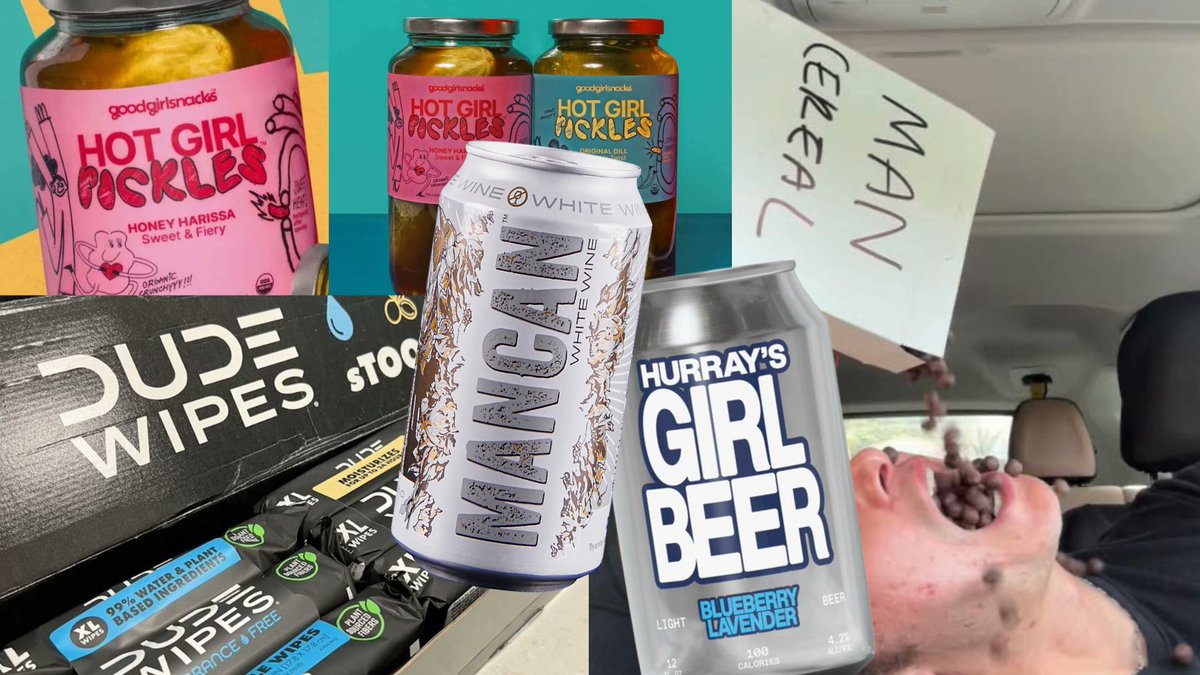
From “Hot Girl Pickles” to “Dude Wipes,” gender-coded branding has taken over consumer packaged goods with surprising intensity. Brands are leaning hard into hyper-specific identities, sometimes as parody, sometimes as sincere targeting.

1
0
0
Gold’s Gym Pre-Workout powder is the gold standard for exercise supplements, so it needed gold-standard packaging. Studio One Eleven developed a custom plastic container and closure that marries form and function.

0
0
0
bluemarlin’s redesign for Kinnie doesn’t hold back on color or geometry. A bold ring system creates a visual bullseye that doubles as a flavor signal that’s warm, bitter-sweet, and citrusy.

0
0
2
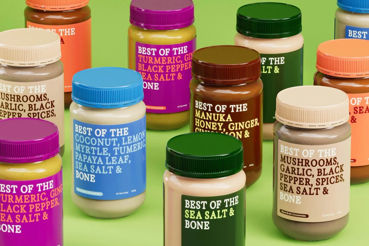
Recently, Best of the Bone called upon design studio Universal Favourite to refresh its identity, and they boiled down the branding, concentrating on the essence of Best of the Bone. Read and see more on The Dieline >>>
2
2
7
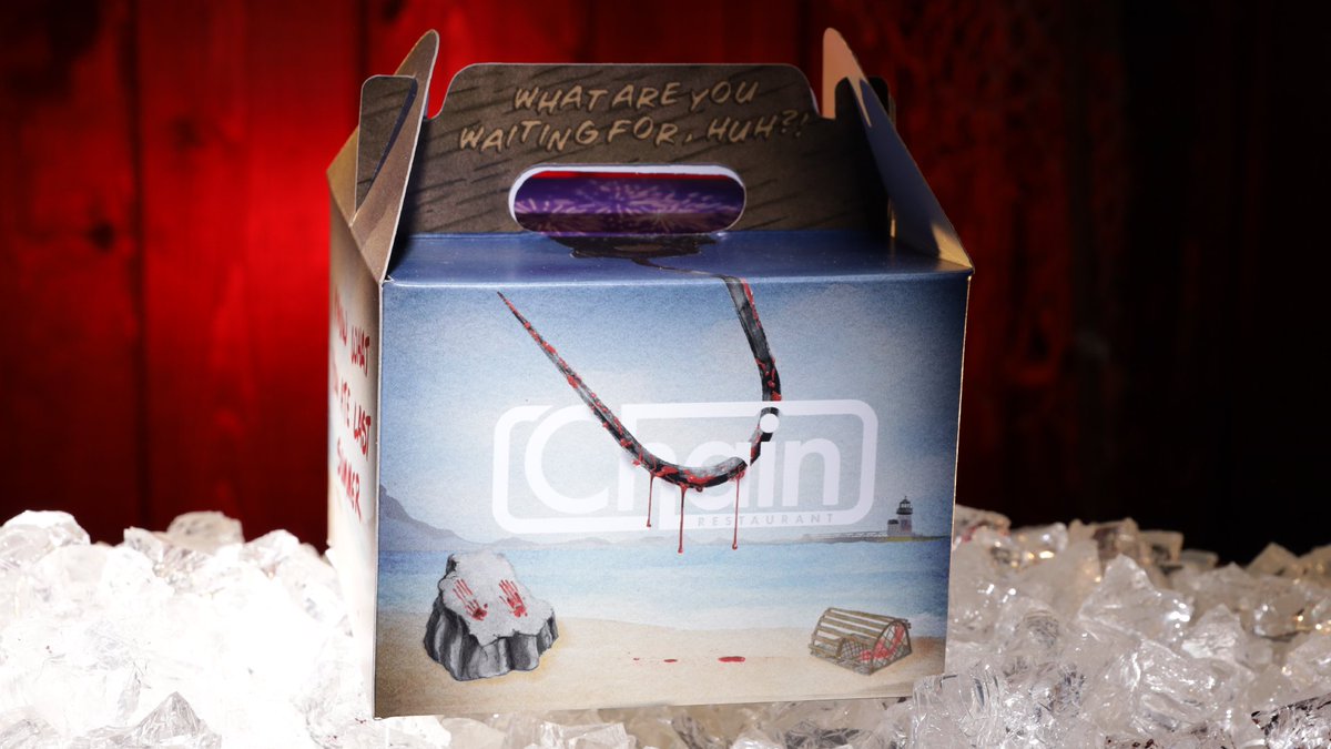
Eat At Chain leans fully into camp horror for its Dread Lobster packaging, and it’s a blood-soaked beach party in a box. The lunch carrier riffs off slasher flick tropes with tongue-in-cheek taglines and a hooded mascot clutching a lobster.


0
1
0
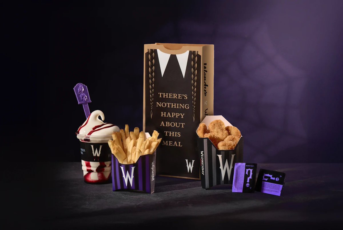
Wendy’s leans into gothic whimsy with its limited-edition “Meal of Misfortune,” a new collaboration with Netflix’s Wednesday. Launching August 4 in the U.S. and August 11 in Canada, the packaging design is a visual feast for fans of morbid chic.
0
1
2