
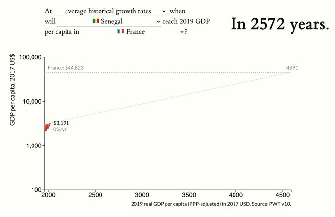
🧵: At historical growth rates, it will take >2,000 years for 🇸🇳 Senegal to catch up to 🇫🇷 France's 2019 GDP p.c.
How long will it take for developing countries reach rich world income levels?
I've built a quick tool to simulate growth scenarios: .
1/N
36
203
706
Replies
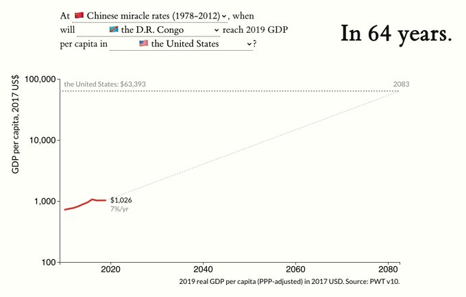
A neat feature is you can simulate how long it will take if a country grows at rates seen in the 🇩🇪, 🇯🇵, 🇨🇳 economic miracles.
Even at a spectacular 🇨🇳 Chinese rate of growth (7%/year), the 🇨🇩 D.R. Congo will take 64 years to reach current incomes in the 🇺🇸 USA.
2/N
2
7
59
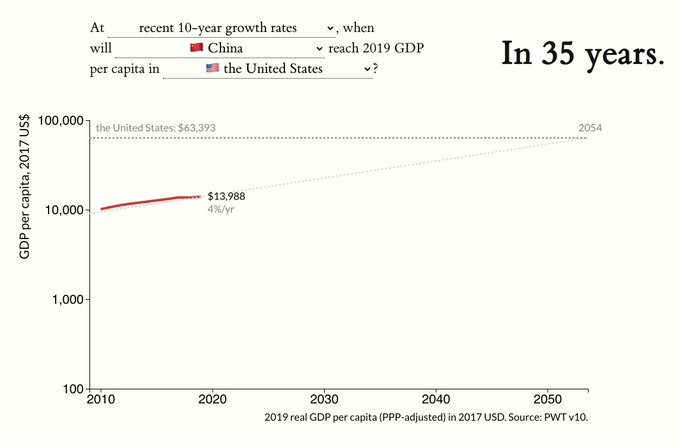
Comparisons for richer countries work as well!
At its present growth rate, 🇨🇳 China will achieve current 🇺🇸 US income levels in 35 years–sooner than 🇯🇵 Japan, which will take 80 years.
3/N
2
6
46
Of course, constant growth rates is a VERY strong assumption---use these estimates wisely. But I hope this brings into focus the harsh logic of compounding growth, and the staggering levels of 🌐 inequality.
Comments + suggestions welcome!
N/N.
1
3
57
Tagging some people who may be interested --
@tedmiguel
@delong
@Noahpinion
@dkedrosky
@pseudoerasmus
@JonSteinsson
@rodrikdani
3
0
18

@oliverwkim
Fascinating, thank you for sharing! I have been doing some research about trends in occupational growth which I've been visualizing in Google Sheets but would love to share in a more public way like you have here-- what tools did you use to build this chart?
1
0
3

@oliverwkim
Fantastic tool, really appreciate if you walk us through the development process of this tool or at least some glimpse about!
1
0
1


@oliverwkim
Double check your assertion on Senegal versus France. Your chart says 343 when those countries are plugged in BUT you also reference a 2572 year number below. Or am i missing something?? Plus where did you source the Ghana per capita no? Seems kinda high.
1
0
1
@ndmanu
The 343 number comes when you use recent 10 year growth rates, not historical (post-1960) rates.
All the data is from the Penn World Tables. If it seems high it’s likely the result of the PPP adjustment.
1
0
3

@oliverwkim
@oliverwkim
This tool is awesome and easy to use. It'll be used widely, including in high schools.
So people who are bad with numbers will use it. They'll forget the conditional and think the catch up years is a fact instead of a projection. Consider adding a tide pod warning.
1
0
3


@oliverwkim
Adding a South Korean historical miracle rate would also have been good in the mix you created.
0
0
0

