

Nate Smith
@nasm423
Followers
1K
Following
18K
Media
289
Statuses
2K
Software designer
Los Angeles, CA
Joined March 2011
Little weekend prototype: iMessage style card stack. Always love a good reason to dive into @FacebookOrigami and work through visual + interactive puzzles like this. Here’s a bit about how I built it and a link to download ↓
37
72
1K

In a few years, docked bars are gonna come back, and ppl are gonna act like it’s the greatest thing since sliced bread.
0
0
1
There are so many islands here… so much more visual noise than if it were a single, docked bar with icons and subtle separators. Hard to imagine that this is a UI paradigm that will stick around for long in its current form.

Yes, the new toolbar has The Glass. It’s got some other neat tricks, too. We’ll save those details for the big reveal. This redesign is so nearly ready, beta dropping very soon.
3
0
6
Yea I noticed this yesterday. It’s super subtle, but all of the glass elements have a bit of HDR boost, especially the edge highlights, which totally disappear in SDR screenshots. Lightroom has a handy “Visualize HDR” option, which shows this nicely.

this is not an accurate representation of how it actually looks on-device Apple did a very… Apple thing here and realised that they may as well use the hardware they make, so Liquid Glass on light mode is literally whiter than white these elements ALWAYS render in HDR — not
0
0
1
1
0
2
Yoooo @figma @skuwamoto, really disappointed to see in a recent update, that menus seem to be always be opening underneath the pop-up button, where up to this point, they aligned to the currently-selected item. Really hoping this is an unintentional regression 🤞🥲
2
0
2

Super cool. Thanks for the great breakdown @hybridherbst

Apple's 3D viewer is based on @threejs, uses @glTF3D and gets more impressive every year! CAD meshes, environment blends, reflection probes, occlusion: let's take a look at what's special this time – (long thread ahead)
0
1
3

More copy often means less differentiation 😕
5
4
119
Capacitive touch is the worst thing to ever happen to kitchen appliances.
0
0
2

I so wish you could turn off the ringing sound on FaceTime, and it would work more like Slack Huddles. You just “turn on the video,” and the other person can join. Let’s move on from the “calling” metaphor.
1
0
3

Next week: iOS 26 drops. Liquid Glass arrives. Play will ship a new version alongside it — the only design tool that lets you design with the real Liquid Glass and the latest iOS elements.
3
5
122

This is sick

sometimes you just wanna know how to get form here to there real quick... 🗺️🧭 2-day iOS 26 app project, hopping to have ready by end of day
2
0
1
Yea this kind of gradient fade that appears on scroll is a nice technique. But let’s not overuse it—there are definitely cases where a hard border (divider, container color, device, etc.) is most effective. But please god never hard clip a scroll area with no separation

if i see any component being hard clipped by a scroll container i get the ick. tiny detail from when i was working on the first version of @soundxyz_ in 2021
0
0
2
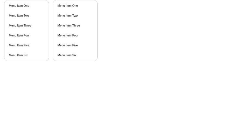
Zero gap interactive stacks ftw baby 💪 Made this demo a while back that I still regularly reference when introducing people to this concept
codepen.io
...

It's wild to me how many of these replies think G is pointing out something wrong here. Your stacked list of links should have full click areas with no dead space between them. It's just better UX.
1
0
1
And if you really want a transition, only fire one on mouse-out, keep the instant transition on mouse-over

Hover transitions seen tens, maybe even hundreds of times a day can make your interface feel slower. Make them snappy by removing the transition altogether.
1
0
8

Drop everything! Drag and drop support in the React Aria Tree component is here. 🫳🎤 🪜 Reorder and move between levels 🌴 Drop on or between rows 🧩 Interoperable with other components 📜 Auto expanding and scrolling 📂 File and directory support 🎹 Fully keyboard accessible
15
25
388
Really really wish there were a system level toggle where you could turn off HDR.. it’s so annoying in Instagram, when your brightness is at 0, then some post just lights up your screen like crazy. Honestly a real accessibility issue
0
0
2