

Lindsey Poulter
@datavizlinds
Followers
6K
Following
2K
Media
261
Statuses
2K
data visualization engineer✨ KC → NYC
New York, NY
Joined May 2016
making the switch over to the butterfly app >> 🦋lindseypoulter
0
0
2

Women's #PoleVault final from yesterday. Now this is a proper multi-tiered cake chart with so many athletes in the final 🥇@ninakennedy_ 🥈@ktnago13 🥉@alysha_newman94
#dataviz #Paris2024 #OlympicGames #Olympics #Athletics @WorldAthletics
1
13
84
Comment below or DM me and I’ll send you a discount link 💃🏻
Excited to announce the launch of Learn Tableau the Right Way on #Udemy! ✨ Over the spring, @wildshanimal and I crafted a #Tableau course designed to make learning the fundamentals engaging - and fun! https://t.co/SR2cRsL3ta
1
1
2
Excited to announce the launch of Learn Tableau the Right Way on #Udemy! ✨ Over the spring, @wildshanimal and I crafted a #Tableau course designed to make learning the fundamentals engaging - and fun! https://t.co/SR2cRsL3ta

udemy.com
Master Tableau's core concepts through hands-on videos, exercises, and visual guides from experienced professionals
0
6
58
This might just be my most enduring contribution to the data fam 😆

2
0
33

Imagine combining @tableau's ease of handling data (to connect, refresh, filter, interact) and the power of d3.js to create and personalize any type of chart you can imagine. This is Viz Extensions, and it's coming soon! Tableau is dead? I don't think so 😉 Power to the devs🦖
6
26
161
The popup from the table 😍

Playfair+ wrapped – see our most popular tutorials of the year, the latest trends in visual analytics, and recent Playfair Data developments. Year in Review, Top 10 Playfair+ Tutorials of 2023: https://t.co/8FyRmwul4i
#visualanalytics #data
1
0
8

Incredible work by John Muller to design our new @TheAthleticFC match dashboards. I've taken a look at some of the big games from the weekend's fixtures, to give you a flavour of them in use! ⬇️ https://t.co/wTyUpFKDPy
19
40
375

2️⃣6️⃣4️⃣ is out and includes @TalkNotesApp @datavizlinds, @Michael_Easter, @DavidDCain, @jonjalex, @arianesconrad & others. With great recommendations by Craig Thompson. Many thanks to @prismatext for sponsoring the issue! 💌 https://t.co/15Ji1COaWI

densediscovery.com
Read the archived version of Issue 264 / Changing the story from consumer to citizen
1
2
5

🚀 Exciting news! Introducing my (first!) course: "Better Data Visualizations with Svelte" w/ @newlinedotco ~10 hours of video content, multiple charts, and code examples throughout to help you learn Svelte + D3 📊 https://t.co/0YSI6HITOI

newline.co
Learn how to declaratively build responsive, interactive data visualizations with Svelte and D3. This course contains dozens of lessons, each complete with live coding examples for students to study...
13
30
177
Check out this almost unbelievable time-lapse of wildfire smoke consuming the World Trade Center and the New York City skyline. Those vulnerable to poor air quality, including seniors and young children, should limit time outdoors if possible. More: https://t.co/ChRuWv7X6E
696
11K
27K

There were 29 homers hit in the Major Leagues on June 2nd. We put them all together here. It's the Home Run Report's Daily Digest.
2
25
150

👀

What happens when war comes for your park? Your gym? Your grocery store? A new interactive story from Vox and @puddingviz explores how Russia's invasion transformed the Ukrainian city of Kharkiv.
4
1
28

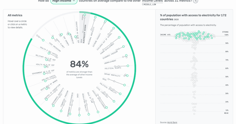
Curious to know what it takes to make an award-winning #dashboard? Read this story from @datavizlinds, the World #DataViz Prize winner. From conceptalization to #design (and redesign), here's how Lindsey found a perfect balance of informational & playful. https://t.co/r32DpSkf9R
nightingaledvs.com
Lindsey Poulter won the World Data Viz Prize using a mix of dashboard features—including a shuffle button to randomize the view.
1
13
47
It was so incredible to reconnect with those I last saw at TC19, to meet all the people I’ve interacted with on Twitter, and to greatly expand my network. I’m in Porto all today if anyone wants to meet up one last time ✨
0
0
5
The venue views? 10/10. The conference? 1000/10. Feeling really grateful for all the connections, conversations, learnings, and inspiration at #outlier2023.
2
2
48

🗺️🌎🛂How to travel the world without a passport! New project for @axios mapping the thousands of U.S. cities named after foreign places. Design routes, explore maps, and find out how these cities reflect immigrant history
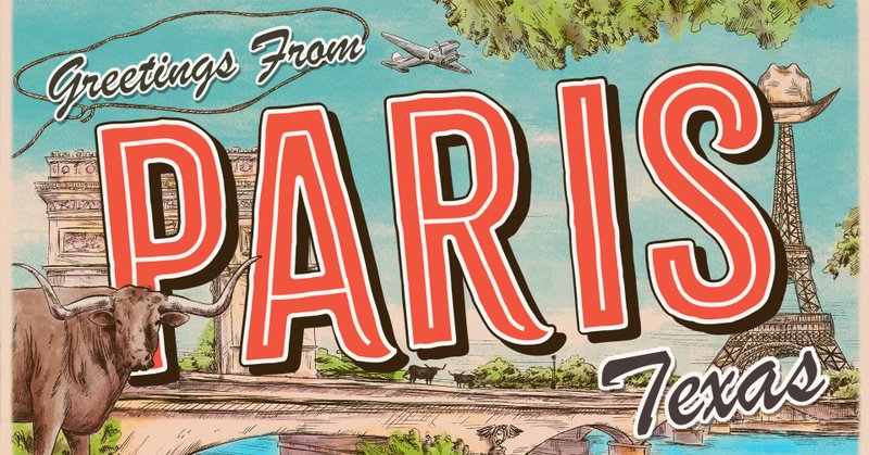
axios.com
The U.S. is filled with towns and cities that were named after foreign places. In fact, there are so many of these cities that you could go on a world tour without ever leaving the U.S. Check out our...
3
13
45