
Elliott Morsia 📚
@EMorsia
Followers
531
Following
30K
Media
78
Statuses
592
Commissions Books 📚 dataviz/AI/CompBio @CRCPress/@RoutledgeBooks D. H. Lawrence Researcher (https://t.co/BmYPoKuRTv) https://t.co/51ZXDezYxB
UK
Joined November 2019
Visualization Analysis and Design by @tamaramunzner: Tamara provides a tutorial on the same topic: #IEEEVIS #VIS2024. 🔚.

ieeevis.org
See the session and its presentations inside.
0
0
0
Information Theory Tools for Visualization by Min Chen, Miquel Feixas, Ivan Viola, Anton Bardera, Han-Wei Shen, & Mateu Sbert: The first book devoted to Information theory (IT) tools. #IEEEVIS #VIS2024.

routledge.com
This book explores Information theory (IT) tools, which have become state of the art to solve and understand better many of the problems in visualization. This book covers all relevant literature up...
1
0
0
Data-Driven Storytelling by @nathriche, @TofHurter, @ndiakopoulos, Carpendale: An accessible introduction blending unique discussions between dataviz researchers and data journalists. #IEEEVIS #VIS2024.
routledge.com
This book presents an accessible introduction to data-driven storytelling. Resulting from unique discussions between data visualization researchers and data journalists, it offers an integrated...
1
0
0
Applying Color Theory to Digital Media and Visualization SECOND EDITION by @tmrhyne: Theresa-Marie provides a tutorial on the same topic: #IEEEVIS #VIS2024.
ieeevis.org
See the session and its presentations inside.
2
0
0
Interactive Visual Data Analysis by Christian Tominski & Heidi Schumann, Foreword by Jack van Wijk: A systematic and comprehensive top-down view on visualization, interaction, and automatic analysis. #IEEEVIS #VIS2024.
routledge.com
In the age of big data, being able to make sense of data is an important key to success. Interactive Visual Data Analysis advocates the synthesis of visualization, interaction, and automatic comput...
1
0
0
Visualizing with Text by @rkbrath, Foreword by Ebad Banissi: Richard is speaking at the NLViz workshop: #IEEEVIS #VIS2024.
ieeevis.org
See the session and its presentations inside.
1
0
0
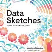
Data Sketches by @NadiehBremer & @sxywu: “Nadieh & Shirley are generational talents. They relentlessly exhibit a wide spectrum of capabilities across creative, editorial, analytical, & technical dimensions.” @visualisingdata. #IEEEVIS #VIS2024.
routledge.com
In Data Sketches, Nadieh Bremer and Shirley Wu document the deeply creative process behind 24 unique data visualization projects, and they combine this with powerful technical insights which reveal...
1
0
0
Mobile Data Visualization (eds) @bongshin, @RaimundDachselt, @dr_pi, & @slowalpaca: “I’ve been waiting for a book like this to open the doors to many possibilities for future uses and devices.” @benbendc. #IEEEVIS #VIS2024.

routledge.com
Mobile Data Visualization is about facilitating access to and understanding of data on mobile devices. Wearable trackers, mobile phones, and tablets are used by millions of people each day to read...
1
0
0
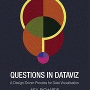
Questions in Dataviz: A Design-Driven Process for Data Visualisation by @theneilrichards: “An amazing resource for data visualisation folks looking for different and more creative design ideas.” @giorgialupi. #IEEEVIS #VIS2024.
routledge.com
This book takes the reader through the process of learning and creating data visualisation, following a unique journey with questions every step of the way, ultimately discussing how and when to bend...
1
0
0
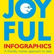
Joyful Infographics: A Friendly, Human Approach to Data by @nigelblue: “Floods of data have made it necessary to increase data literacy. What better way than through humor? Who better than the pioneer, Nigel Holmes?” @thedailyheller. #IEEEVIS #VIS2024.
routledge.com
In Joyful Infographics: A Friendly, Human Approach to Data, one of the leading graphic designers of recent times shows how a judicious use of humor can make infographics more understandable. Written...
1
0
0
Building Science Graphics by @ChristiansenJen: A practical guide for anyone interested in creating explanatory diagrams. “A masterclass in the field of scientific visualization.” @JillGMedArt. #IEEEVIS #VIS2024.

routledge.com
Building Science Graphics: An illustrated guide to communicating science through diagrams and visualizations is a practical guide for anyone—regardless of previous design experience and preferred...
1
0
0
Data Visualization in Excel📊by @jschwabish: A perfect guide for anyone who wants to create better visualizations in Excel. “Pragmatic examples, easy-to-follow instructions and entertaining writing” @storywithdata. #IEEEVIS #VIS2024.

routledge.com
This book closes the gap between what people think Excel can do and what they can achieve in the tool. Over the past few years, recognition of the importance of effectively visualizing data has led...
1
0
0
Data Visualization for People of All Ages by Nancy Organ: A field guide to visual literacy perfect for home or classroom use. “Recommended across ages for those looking for an accessible and fun intro to the world of data.” @abmakulec. #IEEEVIS #VIS2024.
routledge.com
Data visualization is the art and science of making information visible. On paper and in our imaginations, it’s a language of shapes and colors that holds our best ideas and most important questions....
1
0
1
. There is a 25% discount for attendees using 'IEEEVIS24' via above links. /This is also a good opportunity to announce the Visualization Series Videocast 📺: .

youtube.com
Hosting authors from the AK Peters Visualization Series, who sit down with the series editors (Tamara Munzner and Alberto Cairo) for an informal conversation...
1
0
0
🧵. Hi #IEEEVIS! Check out the virtual bookstand for @CRCPress📚at #VIS2024 (hope to see you in-person next year!) - Intro thread follows. 🔗🔗 @tamaramunzner @AlbertoCairo #Visualization #dataviz @tandfSTEM @ieeevis.
2
2
2
Very enjoyable review of @nigelblue's 'Joyful Infographics' by @theneilrichards! It explains 'visual prosody', or how to bring joy to visual information: #dataviz.

questionsindataviz.com
“The designer who wants to be more than a mere decorator must apply his thinking to the proper ‘tone of voice’ for presenting statistics. […] A bar chart is nothing but the skeleton of a story unti…
0
2
5
Attention #dataviz / #dataliteracy folks, check out Nancy Organ's Data Vis Book Fairy Project, which aims to get her new book (for people of all ages) into free community libraries! @WeAreTandF.

gofundme.com
Earlier this summer I dropped off a few copies of Data Visualization for People of… Nancy Organ needs your support for Support the Data Vis Book Fairy Project
8
6
5
RT @AlecStapp: Japan has been collecting data on the date of peak cherry tree blossom since 812. See if you can spot climate change. http….
0
3K
0