
Swiss Typefaces
@swisstypefaces
Followers
8K
Following
1K
Media
1K
Statuses
4K
The Swiss type design company
Suisse
Joined April 2011
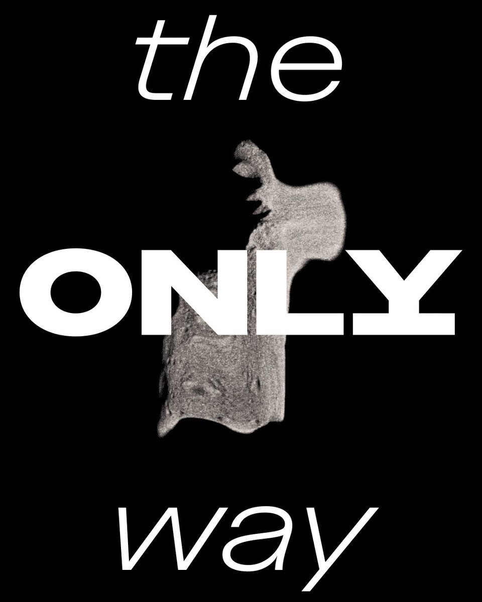
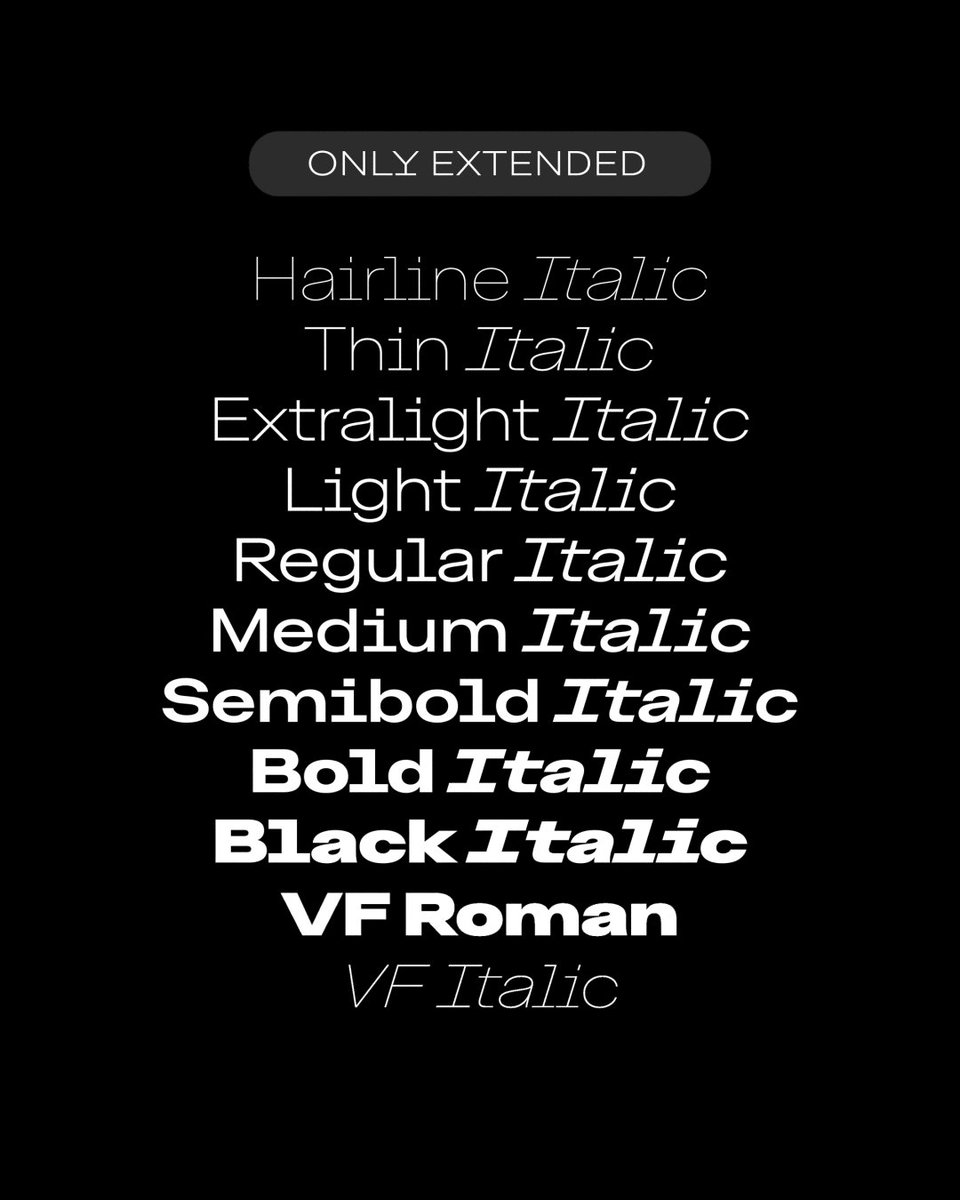
Few weeks ago, we released ONLY EXTENDED: a brand new family of 18 styles + Variable, available in Latin & Cyrillic. 🪐 Its ultramodern geometry combined with a Swiss grotesque spirit are making it a distinctive addition to the design landscape. More: https://t.co/8APrUqU0f6
0
0
1

Something to be said for a passport that is beautifully designed. It's deeper than just nice design. It creates something that an individual is proud to have in their hands. A deeper connection to where one is from. https://t.co/YkXHaH6YyN
@swisstypefaces

1
3
8

The most fun image & video creation tool in the world is here. Try it for free in the Grok App.
0
221
2K
We are looking for a full-time Project Manager to join the team either in Vevey, or Berlin. If you're interested please read all the details of the open position in your preferred location by following this link: https://t.co/m4HJ8h6b80 Application deadline: 30.11.2022
0
0
0

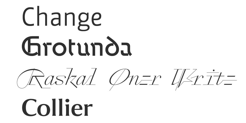
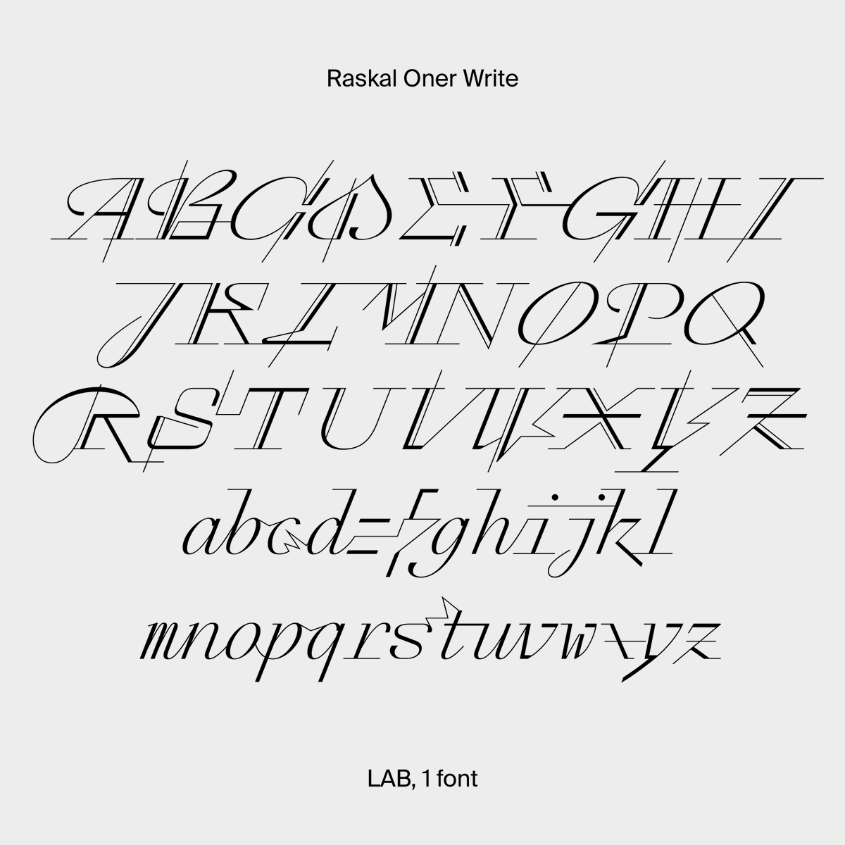
Another four interesting typefaces in this month's blog: Change by Alessio Leonardi, Grotunda by Fabian Dornhecker, Raskal Oner Write by Emmanuel Rey, and Collier by Richard Lipton: https://t.co/wfSkQlt0ct
0
1
9
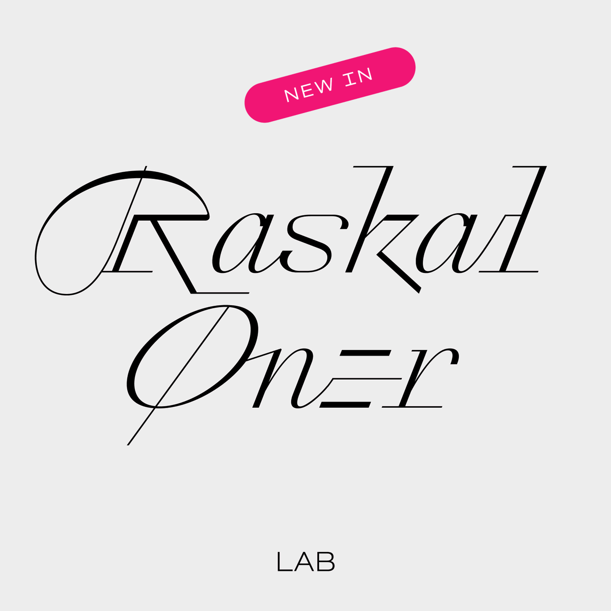
Thanks for the highlight, your opinions are very insightful! Btw, Raskal Oner has been designed by Emmanuel Rey (with the help of @arialcrime )! @typeoff wrote the massive article for us 😅

In this episode, we get into a few new font releases like @nan_xyz_ Tresor by @koeberlin and Raskal Oner Write by @typeoff at @swisstypefaces. Listen here ☞ https://t.co/Z8mHMPck2m
0
2
3
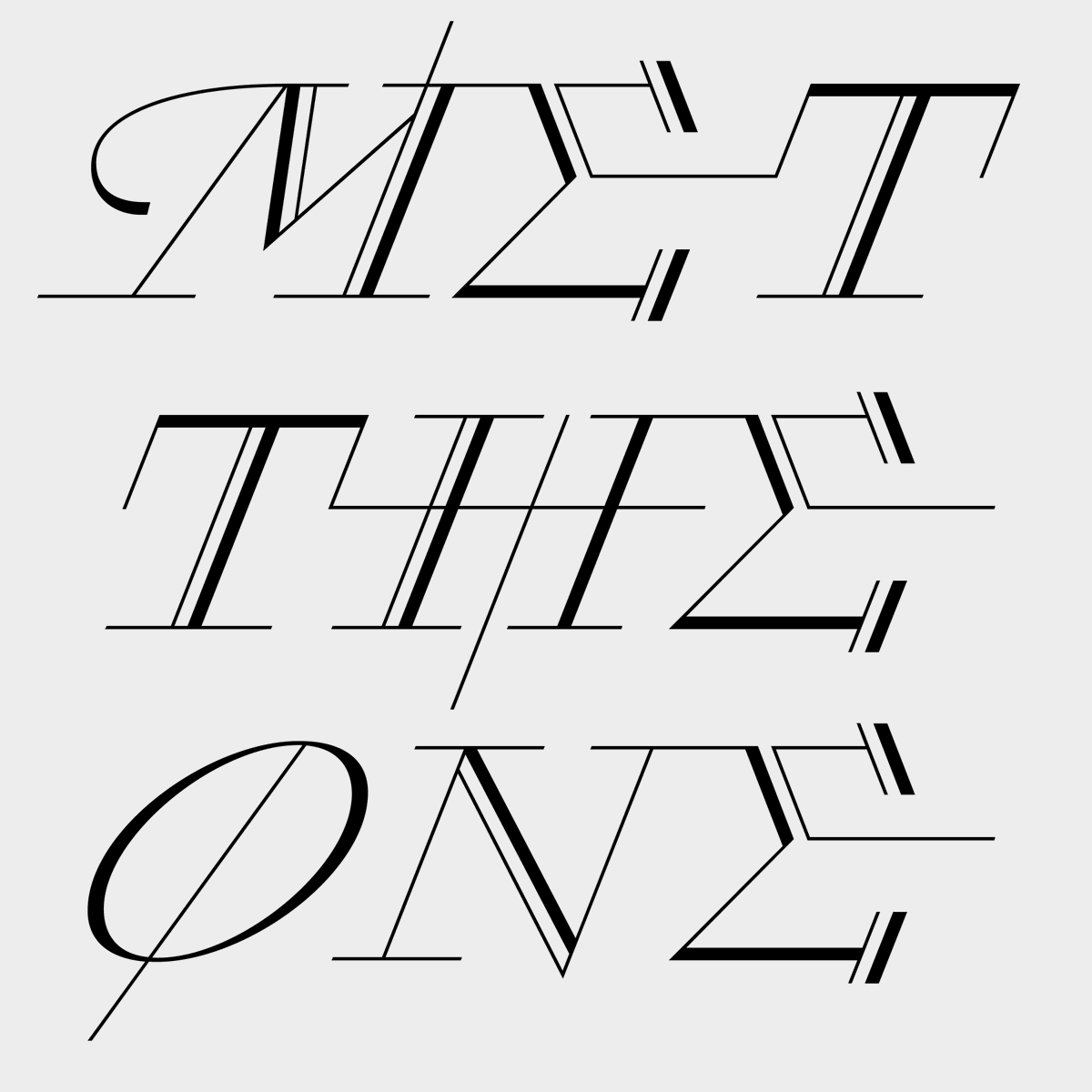
An earlier version of Raskal Oner was initially shown in our Type Life #2, published in 2017. If you want to spot the difference with the released version by yourself, some copies are still available on our Physical store: https://t.co/5kO2HyHlgY

1
0
6
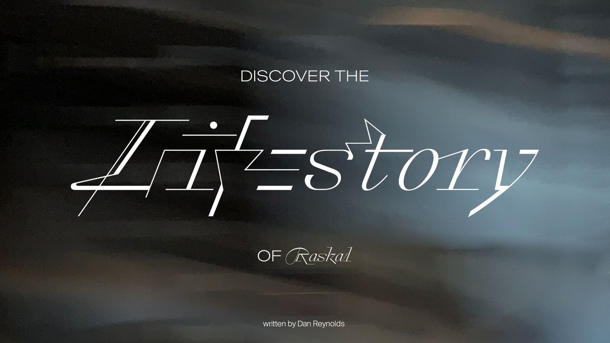
To properly tell the whole story behind Raskal’s design, we collaborated with type nerd and scholar @typeoff With great care and patience, Dan put the words to narrate the 10 years-long process that lead to the first Swiss Typefaces script font: https://t.co/7alqet3rkO
0
2
9
This release is the first one which has been engineered and produced by @arialcrime at Swiss Typefaces! His work on this project went far beyond any regular process (more on that later), and we couldn't have done it without him. Kudos to him! 🥇
0
0
8
🪶 What would a true Swiss Typefaces script look like? Raskal Oner Write is the answer. Discover today the result of a decade-long process of questioning the role, aspect, process of a script font born in a digital world: https://t.co/wKZDzHyzCX
1
5
64
Daria & @arialcrime are on their way to the @Fontstand conference… if they manage to overcome the Dutch train strike! Fingers crossed 🤞 Have a great conference everyone!
0
0
3
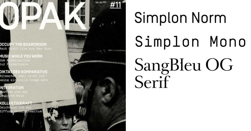
One of the first time Simplon Norm & Simplon Mono were ever used was for the German magazine Opak, designed by Adeline Mollard & Floyd E. Schulze. After digging out and scanning a few issues, we just published it on @FontsInUse :
fontsinuse.com
Opak was a German quarterly cultural magazine which ran from April 2009 to February 2012. Founded by Oliver Koch, the former bassist of Tomte, each issue of the magazine was focusing on a specific...
1
2
11
Nice packagings designed by Lukas Diemling using Simplon Norm.
0
0
5

[Publication] Le numéro 25 de la Revue de la Bnu vient de paraître ! Vous pouvez le retrouver dans les boutiques de la Bnu ou le commander depuis notre site. avec : @in_group @anrt_type @BLB_Karlsruhe et @swisstypefaces
#revue #journals #imprimeur #typographie #bibliothèque
0
3
4
New tiny piece of writing (and Staff Pick post) on @FontsInUse about the amazing cover design of Gogoj’s latest EP by @QINGYU_WU , using our KRSNA font:

fontsinuse.com
For the first solo record of Beijing-based cellist and multimedia artist Gogoj (also known as 盛潔, or Sheng Jie), designer Qingyu Wu conceived a very stark sleeve, using a combination of KRSNA...
0
1
6
Moscow born Daria Petrova is a type designer based in Berlin. Before joining Swiss Typefaces, Daria worked at LucasFonts and attended the TypeMedia course. Her after work creations can be found at FutureFonts, where she offers free licenses for death-related uses of her fonts.

0
1
10

Euclid – Typeface Mystery No. 1 is available at Physical:
1
0
1
The Euclid Typeface Mystery specimen AND a book set in Euclid Flex 😳 Thanks Jim!
1
0
3
Book bundles, new custom projects and announcements regarding 2022: all of this is in our latest Newsletter! Read it online:
0
0
0
The team has expanded again! Talented type designer, cat lover and gravestone enthusiastic Daria Petrova has recently joined our Berlin office. We are really happy to welcome her, and are thrilled for the upcoming times and projects by her side.

0
0
23