Fonts In Use
@FontsInUse
Followers
33K
Following
1K
Media
576
Statuses
4K
Type at work in the real world. Fonts In Use is an independent archive of typography. Moved to Mastodon. Visit https://t.co/1AhMUjB7ko to contact and follow us.
Oakland, NYC, Den Haag, Berlin
Joined September 2010
The Fonts In Use team unanimously condemns the assault on safety, security, and basic humanity continually displayed by Twitter’s new ownership. We loved it here, but can no longer justify engaging in this platform. Find us at and
7
9
60
RT @FontsInUse: The Fonts In Use team unanimously condemns the assault on safety, security, and basic humanity continually displayed by Twi….
0
9
0
We do use our own cookies for basic, anonymized metrics (using our own install of @matomo_org), and for storing your log-in state and preferences.
1
0
4
Here’s a little info about the third-party cookies on . There are none. Last year, as our team discussed GDPR conformity, we agreed it was easier and better to drop any need for cookies than to have an opt-in popup. Receipts:
themarkup.org
A Real-Time Website Privacy Inspector
2
1
39
Featuring examples cataloged on Fonts In Use:
fontsinuse.com
The front of a book. See also book jackets, or see book covers and jackets in a combined search. Related: back covers, book spines, book interiors, title pages.
They say not to judge a book by its cover, but a great cover helps readers forget that advice. Here are ten excellent covers that prove the importance of high quality typefaces and typography. 👉 See the list and read the article here:
0
1
9
RT @fontwerk: Huge thanks to @FontsInUse for featuring the Berlin Fire Brigade campaign as a staff pick. It features Change our newest addi….
0
1
0
RT @sarahfisherco: Eeeek thank you @FontsInUse for featuring my magazine design - we chose Study as the main body text for the magazine and….
fontsinuse.com
Sarah Fisher designed Connect, a quarterly magazine published by Christ Church Southhampton. She writes on her website: The magazine is designed to have a handful of short articles paired with a...
0
1
0
RT @duncanblachford: Stoked the design for this LP was selected as a ‘Staff Pick’ over at @FontsInUse 🖤. #recordcoverdesign #recordcoverart….
0
1
0
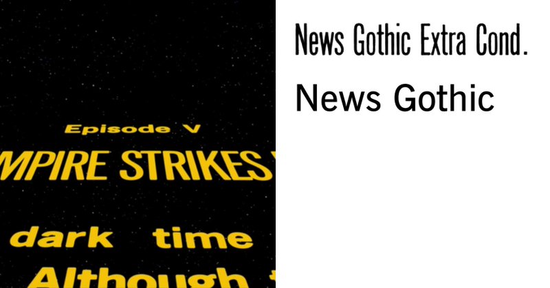
Tonight, our co-founder @NickSherman talks Franklin Gothic at @CooperType! As a surprise for Nick, we just published a slew of FG in celebration:
0
0
9
☮︎ New in the Collection: the Aldermaston to London Easter 62 poster. Since Letraset didn’t include numerals for the largest size of Annonce Grotesque, designer Ken Garland had to create the missing glyphs himself. More:
fontsinuse.com
Poster for the Aldermaston to London march on Easter 1962, designed by Ken Garland. From Wikipedia: The Aldermaston marches were anti-nuclear weapons demonstrations in the 1950s and 1960s, taking...
0
2
5
RT @poem_editions: Almost in use. The Illustration Collection musée Tomi Ungerer by @gr20paris is a @FontsInUse staff pick ⚡️⚡️⚡️. https://….
0
1
0


