

Martin Pring
@martin_pring
Followers
9,579
Following
18
Media
108
Statuses
189
Technical Analyst, Publisher of The Intermarket Review at , Chief Strategist at and Chief Technical Strategist at
Florida, USA
Joined May 2017
Don't wanna be here?
Send us removal request.
Explore trending content on Musk Viewer
Hamas
• 932877 Tweets
México
• 350782 Tweets
Ali Koç
• 259419 Tweets
Colombia
• 179294 Tweets
#precure
• 73449 Tweets
Crazier
• 72491 Tweets
ロックの日
• 40225 Tweets
Gremio
• 38330 Tweets
#仮面ライダーガッチャード
• 37210 Tweets
Kabir is God
• 33652 Tweets
プリキュア
• 32008 Tweets
#ブンブンジャー
• 25772 Tweets
Pence
• 25742 Tweets
#UFCLouisville
• 24462 Tweets
ドナルド
• 21805 Tweets
リリアン
• 19138 Tweets
ユキまゆ
• 13256 Tweets
まゆちゃん
• 12248 Tweets
ギギスト
• 10530 Tweets


Pinned Tweet

Arrows show upside reversals in the Coppock Curve for PPI Finished Goods is usually followed by an up wave in CPI inflation. March upswing likely to extend in April due to firm commodity prices. Go here to article on why Fed likely to raise not lower rates

5
8
39
Anyone expecting the June lows to hold may be disappointed. This chart shows that recession associated lows for inflation adjusted stocks occur with or after rate cycle peaks. Perhaps it's different this time? Though I doubt it!

30
120
510
The vertical lines show initial YC inversion. Since equities discount the economy and inversions precede recessions, an inverted curve increases the probability that stocks ultimately end up lower than when the inversion initially took place. Just look at the arrows!

27
50
194
The indicator in the bottom window of the chart has called every secular peak in the stock market since 1900. For the full article entitled "Burglar or Bank Robber? Watch Your Wallet and Stock Portfolio!" Go to

8
29
185
April saw our Financial Velocity Indicator trigger its eighteenth buy signal since 1965. Only two of those failed, so we think those are good odds to work with!
For more like this check out the Intermarket Review at

8
40
148
Core inflation breaks out from 20-year trading range. Time to start yelling? No, time to stop Yellin!

7
42
133
Looking for a rate decline to stimulate stocks ? Think again. 6 times since 1964 the FF rate has hit a cyclical peak. Stocks declined because of a weaker economy. The 3 exceptions were preceded by a bear market. Either way stocks decline so pray for stable rates

10
47
130
Our Real Interest Rate model for gold has just gone bullish. It could have massive implications for the gold price and inflation. For a deeper explanation of the attached chart please go to

2
35
130
Gold Breaking to the Upside
It looks like gold is getting ready to resume its bull market. Today it broke above the correction down trendline, the RSI down trendline and experienced a KST buy signal.

4
30
117

Expanding margin debt is bullish because it means improving confidence and more money flowing into equities. The vertical lines show when the smoothed momentum (KST) triggers sub-zero buy signals.
Its current bullish subdued level argues for a multi- month rally.

4
25
100
My inversely plotted secular commodity oscillator just triggered a buy signal. Historically this has spelt trouble for inflation adjusted stocks . This chart and many like it form part of my 2022 IFTA/StockCharts outlook presentation at

2
36
99
This chart tells us the position of the long-term trend in 2024 is similar to the politically unstable year of 1968. To read the complete article go here

5
24
96
The 12 month Rate of Change for the S&P 500 is posed to cross above 0 after having a drop below -5%. Historically that has almost always been bullish.
$SPY

3
40
82
There have been two major trend breaks in US stock performance vs the World since 1992. The third is right at the 104-week (2-year) MA and secular up trendline. An oversold bounce is likely now but stay tuned for what could be a major signal of forthcoming US underperformance.

2
24
80
My Global Commodity Index is in a bull market as both it and the KST are above their MAs. It faces a really big test at a 40yr resistance trendline marking the top of a potential giant consolidation pattern. Valid upside break would imply higher commodity prices for years to come

4
27
76
Oil breaks 2008-21 down trendline which should enable an oscillator secular buy signal. Using the 2020 low offers an improbable upside objective of $500. The green arrows suggest a more attainable but still shocking $250. For more see the Feb

4
28
71
The commodity/bond ratio is the ultimate inflation/deflation relationship. It’s fallen to support from a deeply oversold condition. Usually the ingredients for an inflationary rally.

3
27
59
If inflation is a transitory problem due to base comparisons, why are these various ROC's for Core CPI with vastly different time spans ALL breaking out?

1
22
55
This looks like a classic bearish key reversal bar to me. Possibly the end of the bull market since the 12-month ROC for 20-year yields is very overextended.

6
17
53
This indicator has called 6 previous secular peaks in inflation adjusted stocks. It is still bullish but starting to very slightly flatten. For other secular indicators that are not so positive read our article at this URL.

4
5
53
The price oscillator comparing a 3-to a 24-mth MA for part time employment has likely peaked. Most previous reversals signaled an end to the recession. All but 2001 were great equity buying opportunities.

6
9
50
A bottom in the price oscillator has consistently called an end to the recession. With the country continuing to open up, May’s uptick will likely be the first stage of a reversal. Au revoir recession!

6
15
47
Industrial commodity prices look as if they are close to triggering their sixth buy signal since 1840. The ellipse indicates there has only been one false signal. Not bad for 200 years of data. Follow this chart regularly in the Intermarket Review @ .

2
19
47
@DavidCoxWG
Here is the 12 ROC back to the civil war. Not exactly a great buying opportunity!

4
8
48
This chart shows improvement in confidence leads economic recoveries. To read more about it and read a brief article "A Funny Thing Happened on the Way to the Recession", please click on the link below.

1
14
43
Bitcoin completes a massive top. For our in depth article on "The Bursting of the Tech and Bitcoin Bubbles Part II" try this link

6
12
45
The 15-month ROC of the CRB Spot Raw Industrials has bottomed. Most oversold ROC reversals were followed by a bull market. To see bullish commodity indicators from the economy, bond, stock and currency markets, go to for a concise article.

2
8
44
The ratio between commodities and bonds is arguably the ultimate inflation/deflation relationship. It has completed a 20-year top, and is right at the secular support line. See our Intermarket Review for more like this.

2
14
43
The vertical lines tell us when the indicator bottoms out from close to or below the -5% level. There were nine examples of a sub -5% reversal. The average annualized gain over 12-months for REAL stocks was 16.2%. Buy hold was 4%.
Read article here

2
9
43
@McClellanOsc
@McClellanOsc
's Ratio-Adjusted Summation Index is nearing +1000 today . In the last 20 years the only other time it has moved directly from -1000 to +1000 was the March 2009 bottom. In January 2016 it bottomed around -800 -> +1200 (same magnitude but from a higher start point)

4
16
43
When will the slowdown end? I constructed a price oscillator, by dividing a 6 by a 15-month EMA of the ECRI Weekly Leading Economic Indicator. The Price Oscillator usually reverses to the upside prior to the end of the slowdown. It’s still declining.

2
15
42
We have come from an ultra-easy monetary policy where inflation adjusted M2 expanded at a 25% clip to a very stingy negative -5%. A recession has followed every negative 18-month growth, except 1951. Not every recession though, experienced negative real money growth

0
15
39
This chart shows the ratio between the NASDAQ and Oil has reached bubble proportions. To learn more go to our article Timing the End of The Tech and Bitcoin Bubbles
also historical charts

2
16
35
This chart shows one reason for being bullish once the current correction has run its course. To read “Five Reasons for Being Bullish Despite a 60% Advance” go to

1
14
39

Peaks in the ratio comparing the VIX to the 10-year treasury yield that develop at or beyond the green line are either followed by an accumulation pattern or an immediate advance. Thanks for drawing it to my attention.

2
8
36
Tech dominated NASDAQ heading for a H&S breakdown against energy as pressured by short-term momentum. Long-term already bearish. More regulation for both likely to have opposite effect on their prices. Wait for the break!

1
16
34
Here’s a ratio between the VIX and the 10-year yield. When rising, it reflects fear as the VIX is firmer than yield. Green trendline breaks are bullish red bearish. Ratio is caught between 2 lines, so a decisive breakout may signal the direction of the next important market move.

1
9
34
Is it different this time?
Our Commodity model has just given a buy signal but this has been preceded by a trend of rising rates. Invariably rates have fallen prior to previous signals reflecting an injection of liquidity. Will this put a cap on the bull market?

3
9
32
The long-term momentum for ISM New Orders has turned up. The green vertical lines flag previous examples. The S&P typically celebrates with a nice rally when this happens.

6
12
33

This chart suggests that commodity inflation has only just begun. For a complete explanation of the chart and an article entitled “Impending Super Cycle Commodity Signal Argues Against Transitory Inflation” go to

0
12
33
ECRI Weeky LEI is breaking out and so is its momentum. This suggests the 18-month slowdown is over. For more timely indicators like this check out my Intermarket Review @ where a special deal awaits

1
10
31
Tune in to my mid-year outlook with Bruce Fraser

3
5
28
The gold/ bond ratio discounts swings in the CRB. When expressed as momentum it calls the vast majority of important commodity reversals. Red arrows show sell signals. It went tentatively bearish in August with a downside marginal MA cross.

1
11
28
The MSCI World ETF (ACWI) is below its MA as is our derivative of the OECD amplitude adjusted LEI. That earns a red highlight and suggests that the green trendline, which was formerly resistance, will now reverse its role to support thereby limiting any bear market 20-25%.

0
6
26
This tech/energy relationship has broken down. Both industries are under regularity pressure. That for tech is likely to harm margins but restrictions on energy will create shortages sending up the price. Note all momentum is bearish. Ergo, the decline in the ratio will extend.

2
5
28
This coffee chart could be on the verge of telling us we are going to pay more for a cup. Go to or click the link below and download our complimentary historical chartbook for more charts like this!

0
5
28
The Boom Bust Barometer is calculated by dividing the CRB Spot Raw Industrials by initial claims for unemployment. A rising ratio reflects a growing economy and vice versa. When momentum turns up it signals the end of a recession or slowdown.
#economy

0
5
27
Our Leading Economic Indicator has reached an estimated new post-recession high. To find out the true implication of this strength view my latest blog post
#recession
#StockMarket
#economy

0
5
28
July will mark the 108th month of the economic recovery, making it the second longest expansion in history. Another 12-months and it will be the longest ever. Could it be that the business cycle has finally been repealed?
My latest take
#economy

0
13
24
@mark_ungewitter
Thx for sharing Mark!
We identify the stage with our Pring Turner barometers. They are constructed from proprietary technical, and inter-market relationships. At this point they are wavering between stage 6 or stage 1, but could change quickly given the volatility! Stay tuned!
2
1
25
Chemical Activity Barometer Update: Currently sitting on 18-month MA. No slowdown has ever decisively crossed below this MA (not even 1966). All decisive crossovers turned out to be recessions. Confirms: slowdown in the bag but what about recession?

0
6
22
Some leading economic indicators are hinting that the slowdown may be terminating,like the one shown here.
To find out more go here.

1
5
19
Momentum of the Chemical Activity Barometer peaked this summer, and the CAB itself has started to drop, and is now slightly below its 12-month MA. Where momentum turns up from will likely determine if we are in a slowdown or recession.
#economy
#slowdown
#recession

1
13
20
Link to 2021 outlook presentation on StockCharts TV

0
10
19
Global Diffusion monitors a basket of county indexes in a positive trend. It has given 13-buy signals since 1969, all but one were valid. It’s very close to
#14
but needs a more strength to clear its MA. Durability of June rally clearly critical.

2
4
17

When gold is outperforming commodities, it is discounting future inflation. When the ratio’s KST peaks a commodity rally typically becomes a reality. The KST has peaked again. Surprise, commodities have also started to firm up. For more see

0
5
18
This chart shows that our Master Economic Indicator has reached a downside record, as M2 has begun to expand at a record rate. For a deeper dive and to see another chart signaling recession, go to

1
5
16
Housing Sales/inventory KST crosses above zero. Vertical green lines show that has usually signaled the end of a recession (red highlights) or slowdown (gold highlights).
#housing
#economy
#recession

0
4
16
My pleasure Brandon! Thank you for being a loyal follower!

Went out to the mailbox and was thrilled to receive a signed copy of “Investing In The Second Lost Decade” from technical analysis legend
@martin_pring
.
Thanks Martin! 🙏
If you don’t have at least 2 or 3 Pring books on your bookshelf, you’re missing out. 📚
#StandUpGuy

5
3
21
0
5
16
Early last month gold broke to the upside but failed to hold. Today the price joined the Gold Shares in a strong breakout. New bull market highs ahead?

1
9
16
The Gold/bond ratio has broken out and the KST is bullish. The solid arrows show that the ratio usually leads commodities. The ratio’s multi-year high and its reluctance to follow the post 2018 commodity decline argues strongly in favor of higher commodity prices.

0
2
15
@BrandonVanZee
Thanks for sharing with your followers. Indeed our indicators place us in stage IV
As a token of my appreciation I will give away a free copy of my latest book (Investing in the Second Lost Decade) to the first 5 followers that like this tweet and DM me their mailing address.
2
1
16
Economic growth is chugging right along on a slow but steady path higher, supporting the positive investment backdrop.

0
2
14
Our current business cycle models are in fact in Stage IV. The latest
signals, while still marginal in nature, are consistent with the expected chronological business cycle progression. This is where capacity tightens, inflationary pressures build and interest rates rise.
Ladies and gentlemen, we’d like to welcome you to Stage IV. As we approach Stage V, we’d encourage you to fasten your seatbelt & tighten by pulling on the loose end of the strap. Please look around for your nearest exit. In some cases, it might be behind you. 🔄
#BusinessCycle

7
30
76
1
6
15
This chart shows rising starts momentum as part of the biz cycle sequence. For our complete article go here

2
5
15
To see more charts like this and read the full article making the bullish case for commodities please go here:

0
6
15
Our World Bond Index falls to its secular trendline. The bearish KST argues for an eventual break, which would be one key piece of evidence that the secular bull market is over. See unique indicators like this in the Intermarket Review

1
11
14
The Chemical Activity Barometer (CAB), a composite leading economic indicator, published by the American Chemistry Council is breaking out of a trading range, which is typically a good sign for the
#economy

3
3
14
I have an imposter! Please report
@martin_pring_
I would never DM you about a “trading system”
Thank you
@vanhorn64
for bringing this to my attention.
2
3
13
Stocks experienced a correction in February after a steady 15 month rally. Does this recent bout of volatility change the long-term positive outlook for the stock market?
Last week I participated in a webinar that discussed this topic and more.

0
5
14
@BrandonVanZee
Also I will be discussing the recent stage IV change in our upcoming free webinar on Thursday March 15th at market close.
For more information or to register click the following link
0
3
13
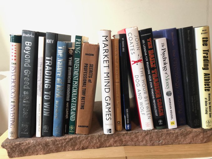
Thank you Brian for including Investment Psychology Explained on your bookshelf!

These are the trading/investing psychology books I own in hardcover
33
56
455
0
4
13
Part-time workers expand in a recession or just prior to it. When this ratio rallies it tells us that wages are rising at an unhealthy pace because they are pushing up the number of part time workers, which is bad sign. No sign of a recession... yet.
#economics
#employment

2
9
12
Rig count momentum suggests that probabilities favor a peak in oil prices.

0
5
11
My bottom fishing indicator is approaching levels where historically the stock market has seen an intermediate bottom. Will be telling for the primary trend to see how this plays out in the weeks ahead.
#StockMarket

2
2
12
I enjoyed presenting my 2020 business cycle outlook with
@rdwyckoff
and the Technical Securities Analysts Association San Francisco.
Don't miss out, the recording is available at for limited time only.
#stocks
#bonds
#inflation

Free Webinar Tonight: 'Market Outlook 2020 with Joe Turner and Martin Pring' This is a New Years Tradition at TSAA-SF. This is the Kickoff event of the year. These legendary Business Cycle analysts share their wisdom and research for 2020. Register at
0
1
1
0
4
11
Wells Fargo Housing Sentiment peaks well before recessions. It coincides or leads housing starts and poised to break out. A KST uptick and a trendline break by the price oscillator suggests it will. For more leading housing indicators please go to

1
3
11
There is little doubt that the US economy is in a slowdown. The question, is “How will the economy emerge from this slowdown?” Will it be with renewed growth like 2016? or Does it fall into a full-blown recession a la 2007?
#Economy

2
6
10
University of Michigan Consumer Sentiment breaks a trendline to the downside, and momentum (KST in bottom panel) is showing a negative divergence. Most recessions have begun with the KST below zero but not every sub-zero crossover caused a recession.
#sentiment
#economy

0
6
9
This coffee chart could be on the verge of telling us we are going to pay more for a cup. Go to or click the link below and download our complimentary historical chartbook for more charts like this!
0
2
10
Thank you for bringing this to my attention. Please report.

@martin_pring
you have an impersonator / scammer (
@martin_pring_
). Reported. Please do the same. Thanks!

0
0
0
2
1
8
NYSE at record highs as the market is coming off an oversold condition.
My latest post discusses what I think this means for the stock market. $NYAD

1
3
8
Using the ECRI coincident Indicator data...all recessions have been signaled with the 9 month moving average of the 1 month ROC at or slightly above 0.
But not all 0 related drops have resulted in recessions. Little margin for error on this.
#recession
#businesscycle

0
4
8
A repeat of 2007 seems unlikely because housing is now rallying and not leading the economy lower.

0
3
8
This chart strongly supports the economic slowdown thesis. ROC has broken trend and previous peaks have mostly corresponded with the start of beige slowdown highlights. A slowdown is defined as a downward sloping Chemical Activity Barometer KST that is not followed by a recession

1
5
9
Thank you for the kind words and
#FF
@SamanthaLaDuc
!

I have a secret to share...
I have learned more about Intermarket technical analysis from Martin Pring than anyone.
#FF
0
2
15
1
1
9
While the Economic Cycle Research Institute's Weekly Leading Indicator holds steady

0
5
8
Looks like I was a month early...
The bond pendulum is starting to swing now. $TLT
#bonds
$tnx

0
2
8

Swings in credit spread momentum, signal changes in confidence levels that affect the economy. Currently this ratio its declining, consistent with a slowdown scenario. Today, confidence looks to be a long way from its usual sub-zero reversal.
#Economy

0
5
6
You're very welcome
@clair520
!

@martin_pring
Thank you Martin for the signed book! You're the Best! Everyone should have this bestseller on the bookshelf.


0
1
5
1
2
7


Conference Board Leading Economic Indicator (LEI) slips slightly

1
3
6