

Leslie Shapiro
@lmshap
Followers
1K
Following
791
Media
123
Statuses
604
Graphics, data viz, words and code @washingtonpost // Trying to be a little bit better every day
md/dc
Joined May 2009
i have no idea what this console error means, but damn does it cut right into my existential anxieties
1
4
32

In yesterday's @washingtonpost we published a portion of the known names of 18,500+ Gazan children killed in the war. We could only fit 18% of the names on these 2 pages — it would have taken 5 more pages to list them all.
1
9
10

Incredible work by @Timmeko @asteckelberg @lmshap @AdrianBlancoR and @sfrostenson visualizing every vote this presidential election as a grain of sand https://t.co/PqiBCooE4i
0
10
21

If the avg. American was in Gaza, this is what it'd mean for their family and friends. "After five months of war, seven would be dead." Powerful framing and statistics from @alyssafowers, @lmshap, @catebrown12, Hajar Harb.
washingtonpost.com
The numbers coming out of Gaza can be hard to comprehend. So let’s apply it to a smaller scale.
4
3
9
one of the most fun projects i've ever worked on :-) i built an interactive beat maker, using the extremely cool and underrated ✨Web Audio API✨, to help you *hear* the story of how reggaeton beats evolved (& make your own beats!). https://t.co/XBotX5FNMA

washingtonpost.com
Make and share your own beat to learn reggaeton history, from Jamaican dancehall in the early ’90s to dembow, the rhythm that propels so many pop songs around the world.

@daddy_yankee @LuisFonsi @wisin Make your own reggaeton beat using our virtual drum machine — part of an audible tour through the genre’s evolution, from Jamaican dancehall to dembow: https://t.co/lQKNYykZVv
0
1
4

Workers @washingtonpost have been in contract negotiations with our bosses for 18 months. But the company is refusing to pay us what we’re worth or bargain in good faith. So on Dec. 7, we’re walking off the job for 24 hours.
7K
1K
3K
got to spend a week answering a question i've long had. the answer, as you might expect, is much deeper than i imagined: https://t.co/SH8igOtDKh (also i got to draw lots and lots of leaves!! 🍃🍂)

washingtonpost.com
Leaf shapes vary from place to place. But did you know that the place helped create the shapes?
2
2
15
Some tech notes for the nerds: I built the viz here in plain old canvas/javascript (in React), with a RAF loop for animations: https://t.co/Fqf6CnlyHS I tried *a lot* of implementations (SVG, P5, animation libs). This was by far the most performant and easiest to manage!
washingtonpost.com
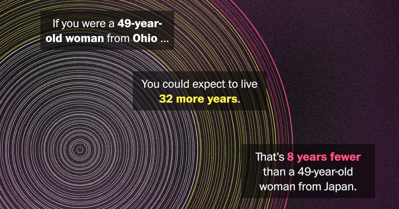
Plug your age and gender into our life expectancy calculator to compare yourself with peers overseas. Find out why so many do better than in the United States.
When generative art makes the A1 :) Sunday's front page was our story on the U.S. life expectancy gap, feat. a print version of the generative rings I built for online. You can see your own personalized version of this viz in our online story: https://t.co/Fqf6CnlyHS
0
1
3
When generative art makes the A1 :) Sunday's front page was our story on the U.S. life expectancy gap, feat. a print version of the generative rings I built for online. You can see your own personalized version of this viz in our online story: https://t.co/Fqf6CnlyHS
0
10
28
this version of the link is an especially fun one to click :-)
washingtonpost.com
Fonts can dramatically shape what you communicate and how you read.
0
2
3
the wapo paywall is off until thursday (!!!) and we have this HOT NEW STORY about FONTS just in time 😉
washingtonpost.com
Fonts can dramatically shape what you communicate and how you read.
1
7
33

We're those weirdos. Our latest: What’s your type? How fonts change the way you read and write. https://t.co/eXV5NQLfns
washingtonpost.com
Fonts can dramatically shape what you communicate and how you read.

I do not give a flying FUCK about Fonts... Weirdo shit.
0
29
31
The World population has just reached 8 billion people. @sadbumblebee @lmshap @RubyMellen and Hailey Haymond worked on this big visual story that includes a calculator to check how many people like you are int he planet (I'm one in 367,900) https://t.co/caQZAfFV6Y
2
12
35

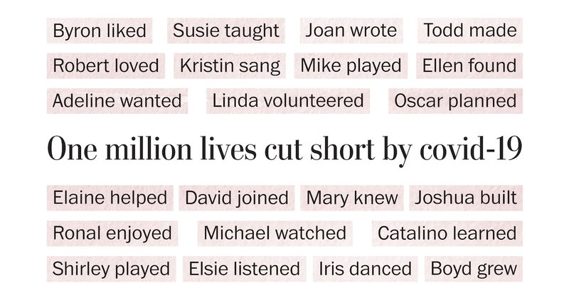
“Cut Short” by @alyssafowers + @lmshap of the Washington Post reads like a story, introducing a fraction of the 1 million individuals who died of COVID. @ClaireESantoro's interview explores this powerful work and the choice to visualize #qualitative data

nightingaledvs.com
In May 2022, the U.S. hit the grim milestone of 1 million COVID deaths. Newsrooms across the country reported this statistic, often accompanied by sobering charts that pointed out the incomprehensi...
0
6
11
🚗⛽️ Planning to hit the road on Memorial Day weekend? We built a gas calculator that tells you how much you’ll pay at the pump (spoiler alert: it’s a lot more than in pre-covid times!). https://t.co/sNtkTmE5nj w/ @lmshap @n_kirkpatrick @dataKateR

washingtonpost.com
After years of pandemic isolation, people are planning summer travel near pre-pandemic levels. But their wallets won’t take them nearly as far.
2
3
7

Every victim of covid-19 had their own joys and hopes for the future. @lmshap and I marked one million deaths from covid-19 by writing about one person who died each week of the pandemic: what they loved doing and what they wanted to do next.
washingtonpost.com
Remembering one person for each week of the pandemic: what brought them joy and what they wanted to do next. And how that was cut short.
2
41
83

The Post identified 1,550 parents who had been gunned down across 20 cities in 2020, leaving behind 3,621 children. @JohnWoodrowCox writes about this often invisible group of sufferers, with graphics by @lmshap
https://t.co/G5IsKMoFYS
1
2
7
New: an interactive look at racial demographic change since 1990, for every census tract in the country! https://t.co/nqVFRw0KJT

washingtonpost.com
A Washington Post analysis of newly released tract-level census data reveals the shifting racial composition of neighborhoods nationwide.
0
6
8
New version of a story we first did back in May, looking at the covid case rate when the vaxxed population is factored in. One big diff: In May, low-vax states were actually looking better than some high-vax states. With the delta surge, that's over. https://t.co/3N5d8UQsBB

washingtonpost.com
An analysis of adjusted rates for cases, covid-19 deaths and hospitalizations shows the country’s summer upswing is slamming the unprotected while others enjoy freedom.
3
3
6
new story with @dtkeating on a seemingly simple but overlooked covid rate issue: as more people are vaxxed, covid cases/hospitalizations are concentrated among the unvaxxed... which means their risk is actually much greater than general pop rates reflect.

washingtonpost.com
With the adjustment for vaccination, the national death rate is roughly the same as it was two months ago, while the adjusted rates in several states show the pandemic is spreading as fast among the...
0
6
19