

Tableau Public
@tableaupublic
Followers
71K
Following
3K
Media
2K
Statuses
6K
Share, create, and explore @Tableau data visualizations for free on Tableau Public. For more inspiration, view our #VizOfTheDay and connect with our #DataFam ❤️
United States
Joined March 2012
This #VizOfTheDay by @VizWithVictory provides a clear view of customer portfolios, tracking key metrics like customer acquisition, retention, and revenue trends. Explore the viz to see how data can be used to monitor and streamline business operations:

2
12
90

This #VizOfTheDay by @imperativusz explores the world's most common and contagious misconceptions for this #MakeoverMonday challenge. Explore the viz:

0
1
26
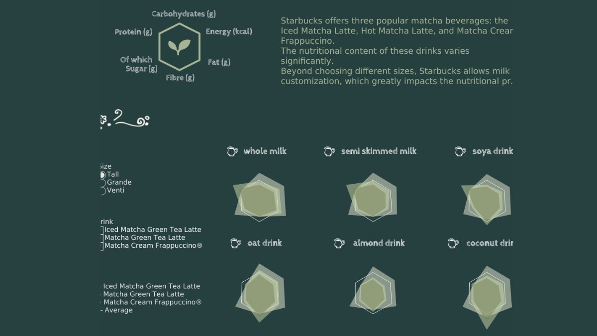
In this #VizOfTheDay, @izumi_0901_tab brought matcha beverage data to life through box plots—visualizing how sugar, caffeine, and calories vary by drink and size. Explore the #B2VB entry on Tableau Public.
6
8
60
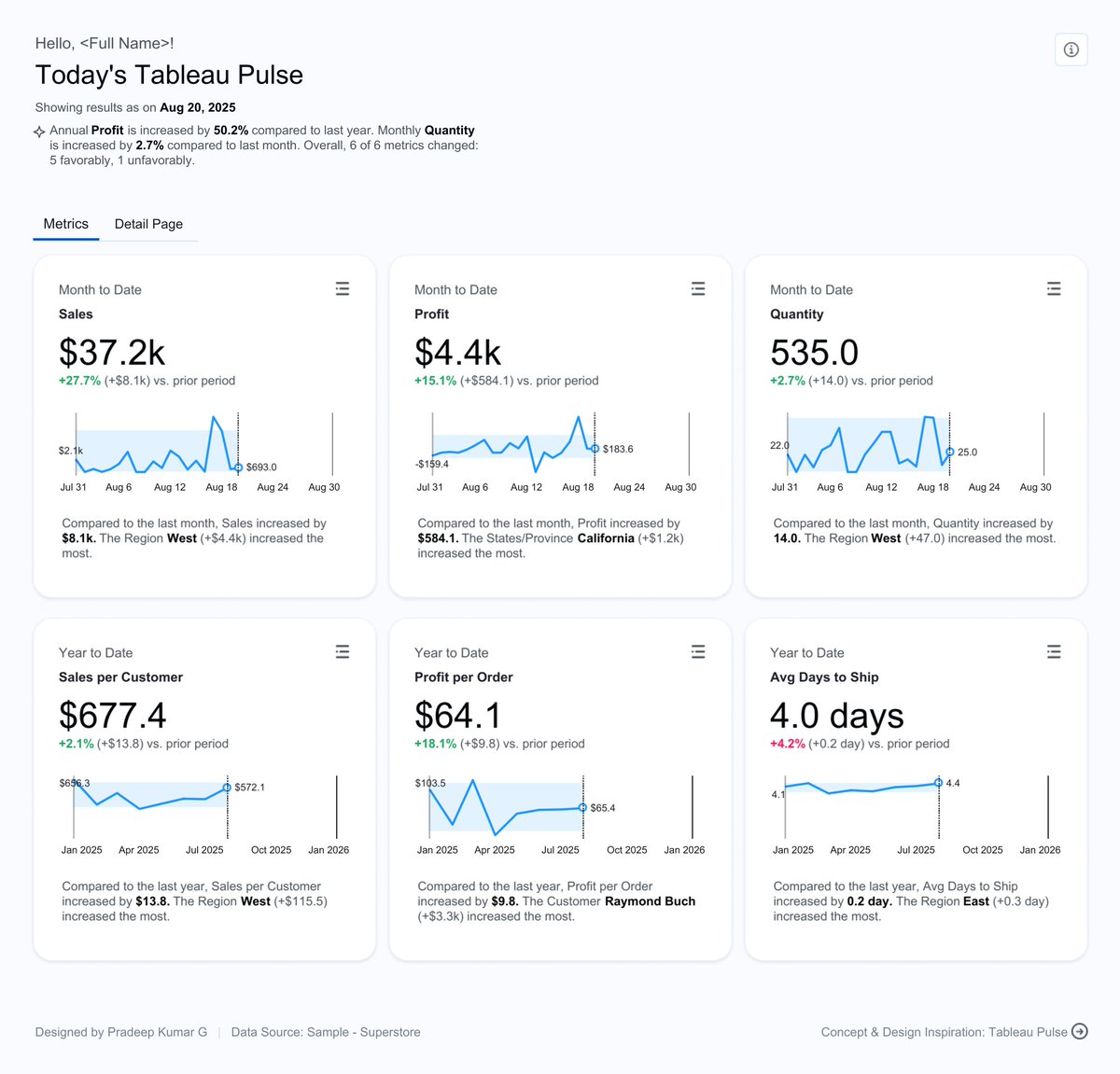
This #VizOfTheDay by @pradeep_zen provides a detailed analysis of sales performance across different categories and regions. Explore the viz inspired by the design of Tableau Pulse.
0
7
74
This #VizOfTheDay by @jreevers5 uses bubble charts, bullet graphs, and more to visualize Barbie’s journey from the toy aisle to the big screen since the 1950s. Explore the viz.

4
0
32
This #VizOfTheDay by Samuel Apanisile provides a clear, data-driven view of a client portfolio in the real estate finance world. Explore this dashboard to see how data can be used to track property performance, loan exposure, and revenue trends.

2
3
43

If you’re hunting for good news here’s something: Talkspace therapy is covered by most insurance plans and the average copay is only $15 (but most covered members pay $0).
33
98
803
In this #VizOfTheDay, Anindita Mitra explores the UK's energy demands and their sources of generation. Explore this #MakeoverMonday entry. Inspired by @DatavizChimdi.

0
0
36
This #VizOfTheDay by @fredffery is a perfect way to experience Tableau's new Map Viewport Parameter. The Spatial Sales Analysis dashboard allows you to filter sales data in real-time simply by zooming and panning on the map. Explore the viz and see this new feature in action:

2
0
31
Explore this #VizOfTheDay by @NicholasPillsb2 who visualized the results of an analysis of pronouns ascribed to animal characters in popular children's books across multiple decades using bar charts and a bubble chart. Explore the viz to see if you can spot some of your

1
1
22
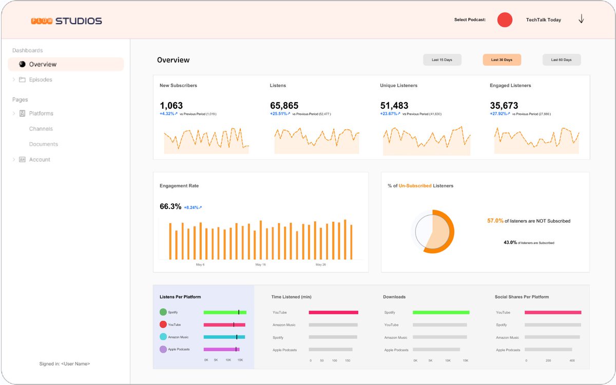
This #VizOfTheDay by @ud_analyst visualizes Podcast Analytics. This dashboard provides a detailed look into podcast performance, including listener engagement and episode trends. Explore the viz:
3
6
48
In this #VizOfTheDay by @LisaTrescott, watch a dashboard go from inaccessible to fully inclusive in 5 steps, with an epic makeover montage that applies key universal design principles along the way. Explore the viz:

4
6
60
This #VizOfTheDay by Jordan Bullington-Miller tracks her and her husband's daily steps in 2025 using a calendar heatmap. With a 10k-a-day goal, may the data be in your favor! . Explore the viz:

0
2
31

🚀 Dexmarket Beta V1 is here! . Launch: 08.27.2025 . What’s New:. - Smarter Trending section for better market insights . - Referral & Cashback program . - Advanced AntiScam Metrics
0
0
8
This #VizOfTheDay by @911xclusive and @gbolahaann is a shipment tracking dashboard that gives you a clear and interactive way to monitor your logistics. Explore the viz to see how data can streamline your operations.
3
7
47
In this #VizOfTheDay, Rubén Martínez provides a practical guide on how to effectively apply color across different KPI card designs. Learn from these examples and add a new technique to your Tableau toolkit. Explore the viz inspired by @VizWizBI.

0
9
93
This #VizOfTheDay by @bluedilphia uses a 3D relief map to visualize tourist movement across Poland, revealing where visitors outnumber locals. Explore the viz inspired by the 3D map work of @ShijiaWendy 👉

4
6
45
This #VizOfTheDay by @Kiwi_Mariner uses map layers to visualize historical cumulative rainfall in the Sunshine Coast of Australia. Explore this viz inspired by @datavizlouis ▶️

4
3
28
Explore this #VizOfTheDay by @trebor_rolyat visualizing key metrics from 50 cars involved in a cinematic heist. See Rob use map layers, tooltips, and animations for a compelling comparison.
4
2
23
This #VizOfTheDay by @datavizfairy uses line, box charts, and more to overview higher education admissions. Explore this business dashboard:

6
12
131
Explore this #VizOfTheDay by Jenil Mar Lin using various funnel charts to visualize candidate flow across recruitment stages. Viz inspired by Anindita Mitra.

3
14
187
This #VizOfTheDay by @El_Dabrah uses a map and a dot strip plot to visualize the 2025 life expectancy at birth projections from the UN World Population Prospects. Explore this #MakeoverMonday viz:

3
4
58