
Steve Schoger
@steveschoger
Followers
120K
Following
14K
Media
1K
Statuses
8K
Designer @tailwindlabs
Kitchener, Ontario
Joined January 2010
🔥 Excited to announce that Refactoring UI is now available! . It's everything we know about designing for the web, packed into a single comprehensive resource. Get it during the launch for up to 40% off 👉🏻.
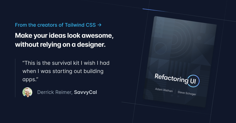
refactoringui.com
Learn how to design awesome UIs by yourself using specific tactics explained from a developer's point-of-view.
166
713
3K
Here's a peek at the Application UI demo for the new Tailwind CSS course we're putting together 🫣
8
6
171


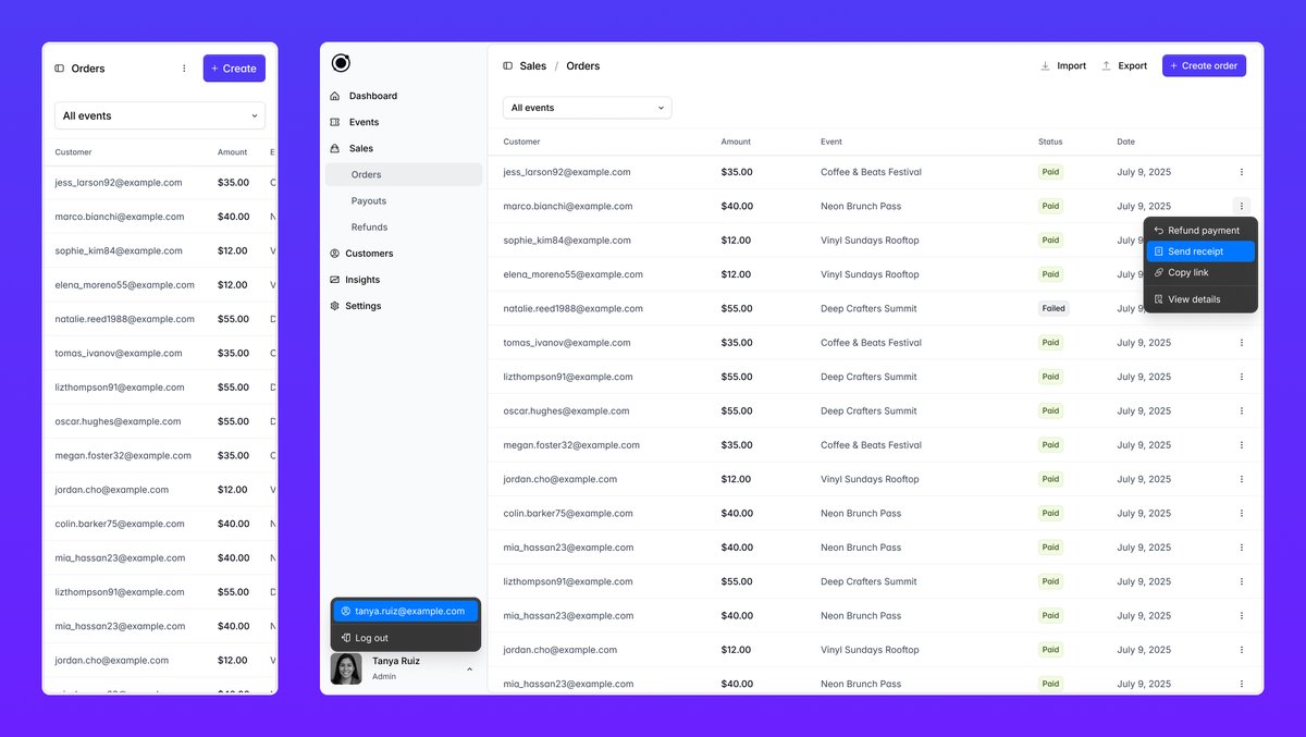
Finalizing the design for this checkout page demo for the new Tailwind CSS course we're working on 🤖

7
10
193
RT @DanHollick: Ever wanted to know how a screen works in excruciating detail? Well, you're in luck. First chapter of Making Software goes….
0
106
0
Putting together a few demos for a new Tailwind course we're working on 🎓

4
6
118
RT @adamwathan: Finally launched a sponsorship program for Tailwind CSS, with a bunch of cool perks ✨. 💬 Private Discord community to conne….
0
58
0
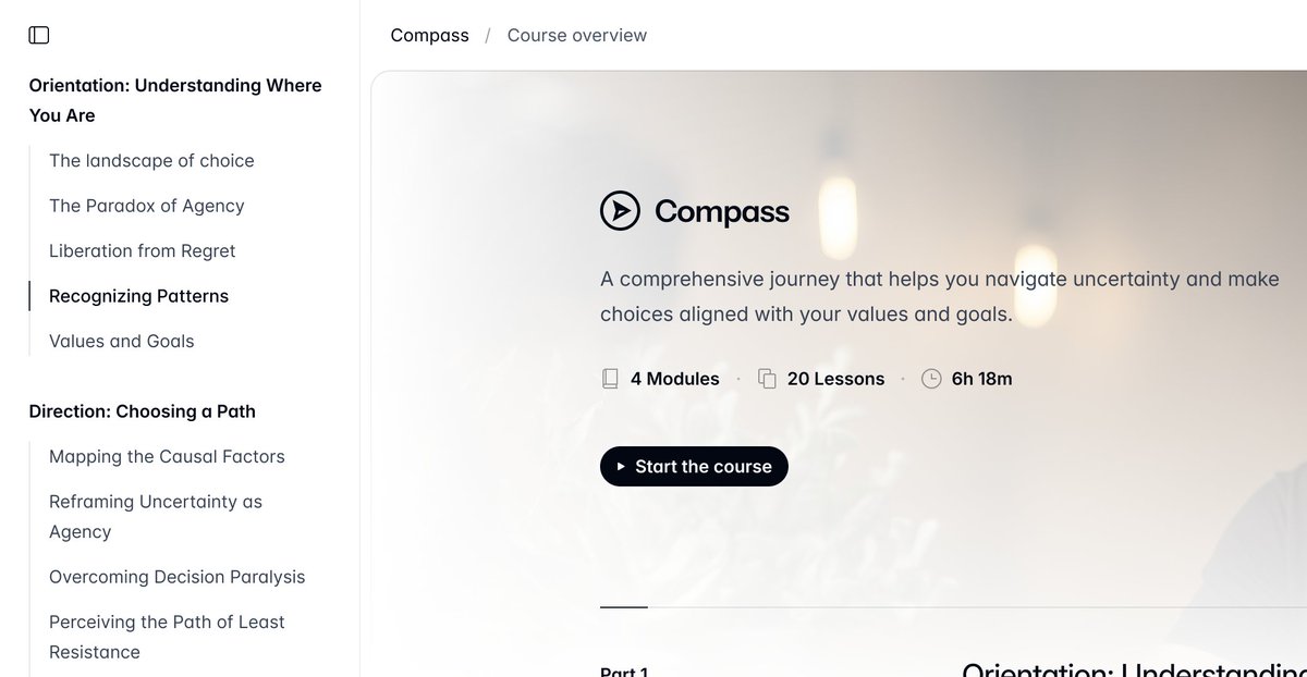
✨ New course template drops later today on Tailwind Plus. Stay tuned.
8
3
183
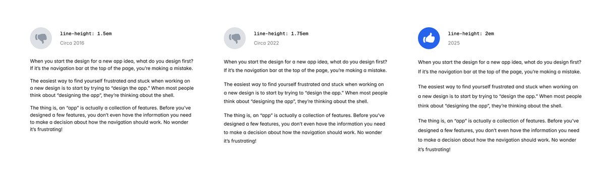
The older I get, the larger my line-height gets. Years ago, I defaulted to ~1.5em. Somewhere in-between I bumped it up to ~1.75em. These days, I’m defaulting to 2em. Surely, 2.25em is in my near future.
14
6
229
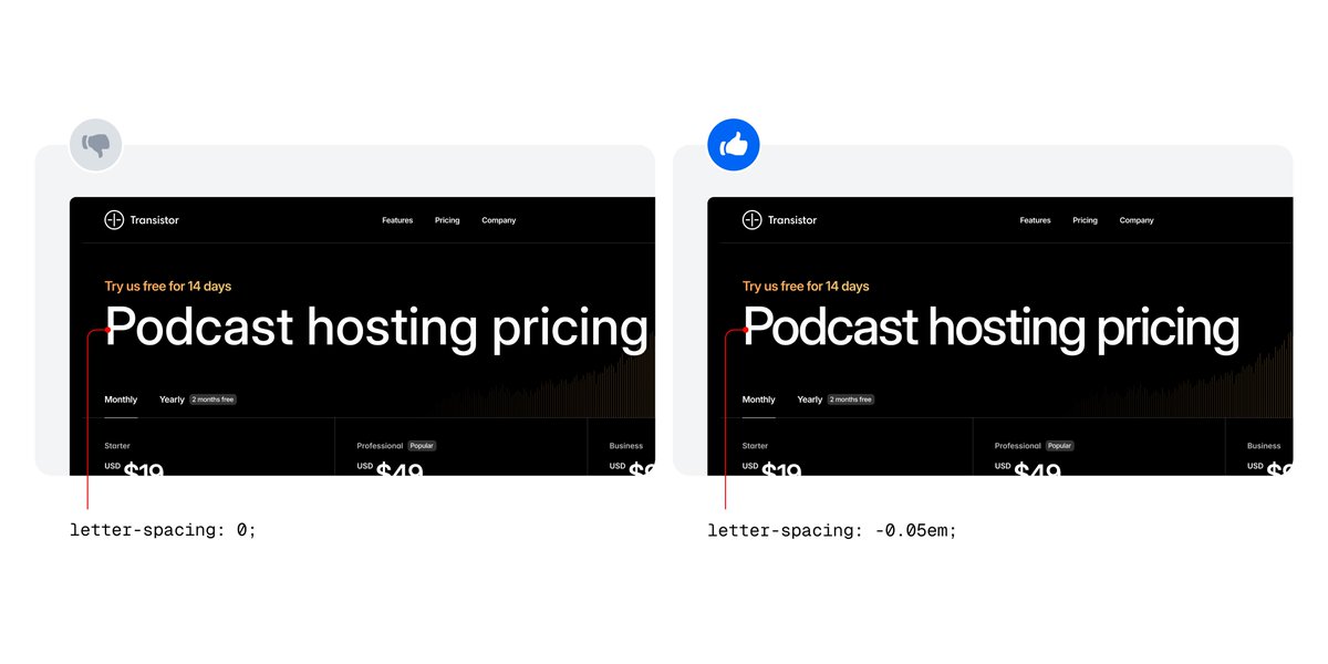
One of the most common things I see developers miss when building a design is letter-spacing on headings. It’s a subtle detail, but makes a big difference in polish.
15
16
318
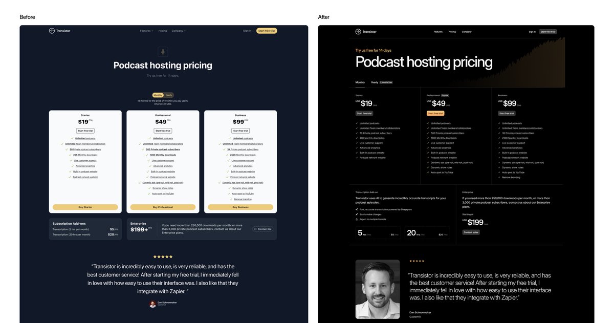
New Refactoring UI videos coming soon 👀. I currently have 3 videos in the pipeline and will start recording as early as next week. First one dropping will be the @TransistorFM pricing page. Here's a peek 🫣
13
13
310
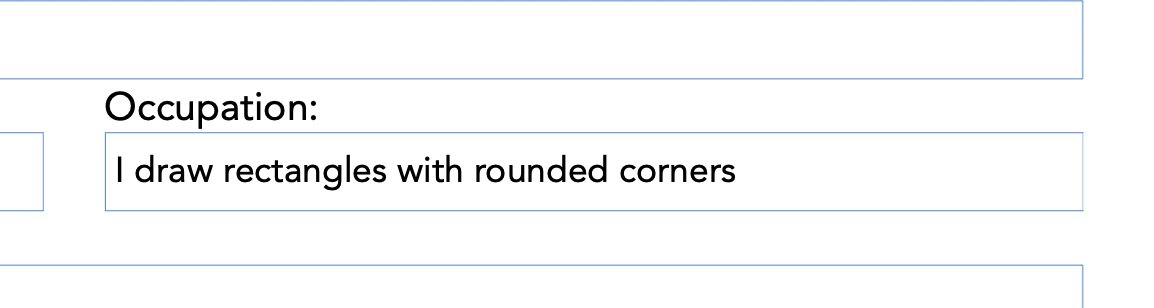
Tempted to write this every time I fill out a form with this question
8
8
144
RT @adamwathan: Me and @steveschoger have both been hungry for a bit of a change, so we decided to commit to working together in person ins….
0
2
0
Planning to reboot the Refactoring UI YouTube channel this year and I'm starting to collect some examples to redesign. If you have a design that you think would be a great example on the channel, I would love if you shared a link or a screenshot in the replies 🤝.
30
17
443
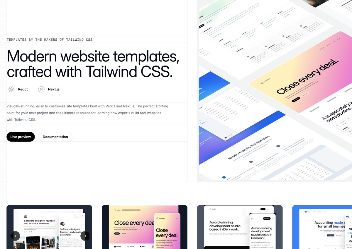
Yesterday we launched Tailwind Plus — something we've been dreaming up for a very long time. We've been working hard on the site design for the last few months and I'm really happy with how everything turned out. Check it out 👉🏻.

Today we shipped a big rebrand that's been in the works for way too long —. Tailwind UI is now Tailwind Plus ✨. Still one-time purchase, still the same price, just a new name with new possibilities.
9
1
156
I can't imagine what the world would like today if Apple went bankrupt in 1997. I don't think anything would look like what it does today if Apple hadn't set the bar for what good design and quality products look like.

In 1997, Apple lost $1 billion. Today, it makes $1 billion in 2 ½ days.

1
6
40