

Dan Hollick
@DanHollick
Followers
19,858
Following
309
Media
851
Statuses
4,235
design @raycastapp - tweets about design systems and tools. Framer course:
JHB → OSL→ LDN
Joined September 2009
Don't wanna be here?
Send us removal request.
Explore trending content on Musk Viewer
América
• 506515 Tweets
Sant Rampal Ji Maharaj
• 311501 Tweets
#母の日
• 195415 Tweets
#MothersDay
• 98649 Tweets
ヴィクトリアマイル
• 77492 Tweets
Newwiee Honey Teerak🩷
• 43854 Tweets
ストフェス
• 41710 Tweets
Chivas
• 38445 Tweets
Pachuca
• 36227 Tweets
カーネーション
• 35103 Tweets
Tatum
• 34404 Tweets
Roger Corman
• 29592 Tweets
Saint MSG Insan
• 26189 Tweets
ティアキン
• 17870 Tweets
ナミュール
• 17382 Tweets
4EVER LOVE MEW
• 16728 Tweets
Toluca
• 14856 Tweets
#LomaKambosos
• 13794 Tweets
Hannibal Lecter
• 12489 Tweets
Derrick Lewis
• 12264 Tweets
マスクトディーヴァ
• 10056 Tweets


Pinned Tweet

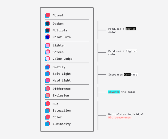
Do you just click different blending modes until it sort of looks right?
Well, that probably won't change after you read this but at least you probably won't use Lighten or Darken again.
(you should bookmark this thread and use it as a reference)
88
8K
30K
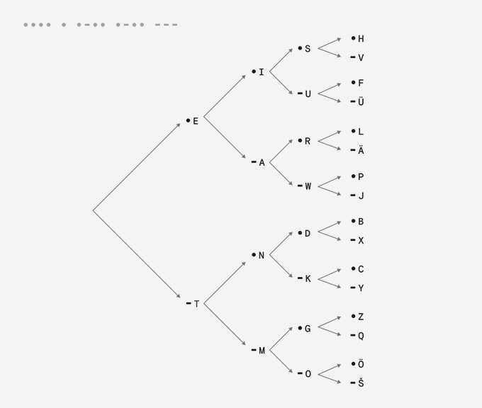
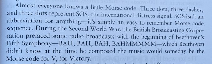
Morse code is designed so that you can decode it with this binary tree.
I just assumed people memorised every letter. 🤯
242
6K
43K
Ever wondered how a QR code works?
No, me neither but it's low-key fascinating.
(Warning, there is some extremely nerdy shit here.👇 )
253
9K
35K
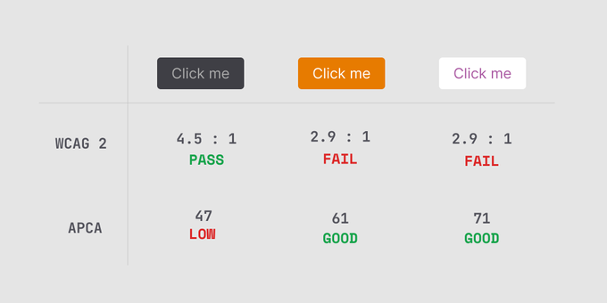
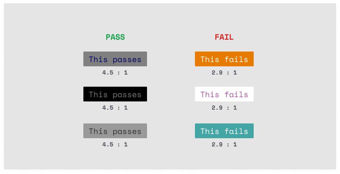
WCAG 3 will use a new color contrast method called APCA (Advanced Perceptual Contrast Algorithm).
It's a big improvement over the current system but there are a lot of changes to get your head around.
🧵
55
1K
5K
The way this works is super fucking clever

18
328
4K
How does a Large Language Model like ChatGPT actually work?
Well, they are both amazingly simple and exceedingly complex at the same time.
Hold on to your butts, this is a deep dive ↓
51
470
3K
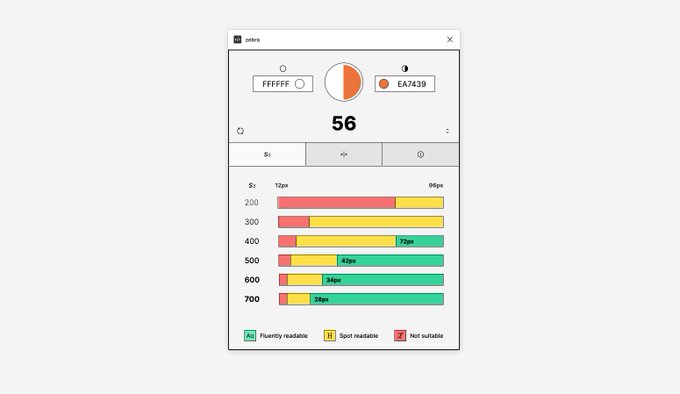
💡Have you ever wondered why the WCAG colour contrast ratio doesn't always seem to work?💡
Well it actually has to do with how we calculate colour contrast and is super interesting.
Hold on to your butts, this is a 🧵
24
767
3K
If you think about it, it's only 0.025 cents per pixel.
Basically free.
89
54
3K
I accidentally made something cool as hell.
(Twitter compression is going to really struggle here)
71
76
2K
Absolutely obsessed with this polar coordinate colour palette generator.
17
244
2K
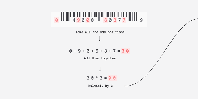
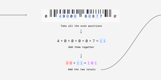
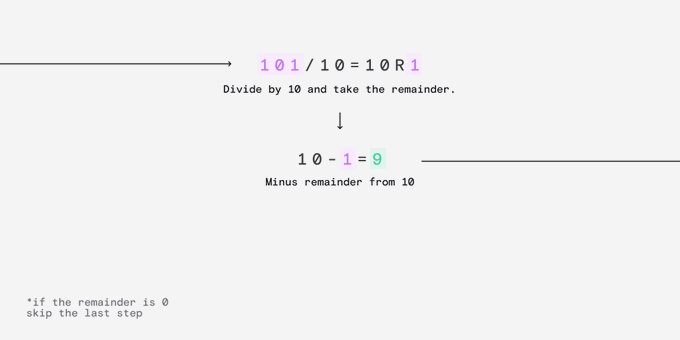
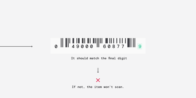
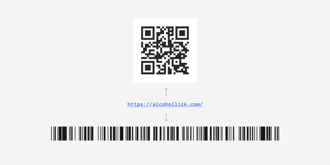
Why can't you just draw a few black lines on a barcode and spoof the scanner?
Well, the last digit in a barcode is actually there to do some clever error checking.
9
221
2K
For the absolute nerds who made it here, a fun fact:
Perhaps the coolest thing about QR codes is that Denso Wave, the company that invented them, never exercised their patent and released the technology for free!
5
111
2K
Excited to finally share what I've been working on.
Introducing Detax, a comprehensive suite of automated tax avoidance and money laundering tools. Our goal is to revolutionise the financial fraud industry by bringing it into the 21st century.
69
168
2K
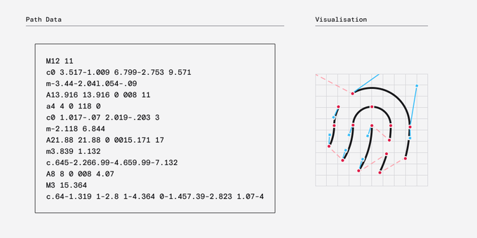
Niche tweet, but have you ever been messing around with an icon and wondered how SVG path data works?
It's actually quite simple.
21
272
2K
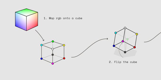
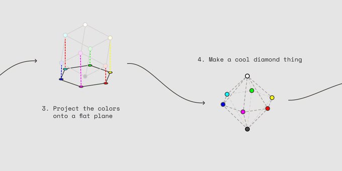
TIL that when you convert a colour from RGB to HSL you're actually doing some geometry. 🤯
9
230
2K
Why is making a dark mode greyscale so hard to get right?
Well, of course it has to do with the weird way humans perceive colour and contrast. 👇
31
216
1K
Apparently, to maximise engagement, I'm supposed to link the original tweet here and encourage you to retweet it.
Ever wondered how a QR code works?
No, me neither but it's low-key fascinating.
(Warning, there is some extremely nerdy shit here.👇 )
253
9K
35K
12
241
1K
Also, I'm an idiot and made an error in that graphic.
•-• should be R
•-- should be W
22
112
1K
The Quick Response code was invented by a subsidiary of Toyota to track parts across the manufacturing process.
Barcodes were proving inadequate - they can only be read at certain angles and didn't store much data relative to their size
The QR code solves those issues and more
5
70
1K
On our work slack we started a thread of our favourite technical/interactive blog posts, so I thought I'd share some of my favourites here.
In no particular order👇
9
94
1K
Ever heard of a shader but too afraid to ask what it even means at this point?
Lets fuck around and find out 👇
23
181
1K
A lot of people have asked how we built this hero.
I think you might be a bit disappointed with how simple it is but lets take a look anyway 👇
55
105
2K
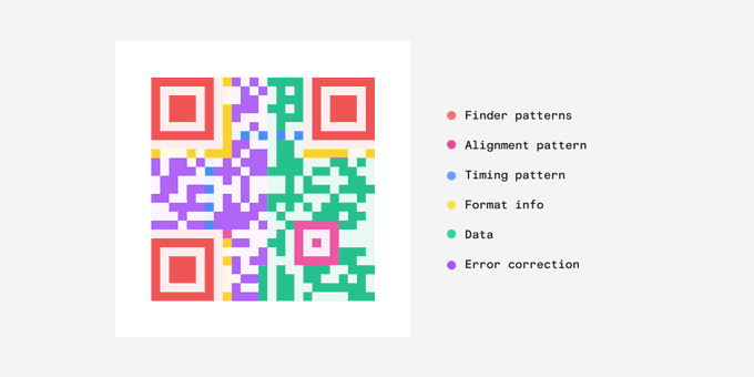
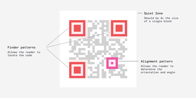
The most distinctive thing about a QR code are these cube shapes, called Finder Patterns, that help your reader detect the code.
The smaller fourth cube, the Alignment Pattern, orientates the code so it can be at any angle and the reader will still know which way is up.
6
30
1K
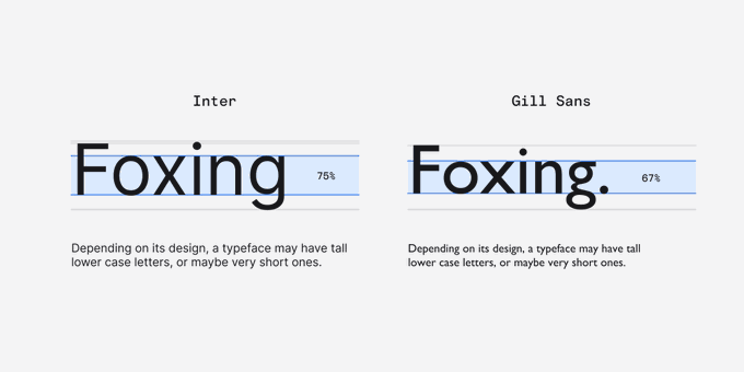
Why are some typefaces harder to read than others at the same font-size?
Well, it has a lot to do with x-height but of course it's a bit more complicated than that: ↓
7
126
992
It's also designed so the most common letters are closer to the root.
So. Fucking. Clever.
11
20
986
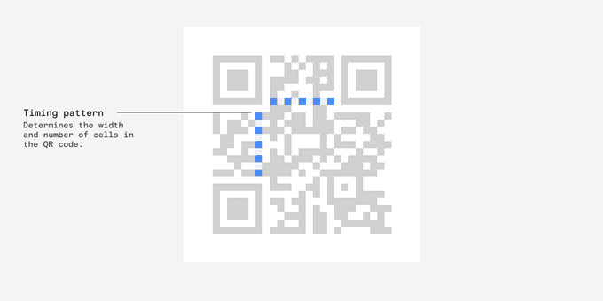
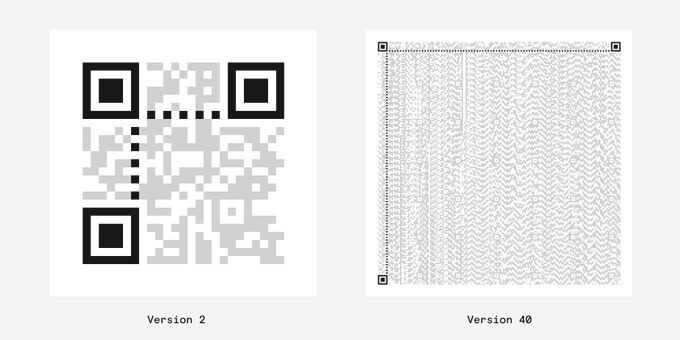
You've probably never noticed but every QR code has these alternating black and white dots called the Timing Pattern.
These tell the reader how big a single module is and how big the whole QR code is - known as the version.
Version 1: Smallest
Version 40: Biggest
4
20
982
2023 edition
10
57
925
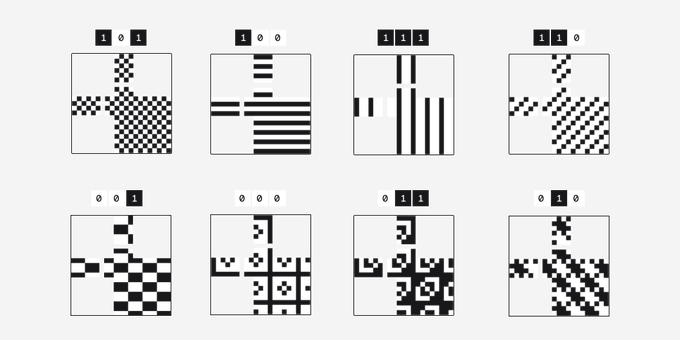
There are 8 standard patterns which are applied one by one.
The pattern that achieves the best result is used and that info is stored so the reader can unapply the mask.
4
24
898
You can check out the unrolled version here:

41
64
875
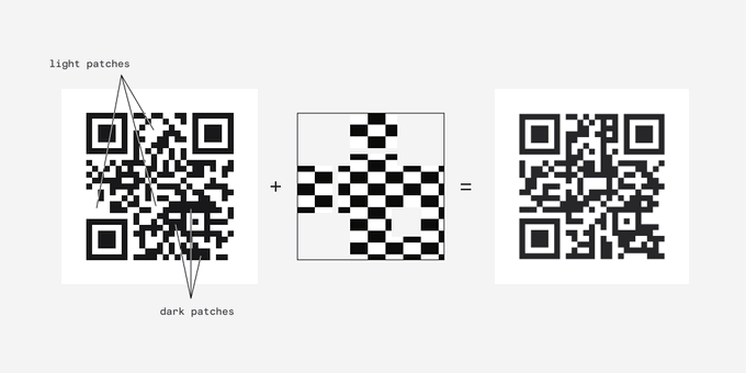
When a mask is applied to the code anything that falls under the dark part of the mask is inverted.
A white area becomes black and black area becomes white.
2
17
809

It's amazing how small tweaks can compound in UI design.
Fiddling with just three properties changes the feel of something drastically.
14
63
801
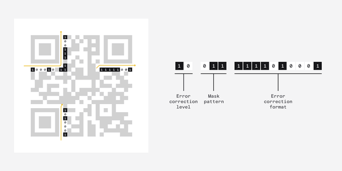
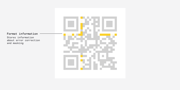
This stores three crucial pieces of information:
- Mask.
- Error correction level
- Error correction format.
I know these sound super fucking boring but they are actually pretty interesting.
4
18
780
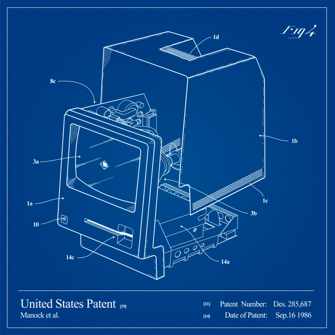
I spent a totally reasonable amount of time on this graphic.

The Mac turns 40 today 🎂
To celebrate, we're giving away Raycast Pro with GPT-4 for one year to 40 people. Simply retweet this tweet and follow
@raycastapp
to enter. Winners will be announced by the end of the week.
65
1K
838
31
26
796
Information about the format is stored in these two strips near the Finder patterns.
It's stored twice so its readable even when QR code is partially obscured. (You'll notice that this is a recurring theme.)
1
17
768
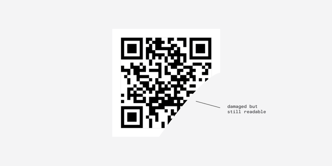
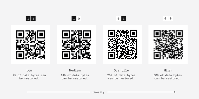
This is pretty amazing - If your code is outdoors you can choose a higher redundancy level to make sure it still functions when obscured.
(try it)
4
18
745
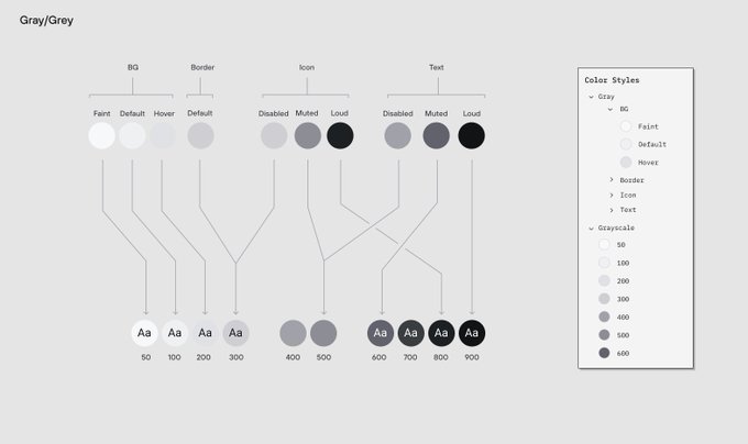
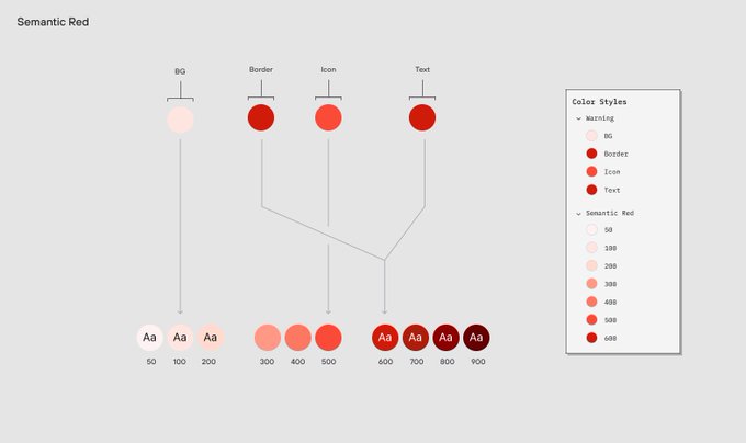
It's a bummer that Figma doesn't natively support color styles pointing to other color styles.
I do this all the time in my code projects and it's super ergonomic.
24
41
752
First, error correction - what is it?
Essentially, it dictates how much redundant information is stored in the code to ensure it remains readable even when part of it is missing.
2
19
731
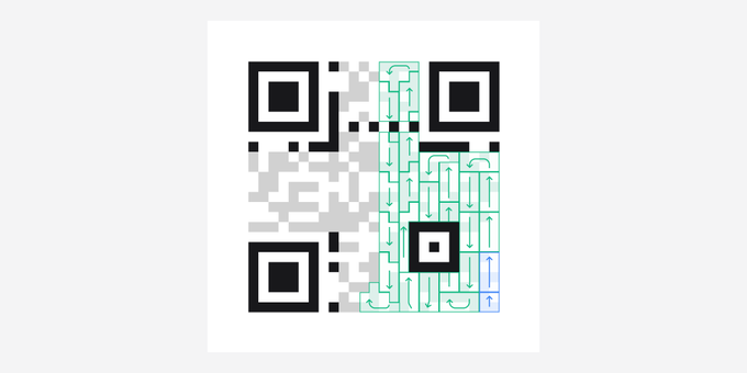
Finally we get to the actual data.
Weirdly, the data starts at the bottom-right corner and winds back up like pictured.
It almost doesn't matter where it starts because it can be read at any angle.
3
21
681
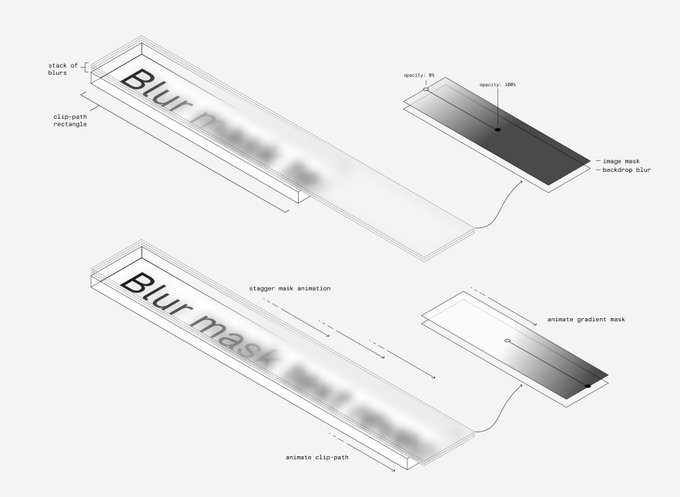
Super clever use of clip-path and image masks here

4
41
694
A bunch of you are new here so you might not know that I tweet about more than QR codes.
Here are some other popular threads about how stuff works 👇

9
68
672
Second, the mask - what's that?
Well, QR readers work best when there are the same amount of white and black areas.
But the data might not play ball so a mask is used to even things out.
2
14
665
There is still a bunch of left over space after our data.
This is where the error correction information is stored so that it can be read if partially obscured. The way this works is actually really really complex so I'll leave that out.
That's basically it!

12
14
664
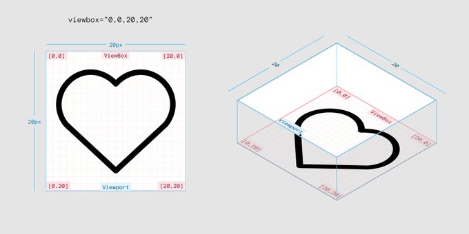
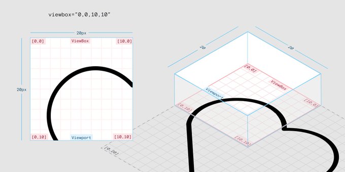
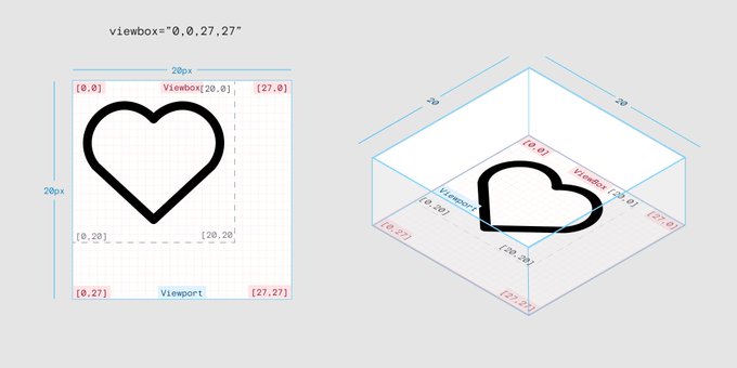
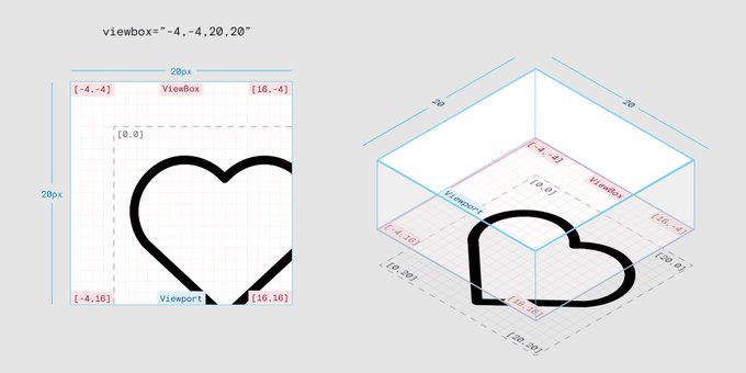
SVG viewbox is surprisingly unintuitive but if you visualise it like this it starts to make sense:
1
65
645
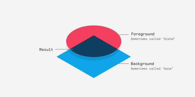
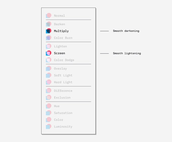
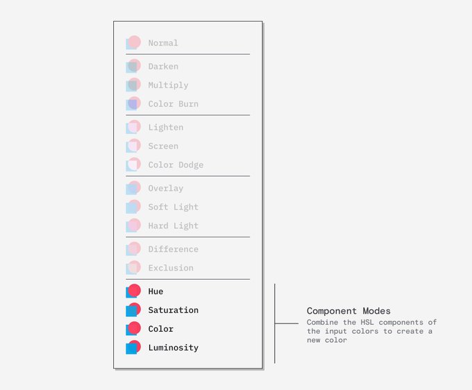
Put simply, blending modes are a way of creating a new colour based on two input colours.
Hierarchy matters to the way we work out the new colour so the input colours are split into background and foreground.
2
34
622
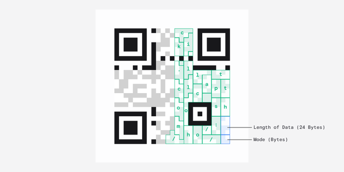
The first chunk of information here tells the reader what mode the data was encoded in and the second tells it the length.
In our case each character takes up 8 bit chunks, otherwise known as bytes, and there are 24 of them.
2
19
613
Have you ever noticed that line-height ruins your design system's spacing?
Here's what's going on🧵:
9
144
625
Stumbled across this rather delightful gradient interaction
2
48
595
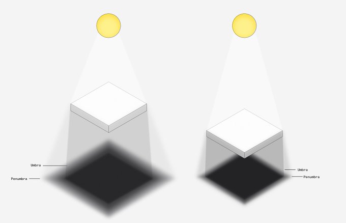
What makes a shadow look realistic?
Well, there are essentially two parts to a shadow: the fully occluded part (Umbra), and the partially occluded part (Penumbra).
Ideally, you need at least two layers of drop shadow to mimic these.
8
63
600
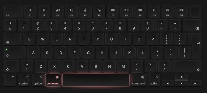
Spent last Friday making a Macbook keyboard in Figma.
Amazed at what I get to call 'work'
15
18
593
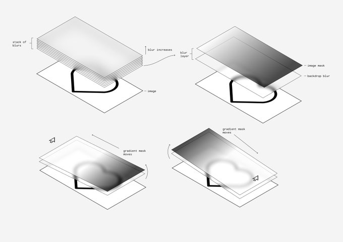
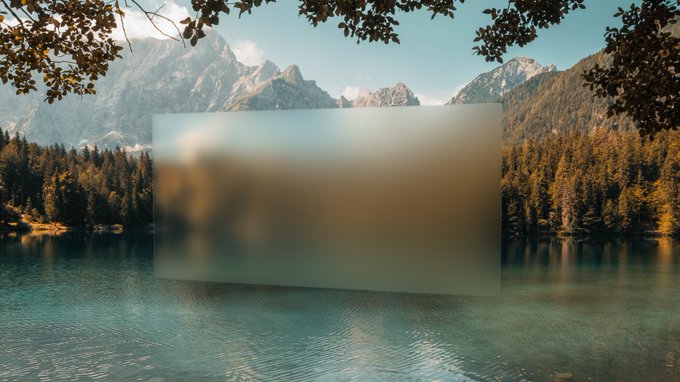
Curious how this spotlight effect works?
Well, cleverly, it uses the css property 'mask-image' to mask the linear gradient in the background.
Turned this Tailwind UI spotlight effect into a Framer component.
Here's the remix link:
8
26
299
5
57
535
I first discovered this in the book Code by Charles Petzold

8
19
508
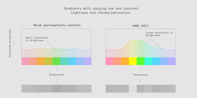
Gradients are the best way to explain perceptually uniform color spaces
6
44
483
I've never really considered how the pen tool works.
Turns out, it relies on Bezier Curves and how they work is super interesting🧵:
7
66
454
Really like this spotlight hover effect on the new tailwind UI template, so I had a crack at doing it myself.
Note: that weird banding is from the screen capture.
7
15
447
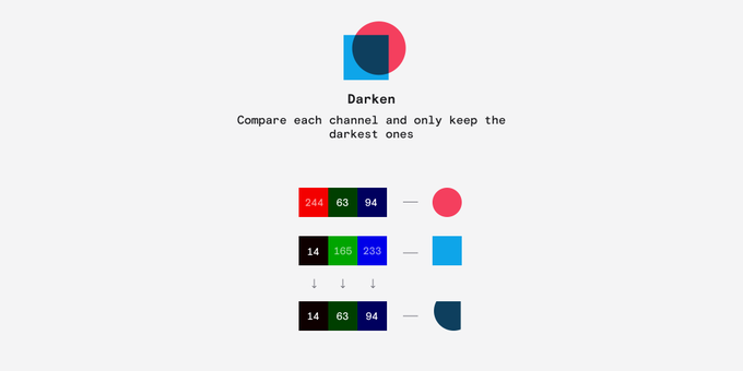
Darken compares each colour's RGB value and selects the darkest value - creating a new colour.
1
9
401
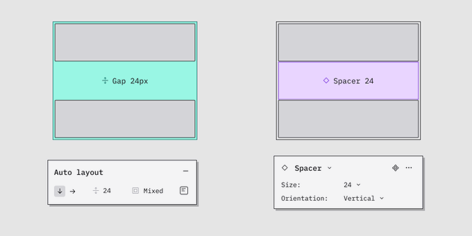
Why do people use Spacer components?
Personally, I prefer using Auto Layout wrappers and controlling spacing with gaps but there might be a use case I'm overlooking?
Made some pros and cons below 👇
14
26
400
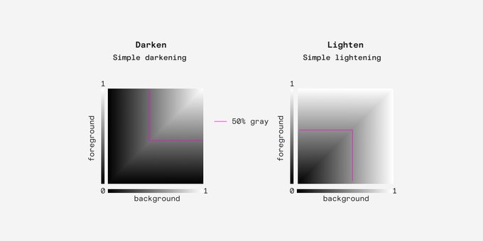
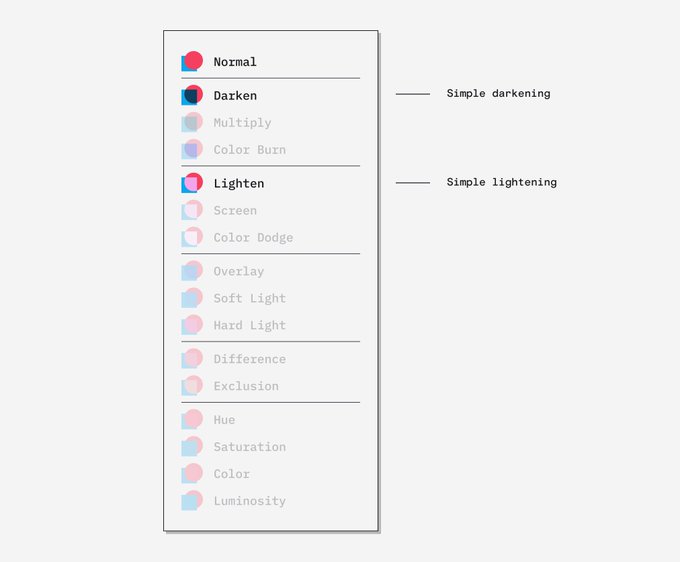
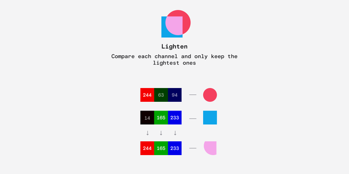
Let's start with Darken and Lighten
These are the simplest blending modes and the produce a fairly predictable darkening or lightening.
2
18
382
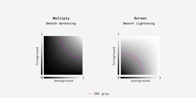
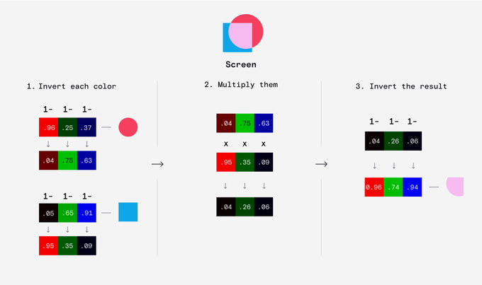
Next up are Multiply and Screen.
Although they produce similar results, you can think of these as more elegant versions of Darken and Lighten that result in a bit more contrast.
When you have Screen and Multiply, there is no good reason to use Lighten or Darken.
3
12
363
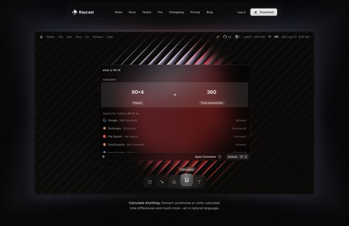
I built an internal
@figmadesign
plugin that fetches data from the TIDAL api and populates our designs.
A real time saver.
14
30
365
Lighten does exactly the same thing but it selects the lightest value.
1
10
354
Screen is actually similar to Multiply but it inverts both the inputs and the result, which is why the result is always lighter.
Again, we need to normalise the values between 0 and 1 to work this out.
2
7
346
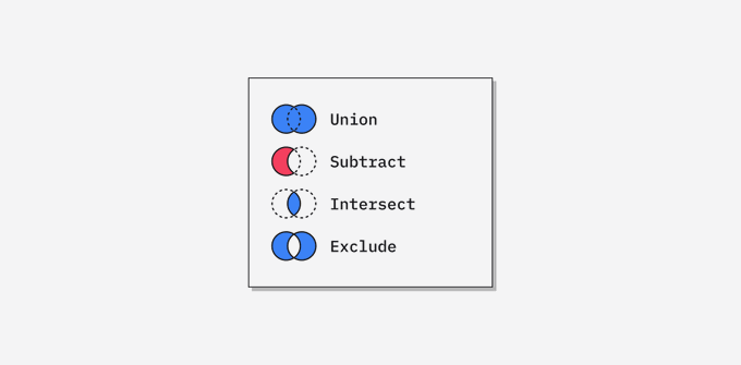
Did you know these are called Boolean Operations?
That's because they use booleans to determine which part of the shapes should be visible.
Let me explain 👇
8
33
341
Multiply does exactly what you'd think, it simply multiplies each channel together.
Because the values are normalised between 0 and 1 the product is always darker than the original.
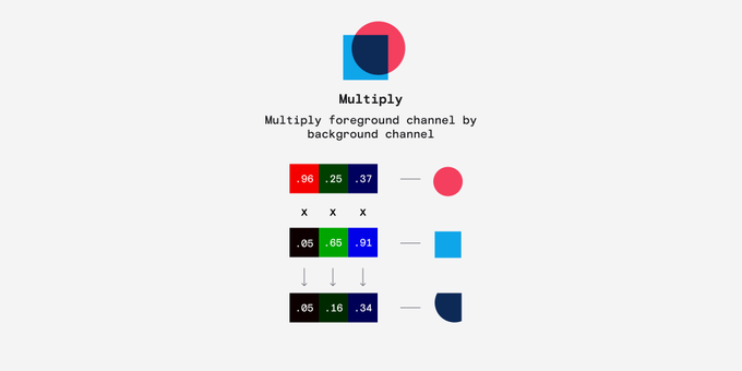
2
8
320
Turns out
@rogie
's noise plugin is a great mesh gradient generator.
Granted you need to know how to write a fragment shader.
2
31
330
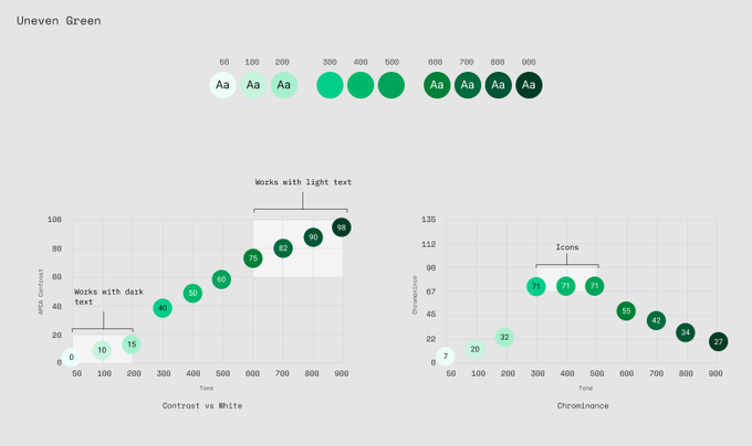
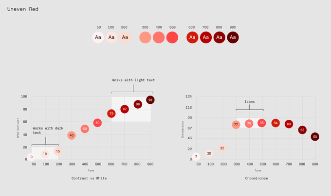
I've been playing around with color scales with unevenly spaced tones.
Clusters of tones at the top, bottom and middle to provide more options for Bg and text.
Anyone ever played around with this before?
14
20
314
Found a cool way to demonstrate the conversion from RGB cube to HSL cylinder.
5
42
310
Turned this Tailwind UI spotlight effect into a Framer component.
Here's the remix link:
8
26
299
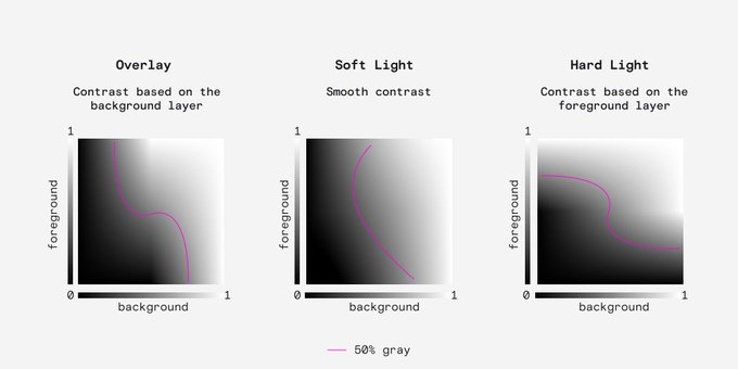
Overlay, Soft Light and Hard Light are known as contrast blending modes because they make the lights lighter and the darks darker.
These are the most versatile blending mode, especially for images.
2
9
285
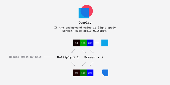
Overlay is interesting.
If the background value is light (> 127.5 ) then it applies Screen at half strength making the foreground lighter.
If the background value is dark it applies Multiply at half strength making the foreground darker.
1
13
280
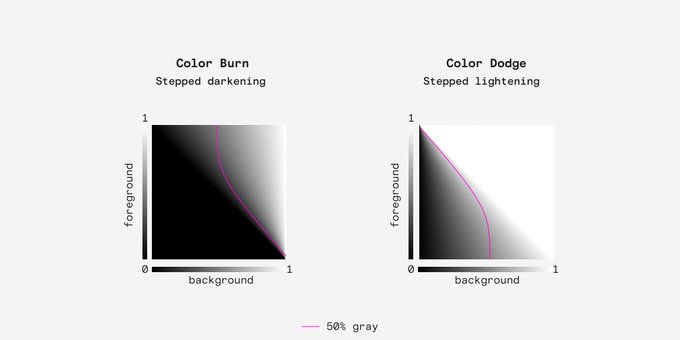
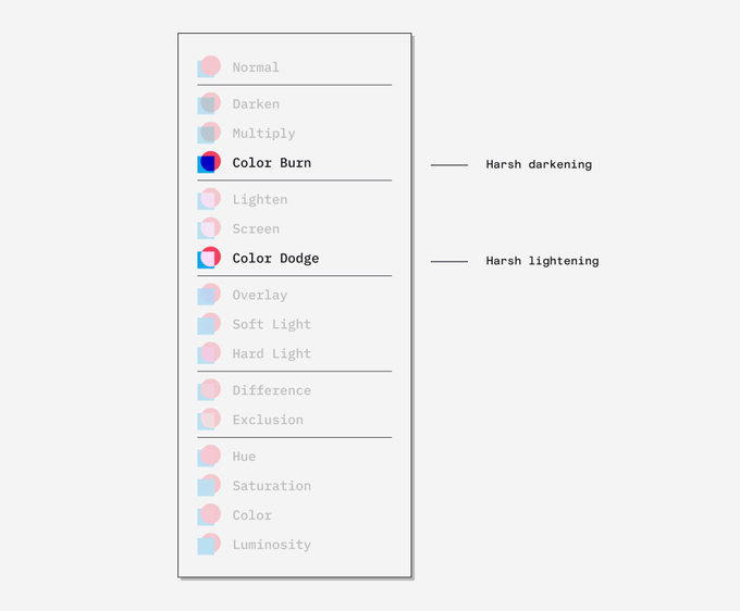
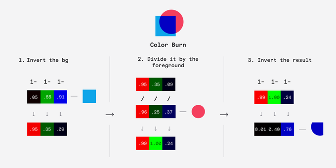
The last pair of darkening/lightening modes are Color Burn and Color Dodge.
They have a pronounced step so they can produce quite harsh results compared to the previous modes.
1
8
275
Have you ever looked at a
@framer
site and thought
"how the hell did they do that?"
I've got something for you:
14
23
283
Color Burn works by inverting the background, dividing it by the foreground and inverting the result.
2
6
258
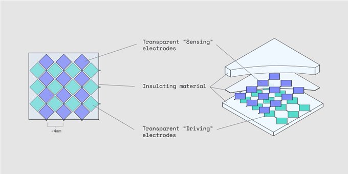
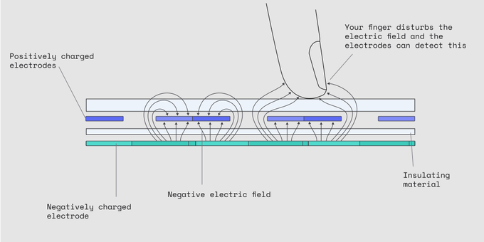
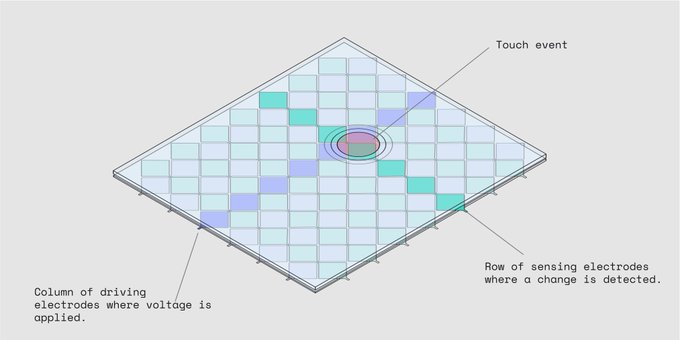
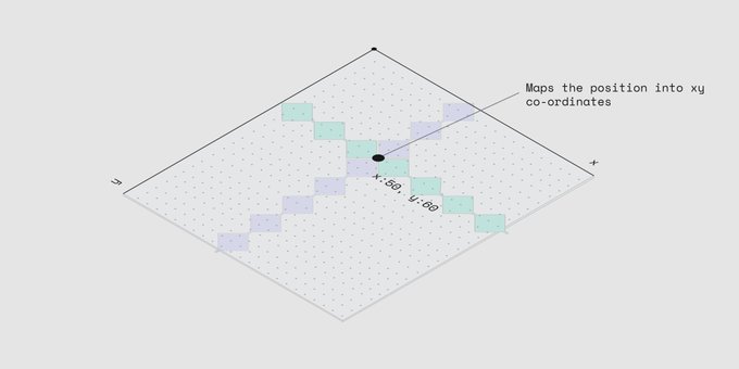
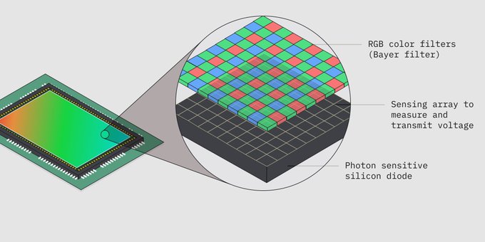
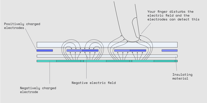
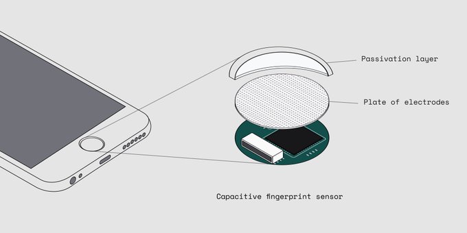
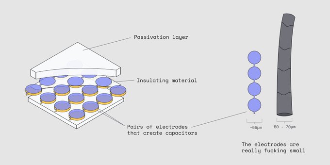
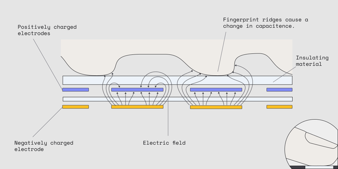
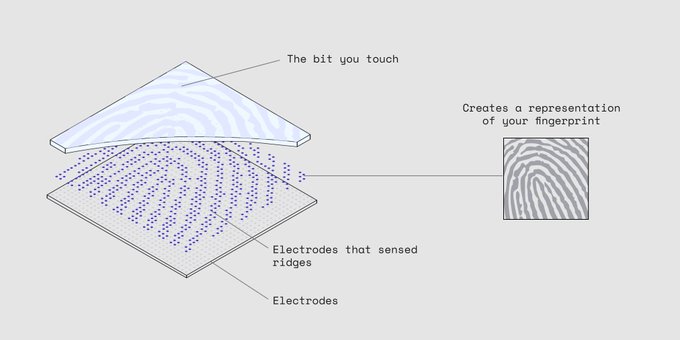
A fingerprint sensor actually works a lot like a touch screen, just at a much smaller scale.
3
40
259
You can read the unrolled version of this thread here:

12
33
256
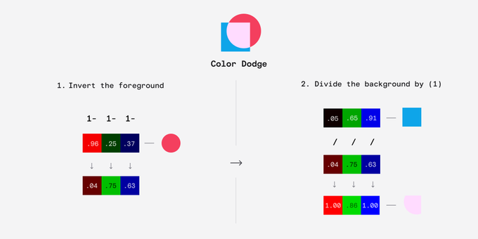
Color Dodge is similar but we invert the foreground divide the background by it.
1
6
248
If you want to learn more, there is an incredibly in depth discussion on the WCAG GitHub:

6
21
247
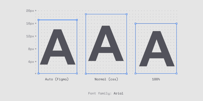
Something I learnt while diving deep on line height is that there are subtle differences between:
line-height: 100%
line-height: normal (css)
line-height: Auto (Figma)
(Very short 🧵 this time, I promise)
6
34
245
If you're excited to test out APCA, I've got good news:
I put together an APCA plugin for Figma.🎉
6
33
234
tl:dr
WCAG 3 will make your life easier as a designer. It isn't out yet but you can (and should) use APCA now.
@MyndexResearch
has a great tool here:
6
24
229
Evernote: Don't forget to make a shopping list.
Trello: Ensure you drag this item to "complete"
Notion: Mustn't forget to do your budget this month.
Roam: It's 3am, you wanna make your own personal internet bro?
#roamcult
3
27
229
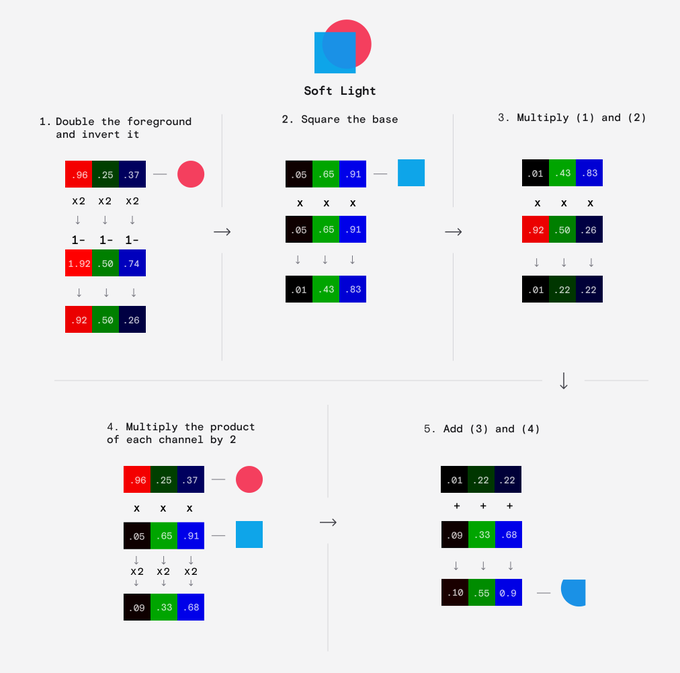
Soft Light is the most complicated of the standard blending modes.
It produces similar results to Overlay but is more subtle.
Multiply the inverted foreground by the squared background and add it to two times the product of the foreground and background. Simple.
2
8
221
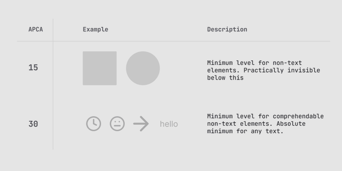
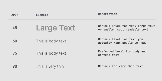
Here's what they mean:
15 - 🚫 Minimum for non-text elements
30 - ⚠️ Absolute min for any text
45 - ‼️ Min for large text (the old 3:1)
60 - ❗Min for body text (the old 4.5:1)
75 - ✅ Preferred level for body text
2
13
226
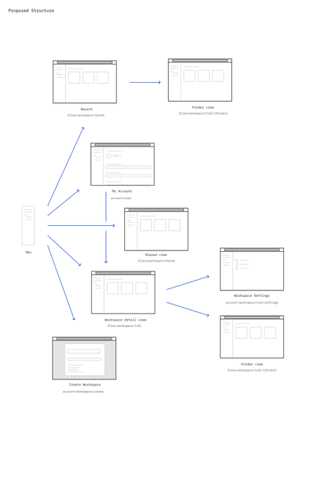
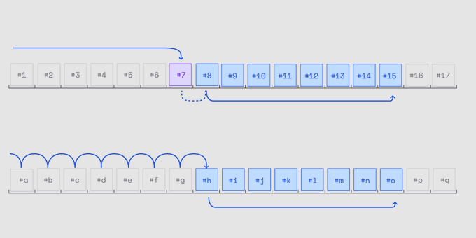
As a designer, you might not know that there are actually two different ways to implement pagination: Cursor vs Offset.
The UI you design can influence which one your devs use or vice versa.
Here's how they work 🧵:
6
34
221
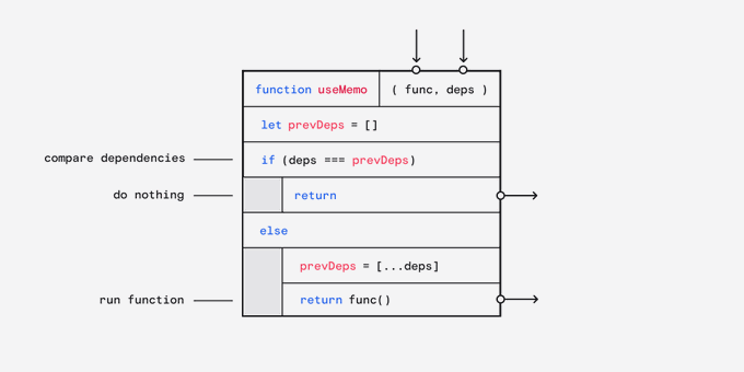
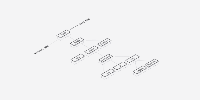
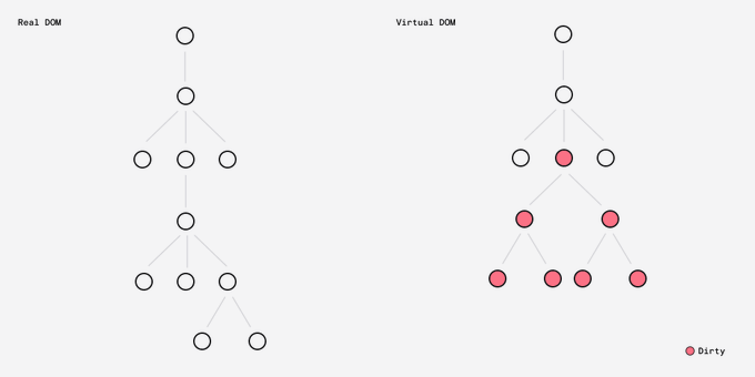
Whenever I hit a problem with React its because I don't have a solid understanding of how it really works.
Here's a brief explainer:
10
31
218
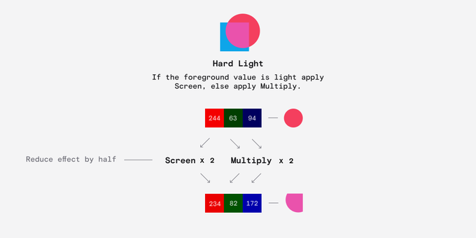
Hard Light is exactly the same as Overlay except it uses the foreground layer.
If the foreground is > 127.5 then apply Screen at half strength, else apply Multiply at half strength.
1
8
211