
Pamela Schultz, PhD
@pamsdata
Followers
63
Following
965
Media
57
Statuses
183
Joined February 2013
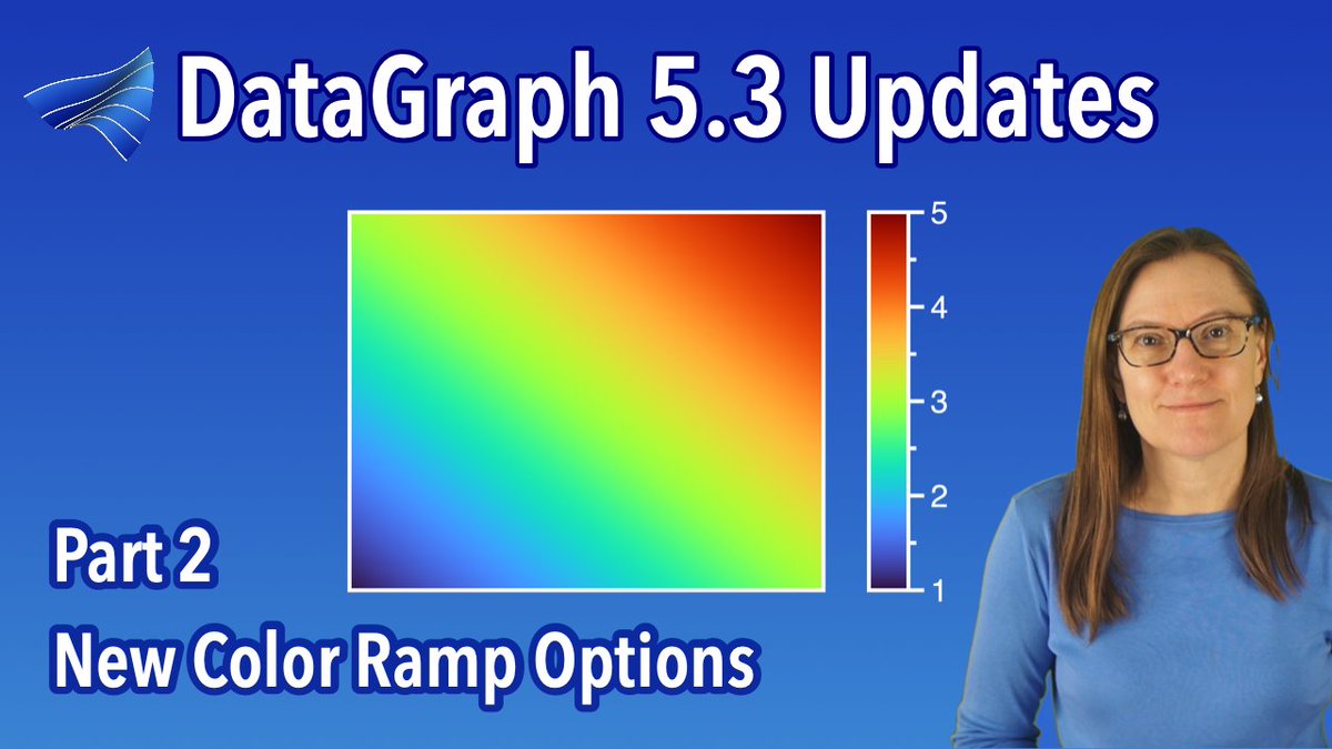
Take a coffee break ☕️ Learn about color ramps 🌈😀.

Premiering soon! 11AM ET - #Color ramps in DataGraph! Learn what's wrong with the rainbow, new color ramp options, and how to create custom color ramps. #datascience #data @YouTube .
0
0
0
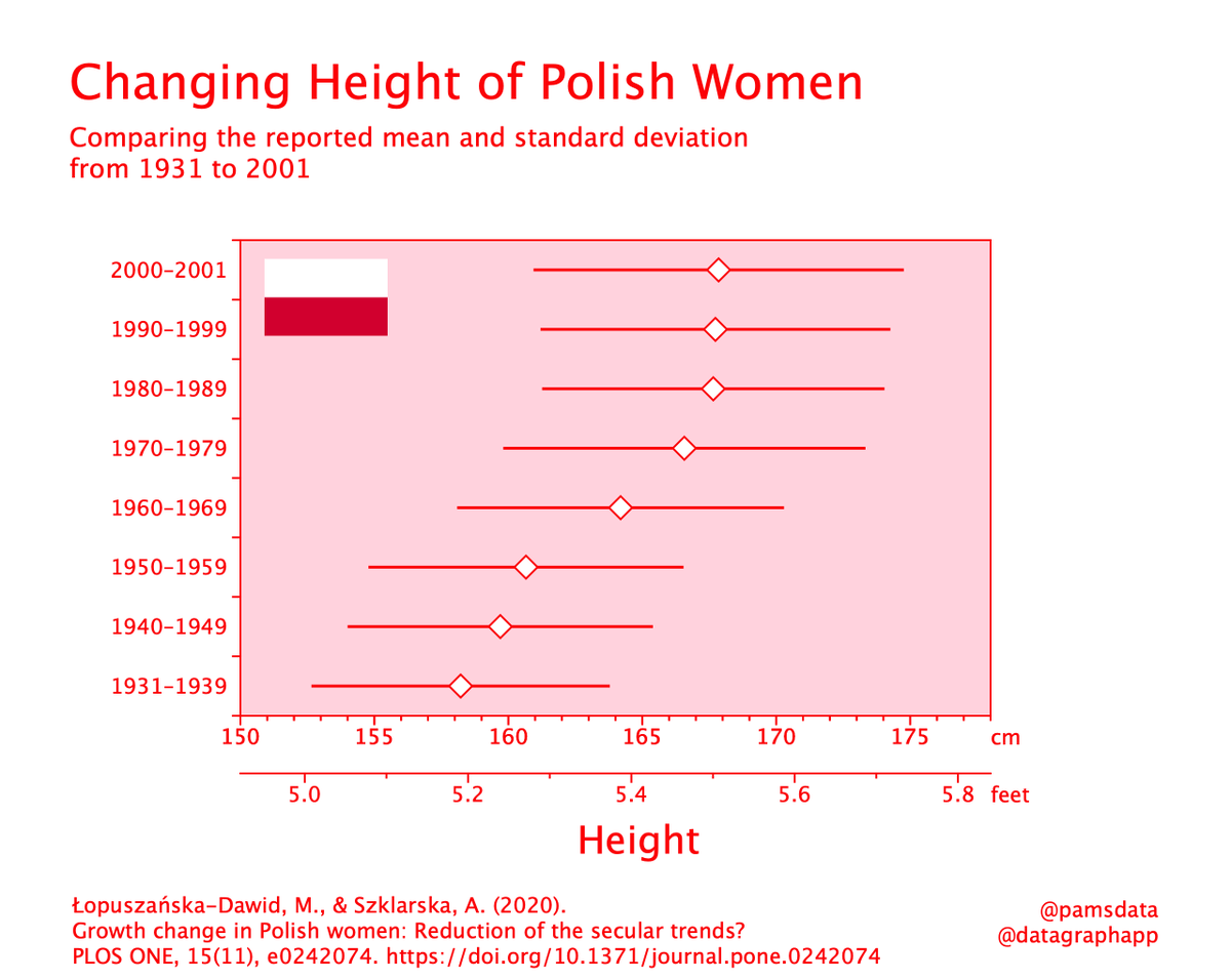
#30daychartchallenge.Day 10 | Distributions | Physical. I decided to do something with height and stumbled upon this article on the height of Polish women. I had no idea height could change that much over time. Tool: @datagraphapp
0
0
7

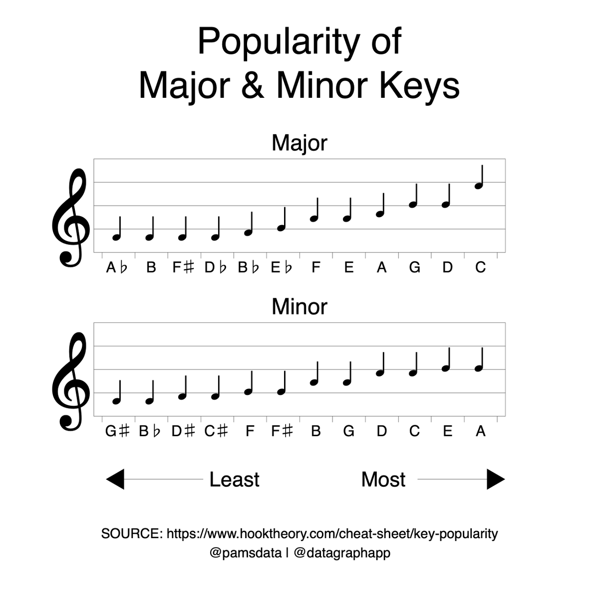
#30DayChartChallenge.Day 9 | Distributions | Major Minor. This was fun 🎼 Ranked major and minor keys used in popular songs according to @hooktheory. Here are two examples from the #Beatles .C Major - Let It Be .A Minor - You Never Give Me Your Money. tool: @datagraphapp
0
0
19
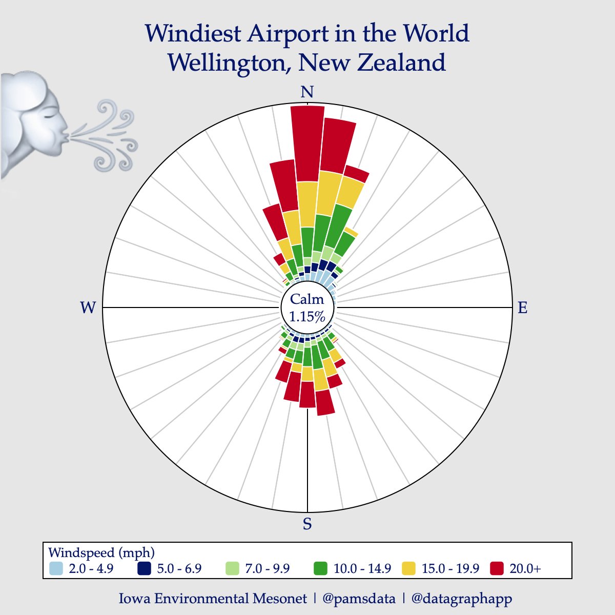
#30DayChartChallenge .Day 8 | distributions | circular. For today, I used data from Wellington, New Zealand, the so-called windiest airport in the world, to create a Wind Rose, showing the wind speed and direction. 🌬️✈️. Tool: @datagraphapp.Data:
0
1
7
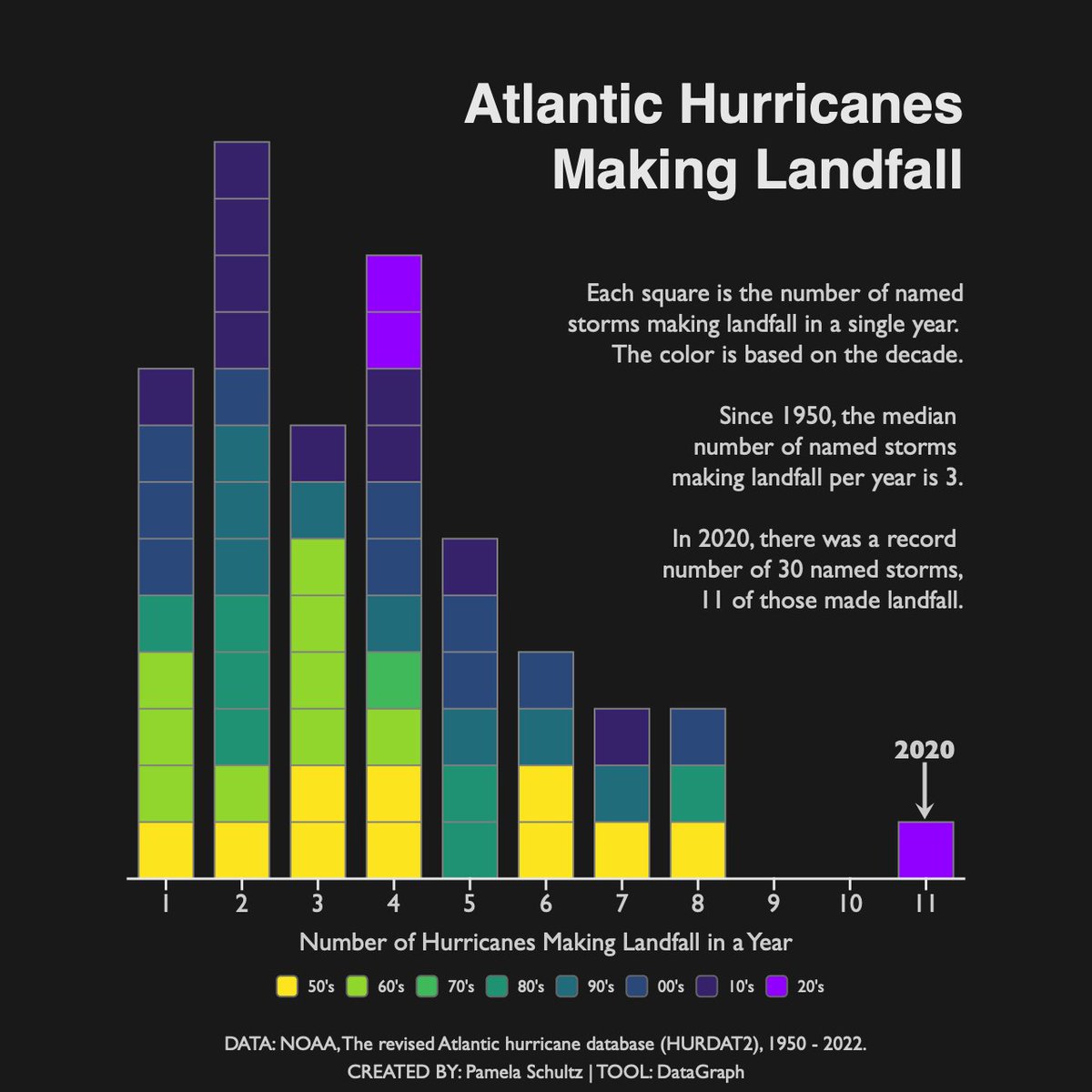
#30DayChartChallenge .Day 7 | Distributions | Hazards. North Carolina, where I live, is known for its hurricanes. So for this prompt, I downloaded the HURDAT database and counted named storms that made landfall in the US from 1950 to 2022. Data: @NOAA .Tool: @datagraphapp
0
1
12
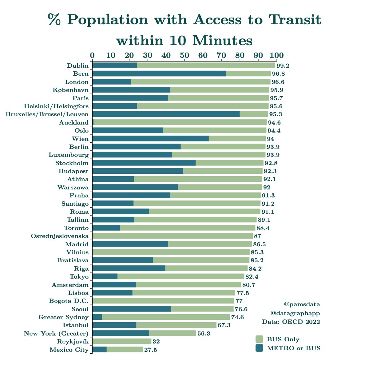
#30DayChartChallenge.Day 6 | @OECD . Picked data to access transit. Dublin topped the list with nearly 100% of the population within 10 minutes of transit! 🚍🚆. Tool: @datagraphapp .Data: @OECD Access to public transport
0
2
12
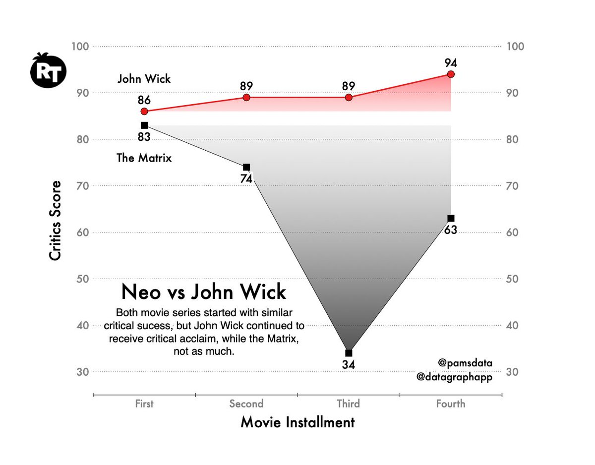
#30DayChartChallenge .Day 5 | diverging. Went to the movies again for this one. 📽️ (second time posting - I forgot to add the image the first time 🤪). Tool: @datagraphapp.Data: #rottentomatoes
1
1
22
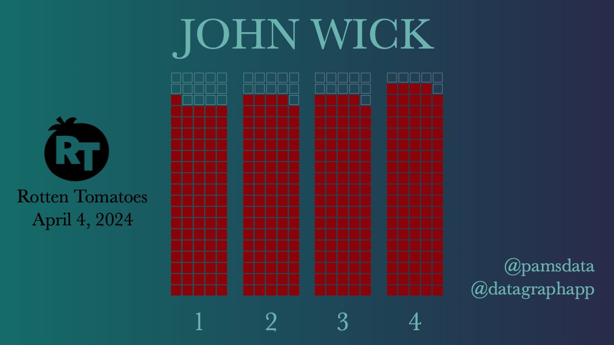
#30DayChartChallenge .Day 4 | Waffle. #JohnWick 4 was released just over a year ago and has the highest #RottenTomatoes ranking of the entire franchise, at 94%! Yes, I am a fan. Data: Tool: @datagraphapp
0
0
10
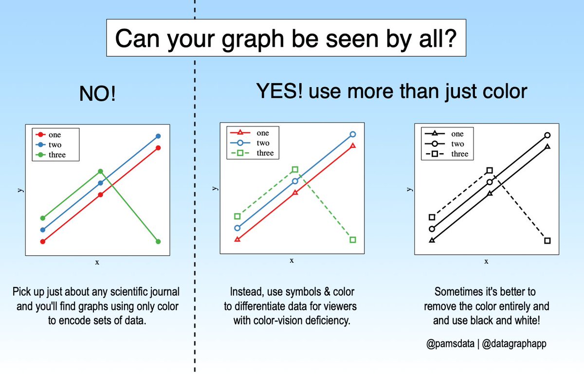
#30DayChartChallenge.Day 3 | Makeover. For today, I made up data, but the graph is almost identical to one published in a recent scientific journal. In fact, I see graphs published ALL THE TIME that use ONLY color to encode data. Tool: @datagraphapp
0
1
13
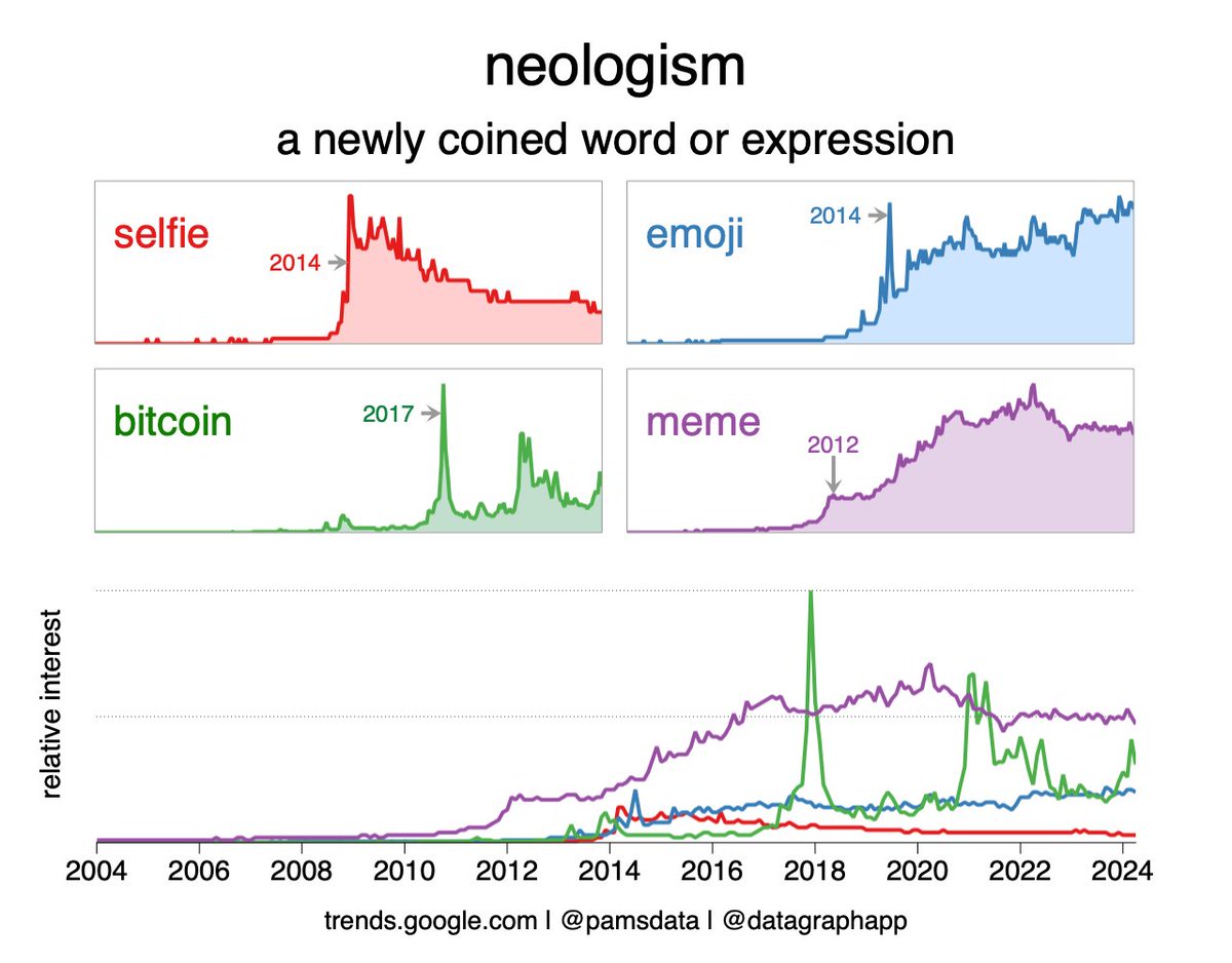
#30DayChartChallenge | Day 2 | Neo. Went with new words for this one.📈 'Meme' and 'Emoji' are still going strong according to #google #trends.🧐. Tool: @datagraphapp .Data:
0
0
19
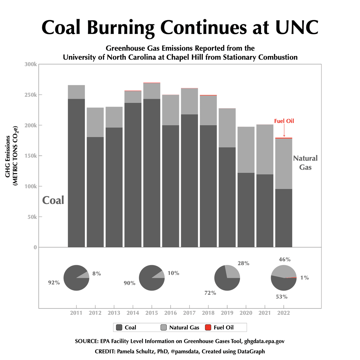
#30DayChartChallenge Day 1 | Part-to-Whole.I pulled GHG emissions from the @EPA for UNC, which pledged to stop burning coal in 2020. Switching to natural gas decreased total emissions, but coal remains the top contributor. Data: Tool: @datagraphapp
0
2
6
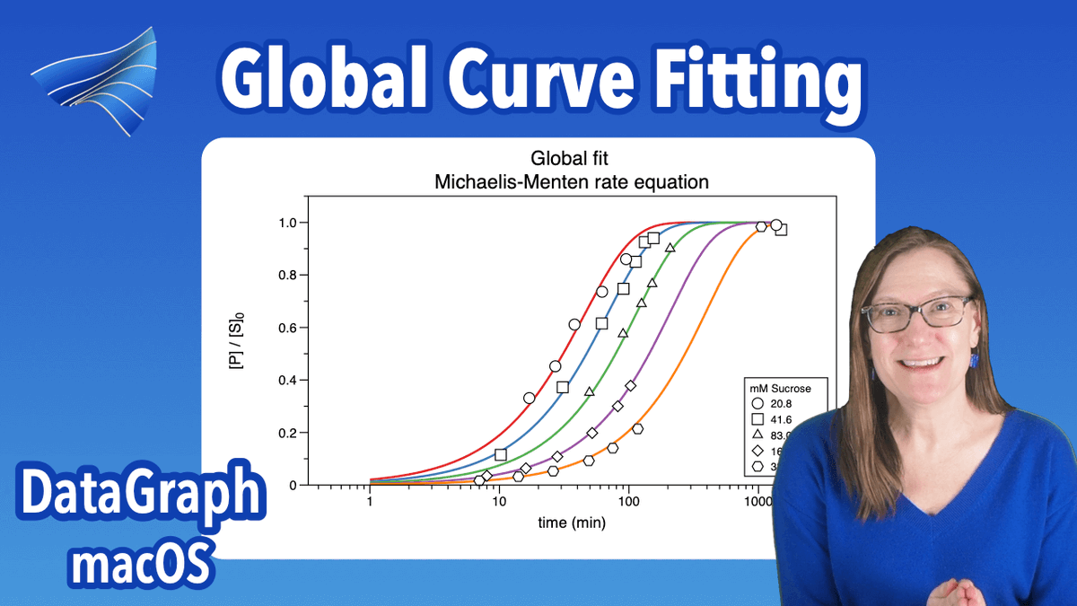

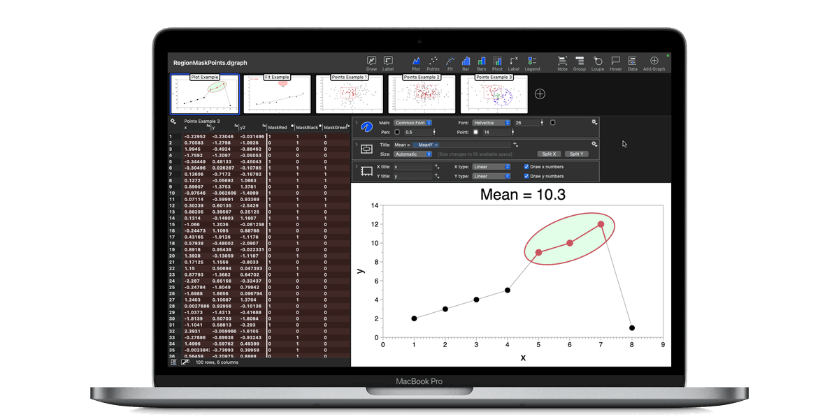
Always so happy when we get a new version out!!! Best DataGraph yet! 📈📊.
0
0
2
After a nice summer break ⛱️ getting back to making videos 📽️📈.
1
0
1
Join me at the annual Women in Data Science (WiDS) Virtual Conference broadcasting on September 14th! Watch the free online broadcast on the WiDS YouTube Channel:
youtube.com
WiDS Worldwide is an actionable community on a mission to change the field of data science across the globe by elevating and empowering women. We strive to reach 30x30: 30% representation of women...
0
0
0
Happy with this demo :).
Learn how to create custom graphs effortlessly with DataGraph 5.1! Our latest video guide is packed with useful tips and tricks. Check it out on our YouTube channel now! #DataGraph #CustomGraphs #ScientificCommunity.
1
0
0
Nice display for one year of temperatures.

Very rarely does the daily temperature range exceed 40°. Yesterday, here in Ashland, it did! Count 365 dots. Each is a temp range over the past 365 days. The box plot is impressively symmetric. The average/median range is 21°. The middle 50% of daily ranges lie within the red

0
0
1
1
1
14