

Anastasiya
@nastengraph
Followers
366
Following
447
Media
144
Statuses
385
BI team lead and #dataviz enthusiast🥰 | x2 VOTD | Tableau, SQL, R and everything that I find interesting💫
Joined February 2013
Finalized @tableaupublic dashboard template I’ve wanted to do for months!. It's a free-to-use, pre-built template with containers. Just copy all your charts to the template and easily put them on the dashboard💫. #datafam #tableau #dataviz #dashboard #bi

0
0
15
Color borders for cleaner maps 💡 . I found this lifehack years ago, and it's been my go-to move with maps ever since. Every time you create a map, try coloring the borders the same color as your background. #tableauhack #tableau #dataviz #datafam

1
2
13
RT @tableaupublic: Explore this #VizOfTheDay by Anastasiia Kuznetsova, using slope graphs to show start vs. finish positions in a global si….
0
3
0
Boring Monaco? In this #dataviz, I look back at 20 years of the Monaco GP and analyze how often drivers finish in the same position they started. #sportsvizsunday #datafam

1
1
42
For this #makeovermonday I’ve tire to looks at the metascores for different game series. Game series groups were done manually so I really hope i didn’t make any big mistakes 🙈.#dataviz #datafam

0
0
10
#30DayChartChallenge – Log Scale. I wanted to create something similar to the famous scatterplot from Edward Tufte’s book Beautiful Evidence. For me, it’s the best showcase of the log scale. Creating the images was the hardest part.

2
0
11
Stellar Scale: How Far, How Bright? 💫 . A visual comparison of 174 visually brightest stars for hashtag#30DayChartChallenge - Stars

0
0
5
#30DayChartChallenge. It's never too late 😅 Trying to still particpate at the #30DayChartChallenge, today about fossils. A histogram of dciovered dinosaurus body lengths

0
0
24
UTF and emojis in dashboard design . Wrote a bigger post in LinkedIn #dataviz #datafam #tableau #dashboards

0
2
13
RT @AdamMico1: The #DataFamRisingStars 2025 are live! 90 standout Tableau innovators from 17 countries are shaping the future of #DataViz +….
0
40
0
RT @tableaupublic: See how @saddykinss visualizes help desk metrics in this #VizOfTheDay. This business dashboard is an entry to the Comm….
0
7
0
Getting ready for the new #F1 Season. Just updated my viz with the full 2024 results. Can't wait!. #sportsvizsunday #dataviz


0
0
15
If you are not sure how to spend your New Year's Eve, here is my suggestion for a New Year reflections questionnaire 🎄

0
0
5
RT @tableaupublic: That’s a viz wrap, DataFam! 🎉. A year of endless creativity on Tableau Public. Discover the most favorited visualization….
0
14
0
Last year, I created this #dataviz showing #formula1 drivers’ salaries and damage costs throughout the season. I just updated it with 2024 data!. Pierre Gasly set a record with zero damage costs this season!.Check it here: #sportsvizsunday

0
1
28
RT @mo_wootten: #SportsVizSunday weekly roundup time! A brief look into some of the cool sports data stuff that people are doing at the mom….

sportsvizsunday.com
It's nearly that time again, not Christmas but the PDC Darts World Championship (which in fact starts today!). Last year, the darts captured the hearts and minds of many with Luke Littler's meteoric...
0
3
0
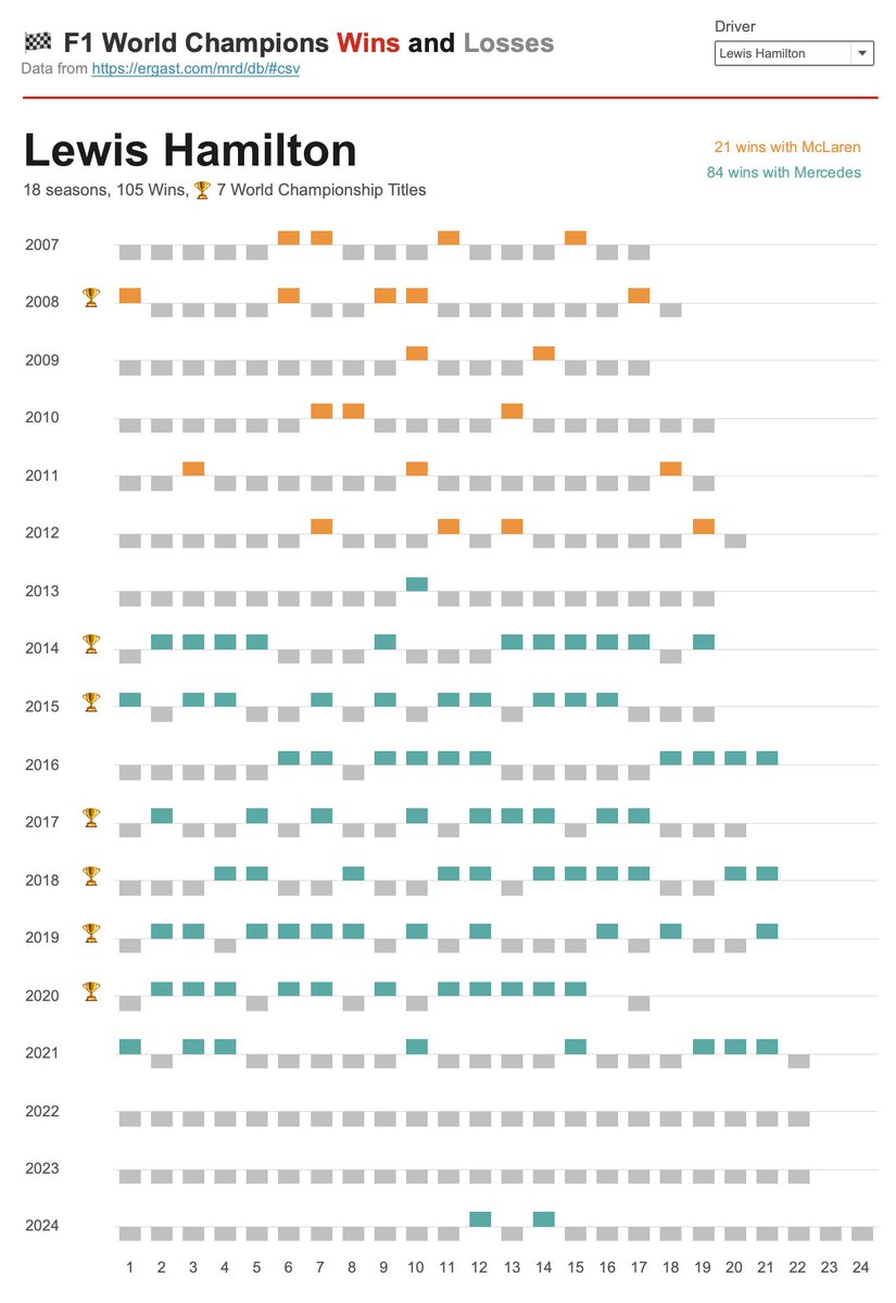
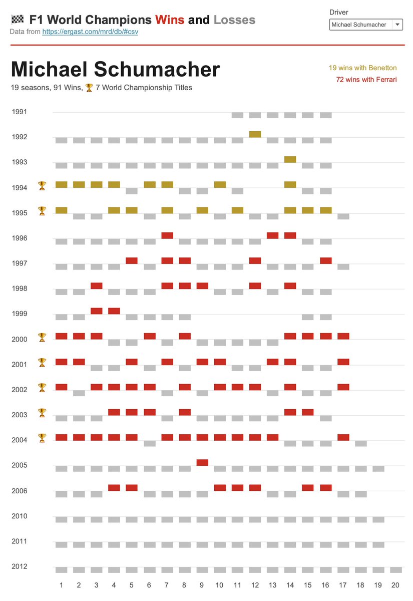
I created an interactive version of win-loss charts. Now you can choose one of the #formula1 world champions to view their stats. #sportsvizsunday #teamlh #f1 #f1stats.

0
1
14
🚀 New Regions Overview Dashboard. I created this using my dashboard template to showcase one of my favorite chart combinations – a bar chart table with sparklines. It provides both the ranking of the regions and the ability to analyze their dynamics. #dataviz #dashboard

2
4
35

All #MaxVerstappen Wins in his #Formula1 career 🏆. Win-loss diagram created in #tableau❤️ . #sportsvizsunday

3
0
26