

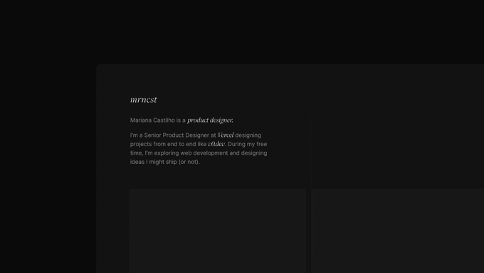
Mariana Castilho
@mrncst
Followers
11,583
Following
640
Media
254
Statuses
3,086
Senior product designer @vercel — prev @onuniverse @uber
🇧🇷 🇫🇷
Joined March 2014
Don't wanna be here?
Send us removal request.
Explore trending content on Musk Viewer
Drake
• 1654933 Tweets
Meet the Grahams
• 202075 Tweets
#แบมแบมอินราชมัง
• 177030 Tweets
Family Matters
• 150873 Tweets
みどりの日
• 123624 Tweets
J Cole
• 115980 Tweets
#بدر_بن_عبدالمحسن
• 67502 Tweets
Adonis
• 67418 Tweets
Clippers
• 67201 Tweets
Kyrie
• 64811 Tweets
Aubrey
• 45490 Tweets
京都新聞杯
• 43109 Tweets
Mavs
• 41274 Tweets
#Maythe4thBeWithYou
• 37387 Tweets
結束バンド
• 37119 Tweets
Kdot
• 30682 Tweets
#StarWarsDay
• 24407 Tweets
Komang
• 23915 Tweets
スペイン村
• 22922 Tweets
Drizzy
• 18565 Tweets
PAVEL BIRTHDAY NANNING
• 14845 Tweets
ダービー
• 13975 Tweets
Bad Apple
• 13917 Tweets
#超こどもの日
• 10887 Tweets


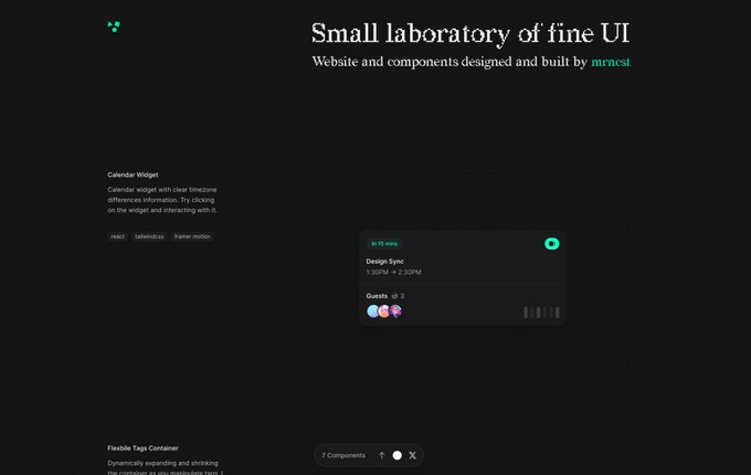
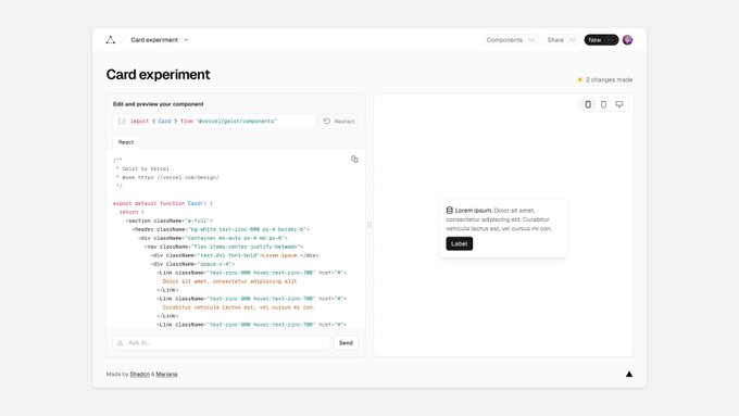
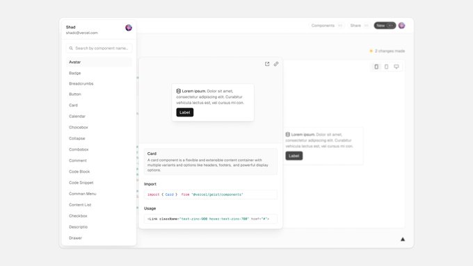
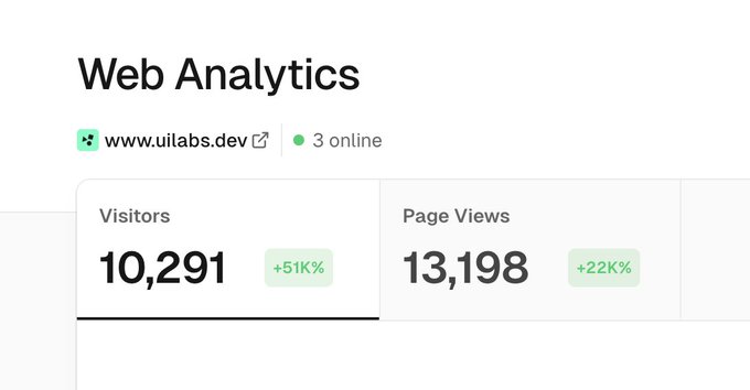
I built a home for the components I’ve been sharing lately - you can play with them here:
All of this is experimental, a page to keep track of my progress and share more unusual components and interactions and understand what feels right or not.
101
99
1K
Tiny cards experiment. Just regular react components and Tailwind. 🃏
23
40
920
I love to see designs that resignify components when need to confirm users' actions instead of prompting additional modals that crowd the UI.
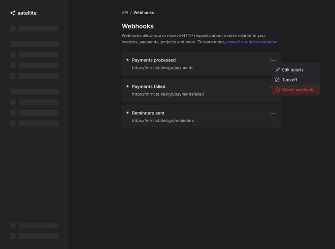
Trying to delete an active webhook.🔌
21
63
840
Seeing UI details that are off in Apple products reminds me that we’re all just mere mortals.
38
30
799
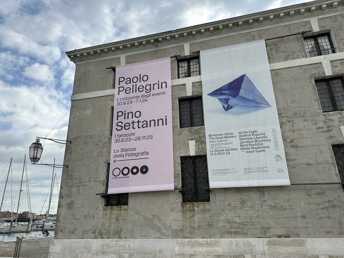
Design Twitter, what’s the typeface of this pink poster?
23
10
587
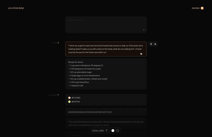
Does the world need another note-taking app? Absolutely not.
Yet, I specifically wanted a brain dump in a timeline format, so I could scroll back in time and filter easily. Just for fun, I decided to build that for myself as a holiday project.
Building with
@nextjs
obviously.
54
11
564
Experimenting with dynamic forms embedded in dropdown for use cases like feedback. Built on top of Radix dropdown primitive.
Check the details here because the video quality is not the best -
23
22
528
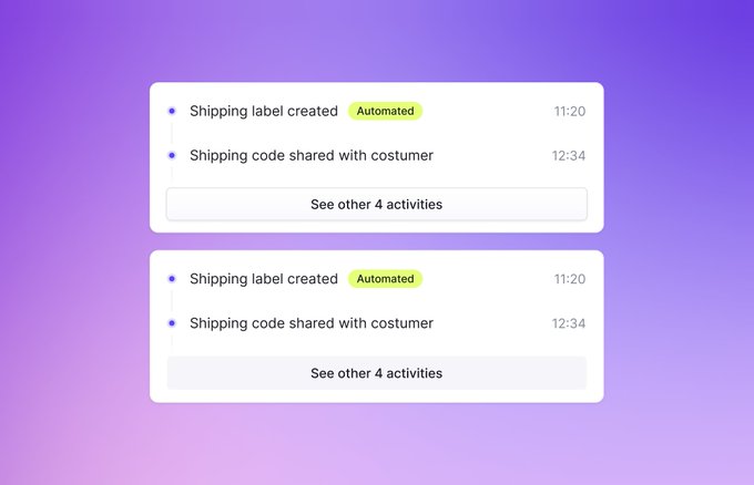
Why don't we give more love to some forgotten components?
Playing around with some animation ideas for API keys. I still have some refinements and other ideas coming up soon. 👀
21
20
488
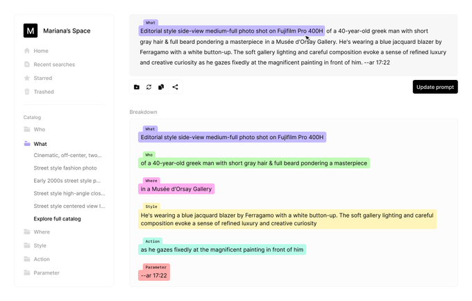
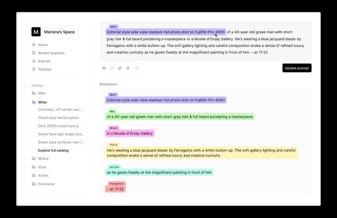
I've been following
@nickfloats
's fantastic work with Midjourney and noticed how prompts can get long.
So I designed a UI concept for a smart editor that identifies semantic differences inside the text and allows you to store and manage snippets to help additive prompting.

19
31
471
Day 018 ↓
So I slept on this design and wanted to experiment a carrousel logic, which in the end, I like much more for this flow as it gives a more interesting sense of progression.
Quick Figma proto here and HD frame below. ✨
Day 017 ↓
Another onboarding exploration. 🥫
A fun fact is that I never have posts ready for the next day; everything I've been posting I'm designing on the day I post it.
So really really not a lot of margin for exploring or testing things out.
5
0
70
22
20
461
I just shared a new experiment in
A contextual toolbar that suggests and enables actions depending on the page the user is.
Some things I like about it below:
29
19
441

Finallyyyy we have exposed nested instances! Best update to components props.
3
25
367

After some days of building with
@emilkowalski_
the waitlist is open at
We plan to start inviting some people for beta testing soon! 🤝
53
11
323
I was really not expecting these numbers ~4 days after sharing publicly. 🥹
This is meant to be a personal diary for my experiments so I'm really happy more people enjoyed it.
22
5
280
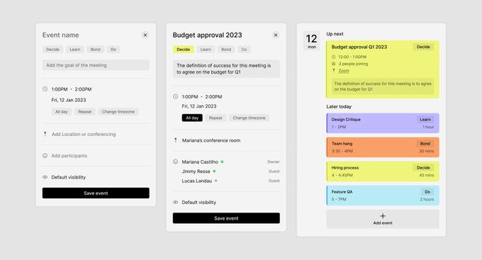
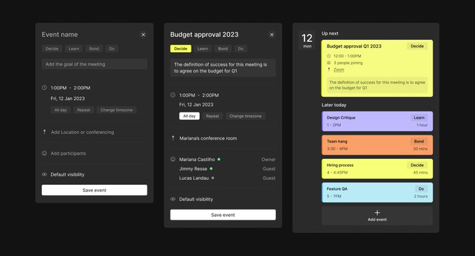
Day 005 ↓
Today's explorations were inspired by this tweet from
@danmall
What if we surface the goal of the meeting to the very top level and we absolutely need to label every meeting we create using one of these 4 options?
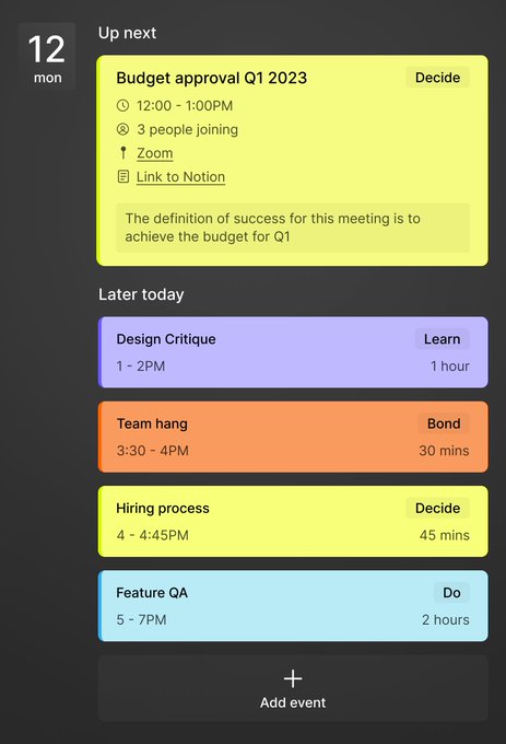
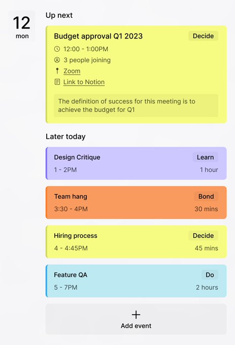

There are only 4 acceptable reasons to call a meeting:
1. Do something together
2. Decide something together
3. Learn something together
4. Bond
Politely decline everything else.
(Thank you to
@adammgrant
for this great framework.)

4
50
286
7
17
262
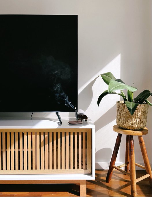
After full day of moving, unpacking boxes and opening suitcases, finally the vibes of the new house are starting to kick in. 🧘♀️
17
3
254
It's oversaid, but it's so hard to find a sans-serif typeface as balanced as Inter for UI design.
I've been testing Graphik, Söhne, Switzer, Manrope, and other great typefaces, but often Regular feels too thin, and Medium feels too thick, or letter spacing doesn't feel right.
27
12
254
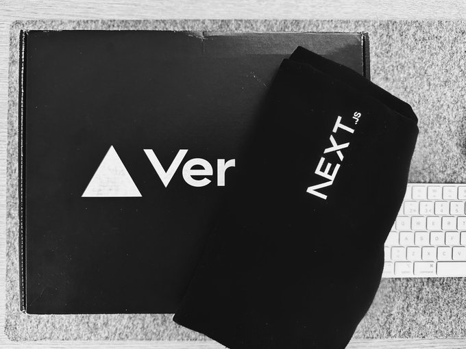
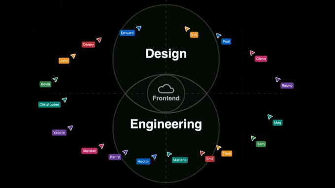
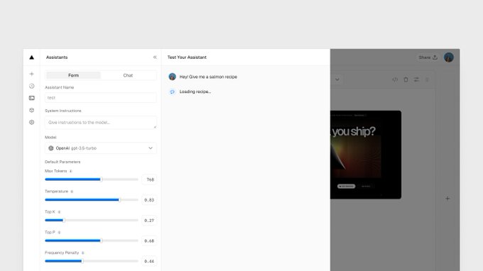
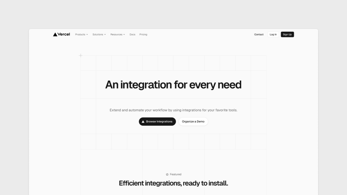
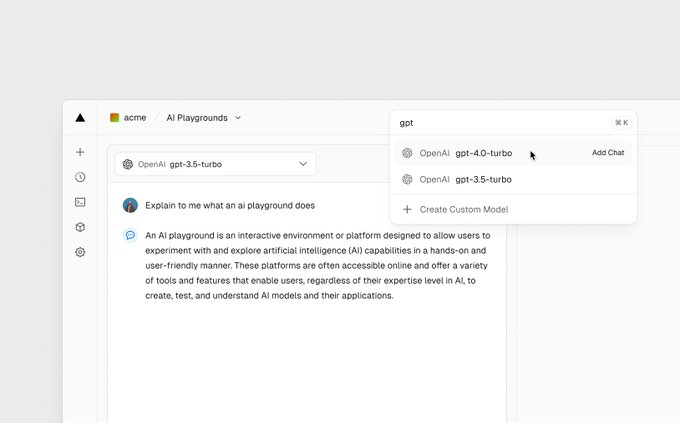
I spent the last weeks designing a new
@vercel
product and it’s finally live! (Sound on 🔉)
You can now seamlessly integrate AI models into your projects, browse and play around with different models without leaving your dashboard, check out full documentation, and more.
12
14
253
Day 007 ↓
Some light mode flavor. 🍙
Day 006 ↓
I started to explore how an event creation UI could use this methodology while still being straightforward.
Ah! And I also did some refinement on the events list UI to make it cleaner. 🧼🫧
3
12
189
8
9
244
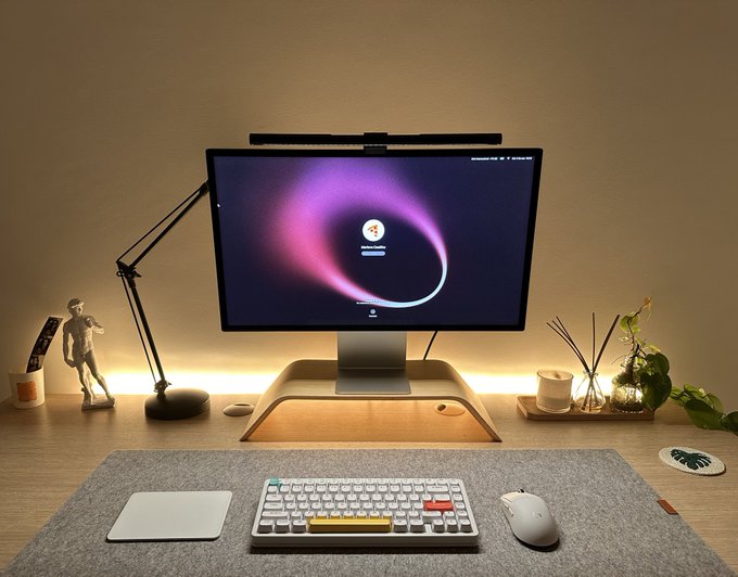
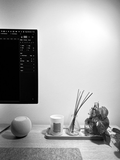
Still missing some posters on the wall but the office is finally getting to its final form. 😌
25
1
226
Quick update - I've partnered up with
@emilkowalski_
and we've started building it already.
More updates coming soon!
Does the world need another note-taking app? Absolutely not.
Yet, I specifically wanted a brain dump in a timeline format, so I could scroll back in time and filter easily. Just for fun, I decided to build that for myself as a holiday project.
Building with
@nextjs
obviously.
54
11
564
16
2
227

So cool to see my tiny name in a
#Config2023
stage during
@rauchg
's talk. 🥹
Every day grateful to be part of this team.
6
9
218
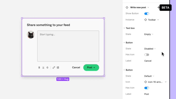
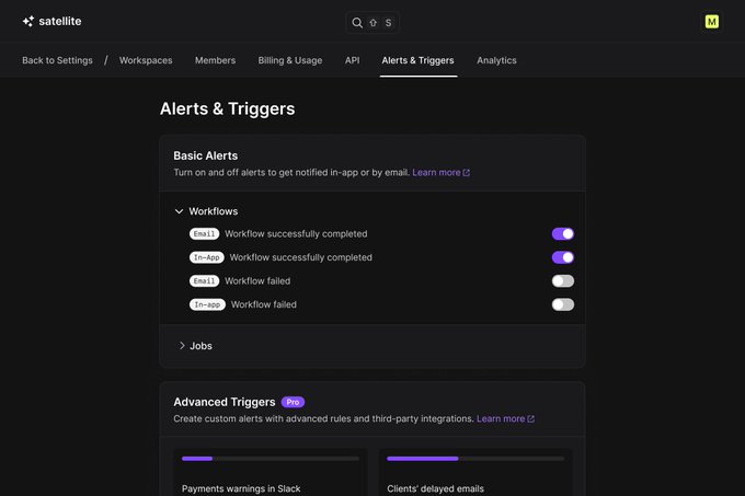
I added a subscribe component in toolbar.
Now you can get emails when new components are shared, useful links and resources. 🤝
14
10
221
WIP of a past exploration - dynamic container for a tag assistant. This is the actual built component, not a Figma prototype.
The animations are not quite there yet and X's compression isn't helping, but it was a fun exploration to exercise my craft.
16
8
210
Day 006 ↓
I started to explore how an event creation UI could use this methodology while still being straightforward.
Ah! And I also did some refinement on the events list UI to make it cleaner. 🧼🫧
3
12
189
I got a fully working, great component with just 2 prompts. And it's crazy how very generic prompts are interpreted just right and produce great results.
Genuinely excited about what we're building. 😌
14
8
191
So
@createwithplay
invited me to test their soon to be launched macOS app!
I'll be playing around with it and might share some insights here. 👀

11
8
186
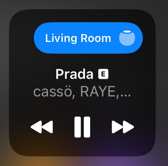
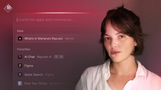
Hello, it’s me talking about a product that I love with amazing people. 🤍
@peduarte
@brunocbreis
@raycastapp

Ever wondered how a designer at Vercel uses their Mac?
Take a peek into what's in
@mrncst
's Raycast 👀
👉
6
7
153
7
8
174
Day 008 ↓
A small experiment with some Figma prototype for a concept onboarding flow.
Still some iterations to do and micro interactions to add coming up in the next few days. 🪐
5
3
176
I love designing mobile web experiences that feel super native.
14
4
175
Soooo that’s it! I’ll be helping the most generous and fast-growing design Community out there sharing what I know and what I’ve been exploring lately.
Join us! ✨

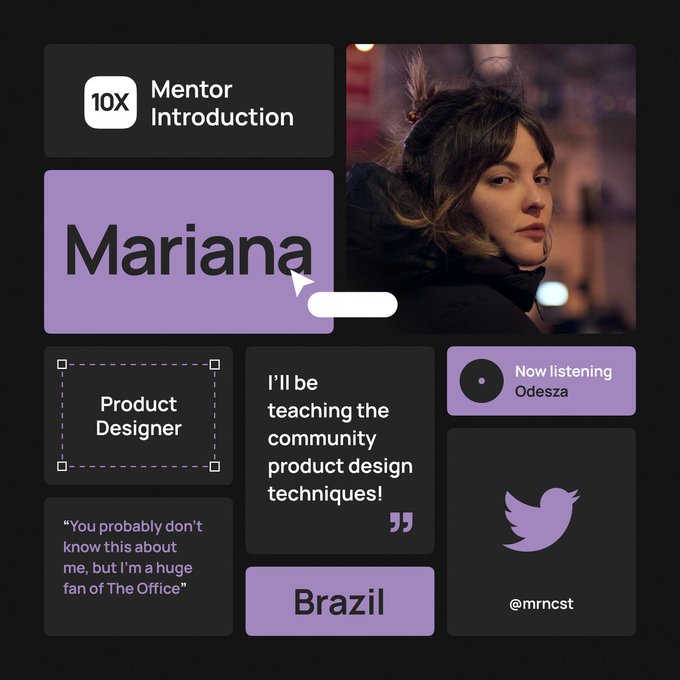
We're happy to introduce a new mentor to you!
Meet
@mrncst
, a product designer from Brazil who will teach the community product design techniques. ✨
Her first lesson "Mastering Dark Mode" will be available to all community members in March! 🌚
15
12
314
14
3
165
Sony Headphones >>>>>> AirPods Max but y’all are not ready for this conversation.
64
3
163

I genuinely think that we all should feel happy seeing other people succeed in their dreams and ambitions.
The world would be a better place if people shared more support and encouragement.
Cheers. ✌️
11
10
161
Day 012 ↓
I'm taking some time to enjoy my vacations 🌴 and show the city to my sister-in-law, buuut here is some design stuff again.
I played around with some ideas for a user management flow and screens, and I'm landing somewhere I like.
9
8
156
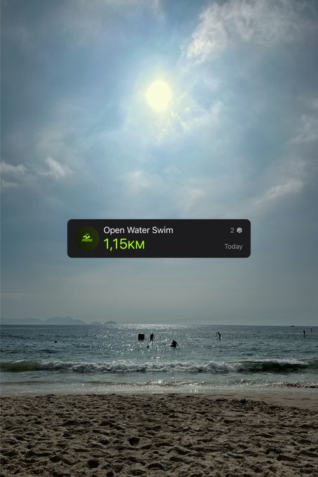
So I guess that’s happy birthday to me!
Early morning swim to celebrate in the best way Rio de Janeiro can offer. Nothing but gratefulness today. 💛

36
0
154
One of my first
@vercel
projects is now live. 🥲
Previously it was very hard to keep track of new Comments across different Previews - you had to enter Preview by Preview or rely on email notifications.
Now you can manage all that's important to you in a single place. 🤝


Comments on Vercel deployments now show notifications in the dashboard.
0
0
25
10
3
151
Experimenting with some ideas to use toasts to display some tips. 🍞
In this case it doesn't require input to be dismissed as it fades away after delay. As it's not giving feedback to any action taken, I think it's ok to not wait for users to dismiss it.
4
5
155
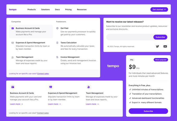
In the past few weeks I've been working with a true
@framer
wizard to bring a very special project to life.
@trytempo
is coming soon - a Framer UI Kit, designed by me and built in Framer by
@aleksliving
. 🍇
18
11
154
I'm slowly making some progress on my new personal site. 🫨
I've been experimenting with some font pairing and nothing is really quite there yet. Potentially I'll change the direction to something else while keeping it very minimal.
12
0
147
Dropping some new code in the
@vercel
dashboard soon, collaborating with the one and only
@JohnPhamous
.
6
4
144
Day 015 ↓
The day was full of trails, but I saved some time to test out some juicy juicy animations. 🍇
(Twitter compressing the s out of this video in 3, 2, 1...)
11
4
143
Just prototyping for fun with react + framer motion. Enabling actions inside cards.
9
1
138
I swim in open sea with a group, and every single day someone in our messages group asks: "what's the temperature of the water?"
I spent a couple of evenings building a tiny app for them to quickly check it out (location fixed at our swimming spot atm) -

11
3
134
Just fooling around with a rough prototype of a baby between a button and a theme selector. It's a Figma proto, so obviously in prod the transitions could be much better.
Decided to post some experiments here after approximately 84 years, don't take me too seriously. 🙃
7
0
135
Some WIP stuff for Polishing some of the core features like:
- Easily add, edit and copy notes
- Add images, links and more
- Quickly search using text, date, tags, etc using the toolbar
Smooth, minimal timeline view.
8
2
134
Late night building sesh recreating the iOS slider but for the web. Using Radix UI and Tailwind.
9
3
131
I'm back to experimenting with code and building tiny projects on the side.
Animation made with code, zero Figma this time. 🤝
8
1
107
One privilege of living in Rio is that this is your morning workout routine.
7
0
105
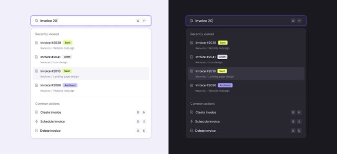
Experimenting with this global search + command menu behavior.
One thing I usually don't see in products that use this component is that, when triggered, the menu suggests first localized actions and results related to the context you are.
Three things that I tried to refine👇
4
2
104
So cool to see out there in the wild, thanks for the feature
@joshtriedcoding
I'll share some new experiments there soon. 👀
Check out his video here:

3
5
99

For those obsessed with UI like me, I totally recommend this profile. I could spend hours scrolling. 🤤


8
4
95
Expanding a bit my experiments on creating friendly UIs for additive prompting with Midjourney. 🔮
What if we could add new blocks of prompt browsing through a categorized catalog of snippets? Like additive prompting made super friendly.
HD frame below video quality is mehh
7
2
92


Thanks
@layers_to
for the feature! 🫶


4
0
91
Christmas arrived earlier thanks to
@raycastapp
🎄
Seriously one of the sickest merch I’ve ever seen, top-tier quality. Thanks a lot
@peduarte
@thomaspaulmann
@brunocbreis

6
2
89
I'll just drop this here

0
9
88
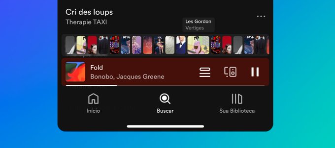
Day 016 ↓
I was on Spotify wondering why your playing queue is hard to find when scrolling through playlists.
Just for fun, I did this quick unsolicited redesign to experiment with other ways to display and manage your queue, triggering it directly from the playing bar.
7
0
89
@ilyamiskov
I'll die on the hill that auto-layout is one of the best Figma features, specially for UI design
9
1
88
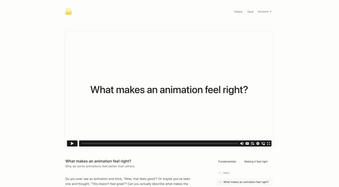
Can’t recommend it enough - if you want to learn how to build great animations for the web this is the best resource out there.

The first part of the course launches today at 3PM ET time. Excited!
38
26
595
4
2
87
So grateful to have collaborated to this project. Vercel is really changing the way we build the web and it’s an honor to be part of such an insanely talented team.
LFG ▲

v0 by Vercel Labs
Generate UI with simple text prompts. Copy, paste, ship.
Explore the prompt library and join the waitlist today.
212
940
5K
5
2
83
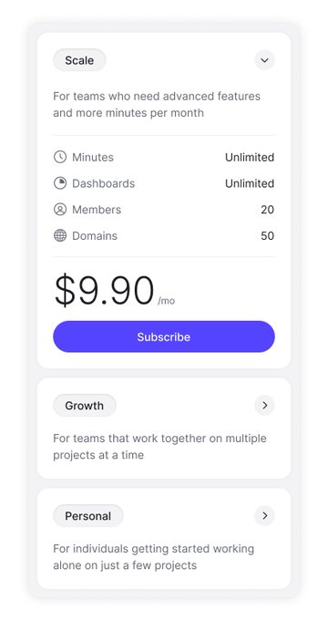
Day 003 ↓
Today I wanted to explore a lighter color palette, keeping the same pricing theme as the previous days.
This might be an interesting solution for mobile, but I also want to explore the same architecture on desktop.
6
1
83

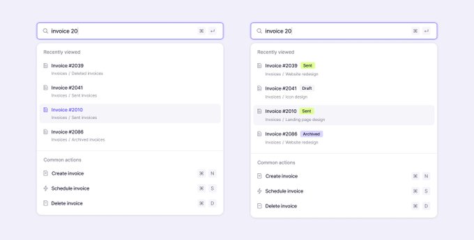
Day 009 ↓
Starting some UI work and exploring some search menu options. 🥶
On the left, the breadcrumb indicates the state of the invoice, while on the right, this state is surfaced to the label, and the breadcrumb indicates the project name.
2
1
77
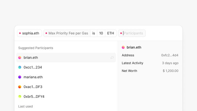
Explorations for a pm/weekend project I've been working on. Image making blockchain data more accessible and easier to explore.
The complexity here is no joke tho. 🤠
3
1
76
What do you do when it’s 2am and your brain starts to bomb you nonstop with work ideas?
38
1
74
I was helping my partner to set up a page in Notion, and...how did it become so complicated so quickly?
Huge respect for the product, but I feel like as they add more and more features and complexify the architecture, it becomes much less intuitive and fluid to use.
11
2
73