Explore tweets tagged as #DataVisualizationTips

Mastering Data Visualization: Stacked Bar Chart Tutorial.#DataVisualization #StackedBarChart #DataAnalysis #DataSummarization #Tutorial #DataSkills #ChartingTechniques #DataVisualizationTips #DataFiltering #DataAnalysisTutorial
0
0
0
How to Create a Gantt Chart for Roadmap Table in 5 Easy Steps.#GanttChartTutorial #RoadmapTableVisualization #DataVisualization #GanttChartTool #DataAnalysis #ProjectManagement #InteractiveCharts #DataVisualizationTips #DataVisualizationTool #GanttChartColors
1
0
1

4/4 Prepare and practice. 🎓 Steve Jobs was known for his legendary presentations, and he always made sure to rehearse them beforehand. Practice makes perfect. #datavisualizationtips #preparatio

1
0
0
2/4 Use Stories - Present your facts using stories. 📚 Steve Jobs was a master of storytelling, which is why Apple products are so popular today. Use stories to make data memorable. #datavisualizationtips #stories

1
0
0

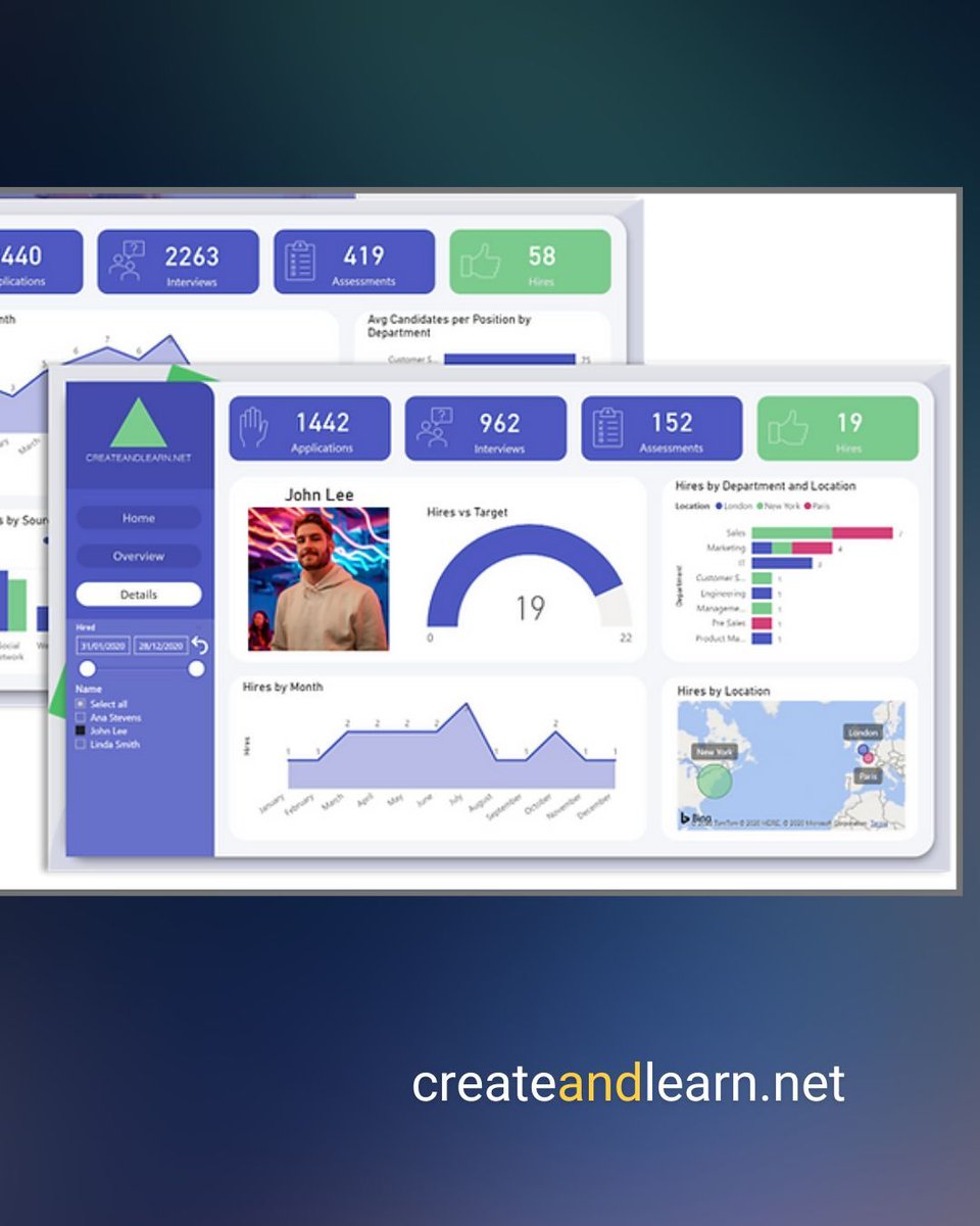
The Art and Science of Creating Effective Analytics Dashboards in Tableau.#TableauAnalytics #DataVisualization #DashboardDesign #DataArtistry #AnalyticsProducts #VisualizeData #DataDrivenInsights #DataVisualizationTips #TableauTips #DataArt
0
0
0
Designing Effective Visualizations: Best Practices for Tableau Dashboards.#DataVisualization #TableauTips #DashboardDesign #VisualDesign #DataPresentation #InformationDesign #EffectiveVisualizations #DataAnalysis #DataVisualizationTips #TableauDashboards
0
0
0

➡️ Tip: Use pie charts sparingly—they are great for showing proportions but can become cluttered when there are too many segments. #DataViz #PowerBI #Excel #DashboardDesign #CreateAndLearn #DataVisualizationTips #BusinessIntelligence #DataAnalytics

0
0
1

Mastering Data Analysis: How to Use Graphs and Zoom Features to Analyze Trends.#DataAnalysis #GraphsAndZoom #TrendAnalysis #DataVisualization #AnalyticalSkills #DataTrends #GameAnalysis #LiveOdds #DataInsights #DataVisualizationTips
0
0
0

Master the nuances of ggplot2 📊! Learn how to tweak legend key sizes for clearer visualizations in this insightful guide: #dataviz #ggplot2 #DataVisualizationTips #PythonRCombo #GraphingHacks.
3
84
388

Pt. 2 FREE Marketing dashboard templates at #marketingdesign #datavisualization #easycustomization #customerjourney #socialmediaengagement #marketinghacks #marketingtools #datavisualizationtips #marketingstrategy #ROI #emailmarketing #marketingvisuals

0
0
1

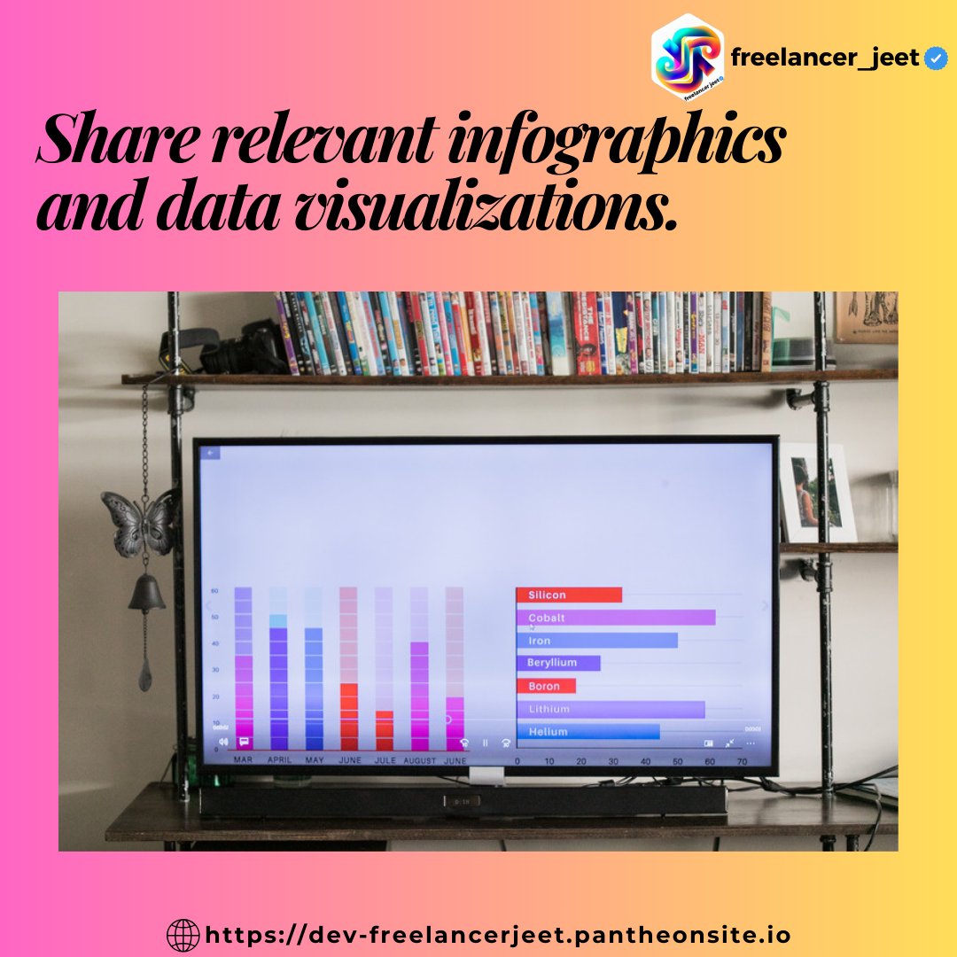
Share relevant infographics and data visualizations. #datavisualization #datavisualizations #datavisualizationart #datavisualizationtips #datavisualizationtools #datavisualizationdesign #datavisualizationtraining #datavisualizationsociety
0
0
1
Elevate your visualization game in R 📊! Nicolo Cosimo Albanese shares top R packages to craft stunning plots via @TDataScience: #ggmap #ggpubr #dataviz #rstudio #plottingmagic #datavisualizationtips.
5
80
333
1/4 Less is More - Keep your message short and simple. 💡 Don't confuse your audience with too much information. Focus on the key takeaways. #datavisualizationtips #lessismore.
1
0
0
3/4 Use Visuals - Use more visuals, less text. 📊 Steve Jobs was known for his minimalistic design. Use visuals like graphs and charts to make your data stand out more prominently. #datavisualizationtips #visuals.
1
0
0

Did the x-axis coordinates decide to take a vacation?.Source: #datavisualizationtips #codingtips #codingtricks #technology #matplotlib #coordinate.
0
0
5
Want to learn more about data visualization? Follow me medium for more tips and resources! #fomo #datavisualizationtips.
0
0
0

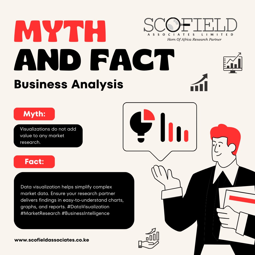
Data visualization helps simplify complex market data. Ensure your research partner delivers findings in easy-to-understand charts, graphs, and reports. #DataVisualization #MarketResearch #BusinessIntelligence #datavisualization #datavisualizations #datavisualizationtips
0
0
0

Excel Pro-Tip. Want to make your #Excel spreadsheet more visually appealing? Try using conditional formatting to highlight important data based on specific criteria, such as color-coding cells with high or low values. #datavisualizationtips.
0
0
1

Improve your Data Storytelling | 8 Data Visualization Tips #datavisualizationtips #july #datavisualization
0
0
2
Want to avoid the #1 mistake in data visualization? Learn from the master, Steve Jobs! Don't bore your audience with too much information. #datavisualizationtips #SteveJobs #fomo #marketingstrategy #designthinking
0
1
1