

Studio.Build
@StudiodotBuild
Followers
37K
Following
8K
Media
2K
Statuses
12K
https://t.co/1W9RhanDUo is an internationally renowned UK-based design agency. Brand Identity, Art Direction & Design. T: +44(0)113 350 2675.
The NORTH
Joined August 2010


RT @SAVEtoReuse: 🎂 For SAVE’s 50th anniversary we’ve introduced a new website and a new look to give us a strong platform to inspire new au….
0
2
0
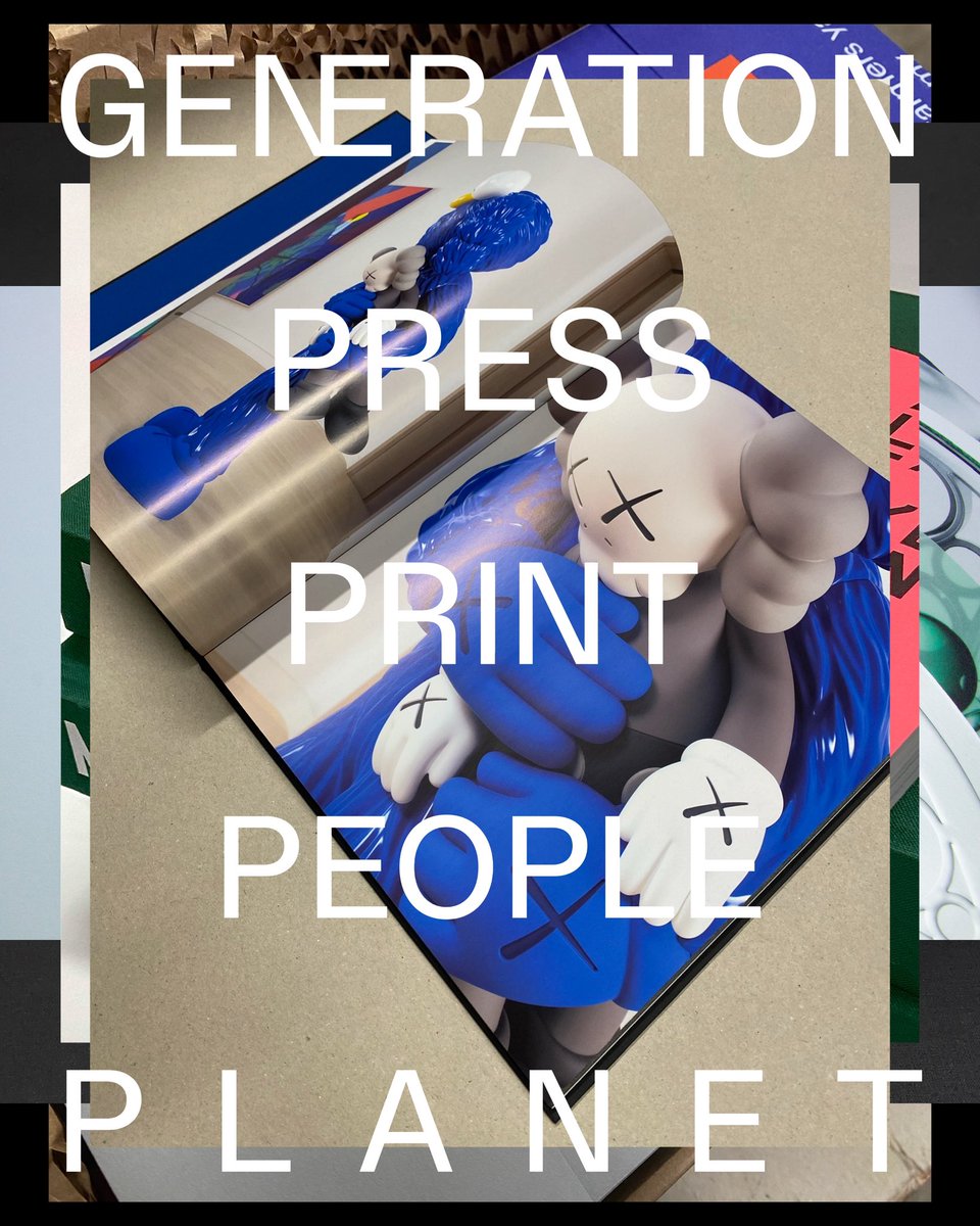

Visual identity refresh for our friends Generation Press


1
0
9

2 years in the making….

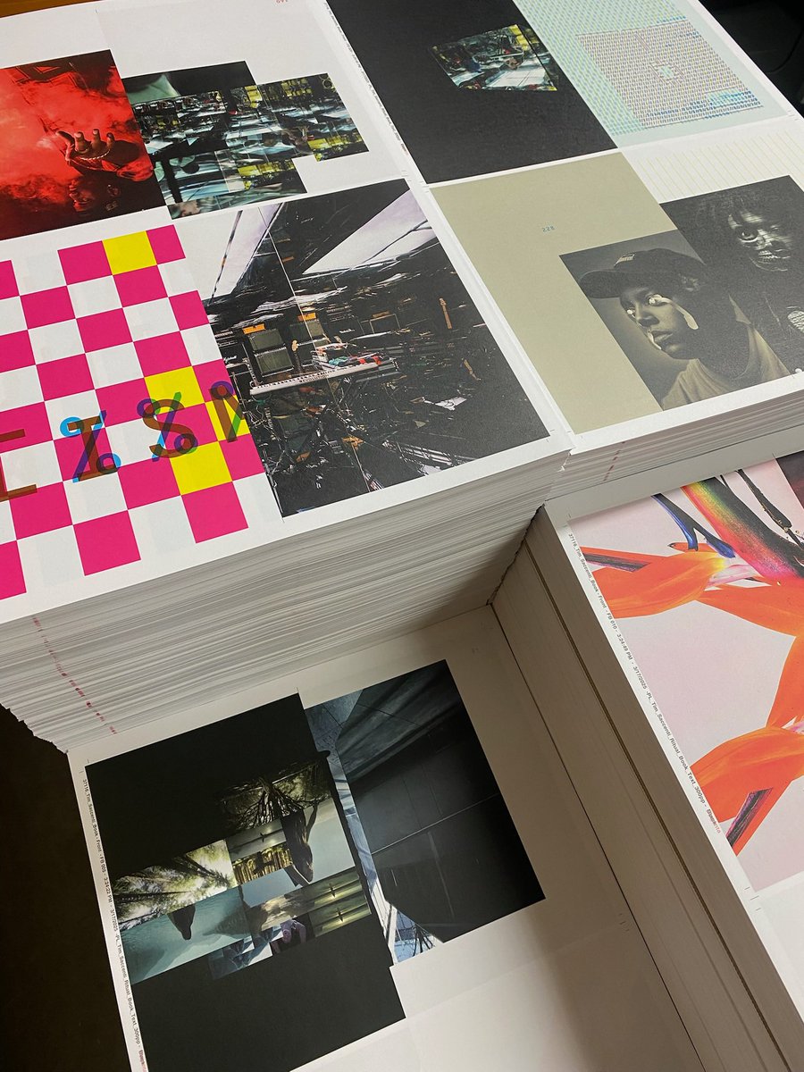
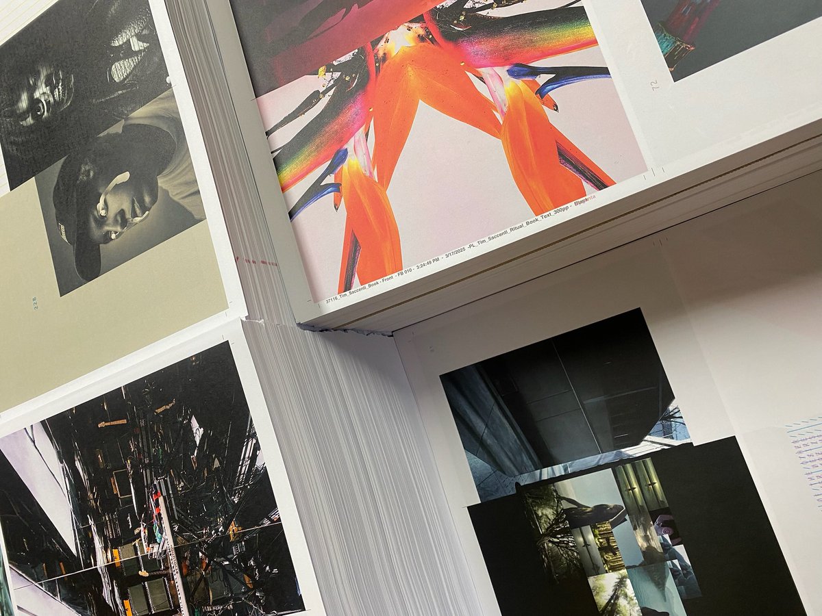
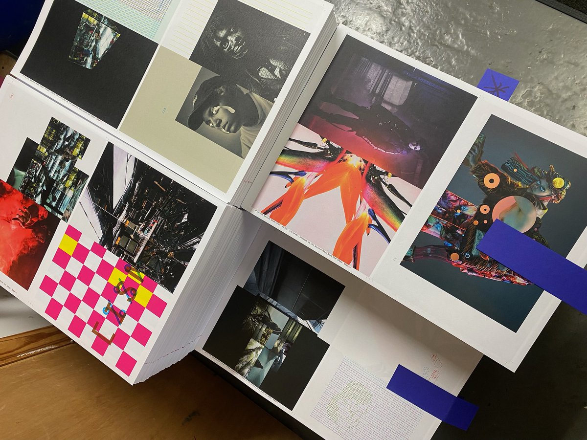
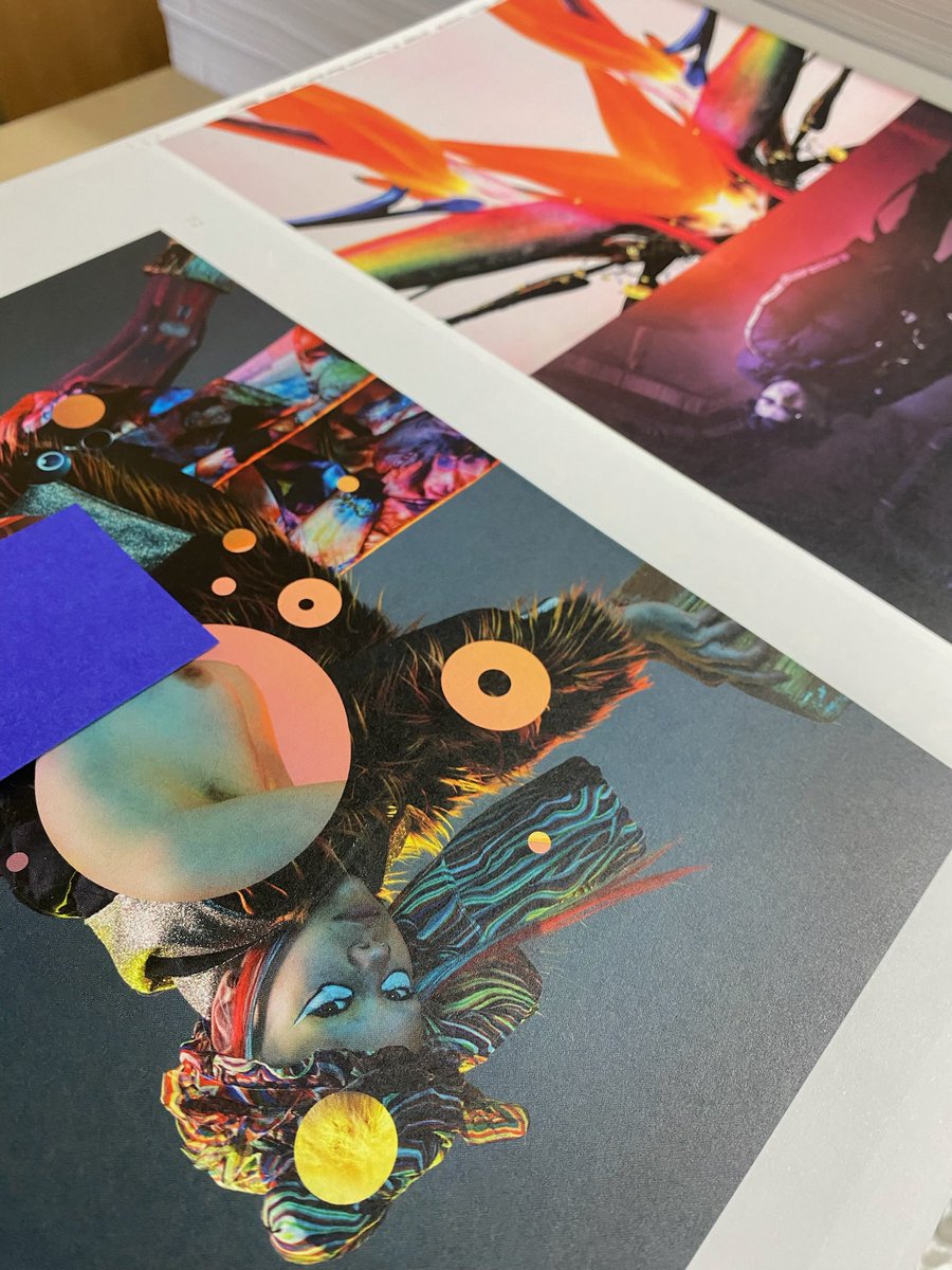
Sample spreads from my next book, titled’THIS’. Tip on cover/Cloth covered/Case-bound/300 pages/Edition of 100 only. Print/Production by @GenerationPress . Summer 2025 release.
0
0
10
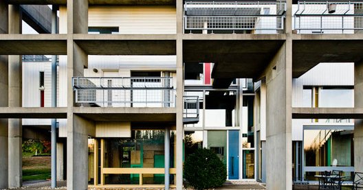
The Miller House, José Oubrerie —
archdaily.com
This article was written by Seattle-based designer and critic Evan Chakroff. Lexington Kentucky’s Miller House is a...
0
0
0
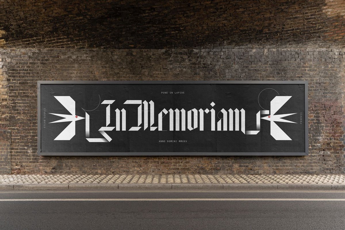
In Memoriam, a black letter font by @StudiodotBuild x @m_c_place x F37. In loving memory of Print. Available to worship soon

0
0
5

RT @ABCQuinn: Five weeks since we sent @gates_light II out into the world; so many beautiful connections and opportunities opening up now a….
0
6
0
Love this photograph!.

0
1
5
Dream team.

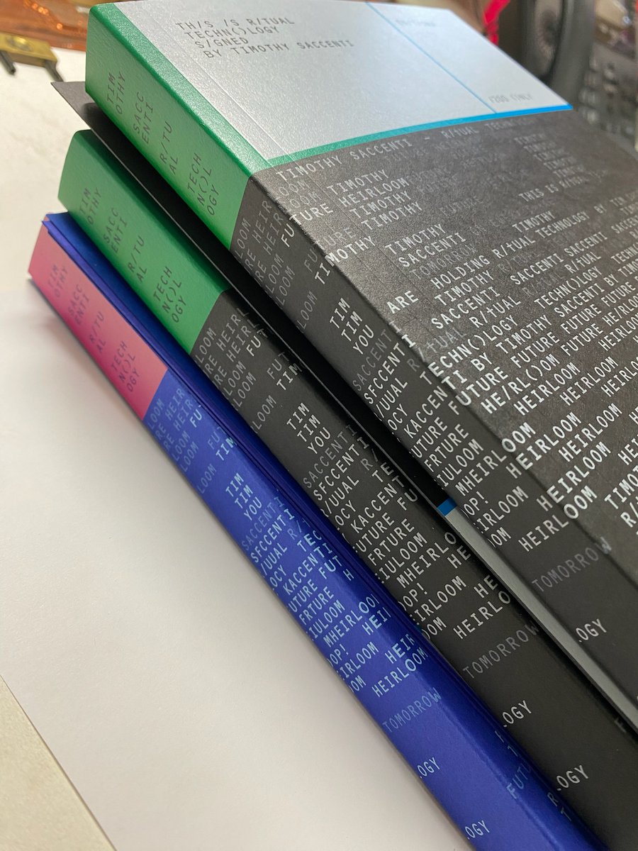
Coming soon - #ritualtechnology book .Photography Works of @timothysaccenti @SettaStudio .Design by @StudiodotBuild @michaelcplace .Print by @GenerationPress


0
0
4


