
Sam Parsons
@SParsonsDataViz
Followers
6K
Following
16K
Media
754
Statuses
7K
Biztory: https://t.co/mnjU9EJ4x9 | Tableau Visionary & former Zen Master | Iron Viz '21 Global Runner-up | Views are my own
Chippenham, England
Joined February 2018
Drunken Gauge / Speedometer Charts. I've wanted to build one for a while now!. They are niche in their use case & I wouldn't recommend as the go to KPI visual, but they are fun & tell a story. Now published to my @tableaupublic site (link below). Link:


6
13
62
RT @tableau: Applications and nominations for the next Tableau Ambassador cohort are now open! 🎉. Teach. Share. Lead. Innovate. Inspire. Ap….
0
42
0
Thank you Tableau! I still remember getting my first years ago and not know what was going on as my phone blew up with messages! 😅.

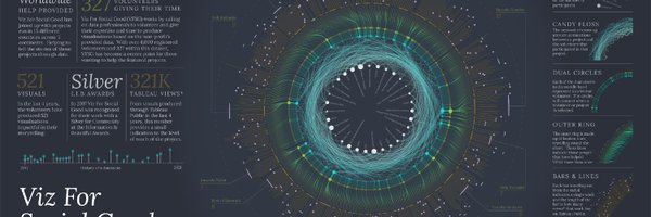
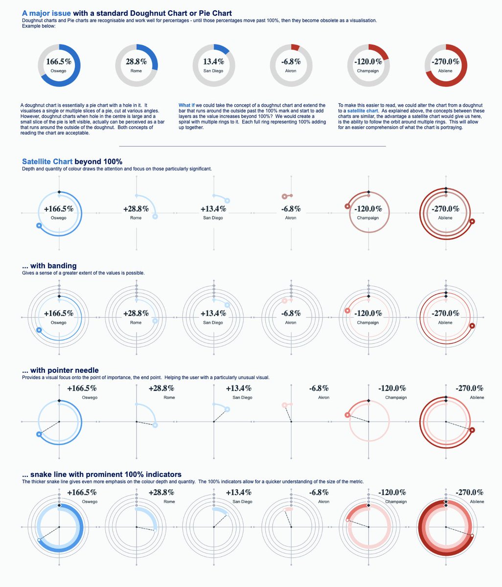
Try spiraling satellite charts with this #VizOfTheDay by @SParsonsDataViz—an alternative to visualizing pie and doughnut charts when percentages exceed 100%.
3
0
27

RT @tableaupublic: Explore global climate data with this #VizOfTheDay by @VisualClimate, who joined the Keynote stage at #TC25 and shared h….
0
9
0
RT @dat_tableau_gal: This looks amazing @SParsonsDataViz .I love to see variants of the regular chart we always use and this is super bril….
0
1
0
Spiraling Satellite Charts. New visualisation using Tableau! What can you do if your pie / doughnut chart %s go beyond 100%? Try a spiraling satellite chart! . Link:

6
9
69
RT @tableaupublic: This #VizOfTheDay created during the 2025 #IronViz competition by finalist @katmccrind explores data from wildlife strik….
0
12
0
RT @trebor_rolyat: Here is another tip from the #DataFam community, which I learnt from @SParsonsDataViz and is great for getting started w….
0
1
0
RT @tableau: Meet 2025 #IronViz finalist @katmccrind! . Read Kathryn's journey to her very first Iron Viz participation and the creative ap….
0
5
0

RT @ZachBowders: This was my first @tableaupublic viz from July 2017. Since then I've published 272 vizzes, completed 5 years of the Data+L….
0
2
0
RT @tableaupublic: 15 years. 11 million vizzes created. 5 million people exploring data. Countless moments of insights and inspiration. He….
0
31
0
RT @SerenaPurslow: Hey #datafam! I’m seeking a new role, so if anyone knows of any exciting opportunities please send me a message! .💼 I’m….
0
21
0
Congratulations to @boknowsdata and @ryandsoares for their #IronViz finalist entries! . But special shout out to @katmccrind my partner in crime at Biztory before I left! Superb effort Kathryn!! . Superstars all three of you!.
1
0
20
🚨 I'm hiring! 🚨 .Based in: India.Role: Senior Data Visualization Analyst. Come work for me in my Data Viz team at Amex GBT! If you are interested, the link is below. It is critical you share your dashboard portfolio in the application. Job details:
1
11
28
RT @911xclusive: Hello #DataFam👋. Kicking off the year with my first data viz: a Health Tracker Dashboard that monitors the performance of….
0
54
0
Thank you @tableaupublic 😊.
Explore the use of gauge charts—also known as speedometer charts—in this #VizOfTheDay by Tableau Visionary @SParsonsDataViz. Often used to show progress toward a target, this chart cleverly visualizes the Tableau Superstore dataset.

3
1
23
RT @tableaupublic: Explore the use of gauge charts—also known as speedometer charts—in this #VizOfTheDay by Tableau Visionary @SParsonsData….
0
7
0