
Yan Holtz
@R_Graph_Gallery
Followers
22K
Following
5K
Media
487
Statuses
2K
Software engineer who ❤️ #dataviz. Creator of https://t.co/sj29jZPkYr and the R, Python, D3 and React graph galleries. ➡️ https://t.co/PoJNeHXz8a 📈 🌊 🍺
Montpellier, France
Joined February 2016
😅 Finally! 🍾 ➡️ 6 months of work later, I'm launching my https://t.co/wK6l6vXJe9 project! ❤️ If you're using #Rstats for data analysis, you will very likely enjoy it! 🙏 Thanks so much to the 200+ early adopters! ⏰ Pre-launch price available until the end of the day
3
17
158
I spent 2 years building this. I left my job to teach programming and dataviz, and now 4 projects are finally live: 1️⃣ https://t.co/wK6l6vYh3H 2️⃣ https://t.co/sCU4ungvzw 3️⃣ https://t.co/HxJb2xaYZx 4️⃣ https://t.co/0B6a1ecgqy They’re all 50 percent off until Sunday! 😀
0
0
4
I just released https://t.co/0B6a1ebIB0 ➡️ a tool to build a good looking portfolio in a few minutes! If your work is more or less related with #data, I think you'll like it!
0
5
32
🎉 Want to build better charts with #Python and @matplotlib ? Join me and @joseph_barbier for a brand new #dataviz workshop! We’ll spend 2 half-days together, alternating between impactful explanations and hands-on exercises. Only 15 spots available! https://t.co/2HytHSWqwm
0
2
6
Want to improve your #dataviz design eye? ➡️ I just released a little game: You have to spot the better version of a chart and learn the fundamental concepts along the way. https://t.co/bI1MERgPyf What's your score!? 😀
7
17
79
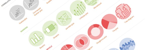
❌ Made a list of the 37 most common #dataviz caveats - Rank your groups - what's wrong with boxplots - Dual Y axes - overplotting - misleading error bars ... ➡️ https://t.co/elGnMswssl I'll use in my https://t.co/sCU4unfXJY and https://t.co/HxJb2xar9Z Any I should add?
1
15
115
#dataviz is a long, iterative process. If you want to learn the required steps to create a great graph with R and ggplot2, we are building something for you with @CedScherer ! https://t.co/HxJb2xar9Z
2
17
111
😀🍾 Big, big news!! 🎉😱 ➡️ I'm starting a new #dataviz project with @CedScherer It's an interactive online course designed to turn you into a ggplot2 dataviz expert! ➡️ https://t.co/HxJb2xar9Z Pre-launch until Sunday. If you like making charts with R, you'll love it!
5
27
193
New Python Tutorial: Choropleth + Histogram as a legend with @matplotlib Original work by @Koen_VdE, with Python code written by @joseph_barbier! https://t.co/YY3qFq5MSl
0
27
127
🚨 66% of R and Python users do NOT use a formatter 😳 A formatter takes messy code and automatically improves its layout: ✅ Better indentation ✅ Proper spacing ✅ Reasonable line length Poll and explanation in my latest post: 👉 https://t.co/ML4oh9CPC4
1
6
50
"Python creates only ugly charts" ❌ I wonder how many times I've heard this wrong statement! Matplotlib is very powerful! It's not the most intuitive API, but look what Roy built after investing a few hours in https://t.co/sCU4unfXJY! Code: https://t.co/vFKfQZjTVE
2
7
61
🎉 10,000 people! 🍾 Every week, I share one short, impactful #dataviz tip in my newsletter. Something you can apply at work the next day. And it looks like people enjoy it: 10k joined in just a year! 😳 Huge thanks to everyone for the feedback 🙏 https://t.co/RJBDamXlIS
2
6
42
It's now incredibly easy to build calendar heatmaps! Thanks @joseph_barbier for your dayplot library! Documentation: https://t.co/QyCBM9FV85 If you like making charts with Python, come learn with us at https://t.co/sCU4unfXJY!
2
45
210
Chord diagrams are a great way to represent flows. BUT, they become very hard to read when there are too many connections. In this chart, Ansgar Wolsing smartly used small multiples to avoid this trap Love it! ❤️ https://t.co/7xFCJBIuCB
2
25
195
🍾 Yay! Excited to release a new project! It's a visual exploration of our aging world. It made it to the long list for the Information Is Beautiful Awards! 🚀 Tech stack: React + D3.js, of course ❤️ https://t.co/lAeHKWYlqf
0
2
27
🔥 New Python library for #dataviz! "morethemes" gives your graph a better theme in 1 line of code! It currently offers 10 themes inspired by famous journals such as The Wall Street Journal, andThe Economist. Learn more: https://t.co/4D4muqdkPw Congrats @joseph_barbier !
2
45
264
⏰ Last call! If you want to create stunning charts with Python, there are a 8 hours left only to join Matplotlib Journey! https://t.co/6zVs07hJA6 Thanks so much to the 414 people who joined already! 🙏 Graph by the awesome @CedScherer, python repro by @joseph_barbier
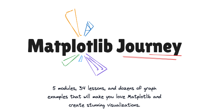
matplotlib-journey.com
An all-in-one, interactive online course designed to make you a python & matplotlib dataviz expert.
0
3
24
Want to make better charts at work? Only 1 way: 🙇♀️ Practice 🤝 Get feedback ♻️ Repeat! The charts below are a glimpse of what students created in https://t.co/Zprzmadjhh. They use the course Discord to share, get feedback, and refine their code! Only 2 days left to join🚀
0
12
130
Many ppl ask me why I compete with Coursera, Datacamp, Udemy.. But I create very different content! 🎮 Highly interactive 📈 Learn #dataviz AND #coding. Not just one. 👷♂️ Practice for real (like a lot!!) ⛏️ In depth: understand matplotlib for REAL https://t.co/sCU4unfXJY
0
1
20
If you’re into Python, #dataviz, and maps, you’ll love the last module of my https://t.co/6zVs07hbKy project! It covers everything you need to create stunning maps, and is half price until the end of the week! 💸
matplotlib-journey.com
An all-in-one, interactive online course designed to make you a python & matplotlib dataviz expert.
1
3
20
5️⃣ Pick a color palette Check out the 2600+ palettes in pypalettes. Choose a continuous palette and tweak thresholds. This is the trickiest part! 6️⃣ Add a legend I love how Vinicius Oike Reginatto uses a histogram as a legend in his example. Such a smart touch! 👏
1
0
4