
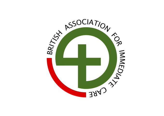
We would really like to seek your views on a slight change to our logo. The aim is to make it sharper and to add part of the original red back into it. We also propose using the British Association for Immediate Care, rather than BASICS
Thoughts welcome -
6
6
36
Replies


@BASICS_HQ
Text needs to be BOLD, also - how would you avoid using “BASICS” do you just mean on the logo?
BASICS responder is essentially a brand, seems a shame to not see the brand on the Badge
1
0
6


@BASICS_HQ
Splash of red is nice.
Losing the BASICS feels like a potential misstep. It's a very strong brand (I say this as an outsider to the organisation). What's the rationale?
0
0
0

@BASICS_HQ
The ‘BASICS’ brand is better known than the full title. If you want the full title to be better known, it may be best to display it alongside the more commonly use name.
0
0
3