
zeta0134
@zeta0134
Followers
544
Following
96
Media
121
Statuses
180
Programmer, musician, 6502-tickler and all around NES enthusiast
Joined January 2023
It may not be obvious from the video, but this is running the NES version of the game under the hood, consuming my own emulator (rustico) as middleware. The gameplay is identical, but I can cheat the visuals, overclock the system, remove flicker, etc etc. Works great so far.
0
0
0
Two new items added to Tactus this weekend: "Dingbat": Sound a chime when hidden secrets are near "Interrogation Beam": Reveal the true contents of chests. Also, timed chests, and perfectly normal chests! Nothing suspicious at all, no sir! #gamedev #nes #screenshotsaturday
0
4
22
In order: "Peony", "Petunia", "Passion", "Protea" and "Periwinkle." As these are Player Palette Personalization Preferences, it is important that they all start with "P". I named them after real-world flowers for fun. 💐
0
0
1
Mad props to @provolonecinco for working with my weird hardware palette constraints. This title screen splash art turned out great, and I'm able to draw it on NES hardware with the player's custom palette choices. Here "you" are, rendered with all current presets. #pixelart
1
48
7
Finally, the last #accessibility option is programmed! The rhythm assist feature can flash the separator bar or the player sprite in time with the actual music, helping to "see" how on-tempo your inputs are when audio is otherwise unavailable. #gamedev #nes
1
59
37
One of my #accessibility options is "dot matrix mode", retro styled and fully monochrome, for anyone with any vision ability. Normally I'd cycle the enemy color in warp zones, but I don't have color, so here I'm cycling the luminence instead. Works just as well! #nes #gamedev
0
68
14
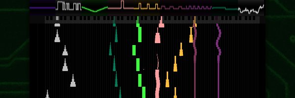
Hrm... here's a different approach: Earth and Air are mechanically opposed, so I put them on opposite ends of the strong hue axis. Ice and Fire are also opposed, so they get to be light and dark instead. More readable at a glance? #accessibility #pixelart
0
52
15
In this game there are "Earth", "Ice", "Air" and "Fire" enemies, which are meant to be distinguished by color. For hardware reasons I don't have the ability to vary graphics tiles for each enemy, so I need the palette alone to communicate the difference.
0
0
1
I'm working on #accessibility modes for my NES game Tactus: TopLeft: Tricolor TopRight: Protanopia / Deuteranopia BottomLeft: Tritanopia BottomRight: Monochrome I'm told simulators can be unreliable. Can anyone with these conditions spot check my attempt? #nes #pixelart
3
47
12