
West Toronto Paint & Wallpaper
@wtopaintandwp
Followers
53
Following
201
Media
302
Statuses
573
Toronto's Benjamin Moore paint and wallpaper retailer.
2975 Dundas St West, Toronto
Joined November 2016
There's just something about these two bold sunbaked hues that radiate warmth and well-being in our spaces! #BenjaminMoore #JunctionTO #Paint #Home #InteriorDesign #interiorpainting #residentialpainting #homeimprovemen
0
0
0
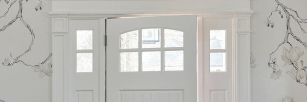
Fall is almost here... Celebrate with a seasonal—but year-round-friendly—pop of orange on your front door. You'll be sure to have an eye-catching look perfect for accessorizing with pumpkins, hay bales, and more. #BenjaminMoore #JunctionTO #Paint #Home #InteriorDesign
0
0
0
Rosy Apple 2006-30 & White Heron OC-57 Looking for a way to be creative without painting a wall? A bold colour scheme on your stairway can set the tone for your entire home, especially when you use our high-quality paints that will both protect and beautify. #BenjaminMoore
0
0
0
Wish AF-680 What is it about a warm gray that makes any room feel cozy? ✨ Wish AF-680 softens this bright and airy bedroom, while never taking away from its cathedral ceilings and abundant natural light. #BenjaminMoore #JunctionTO #Paint #Home #InteriorDesign
0
0
0
Potters Clay 1221 You don't have to be a pottery pro to appreciate Potters Clay 1221, a deep, sunbaked orange. Use it anywhere you're looking to create an earthy, grounded sense of calm. #BenjaminMoore #JunctionTO #Paint #Home #InteriorDesign #interiorpainting #residential
0
0
0
Gray Mist OC-30 Painted cabinets are the perfect way to create a monochromatic look in a spacious kitchen. Look for an off-white or gray that brightens the space with or without natural lighting, like Gray Mist OC-30. #BenjaminMoore #JunctionTO #Paint #Home #InteriorDesign
0
0
0
Carob AF-160 & Limestone 513 At first glance, the red undertones of Carob AF-160 and the yellow-green undertones of Limestone 513 have nothing in common. But when you look a little closer, you'll find they balance each other out in a fresh, welcoming way. #BenjaminMoore
0
0
0
Give old furniture new life with Advance® Interior paint. Advance cures to a furniture-quality finish with outstanding coverage and hide, making this bookshelf look straight-from-the-factory fresh. (WALL) French Canvas OC-41 (BOOKCASE) Snowfall White OC-118 #BenjaminMoore
0
0
0
Blue Nose 1678 & Wescott Navy 1624 Cabinets painted in mid-tone Blue Nose 1678 offer a traditional yet playful feel, while the Wescott Navy 1624-painted accent wall highlights the antique bookshelf and offers a rich backdrop for the charming, mismatched ceramics. #BenjaminMoore
0
0
0
Aegean Teal 2136-40 If you're looking for year-round relaxation, Aegean Teal 2136-40 is the perfect choice. Inspired by the blue-green hues of the Mediterranean, it works from pantry to pool house. #BenjaminMoore #JunctionTO #Paint #Home #InteriorDesign #interiorpainting
0
0
0
Misted Fern CC-668 & Cloud White OC-130 Add dimension with a panelled accent wall. Balance a mossy green like Misted Fern CC-668 with soft Cloud White OC-130 to create a colourful space without feeling overly saturated. #BenjaminMoore #JunctionTO #Paint #Home #InteriorDesign
0
0
1
Ballet White OC-9 What's in your dream bathroom? Ours has to have a relaxing off-white paint colour (Ballet White OC-9, anyone?), marble accents, and definitely double sinks so we don't have to share. #BenjaminMoore #JunctionTO #Paint #Home #InteriorDesign #renovation
1
0
0
Deep Space 2125-20 & Van Courtland Blue HC-145 What colour is your dream kitchen? We're all in on dramatic hues like Deep Space 2125-20 especially when it's paired with Van Courtland Blue HC-145 cabinets. #BenjaminMoore #JunctionTO #Paint #Home #InteriorDesign #painter
0
0
0
Pour yourself a cold drink and celebrate the weekend! (DECK & RAILINGS) Silver Gray, ARBORCOAT®, Translucent (SIDING) Coventry Gray HC-169 Regal® Select Exterior MoorGard, Low Lustre (TRIM) White Wisp OC-54 Regal® Select Exterior MoorGard, Low Lustre
0
0
0
Venetian Portico AF-185 When choosing a hue for your bedroom, pick a colour that encourages relaxation while looking luxe. Venetian Portico AF-185 is a lush, earthy neutral that evokes sun-baked clay and goes with any decor, from wrought iron to fresh greenery. #BenjaminMoore
0
0
0
Metropolitan AF-690 Work smarter, not harder, in a modern home office that features sleek accents, your favourite books, and a can't-go-wrong paint colour, like Metropolitan AF-690, a stylish gray with cool undertones. #BenjaminMoore #JunctionTO #Paint #Home #InteriorDesign
0
0
0
Blue Hydrangea 2062-60 Using blue as a neutral? Oh yes, you can. Blue Hydrangea 2062-60 does the work of an off-white or beige in this living room, adding a touch of color for an eclectic, but cohesive, look. #BenjaminMoore #JunctionTO #Paint #InteriorDesign #interiorpainting
0
0
0
Balsam 567 Considering a kitchen refresh? Don���t replace...repaint! Balsam 567 gives your kitchen cabinets a stylish new look in less time than you think. #BenjaminMoore #JunctionTO #Paint #Home #InteriorDesign #painter#interiorpainting #residentialpainting #homeimprovement
0
0
0
Kendall Charcoal HC-166 Who says your summer can’t be a little bit gray? Kendall Charcoal HC-166 is a year-round classic, perfect for exteriors to accent walls and everything in between. #BenjaminMoore #JunctionTO #Paint #Home #InteriorDesign #painter #interiorpainting
0
0
0
Ocean Air 2123-50 and Cloud White OC-13 You don't have to live at the beach to set the tone of a seaside summer. Use light, airy hues, like Ocean Air 2123-50 and Cloud White OC-130, to create a coastal vibe perfect for warm days and cool nights. #BenjaminMoore #JunctionTO #Home
0
0
1