
UX Movement
@uxmovement
Followers
22K
Following
4
Media
264
Statuses
808
100+ professional articles for you to master UX design
United States
Joined October 2010
Interfaces with too many borders cause visual noise for users. A far better approach is to use surface shades. Learn how to create surface shades: https://t.co/bxNPLHT1Ax
0
0
1
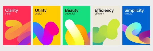
The Law of De-Emphasis Don't emphasize every visual element. Instead, de-emphasize every visual element except the most important one. The result is a cleaner and more minimalist interface. Learn about the law of de-emphasis: https://t.co/6c5imXtCVl
0
0
6
The secret trick to making a double column form easier to fill out is Jointed Fields. Jointed Fields conjoin 2 related fields together so that they're quicker to mentally parse and process. Instead of an 18 field double column form, users now perceive a 9 field single column
1
1
6
Bright button colors with white text labels are failing the international accessibility standard which hurts the user experience. Indigo is the only color that passes. To make them accessible, you have to have to tweak the button hue or text label. Find out how:
0
0
1
Sometimes it's better to use a different text label than "Cancel" on your modal dialog buttons. "Cancel" in this context could be confused with canceling the file download. "Go Back" would be a better alternative. Learn when not to use "Cancel": https://t.co/5or1wXPYUA
0
0
2
Modal dialogs should have states indicated by a color coordinated icon at the top. This way, users understand the severity of the confirmation. The more severe, the more attention they'll pay, preventing misclicks and errors. Learn why: https://t.co/CST5ax62gI
0
0
2
Delete buttons on modal dialogs shouldn't be red. Instead, you should use a red icon or red text label to indicate the potential danger. Find out why: https://t.co/7JZP64kNeZ
0
0
3
Toasts aren't the best for button feedback. Users have to move their eyes long distances to view and interact with them. Sometimes they'll ignore them, or fail to catch them in time. Learn the approach for a better UX: https://t.co/kJCRUdIlD3
0
0
2
Just added 3 new chapters to my book for a total of 9 chapters. It's a bible of best practices for designing forms with optimal UX. Buy the book "Dos and Don'ts for Form Input and Selection"
uxmovement.gumroad.com
Imagine having a book that helps you design the optimal UX for form input and selection. This book would comprehensively list all the dos and don'ts you should follow for every form component. You'...
1
0
0
Hot mic gaffes happen when the design of your voice app has a confusing mic button. Users don't know when the mic is muted or unmuted. Below is how the toggle states of your mic button should look. Learn why this is the best UX for mic buttons: https://t.co/aic7fOp8JR
0
0
1
Floating form labels (infield top-aligned) cuts visual fixations in half compared to top-aligned form labels. As a result, users can scan and complete forms faster with a lower cognitive load.
0
0
4
Can you solve this UX design problem that everyone usually gets wrong?
4
0
5
Oracle's menu is large, complex, and hard to navigate. Designers need to stop using traditional menus, and start designing Bento Box menus. They are more intuitive, space-efficient, and easier to scan. Read the full article for more details: https://t.co/VYNTFC79ls
0
0
2
Mega menus require a high cognitive load to navigate. A new and better approach is to use bento box menus. They're more space efficient and help guide visual scanning. Learn why bento box menus have better UX: https://t.co/t4UHs6ZRIW
0
1
4
Pricing Table UX Failing to design your pricing table with optimal UX leads to a loss of sales. This is what a profitable pricing table looks like. Full Article: https://t.co/FRDtnLR6LD
0
1
2
Menus don't always have to be a traditional list. You can create a small hierarchy by horizontally aligning the top 3 items at the top. This allows users to find and perform common actions faster. Full Article: https://t.co/6lry6XxXGi
0
1
10
Borders are great for distinguishing elements from one another, but using too many of them can make your UI look busy, cluttered, and harsh on the eyes. Instead, try using natural shading to distinguish elements and levels of depth.
0
0
8