
Randy Krum
@rtkrum
Followers
9K
Following
1K
Media
1K
Statuses
7K
Data Visualization Designer, Infographics, Presentations, Author @coolinfographic, Keynote speaker, President @InfoNewt, Instructor @SMUCAPE, DFW DataViz Meetup
Dallas/Fort Worth, Texas
Joined April 2007
Apple traditionally doesn't release any products during December, so all of my Apple Release Pattern #infographics are complete and up-to-date for 2025. Are you looking forward to any #Apple product updates in 2026? https://t.co/TOoQnCFLHc
0
0
0
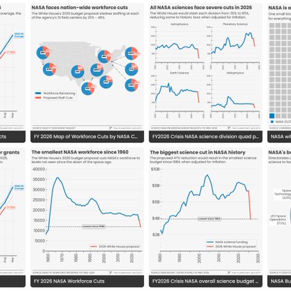
The Planetary Society has a great collection of #infographics and data visualizations (#DataVisualization) about NASA and the state of the U.S. Space Program.
coolinfographics.com
The Planetary Society has a great collection of infographics and data visualizations about NASA and the U.S. Space Program. Founded in 1980 by Carl Sagan, Louis Friedman, and Bruce Murray, The...
0
0
0
For all of my fellow book authors, you can now positively determine if pirated copies of your book(s) were illegally used in the training of AI models.

coolinfographics.com
For all of my fellow book authors, you can now positively determine if pirated copies of your book(s) were illegally used in the training of AI models. Use the search tool here: https://secure.anth...
0
0
1
New book arrived today! Congrats to Steve Wexler, Jeffrey Shaffer, Andy Cotgreave, and Amanda Makulec!!! 🎉
0
0
1

Canada is threatening to take away charitable status, again. Professor Pierre Gilbert explains why this would be devastating to us all. Watch the full episode on Leaders on the Frontier YouTube.
0
2
35
I'll be giving my updated talk on #dataviz in AR & VR in a free online Meetup event on Feb 13th. Join through your local DataViz Meetup group, or you can register here: https://t.co/CPz5rMrMaN
0
0
4
Cultivating a creative community with Tina Roth-Eisenberg of Creative Mornings:

open.spotify.com
How I Built This with Guy Raz · Episode
0
0
3
Introducing Microsoft Fabric: Data analytics for the era of AI, integrating technologies like Azure Data Factory, Azure Synapse Analytics, and Power BI into a single unified product

azure.microsoft.com
Announcing Microsoft Fabric—a unified analytics platform that brings together all the data and analytics tools that organizations need. Learn more.
0
0
1
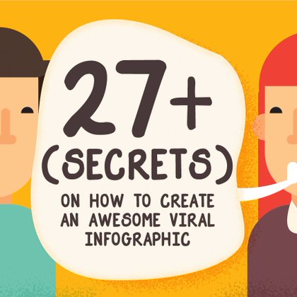
27+ (Secrets) on How To Create An Awesome Viral Infographic in 2023 - great content and tips, but not a great infographic (sadly)
coolinfographics.com
So you want to make an awesome infographic, but you aren’t sure where to start. Capsicum Mediaworks has 27 (Secrets) on How To Create An Awesome Viral Infographic in 2023 . This is definitely and...
0
0
1

We're partnering with @doodles to host an art challenge ( • -) • Doopies can smush together into objects as a way of avoiding danger or predators - make something made out of doopies for a chance to win! details ↓
76
238
768
Chart Reader: Accessible Visualization Experiences Designed with Screen Reader Users:
alper.datav.is
Through a co-design study, synthesized an engine to construct accessible visualization experiences for screen-reader users.
0
0
0
Check out the new page for the Open Climate Data project from Creative Commons which launched in Spring 2023, to facilitate the opening and sharing of climate datasets and data models available across the globe. https://t.co/usFxKuUXAz
0
0
0

From rock crawling to city cruising, AccuAir's got you covered.
0
16
248
How to maximize your marketing content and reach every audience you want:
columnfivemedia.com
How to Market One Piece of Content to Many Audiences
0
0
0
Visualizing Sick Days is interesting twist on quantified self charts:
coolinfographics.com
Zach Rottman dealt with the stress of his son bringing home “bugs” from daycare by creating a table on how often the individuals of the household were sick. There are a bunch of advantages you can...
0
0
0
New paper from Robert Kosara: Notebooks for Data Analysis and Visualization
eagereyes.org
Computational notebooks offer an alternative to the common GUI-based tools used for data visualization and BI today. In this new paper, I talk about what they are, their pros and cons, and how...
0
0
1
Why are six colors common in color palettes for data visualization? by Jon Schwabish https://t.co/klQmH7lbMe
0
0
0
A Eulogy for Dark Sky, a Data Visualization Masterpiece (Dark Sky was my favorite weather app!) https://t.co/FBbWxuUF1V
2
0
10