
Observable
@observablehq
Followers
25K
Following
5K
Media
730
Statuses
4K
Make it make sense
San Francisco, CA
Joined September 2017
Want to show how your data adds up? 📊 Meet 6 charts for visualizing parts of a whole — from treemaps to streamgraphs — w/ tips on when each may be a good option. Learn how to create these charts & many more in under a minute in Observable Canvases: https://t.co/wdOUik9akh
1
2
8
[TOMORROW] Get ready for our webinar: Art + science: Blending creativity and analysis in data visualization 🎨📊 Our guests will share their perspectives on chart choices, interactivity, AI, and more. https://t.co/Qa0vdk4J3e
0
0
4

Model 3 and Model Y battery packs retain 85% of their capacity on average after 200K miles of driving We also offer an 8 years or 120,000 miles battery warranty, whichever comes first
0
781
7K
In Observable Canvases, users can freely arrange charts and analysis across two dimensions for unconstrained, branching data exploration. Learn how we designed custom connectors that keep data flow clear and manageable at any scale: https://t.co/ZD4w6Cdfdf
0
2
7
Want to make visuals that don’t just inform — but resonate? Join us on Nov 11 for Art + science: Blending creativity and analysis in data visualization, & learn how experts balance clarity, creativity, & collaboration. 🎙️@sxywu 🎙️Tanya Shapiro 🎙️@kel_n94
https://t.co/Qa0vdk4J3e
0
2
10
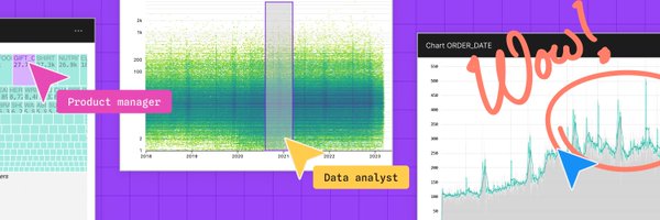
What happens when a computer scientist helps oncologists visualize patient-survey data? Read how Dr. Philip Bogden’s interactive data app turned messy spreadsheets into insights — and reshaped collaboration in medical research. https://t.co/ujb1LY886X
1
1
8
It's now even easier to build on-brand data visualizations in Observable Canvases. 🎨 With data-driven colors, you can define custom color scales based on categories in your data. Learn how Observable helps you create fast, consistently branded charts: https://t.co/meQ03xmeXb
0
0
5
🕸️ For our final Observa-bite of the month we are adding radar charts (aka spider charts) to Observable Canvases. Check out radar charts, and all of our advanced chart types, available in canvases: https://t.co/FX8T4d874n
0
1
8
Great data viz is both art and science. 🎨📊 Join Observable’s @allison_horst + our powerhouse panel for an inspiring discussion on where the two converge. 🎙️@sxywu 🎙️Tanya Shapiro 🎙️@kel_n94
https://t.co/0y9kbznUca
0
1
5
Observable’s built-in charts are designed by top data visualization developers, interactive by default, & fast — even with big data. We recently added advanced charts including Sankeys, beeswarms, arc maps & more. Meet our state-of-the-art visualizations 👉 https://t.co/cyM8irys3Z
0
0
7
Table nodes in Observable Canvases are powerful for fast, UI-based data wrangling. In addition to interactive filtering and column management, you can now derive new columns, convert data types, and limit rows — all in the same place. Learn more: https://t.co/FX8T4d874n
0
0
4
Ever built a chart that was technically correct, but still led people astray? Accuracy alone doesn’t guarantee clarity. Fast forward to 23:02 of the storytelling with data podcast to hear examples & how to balance accuracy, clarity, & audience engagement: https://t.co/C4P9Siw9OK
0
0
1
Data exploration should inspire new questions & analyses. But BI tools can make exploration cumbersome, discouraging new exploration paths. Observable Canvases are designed for fast, fluid, iterative data exploration. Meet 8 features that make it possible: https://t.co/ZM431I6Xiw
0
0
2
🪄 Chart theming is here! Now, in Observable Canvases, you can apply custom color palettes and fonts to create dashboards that are automatically on-brand. Get started with dashboards and chart theming here: https://t.co/FKUgRjoNol
0
0
6
Think your dashboard is done? Think again. “A successful dashboard isn't ever done…it should evolve to stay relevant as a hub for discussion & decision-making.” -Allison Horst, DevRel at Observable. Hear more on the storytelling with data podcast →
0
0
2
😱 Horrified by the hours you've spent building dashboards that end up rotting away in forgotten bookmarks? Observable Canvases simplify development, boost collaboration, & put interactive charts at your fingertips for dashboards that stay alive long-term: https://t.co/F7UsDFFL0G
0
0
3
Despite claims that dashboards are dead, they remain a highly requested BI deliverable. New features in Observable Canvases, like a streamlined viewer experience + control nodes, make dashboards easier to build & better to use, so they stay alive & well: https://t.co/F7UsDFFL0G
0
0
8
🐝 Beeswarm charts are a powerful way to explore quantitative variable distributions, and a useful alternative to more aggregated options like histograms & box plots. Meet our expanding suite of state-of-the-art, interactive charts in Observable Canvases: https://t.co/wOEIvRK5YF
3
0
5
📣 Calling all data professionals! We just launched a new survey on the state of business intelligence and analytics tools, and we want to hear from you. Share your POV here:
1
0
1
Data joins are everywhere in analytics, but it's tricky to build UI-based joins in a reactive canvas. In Observable Canvases, we’ve built robust joins that avoid SELECT *, deduplicate columns, and handle upstream changes. Learn more: https://t.co/pmgmI88hBZ
1
0
8
We recently announced Observable Notebooks 2.0 with a new, open notebook file format + desktop app. Now, we’ve added Python & Node.js data loaders — special cells that run at build time, for better stability and performance. Learn more 👉
0
2
8