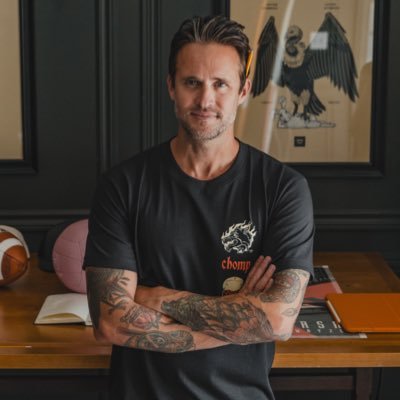
Kaejon
@kaejonmisuraca
Followers
2K
Following
6K
Media
809
Statuses
8K
Freelance Brand Strategist & Identity Designer / Digital Nomad / Brand Nerd / Photographer / Futbol Fan / https://t.co/9y7RHwS0dY
Joined August 2010
It's #PortfolioDay! I'm Kaejon, a freelance brand designer. Here are some of my favourite brand identity projects I've worked on. Check out more on my website below: https://t.co/YDesqNrsvh
1
0
2
Love it or hate it, ConvertKit’s rebrand to Kit has something every brand should learn from! 👀 Read more at the link below: https://t.co/zX4Xq0HjFy
linkedin.com
Love it or hate it, ConvertKit’s rebrand to Kit has something every brand should learn from! 👀 I absolutely love the new direction and execution—but what really stands out to me isn’t the rebrand...
1
0
0
Lastnight was insane 🤯 First time experience and so grateful 🫶🏼 Who else watched the show?
0
1
1
I just finished this book on how to create a name for your brand. This is a great, short read packed with lots of insights, from real-world examples to best practices, no matter the size of the client. I highly recommend it if you're wanting to learn more about brand naming 🙌🏼
0
0
5
Learning a new skill is frustrating but rewarding. A friendly reminder to enjoy the process 🫶🏼
0
2
6
Brand design is so much more than creating a visual identity. It’s about establishing the core values and vision of the company and building off of that to craft the way a brand looks, feels, speaks, and acts.
22
73
735
2022 was a year full of so many special memories, and these top 10 shots are just a glimpse into all of the unforgettable moments captured. Stoked for the adventures and memories that 2023 has in store! 📸 (thread)
1
1
11
Overall it is interesting to see a car brand stick with a chrome-style logo when every other brand seems to be going flat. But maybe this will help them stand apart from the rest. Only time will tell. More info here: https://t.co/QTV9hPTfni
0
0
0
They also created a new wordmark which I think matches the new symbol better, making the whole logo look balanced, as the old wordmark looked off when paired with the symbol.
1
0
0
The new symbol drops the circle and horizontally aligns the three shapes instead of stacking them at different heights. The shapes have been recreated and simplified, and without the circle, they now stand stronger.
1
0
1
Buick is not following the pack with its new brand refresh. They are the first car company I have seen in the past few years that have kept the chrome-style instead of jumping on the car trend where logos are going flat.
1
0
3
Buick is not following the pack with its new brand refresh. They are the first car company I have seen in the past few years that have kept the chrome-style instead of jumping on the car trend where logos are going flat.
0
0
3
One of the biggest lies we’re taught as designers is that you have to be able vocalize every single decision you make with data or research. Nah. Add that gradient because you think it looks cool. Use that typeface bc you enjoy it. That’s all the excuse you need.
32
128
965
A N N O U N C E M E N T Lay offs are no fun, but the energy doesn't stop. If you're hiring for any: → Brand Designer → Web or Webflow Designer → Or a combination of the two (nocode + creative/brand) I'd would love to chat or get connected with someone
12
71
309
Stoked to share a rebrand project I have been working on for the past few months – rebranding Polar to Nova. Click the link to view more: https://t.co/wDBYU9VAuA
#rebrand #brandstrategy #brandidentity
kaejon.com
Overview of the Nova rebrand project – Rebranding the industry leader in social display advertising. Rebranding from Polar to Nova.
0
0
0
Overall I think they did a great job with this refresh and I love seeing the brand evolve while staying true to its historical identity. Find more info here: https://t.co/iWUnhBn8wN
#sprite #brandrefresh #logodesign #branding #brandidentity
0
0
2
I like that they did not completely remove it from the brand; instead, they updated it and use it separately from the wordmark as a brand identifier. The new full-colour packaging is a nice touch as it reinforces the brand colour and helps differentiate it from the competition.
1
0
0
The choice to separate the starburst or what they call the "Spark" was smart. I think it made the brand look cheap, and the logo now stands stronger without it.
1
0
0
I love the new sprite brand refresh! The new typographic wordmark without the starburst elevates the brand to something more on par with the Coca-Cola logo. The wordmark now looks both eye-catching and clean.
1
0
2


