

Dima Groshev
@dimagroshev
Followers
997
Following
2K
Media
795
Statuses
4K
Product Designer × Entrepreneur Founder of @the123done I tweet about #design, @figma, #buildinpublic
Joined October 2009
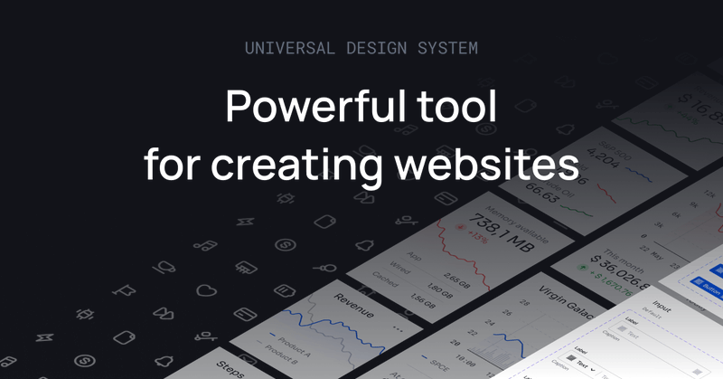
Powerful @figma Design System for creating landing pages, websites and dashboards. Save hundreds of hours and kickstart any project with ease. Design 10x faster ⚡️.
123d.one
Powerful Figma Design System for creating landing pages, websites and dashboards
0
0
0


Generate videos in just a few seconds. Try Grok Imagine, free for a limited time.
1K
3K
11K


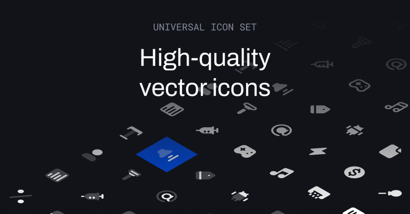
High-quality icon set for websites, apps, social networks, and prints. Design 10x faster ⚡️.
123d.one
High-quality icon set for websites, apps, social networks and prints
0
0
0


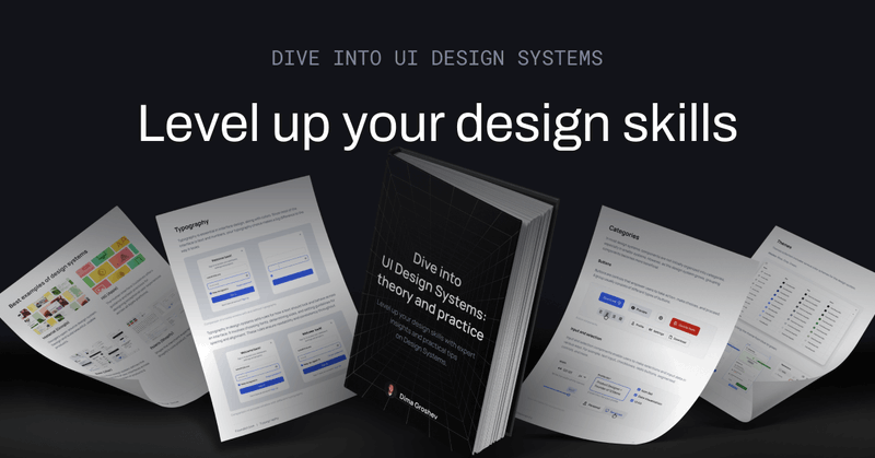
Learn more about Typography and Design Systems in my eBook ↓.
123d.one
Level up your design skills with expert insights and practical tips on Design Systems.
0
0
1
8/8. Regular vs Monospace . In addition to the Regular font, consider using a Monospace font for digital values. Monospace fonts ensure consistent spacing, making them ideal for displaying numerical data like prices or balances. It is specifically for financial, numeric

1
0
0
7/8. Sizes . Each role needs different sizes for various purposes, like using different heading sizes on a page.

1
0
0

5/8. Line heights . Line height is the vertical space between base lines of text, essential for font readability and interface harmony. Line height can be calculated by multiplying the font size by the chosen ratio.

1
0
0
4/8. Font sizes . Once we decide on a base font size, we adjust the sizes for other elements like body text, headings, and buttons. An easy way to do this is to increase or decrease the font size by 2 or 4 steps from the base size.

1
0
0
3/8. Base size. The base font size is crucial for readability in your interface, impacting the overall design. Generally, highly readable body text ranges from 14 to 16 points.

1
0
0
2/8. Font types. There are many different types of fonts, but we're interested in those suitable for user interface design: Sans Serif, Serif, Slab, and Monospace. Let's compare them using the Roboto typeface.

1
0
0
1/8. Typography. Typography is very important in interface design, just like colors. Since most of the interface consists of text and numbers, your typography choices significantly impact its appearance.

1
0
0