
David Rudkin
@davidmrudkin
Followers
72
Following
91
Media
22
Statuses
81
Analysis | Insight | Visualisation. 2x Tableau #VizOfTheDay. 1x #IIBAwards longlist.
Surrey, England
Joined November 2018
RT @mrroweuk: This week’s #SportsVizSunday roundup is live! 🏆. A showcase of the best sports visualisations from across the community — cri….
0
2
0
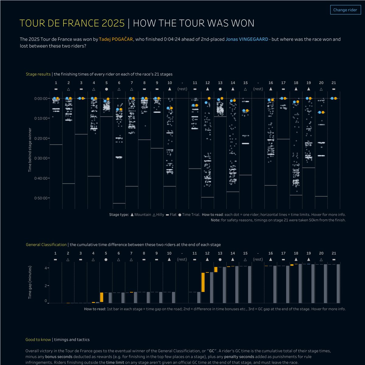
My new #dataviz looks at individual rider performances in the #TDF2025, using jitter and waterfall charts to show where overall winner Tadej Pogacar gained time on his rivals. #Tableau #DataFam #SportsVizSunday.
0
1
23

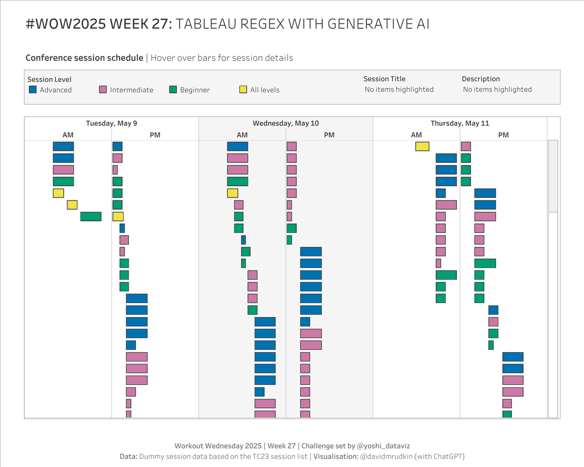
My viz for #WOW2025 week 27. I found that #ChatGPT did the regex formulae well, but needed 2 or 3 attempts when I tried asking it to convert dates and times from text to datetime using #Tableau functions. Thanks @yoshi_dataviz for the challenge.
0
0
8
It’s June, so happy #BlackMusicMonth!.
The great #StevieWonder recently released his first new song in 4 years. My new #dataviz looks back over his career via a cluster analysis of all his previous recordings, using #Spotify song attribute data. #Tableau #DataFam #DataPlusMusic.
0
0
0
RT @mrroweuk: A veritable treat of sporting-related dataviz on display this week in our ever-popular #sportsvizsunday round-up. Check it o….
0
3
0
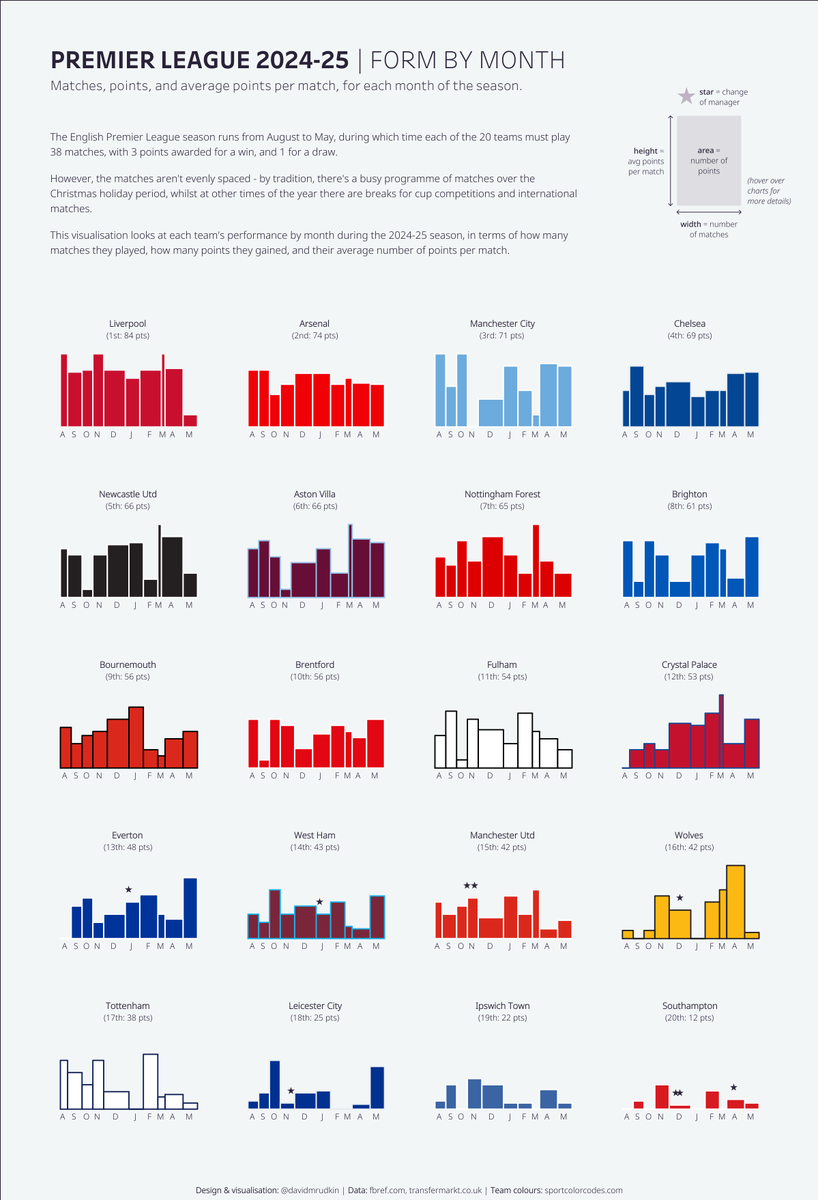
My new #dataviz looks at the form of #EPL teams in each month of the 2024-25 season. Variable-width bar charts, showing 3 measures (matches, points, points per match) and 1 dimension (month) simultaneously. #Tableau #SportsVizSunday.
1
1
15
The third in my #dataviz series about cycling’s Monuments - this time looking at the 2025 men's and women's #ParisRoubaix.
1
0
2
Following on from my last #dataviz, this one uses the same template to visualise the men’s and women’s races at the second Monument of the cycling season, #RondevanVlaanderen.
0
0
13
RT @mrroweuk: Have we ever had as many as 7 (SEVEN) different sports covered in the #sportsvizsunday weekly round-up? . I'm not sure, but i….
0
5
0
My new cycling #dataviz is about this year’s #MilanoSanremo, which featured a women’s race for the first time in two decades. Includes graphics on the routes, results, history, and prize money. #SportsVizSunday.
0
1
11
MIDI visual inspired by @deeVizable Firebird Suite viz and accompanying blog post.
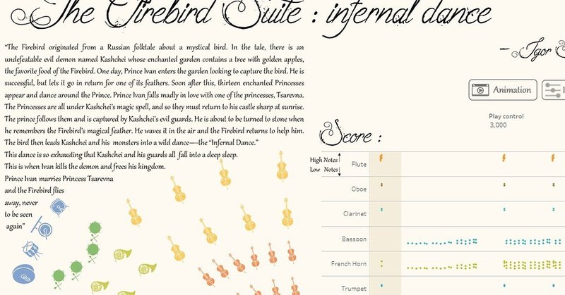
herdata.net
In 2019, the 'Firebird Suite' visualization was created for IronViz, blending music and data through animation and instrument visualization.
0
0
0
A music viz created from a MIDI file of The Swan by #SaintSaëns, with features like gridlines and tooltips added to help interpret the marks and relate them to the listening experience.
1
2
13
I’m pleased to say that my Tour de France viz has been longlisted for the 2024 #IIBAwards. Thanks to everyone who responded positively to it - you inspired me to enter for the first time this year. #DataFam #SportsVizSunday.

0
0
31
RT @_CJMayes: Bit of data art this week. custom shape packed bubble charts in Tableau. 🖌️💙.
cj-mayes.com
Hi all, A fun data art style blog this week. This idea was heavily inspired from The Flerlage Twins btw. You can check out their blog here. It was written 5 years ago now and still works perfectly …
0
4
0
A viz for Valentine’s: the four Shakespeare plays where the word “love” is used most often. Packed bubbles, filterable by character, with the quotes themselves on the tooltips.
3
6
27
RT @mo_wootten: It's a Sunday. That means it is #SportsVizSunday roundup time #DataFam!. Think of it like WD40 for your creative gears. Pl….
sportsvizsunday.com
This is one of my favourite times of the sporting year - NFL postseason time! After an 18 week season to establish who competes in the postseason, everything from now to the Super Bowl itself is...
0
6
0
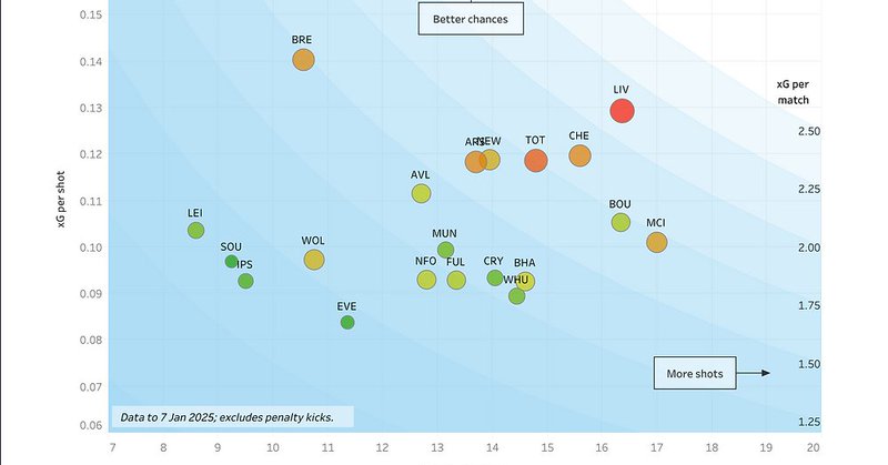
In football, the xG metric measures chances created. But do teams with a high xG create high-quality chances, or a high quantity of chances? My new #dataviz breaks this down for each team in the #EPL season so far. #DataFam #SportsVizSunday.

0
0
1