

ChocoPixel 🤍 | UI/UX
@_Fawzeeyah
Followers
171
Following
1K
Media
39
Statuses
422
I design Mobile Apps and Websites that bring your vision to life || student @devanddesignhq || Chemist || Lowkey chef 👩🍳
Lagos,Nigeria
Joined April 2025
So, I thought to share with you guys that I recently got into the UI/UX Design bootcamp led by @Joe_brendan_ 💃 and also to drop this here so I can come back to quote tweet in 4 months 😅 Wish me luck 🙂↔️
10
3
28

I did a lot of mobile this month

October dump: What you worked on as a creative.
9
0
20
I used a mouse sha 😅
0
1
2


Tbh, both layouts work well on desktop. Personally, I put the illustration on the right so users attention goes to the input field first.

@_Fawzeeyah I've seen some desktop onboarding where the illustration is on the left and the input fields on the left and I see others where the illustration is on the right and input field on the left which of this is better
0
0
3

Hello Twitter, Four months ago, we announced @Mazerance to the world. Today, here’s a first look at what we’ve been building with teams across Australia, Singapore, Spain, and Nigeria. We’re just getting started, and we’d love your support on this journey that will take years.
276
1K
4K

Creative ads? V2 💫
40
98
974
Login screen for renvault reimagined as a Web app experience that makes saving for rent feel effortless. 🌸
I just published my first case study as a UI/UX Designer 🤭🤭 The case study is on Renvault, a rent saving app that helps salary earners plan, save and manage rent payments effortlessly alone or with peers. Click to view the full case study on behance https://t.co/PDmllk8XvZ
18
1
44

Person wey no fit read tweet finish no go fit make am for medicine and surgery oh

0
2
4

If you’re designing for yourself, prioritize what excites you like fancy animations or making it pop😎. Product for users, prioritize what serves them. Clarity over cleverness, speed over spectacle, outcomes over aesthetics. Keeping balance is everything ✨
0
1
2
The week's task: Web 3 hero section recreation. It pushed me to explore modern Web3 aesthetics and i had fun with it.😀 The Original My Recreation

Task for the week: UI/UX Design Recreation For the UI/UX Designers 🧡💙
27
4
60
Hi GDG Lagos, I’d love to join your design team for DevFest Lagos if there’s still an opening. Happy to volunteer and contribute creatively.

It’s a new week, another opportunity to be a #DevFestLagos attendee. Grab your tickets now: https://t.co/x7eYbU8Nr2
29
11
43
I mostly use neutral color for "Delete Actions" I would only use red when there may be loss of data or some other irreversible scenarios. Not all "Delete" operations are equal, treat them as such - this is so that your users don't outrightly lose sensitivity due to
13
10
91
First of manyyy choco 🎉 Your case study is well structured couple with the fact that it’s backed with real user feedbacks and strong visuals on genuine users pain point. Impressive!. It can only get better from here 😇💯💯
I just published my first case study as a UI/UX Designer 🤭🤭 The case study is on Renvault, a rent saving app that helps salary earners plan, save and manage rent payments effortlessly alone or with peers. Click to view the full case study on behance https://t.co/PDmllk8XvZ
1
1
2
I just published my first case study as a UI/UX Designer 🤭🤭 The case study is on Renvault, a rent saving app that helps salary earners plan, save and manage rent payments effortlessly alone or with peers. Click to view the full case study on behance https://t.co/PDmllk8XvZ
When I started designing Renvault, all I had was figma and an idea of what I wanted it to look and feel like which was "aesthetically pleasing and simple enough for anyone to navigate". Now, gradually that idea is coming to life. 💃🏽
27
7
66
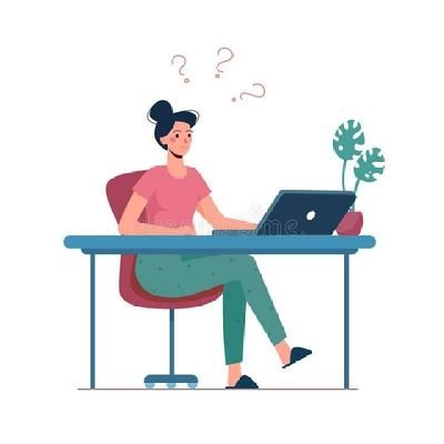
Me to myself every time 😩😩

Good design keeps popping up on my TL, and my brain’s just like, ‘I need to step up.’ 🤲🏽🙂↔️
0
3
5

Yoooooo!!! We are making it happen again, and the Web3 transition blueprint will be exposed. Set your reminder for tomorrow cause it's going to be massive. https://t.co/paoutHL7FF
@The_DesigNation
19
8
115