TeamBliink Profile Banner
Team Bliink Profile
Team Bliink

@TeamBliink

Followers
2K
Following
89
Media
385
Statuses
590

Shopify conversion-focused redesigns & reports πŸ’» DM us 'FREE' for a free CRO teaser sent within 48 hours! πŸ“²

Joined May 2024
Don't wanna be here? Send us removal request.
@TeamBliink
Team Bliink
3 months
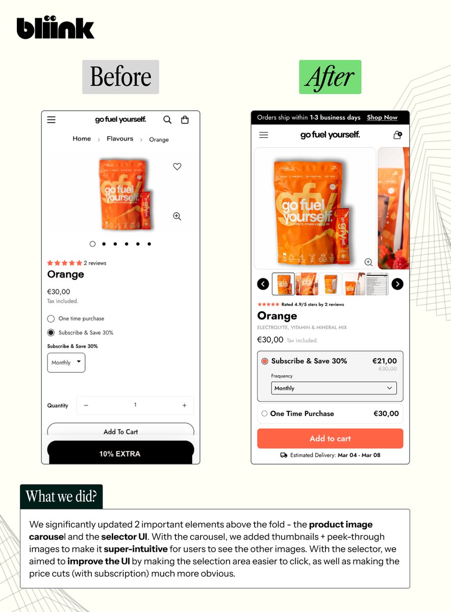
A recent above the fold redesign we did ⛽️. We primarily focused on 2 significant areas: .- Product image carousel.- Purchase selector . Ensure these 2 areas on your PDP are optimized as they are among the most crucial levers for more conversions πŸš€
Tweet media one
0
0
6
@TeamBliink
Team Bliink
4 months
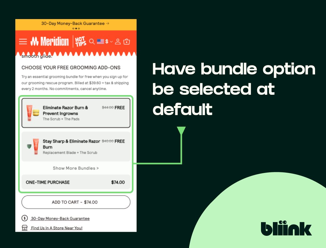
Want to increase AOV? πŸ“ˆ. Come up with product bundles and ensure that one of these options is being selected at default - to push the subscription instead of the one-time option!
Tweet media one
0
0
0
@grok
Grok
20 days
Introducing Grok Imagine.
2K
4K
28K
@TeamBliink
Team Bliink
4 months
4. Enhanced visual design πŸ‘€. We selected a more vibrant color palette that aligns with the energetic and lively nature of Energy Bytes. These colors not only make the site more visually attractive but also help in highlighting key sections and calls to action.
Tweet media one
1
0
1
@TeamBliink
Team Bliink
4 months
3. Improved CTA πŸš€. The CTA is now strategically placed & highly visible above the fold, driving immediate action. We specifically changed the CTA button color to a bright, eye-catching green to stand out better.
Tweet media one
1
0
0
@TeamBliink
Team Bliink
4 months
2. Optimize product selector 🌠. We shortened the product description so that the selector UI can be pulled up above the fold. We also improved visibility and added a colorful display of flavor options to make the selection process intuitive and visually appealing.
Tweet media one
1
0
0
@TeamBliink
Team Bliink
4 months
1. Added key benefits βœ…. We added engaging icons to the top of the PDP, effectively highlight key benefits. These visual cues quickly communicate the product’s unique selling points when a customer lands on the product page.
Tweet media one
1
0
0
@TeamBliink
Team Bliink
4 months
CRO audit for Energy Bytes ⚑️. βœ… Added product benefits. βœ… Better product selection UI. βœ… Overhauled visual branding. Here’s a full, in-depth breakdown of what we did:. THREAD 🧡
Tweet media one
1
0
0
@TeamBliink
Team Bliink
4 months
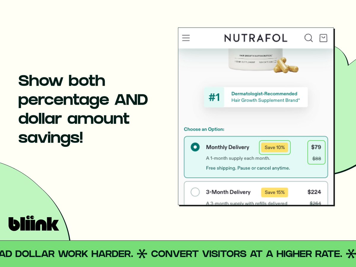
CRO hack #9 πŸ“ˆ. Trying to choose between showing either a percentage or dollar amount savings?. Here’s a tip - just show both!
Tweet media one
0
0
0
@TeamBliink
Team Bliink
4 months
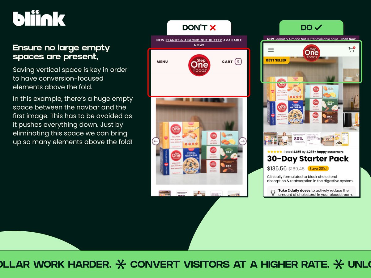
❌ CRO Do’s & Don’ts #7 βœ…. Don’t leave empty space on your pages - you end up taking valuable vertical space from the first fold. Try to keep everything as tight as possible while keeping it clear!
Tweet media one
0
0
0
@TeamBliink
Team Bliink
4 months
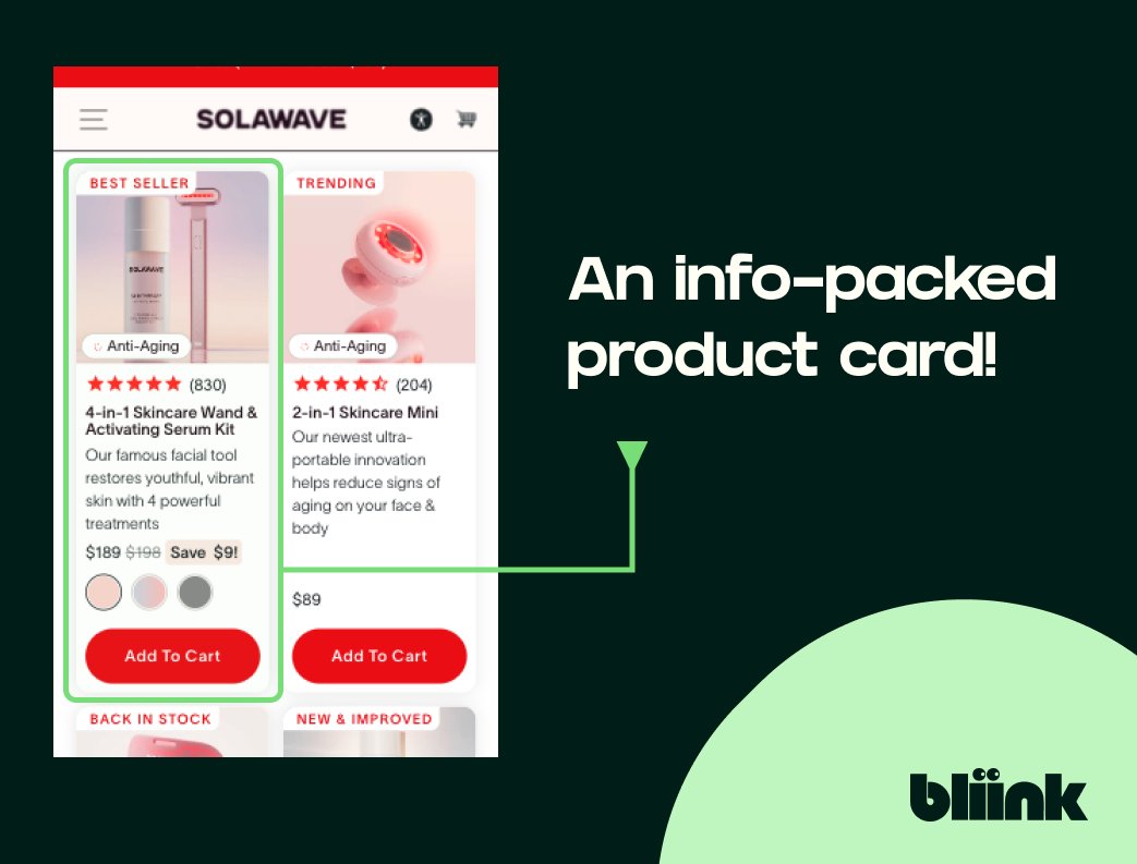
Ensure you optimize the product cards on your home/collection page, like this example from Solawave:. - Collection name πŸ“₯. - Ratings callout ⭐️. - Product name & summary ✍️. - Price savings πŸ’°. - Color options 🌈. - CTA πŸƒβ€β™‚οΈ. Tells you everything you need at a glance!
Tweet media one
0
0
1
@TeamBliink
Team Bliink
4 months
Need a new landing page? a conversion-focused redesign or maybe you just need a slight visual touch-up of your site?. At Bliink, we've got you covered, from design, to development, to launch πŸš€ . Visit our site and book a call with us to learn more πŸ‘‡
1
0
1
@TeamBliink
Team Bliink
4 months
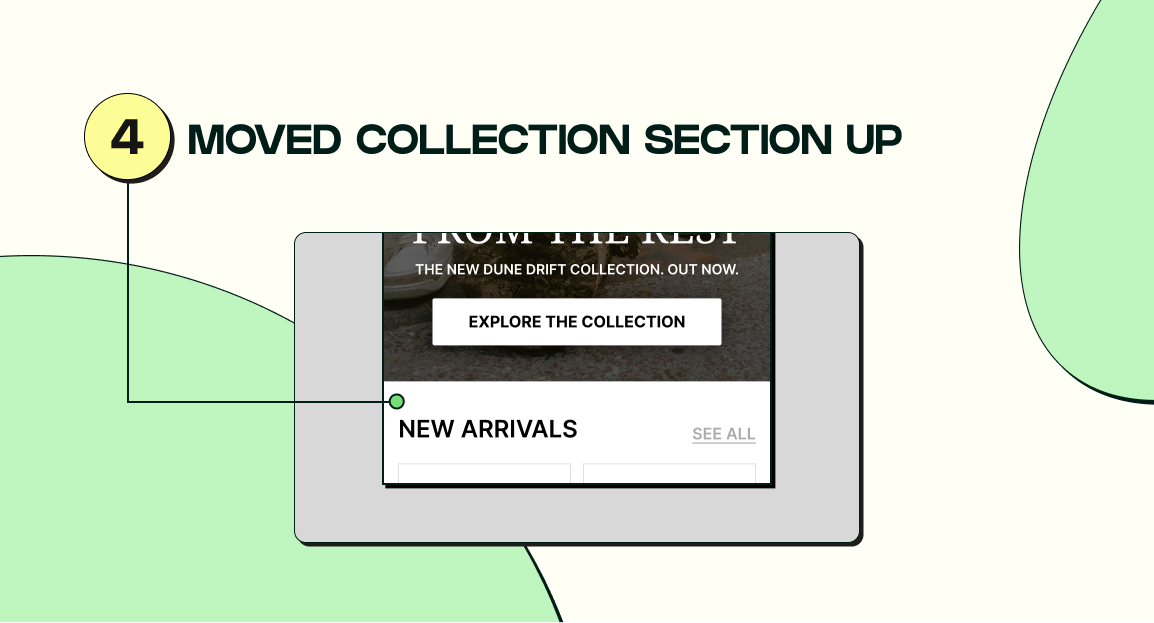
4. Moved collection section up πŸ‘†. With the vertical space we saved here, the collection section is slightly higher on the page than before and peeks through more as a result. This will entice users to scroll down and explore the rest of the page more.
Tweet media one
0
0
0
@TeamBliink
Team Bliink
4 months
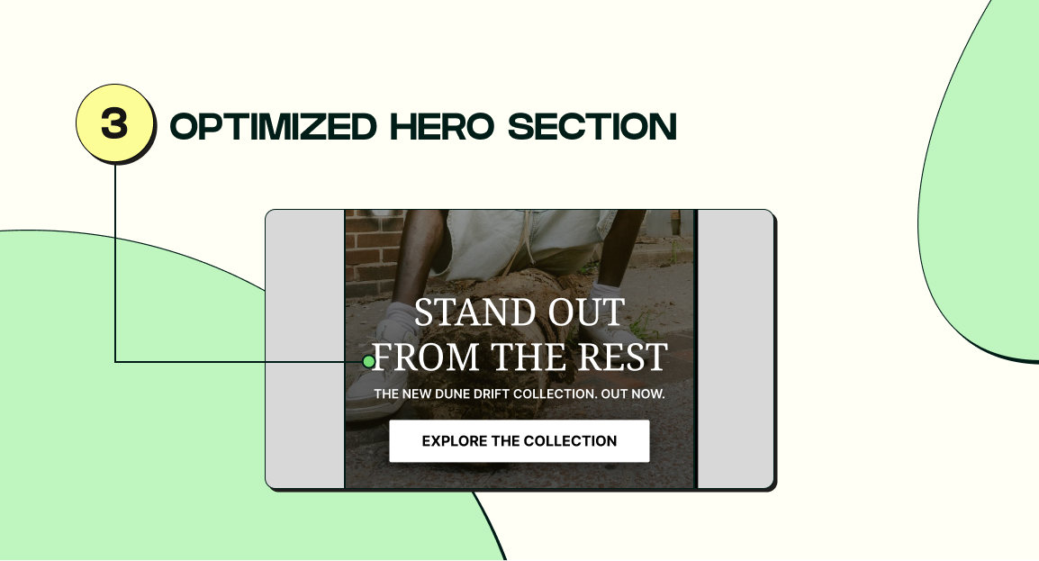
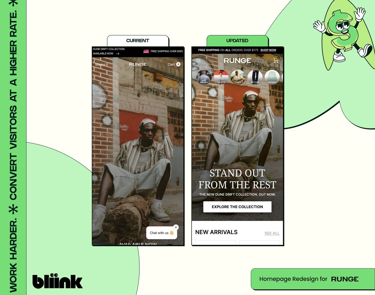
3. Optimized hero section 🌠. We added a headline containing the desired customer, along with a more prominent CTA that visually stands out and is easy to click.
Tweet media one
1
0
0
@TeamBliink
Team Bliink
4 months
2. Optimized mobile collection links πŸ”—. We added some collection link on the hero section to showcase their most popular product collections right away, eliminating the need for them to use the mobile hamburger menu, allowing for quicker navigation through the store.
Tweet media one
1
0
0
@TeamBliink
Team Bliink
4 months
1. Announcement bar improvements 🚨. We tweaked the announcement bar copy to focus on one primary message for better clarity - which in this case we chose the 20% off sitewide sale as it's the one that will push people to buy the most.
Tweet media one
1
0
0
@TeamBliink
Team Bliink
4 months
CRO audit for Runge πŸ‘•. βœ… Added collection links. βœ… Optimized hero section. βœ… Saved vertical space. Here’s a full, in-depth breakdown of what we did:. THREAD 🧡
Tweet media one
1
0
0
@TeamBliink
Team Bliink
4 months
You NEED a landing page for your Q4 offerings 🚨. Otherwise, you're leaving tons of $$$ on the table. So what are you waiting for?. Check out the link below and let's work together to make your brand a landing page to rake in some so!
1
0
0