

Tableau Public
@tableaupublic
Followers
71K
Following
3K
Media
2K
Statuses
6K
Share, create, and explore @Tableau data visualizations for free on Tableau Public. For more inspiration, view our #VizOfTheDay and connect with our #DataFam ❤️
United States
Joined March 2012
This #VizOfTheDay by @GeorgeKoursaros showcases Australia’s coastal history, charting recorded shark attacks from 1790 to 2024. Explore the viz to spot activity hotspots and known incidents.

0
1
9
In this #VizOfTheDay, @ZachBowders visualizes survey results from over 1,000 U.S. respondents rating 30 classic summer activities. Explore the viz to see which activities came out on top and which ones fell flat.

3
4
27
This #VizOfTheDay by Tabitha Diaz shares an overview of help desk performance, and insights into ticket volume, resolution times, and team metrics. Explore this Real World Fake Data #RWFD viz entry.

1
5
42

Bitcoin’s on fire at $112K! Time to flip the charts on BTCC!.Exploring Cryptocurrency with Jaren Jackson Jr.🏀.
0
1
9
This #VizOfTheDay by @brrosenau visualizes the Monterey Bay Aquarium's Seafood Watch ratings with bar charts, a pie chart, a sankey diagram, and more. Explore the viz to learn about sustainable seafood choices.

1
2
39
In this #VizOfTheDay, @zsaucede visualizes key performance insights for athletes through phone and watch interfaces. Explore the different layouts and the design inspirations behind them.

0
0
27

“We’re building advanced American manufacturing for solar and storage. Partnering with @PalantirTech allows us to quickly and effectively build a supply chain that creates U.S. jobs and stays ahead of the changing legislative landscape,” says T1 Chairman & CEO @_danielbarcelo.

0
4
19
This #VizOfTheDay by @flerlagekev uses line charts, filters, tooltips, and YOY comparisons to track key performance indicators and drive data-informed decisions. Explore the viz based on a real-world client project:

4
4
47
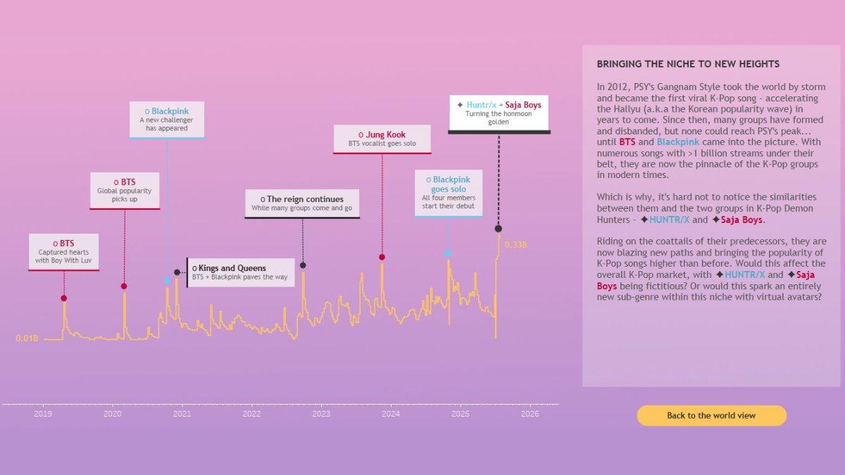
In this #VizOfTheDay, @datavizlouis explores the buzz around one of the most-streamed animated films of the past 5 years. Is it just a one-hit wonder, or could it shake up the K-Pop industry?. Explore the viz inspired by @prem_prasann:
6
3
31
This #VizOfTheDay by @VizWithVictory provides a clear view of customer portfolios, tracking key metrics like customer acquisition, retention, and revenue trends. Explore the viz to see how data can be used to monitor and streamline business operations:

3
15
106
This #VizOfTheDay by @imperativusz explores the world's most common and contagious misconceptions for this #MakeoverMonday challenge. Explore the viz:

0
1
26

Always curious and full of energy, Beagles turn every walk into an adventure 🐾🎉.

98
384
7K
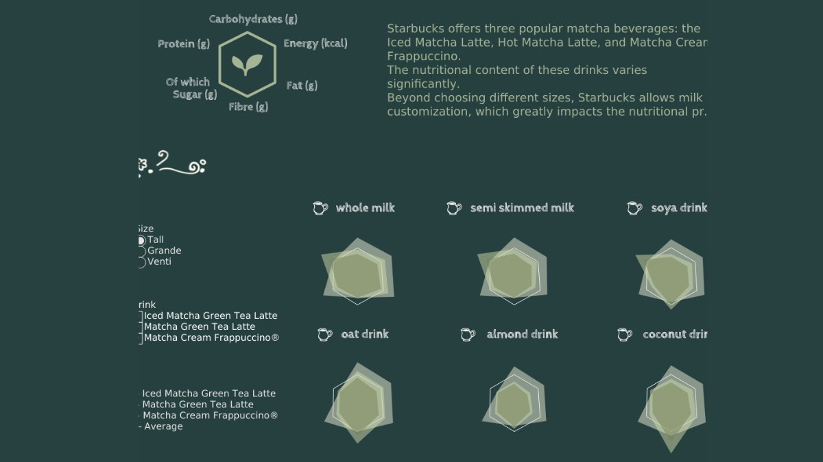
In this #VizOfTheDay, @izumi_0901_tab brought matcha beverage data to life through box plots—visualizing how sugar, caffeine, and calories vary by drink and size. Explore the #B2VB entry on Tableau Public.
6
8
60
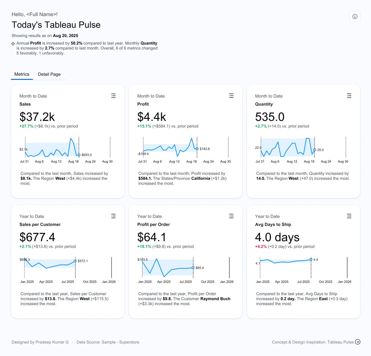
This #VizOfTheDay by @pradeep_zen provides a detailed analysis of sales performance across different categories and regions. Explore the viz inspired by the design of Tableau Pulse.
0
7
75
This #VizOfTheDay by @jreevers5 uses bubble charts, bullet graphs, and more to visualize Barbie’s journey from the toy aisle to the big screen since the 1950s. Explore the viz.

4
0
32
This #VizOfTheDay by Samuel Apanisile provides a clear, data-driven view of a client portfolio in the real estate finance world. Explore this dashboard to see how data can be used to track property performance, loan exposure, and revenue trends.

2
4
44

It’s official!.XSPA Wallet is now available for download on both Android & iOS. Set up in minutes and explore its features today.
0
0
7
In this #VizOfTheDay, Anindita Mitra explores the UK's energy demands and their sources of generation. Explore this #MakeoverMonday entry. Inspired by @DatavizChimdi.

0
0
37
This #VizOfTheDay by @fredffery is a perfect way to experience Tableau's new Map Viewport Parameter. The Spatial Sales Analysis dashboard allows you to filter sales data in real-time simply by zooming and panning on the map. Explore the viz and see this new feature in action:

2
0
31
Explore this #VizOfTheDay by @NicholasPillsb2 who visualized the results of an analysis of pronouns ascribed to animal characters in popular children's books across multiple decades using bar charts and a bubble chart. Explore the viz to see if you can spot some of your

1
1
22
This #VizOfTheDay by @ud_analyst visualizes Podcast Analytics. This dashboard provides a detailed look into podcast performance, including listener engagement and episode trends. Explore the viz:
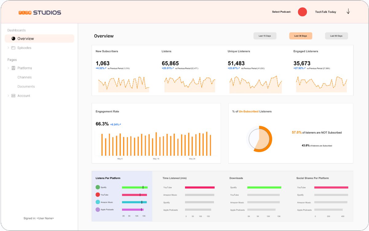
3
6
50

We are looking for a new grad engineer to join our engineering team. This is an unique opportunity to work on an high-visibility special projects with support from many industry leaders and CEOs. If you’re passionate about performance engineering, system reliability, and want.
2
9
180