James Freemantle
@StJamesPrkPress
Followers
2K
Following
10K
Media
190
Statuses
215
St James Park Press ▫️Fine Printing, Letterpress and Illustration
London, UK
Joined January 2013
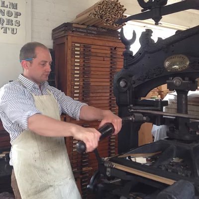
Sketching out designs and possibilities to lead up to the final print and then seeing it as a print is a fantastic and satisfying process. And yet it always comes as a surprise when it happens.

0
0
3
It’s very lucky that as a result of past acquisitions from fellow presses, I can replicate important aspects of Byrne’s Euclid with hand-set metal type; my foundry Caslon type from Fleece Press, my Caslon black-letter from Old School Press, and ornaments from Evergreen Press!


0
2
6
Adding the blue layer, to highlight in Byrne’s Euclid both: the swash letters used alongside their italic counterparts (in later iterations further swash letters were added to Caslon’s Old Face); as well as the roman long s.

0
0
3

"A girl in a flowing white dress floating gracefully into a dreamy sky filled with stars and colorful clouds at sunset.". Try Grok Imagine, free for a limited time:.
3
0
15
Continuing the exploration of Caslon’s Old Face in Byrne’s Euclid, alongside the normal roman (as in the T here), the Chiswick Press printed using the wonderful long s, here in italic. Sweepingly winsome.

0
0
1
Although Byrne’s Euclid was set in Caslon’s Old Face, the compositors at the Chiswick Press (who printed the edition) had quite the field day when setting the text, using no less than 5 versions of the upper case letter Q…

0
1
3
Caslon’s Old Face is the type used for Byrne’s 1847 edition of Euclid’s Elements (or to be more precise, the edition published from the Chiswick Press). Although Caslon is not everyone’s cup of tea, there is no denying that this long tailed Q - printed enlarged - is rather bonny.

0
0
1
Adding a full alphabet of Mary Byfield initials around the larger coloured A. Byrne did not actually need to use every letter of the alphabet for his Euclid edition, so it’s nice to have the full complement here.

0
0
3
Adding the colour red underneath Mary Byfield’s letter. This wasn’t done in the original edition, but it helps to highlight the letterform itself, as opposed to the ornamentation around it.


1
1
2
Mary Byfield was an illustrator during the first half of the 19th Century. Alongside all manner of engravings for various works, she cut the initials for the Chiswick Press that adorn Byrne’s Euclid. This letter is printed as an enlarged version.


0
1
2
The final red addition to complete the title page print run… this image has become synonymous with Byrne’s Euclid, used not only for the title page, but also on the cover of the original binding, as well as within the book itself.


0
0
2
The layers of colour for the title-page continuing to grow… this time a blue colour run.

0
0
2
Printing the yellow colour run for the recreated title-page required some reading up of William Savage’s ‘Practical Hints on Decorative Printing’ (from 1822) to look at mixing the right shade of yellow.

1
0
4
Although the same black ink, printing these next elements after the type was primarily due to the level of inking needed on the geometric ornament, which would have been a tad too much for the type (with the border aiding the even inking of it).


0
0
0
I’ve always loved the title page to Byrne’s Elements of Euclid, but seeing the text printed fresh, from foundry type, on unblemished white paper, makes me love it even more.


0
0
1
Now that “fair season” is over, I can get back to ‘The Beauty of Byrne’…. Re-creating the title page in letterpress (for the first time since the Chiswick Press did so in 1847), but this time on fresh, bright, Somerset paper; requires using the same type, spacing and layout.


0
0
3
It is with great pleasure that I have been able to show @firstslondon all the small books printed by the St James Park Press for the Chestnut Press.


0
0
0


