
Responsive Design
@RWD
Followers
134K
Following
999
Media
226
Statuses
9K
This is where @beep curates link-y things about responsive design. He also wrote two books on the topic: https://t.co/8XU1BNnaIw
Joined August 2011
Happy new year! 🎉 Want to learn responsive design? Or the basics of CSS Grid? Check out my online class, which comes with a free 2-month @skillshare trial! https://t.co/Qj9Uq1O6ZE
5
4
35

no it’s cool i’ve just got something in my eye, it’s very dusty in here
0
3
15
It’s true! Happy eleventh birthday, responsive design!

Happy 11th Birthday Responsive Web Design! On May 25, 2010, web designer Ethan Marcotte published an article entitled "Responsive Web Design" in the online magazine A List Apart. https://t.co/vjK4affT5b
#WebDesignHistory
2
23
81
Related: here’s an older post from @TrentWalton, on tuning type sizes with a vertical media query:

trentwalton.com
I’ve been tinkering with the font-size and the media queries that trigger width-based changes for this site regularly over the past month. I thought that maxing out at 20px for body copy at widths...
0
0
7
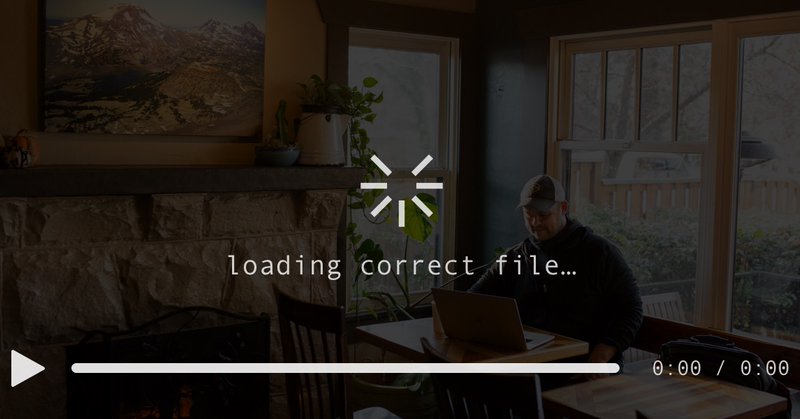
I’ve often said testing your responsive designs in landscape mode is one of the fastest ways to highlight design issues, especially vertical ones. Here’s a wonderful example of that in action:

So what happened? The page was built for mobile responsiveness. Portrait-mode only, of course. Developers, CHECK YOUR MOBILE STYLES IN LANDSCAPE PLEASE. Use CSS media queries to unstick sticky shit.
1
3
13
At long, long last, there’s real movement on container queries. And that’s incredibly exciting. Here’s @una with how you can start experimenting with CQs today!

🚨 An experimental flag for container queries (@container) just hit Chrome Canary! Yes, seriously! Go to: chrome://flags in your URL bar and turn on enable-container-queries to try it out. Here's a demo to help you see how they work (w/flag in Canary): https://t.co/DrZxzoggV4
0
0
8
“People using small screens won’t want to subscribe to our newsletter.” “People using small screens don’t want to print.” “People using wide viewports won’t use geo-aware services.” 🤔🤔🤔🤔🤔🤔🤔🤔
0
0
9
one day i will get the VIEWPORT SIZE IS NOT A PROXY FOR DEVICE DETECTION knuckle tattoos i keep talking about i just need more knuckles

Viewport size is not a proxy for device detection. Product designer assumed downloading an .exe shouldn't be shown because viewer was on a phone. Except they were on their desktop with large monitor 800x600 resolution with an unmaximized browser, because they had low-vision.
2
4
17
This is an impossibly exciting new project from @robweychert, but WOW it is ALSO a really beautifully-made piece of responsive design! 😍😍😍

plusequals.art
A quarterly zine exploring algorithmic art with a focus on combinatorics
0
2
3
“80% of all digital minutes are on mobile.” If your team or organization hasn’t adopted a mobile-first mindset, now would be a *fantastic* time to start. https://t.co/1JdMFYRrWA

🔥 The State Of Mobile in 2021. – 80% of all digital minutes are on mobile – Avg. consumer upgrades their phone every 2 years – In the US phone replacement cycle is 33 months – 84.8% of all shipped phones are Androids. Jump to all details: https://t.co/JF7KyuP4UC
1
15
32
(thanks for uncovering this, @acolangelo! so glad you were there!)
0
0
2
behold, a photo of Yours Truly from 2010, giving the talk that coined the phrase “responsive web design” while looking as though i’d never seen this slide before 🤔

1
4
17

HTML Video Sources Should Be Responsive
css-tricks.com
Scott Jehl doesn't mince words here:
1
23
102
We used to have the ability to create responsive, viewport-aware videos, but it was removed. I think @scottjehl is right: responsive videos should be restored in HTML, and expanded.
0
1
9

Friendship ended with NATIVE APP Now RESPONSIVE WEBSITE is my best friend
1
0
14
“ethan, what’s your favorite responsive design,” they will ask me “i love them all,” i’ll reply but i’ll know i’ll know it’s secretly this one https://t.co/cTJWGujgwq i’ll *know*

nytimes.com
Searching for a last-minute gift … that may take months to arrive? This holiday gift guide might give you a few ideas.
0
0
9
I’m pretty sure @hicksdesign’s was the first responsive site I remember seeing after the original article was published. Unsurprisingly, Jon’s new portfolio site is a responsive *stunner*

hicks.design
Graphic design, branding, illustration & iconography. You may recognise our identity work on logos for Firefox, Mailchimp and Shopify, as well as emoticons for Skype.
0
2
16
oh HELLO

Uncle @davatron5000 and I have a chat about the (very exciting, very not-definitive) movements on container queries (!!!) https://t.co/HQcMhkWM1Z And also Dave tells me about 900 things I didn't know about mechanical keyboards.
0
0
1