AisleOne
@AisleOne
Followers
58,770
Following
817
Media
1,336
Statuses
24,294
A weekly newsletter on design, photography, film, music and culture. Curated and written by Antonio Carusone. Subscribe for free.
New York
Joined January 2009
Don't wanna be here?
Send us removal request.
Explore trending content on Musk Viewer
Trump
• 2484185 Tweets
Trump
• 2484185 Tweets
America
• 887119 Tweets
Justice
• 847100 Tweets
Jury
• 788754 Tweets
New York
• 478926 Tweets
Democrats
• 399328 Tweets
Joe Biden
• 338540 Tweets
MAGA
• 305236 Tweets
All 34
• 285922 Tweets
Supreme Court
• 227265 Tweets
Republicans
• 192004 Tweets
POTUS
• 115766 Tweets
White House
• 110215 Tweets
Clinton
• 90606 Tweets
Hillary
• 86807 Tweets
Dems
• 86788 Tweets
Alvin Bragg
• 70914 Tweets
Stormy Daniels
• 68012 Tweets
Endrick
• 46722 Tweets
Law and Order
• 41587 Tweets
Norita
• 38348 Tweets
#StateOfPlay
• 33323 Tweets
Neymar
• 33238 Tweets
#SVGala13
• 32804 Tweets
OUÇA MINHA HERANÇA
• 32241 Tweets
DeSantis
• 25062 Tweets
Silent Hill 2
• 22466 Tweets
Astro Bot
• 19951 Tweets
#LockHimUp
• 19656 Tweets
Overwatch
• 19087 Tweets
Nora Cortiñas
• 17053 Tweets
Monster Hunter Wilds
• 16170 Tweets
温帯低気圧
• 15230 Tweets
#النصر_الهلال
• 14280 Tweets
San Lorenzo
• 13539 Tweets
ワイルズ
• 10730 Tweets


Pinned Tweet

I'm pleased to introduce two premium newsletter memberships that offer exciting benefits and content like exclusive articles from guest writers, good-for-creating playlists and more. You can learn more about the memberships and subscribe to them here:

10
17
137
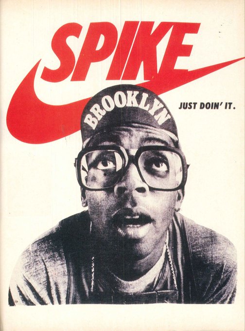
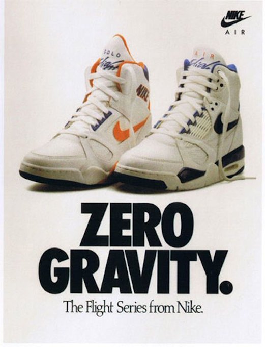
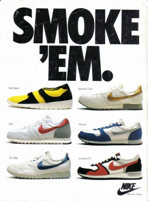
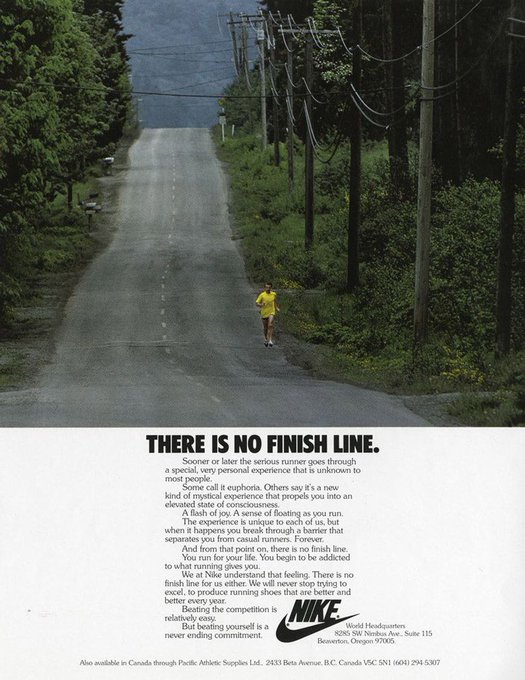
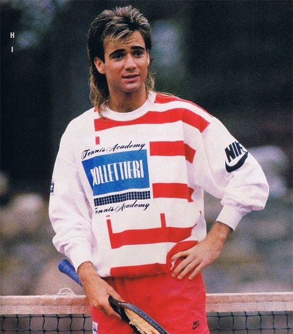
Nike ads from the late 80s and early 90s were something special.

11
324
3K
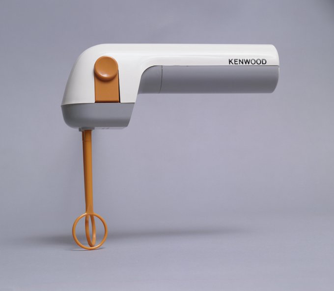
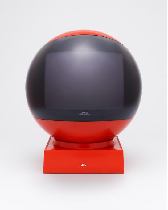
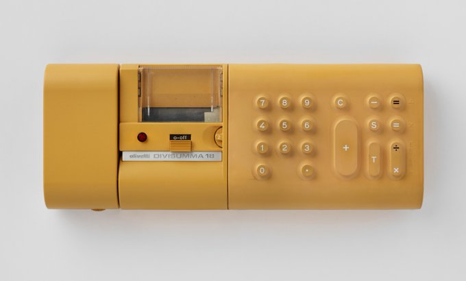
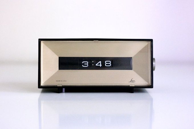
Industrial design of the 70s and 80s.
1. Kenwood Whisk — Kenneth Grange — 1971
2. Sony PS-Q7 Turntable — 1982
3. JVC Videosphere Television — 1970
4. Olivetti Divisumma 18 — Mario Bellini — 1972
Source: The Philadelphia Museum of Art

17
347
3K
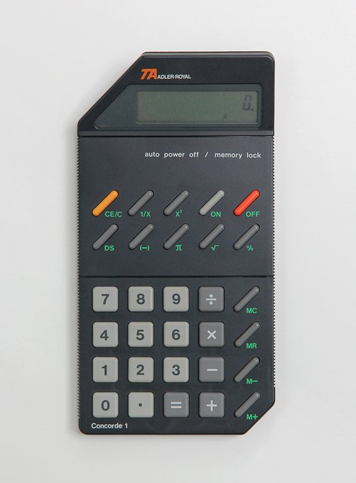
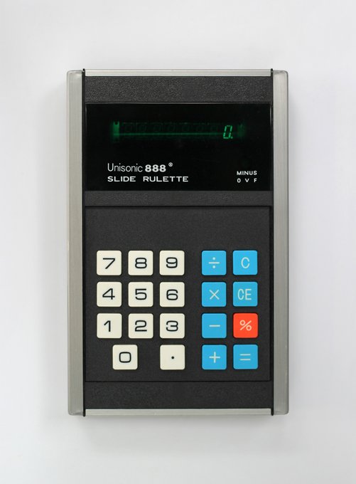
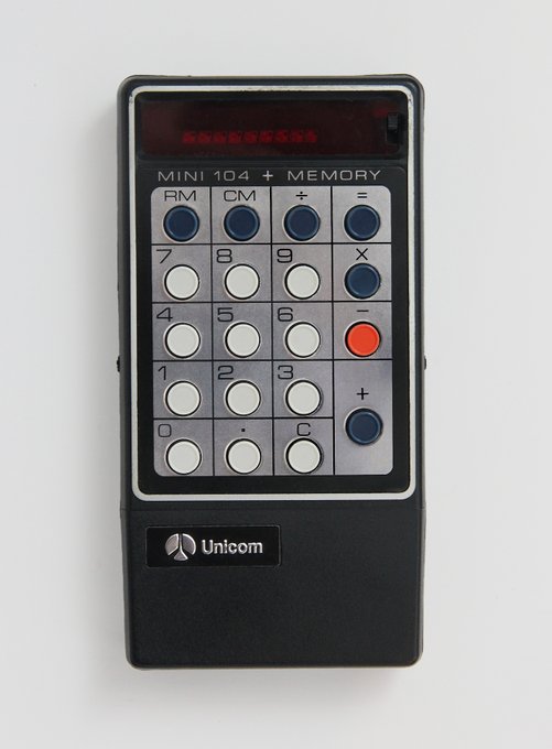
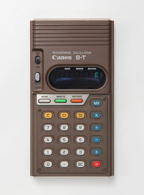
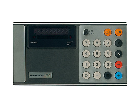
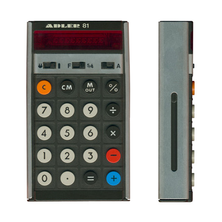
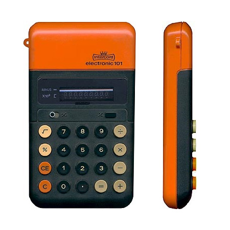
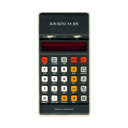
Designer Shawn Hazen's personal collection of vintage calculators. The Triumph-Adler Concorde 1 from 1986 is blowing my mind with those colors and the angled corners... my goodness. I need to find one.
20
324
2K
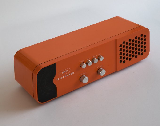
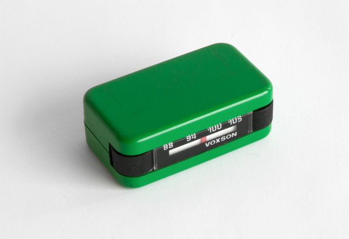
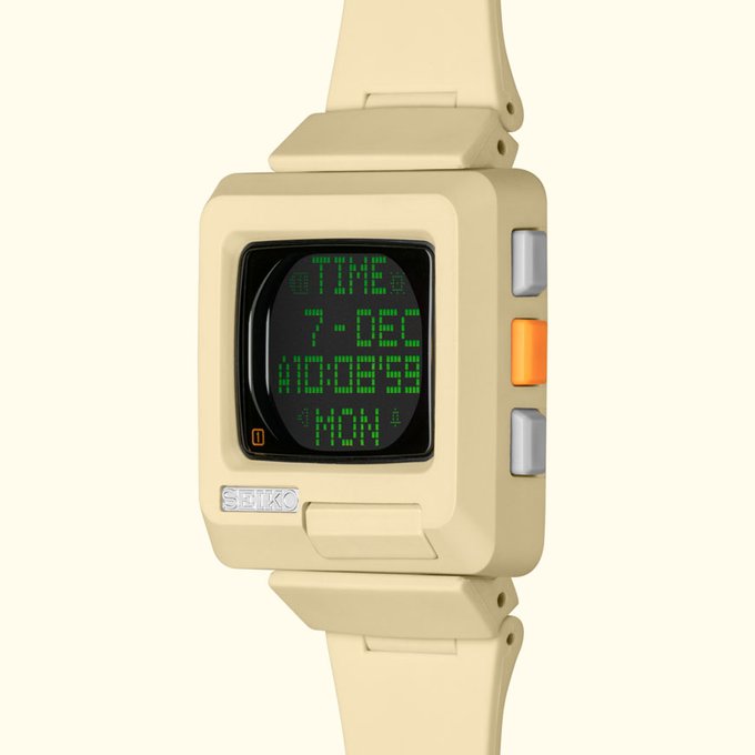
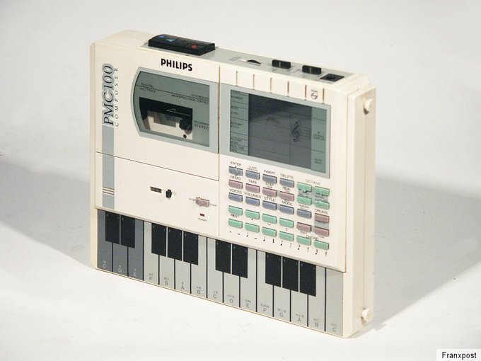
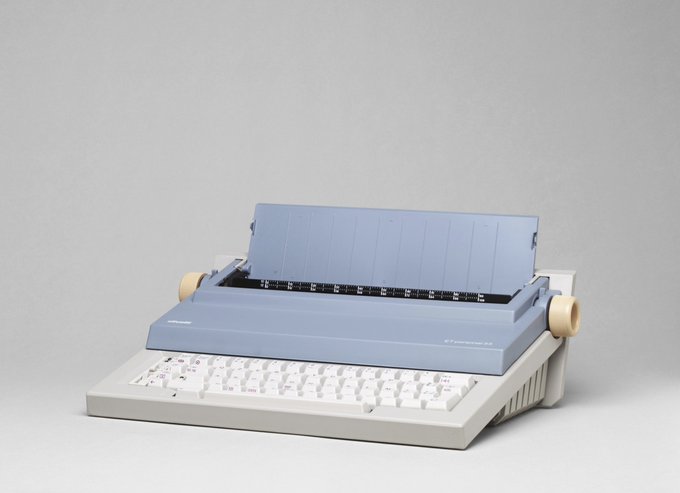
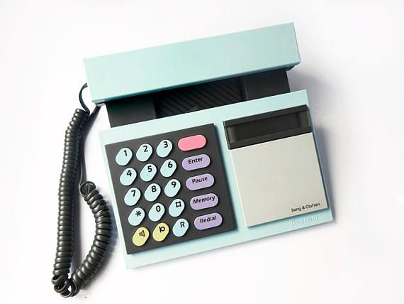
Pastels in product design. I'd love to see this make a comeback.
1. Seiko h-timetron — 1999
2. Philips PMC 100 — 1986
3. ETP 55 Typewriter — 1983 (Source: MoMA)
4. Bang & Olufsen Beocom 1000/2000 — 1985
10
289
2K
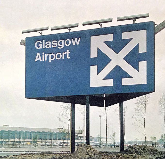
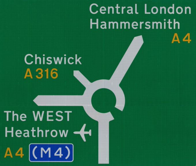
Typographer and graphic designer Margaret Calvert designed UK's road sign system, the Glasgow Airport logo and signage, and the Transport, Rail Alphabet, and Motorway typefaces. Here's a sample of her influential work.
8
213
2K
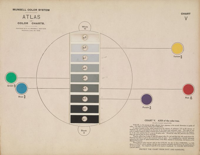
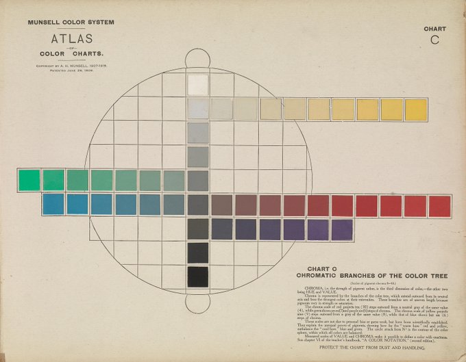
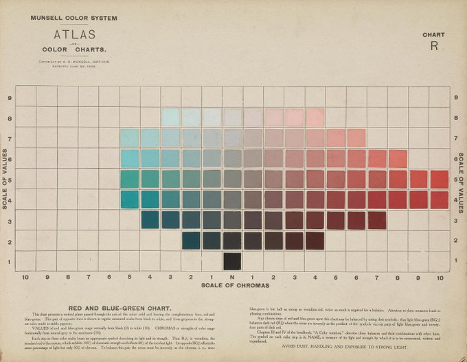
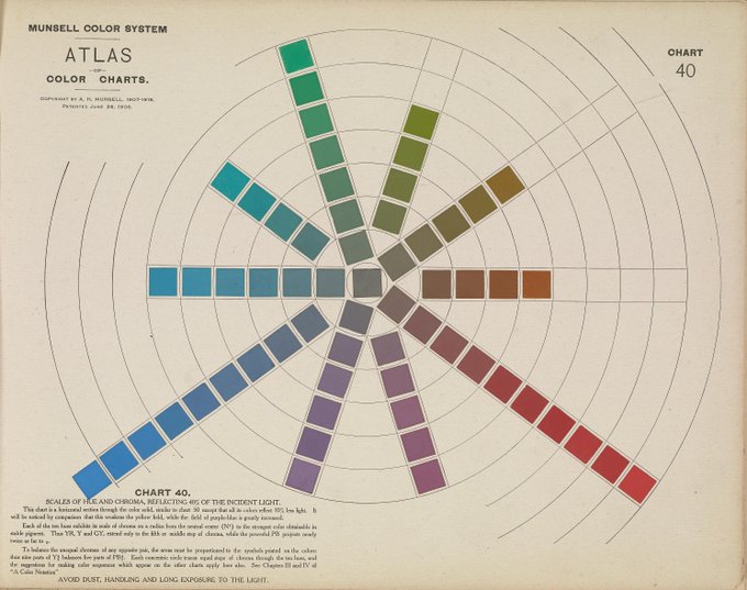
These color charts in the 1915 book 'Atlas of the Munsell Color System' by A. H. Munsell are insanely good.
View the entire book:
4
283
2K
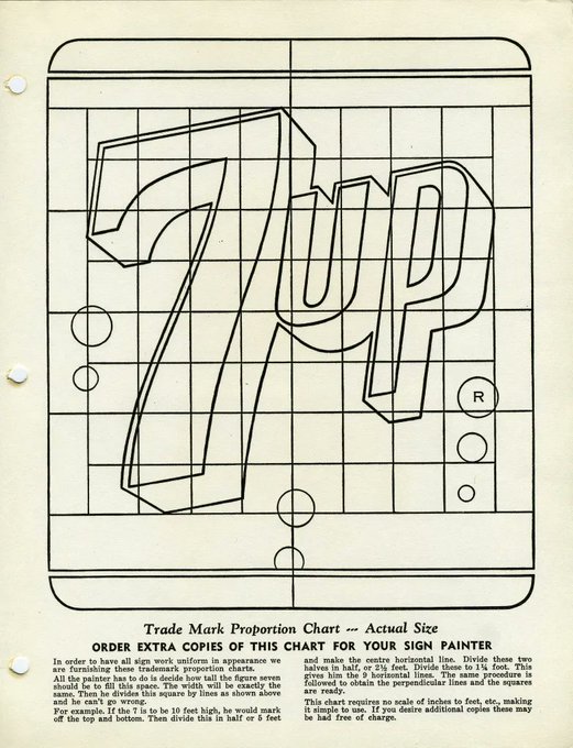
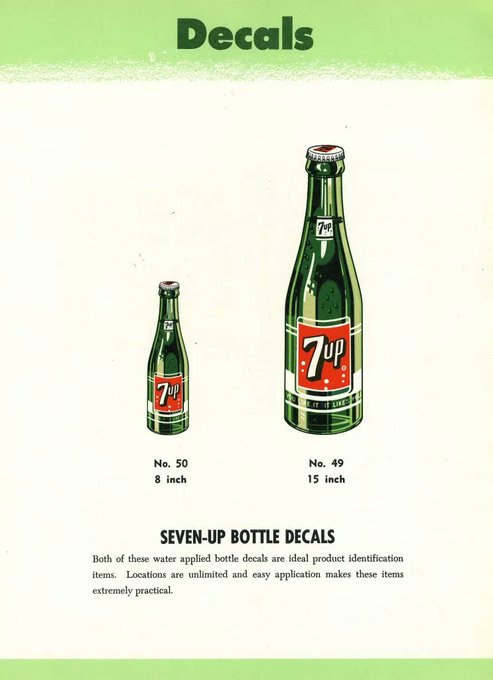
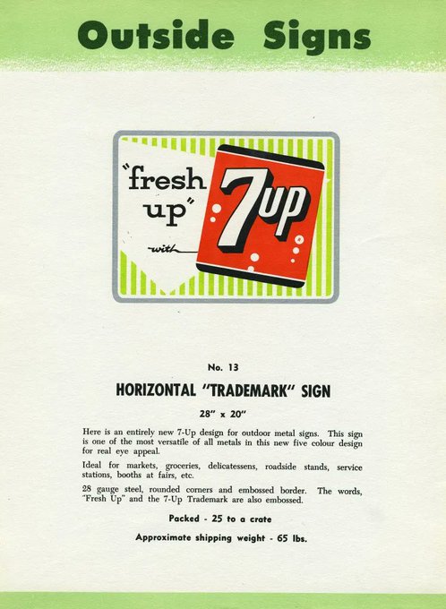
1950s 7Up logo, proportion chart, and advertising available to distributors.
More →
3
206
2K

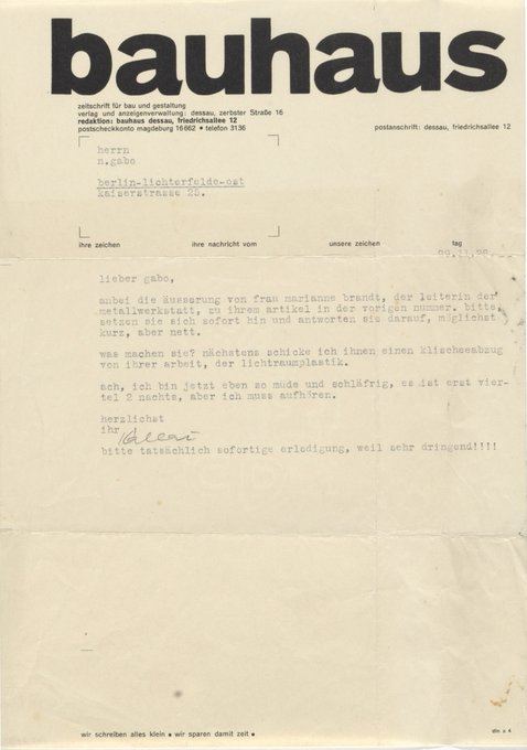
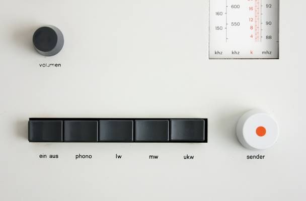
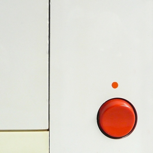
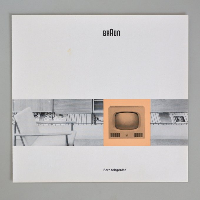
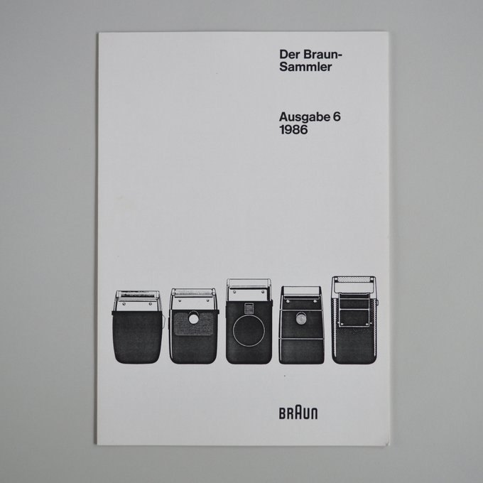
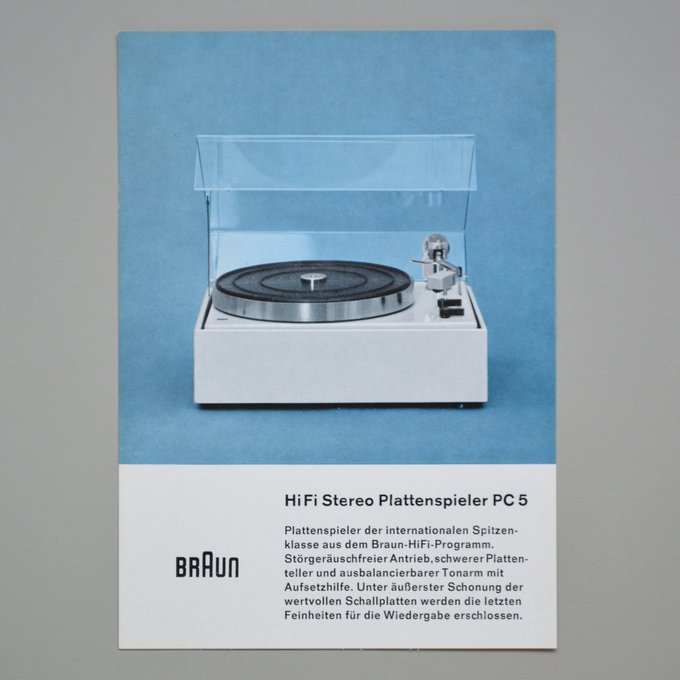
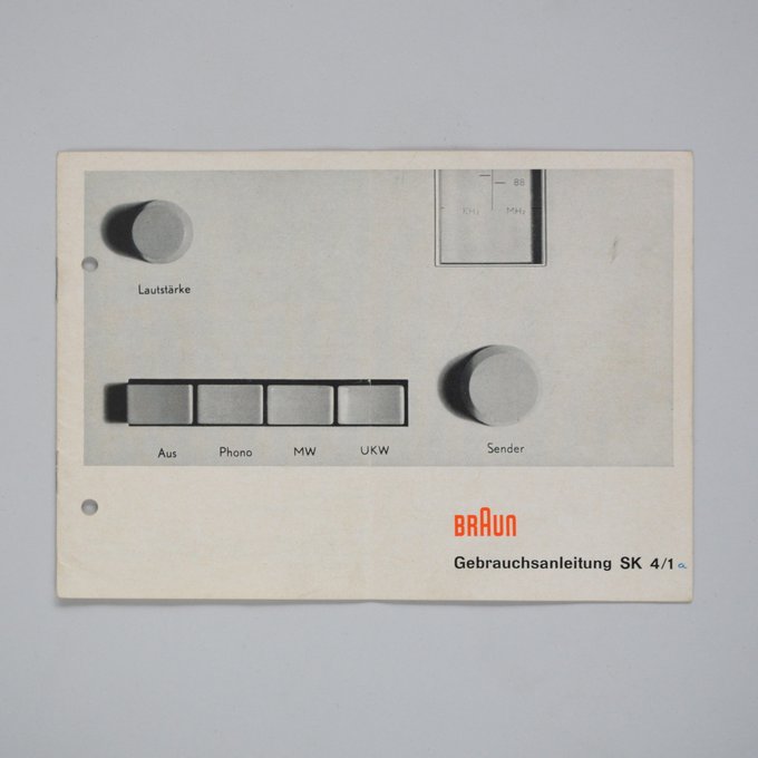
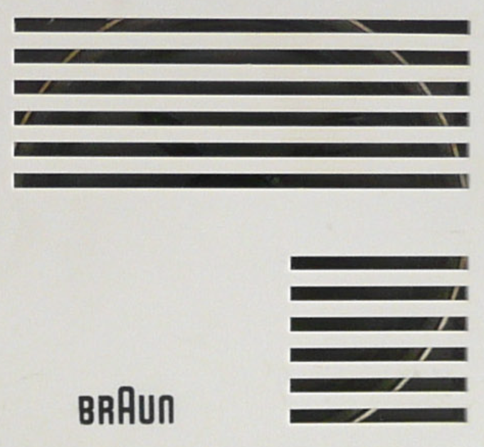
Braun printed materials from the 60s are so good.
A bunch more here:
6
160
2K
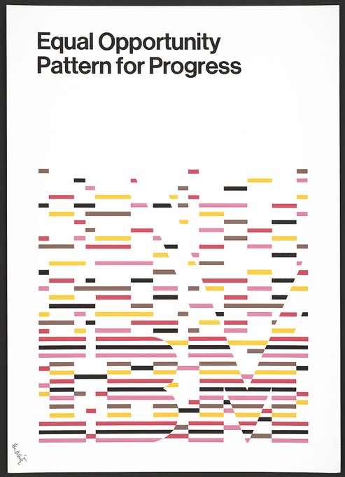
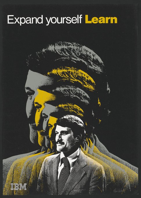
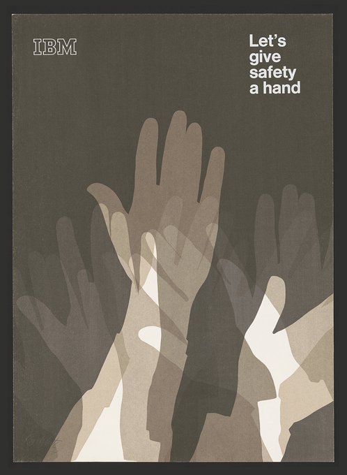
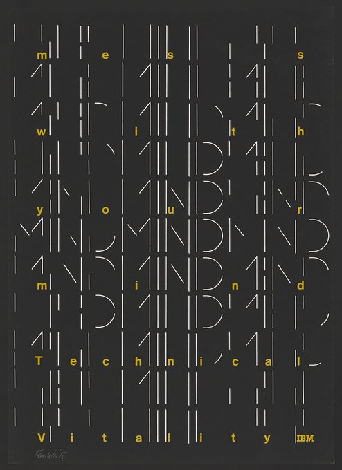
IBM posters designed by Ken White in the late 60s and early 70s.
Source: Library of Congress
9
150
2K
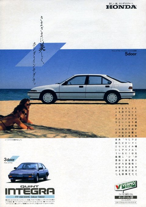
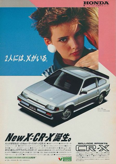
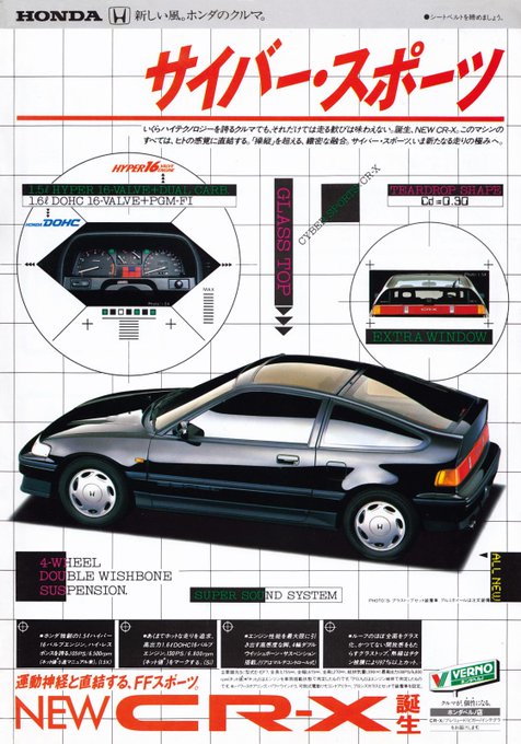
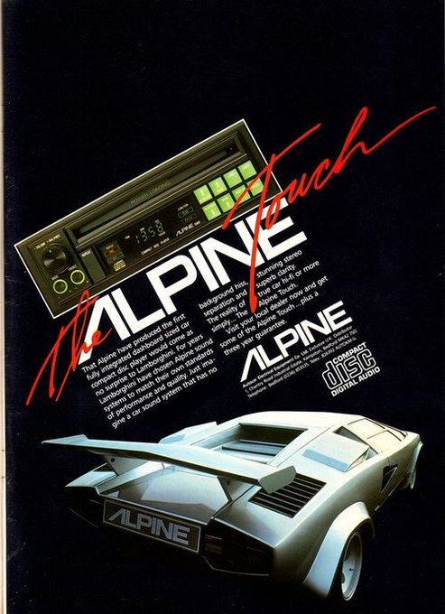
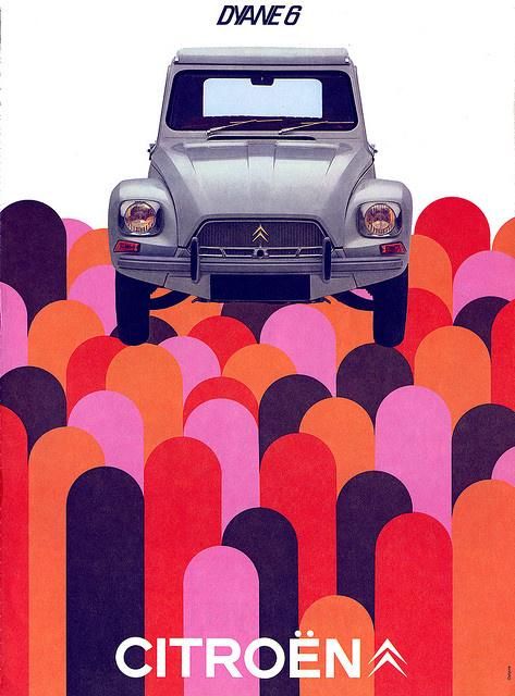
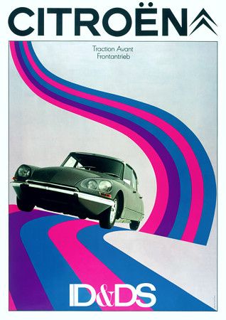
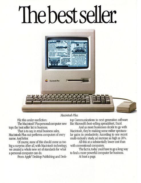
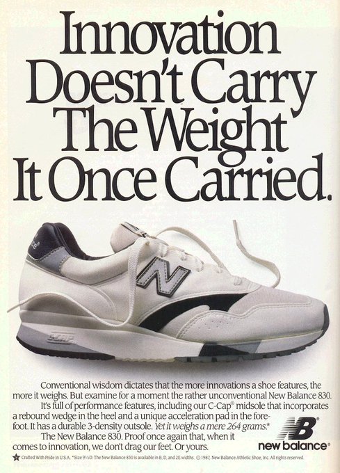
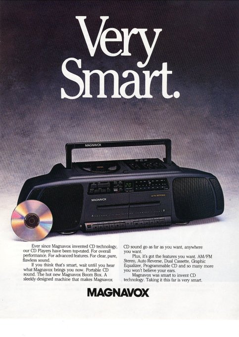
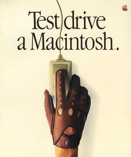
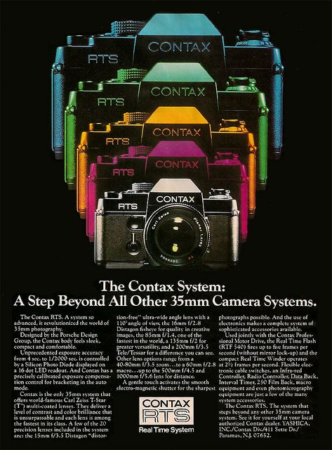
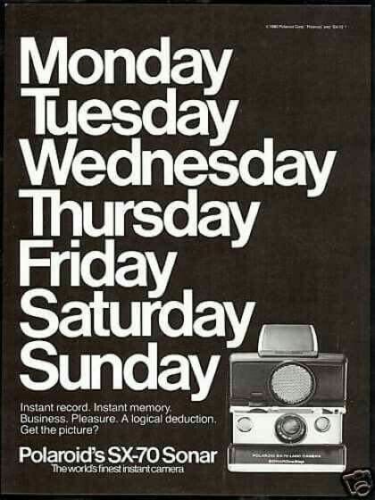
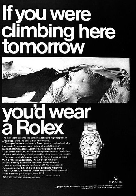
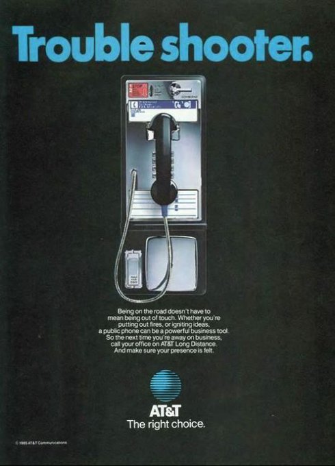
Remember when ads used to be great?
1. Unknown
2. Chiat/Day
3. Fallon McElligott
4. John Brown & Partners
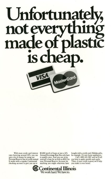
9
139
1K

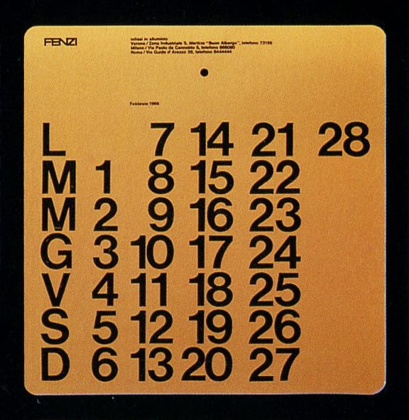
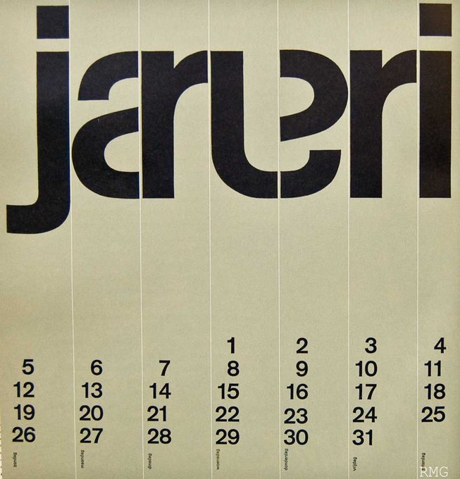
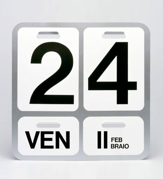
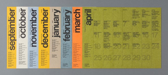
Some of my favorite vintage calendar designs.
1. Massimo Vignelli - 1965
2. Wim Crouwel - 1964
3. Enzo Mari - 1963
4. Barbara Loveland - 1975
Sources: West Michigan Graphic Design Archives, Flickr, eMuseum, Archivio Grafica Italiana
6
138
1K
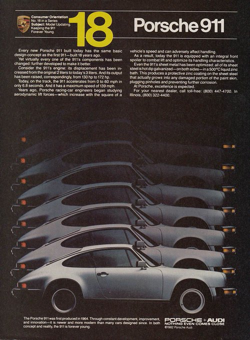
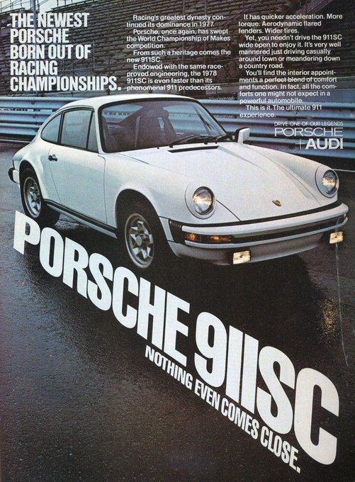
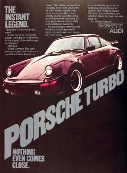
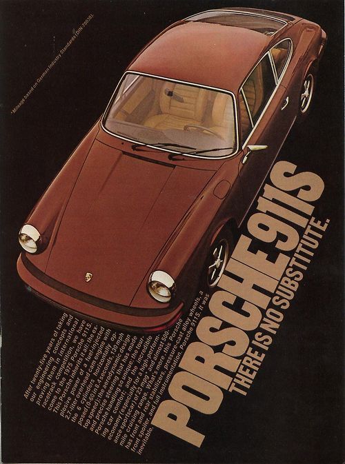
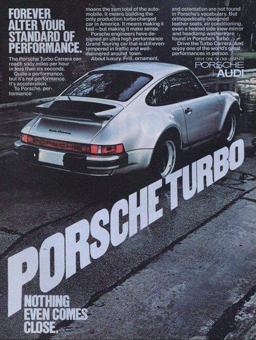
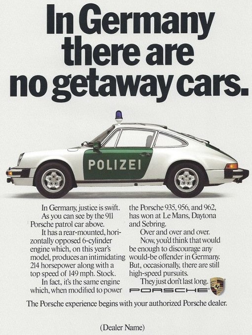
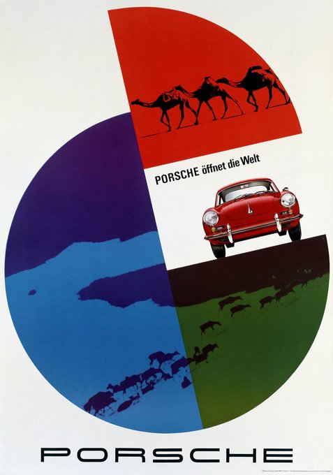
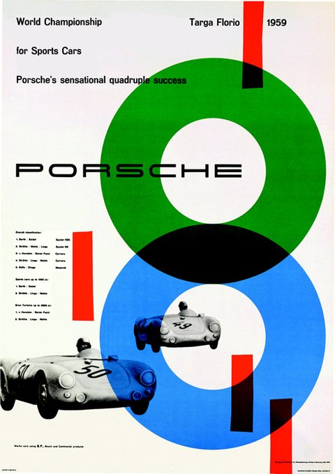
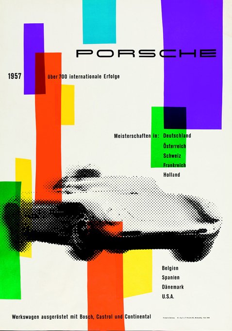
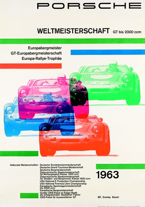
I can't get enough of these Porsche Racing posters designed by Hanns Lohrer in the 50s and 60s.
9
160
1K
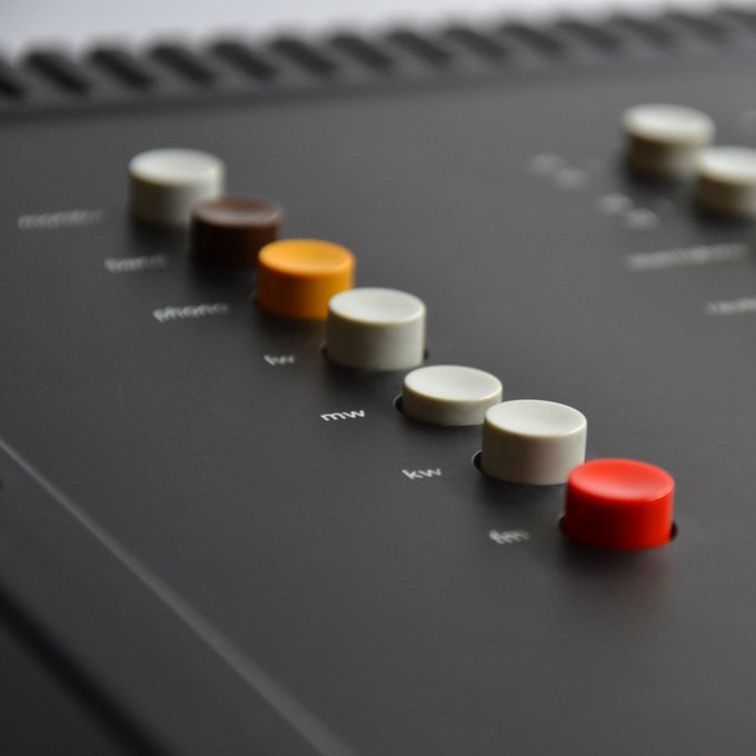
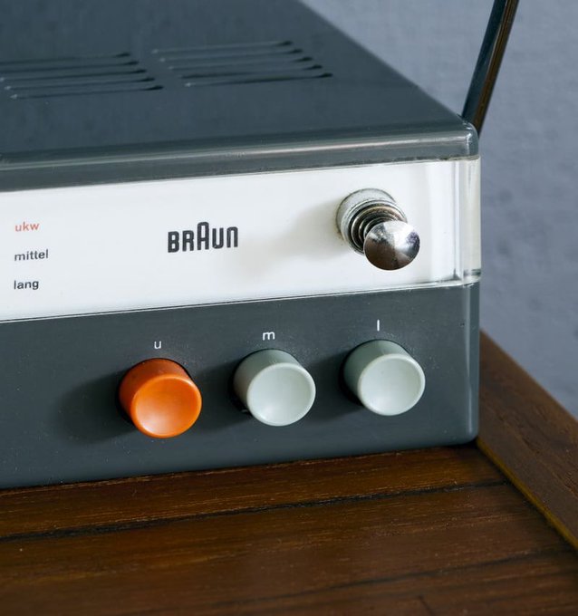
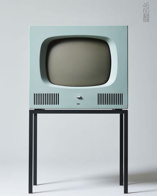
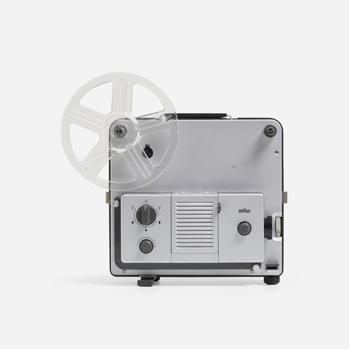
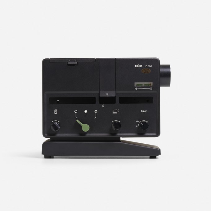
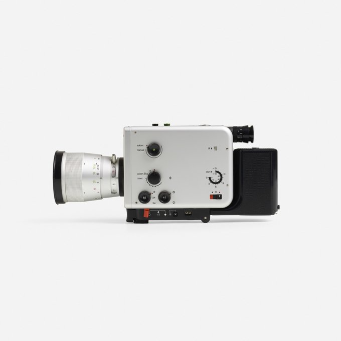
Braun cameras and projectors designed under the supervision of Dieter Rams.
Source:

6
117
1K
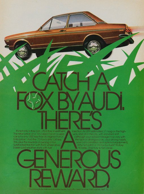
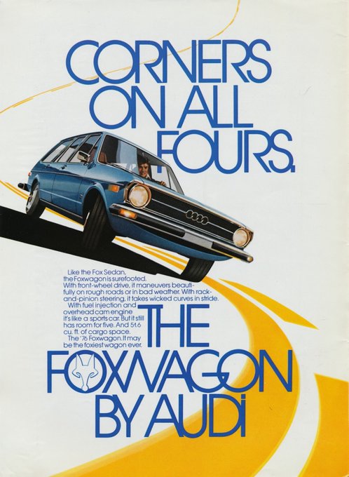
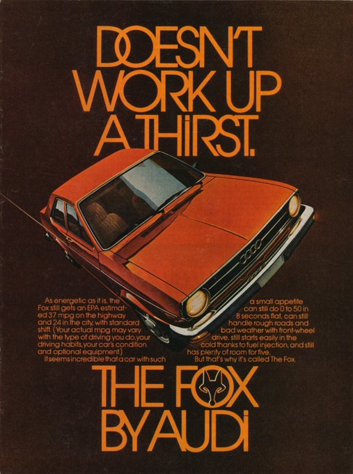
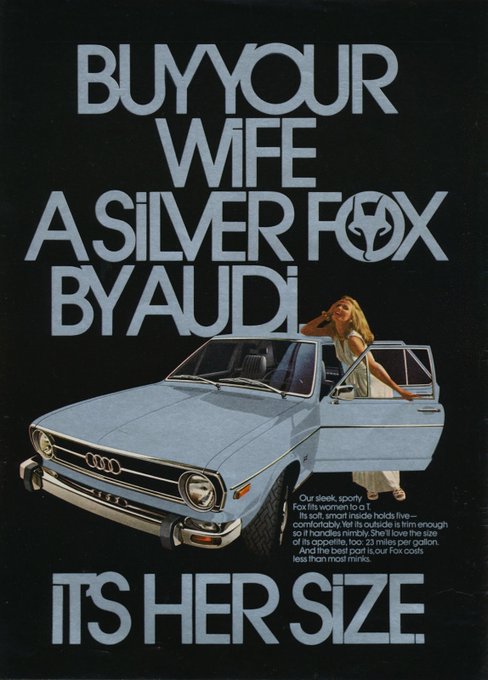
Gorgeous 1970s Audi Fox ads set in Avant Garde Gothic, designed by art director Helmut Krone.
More →
4
213
1K
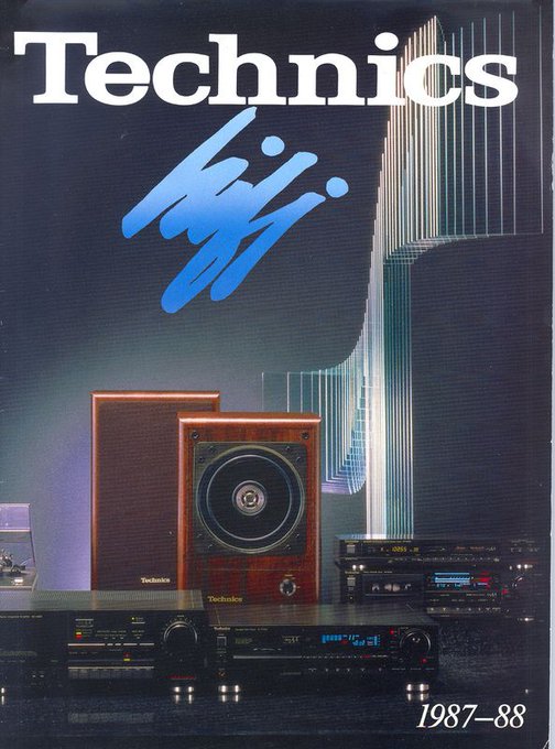
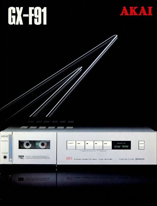
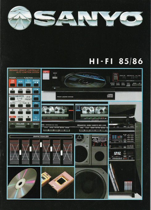
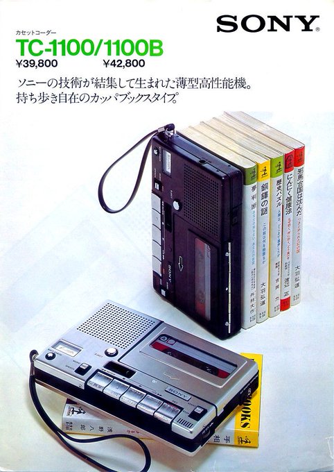
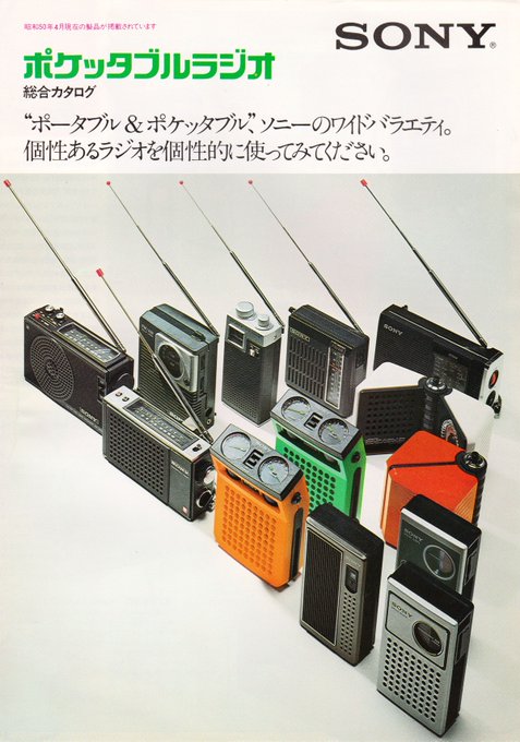
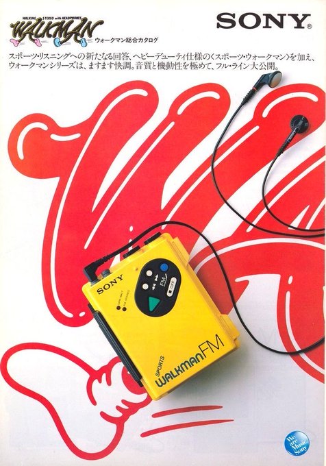
1980s Sony catalogs. I dig this layout design and how it easily allowed for different variations.
8
177
1K
Some of my favorite pieces of work by Italian graphic designer Ilio Negri.
Source: AIAP
3
83
1K
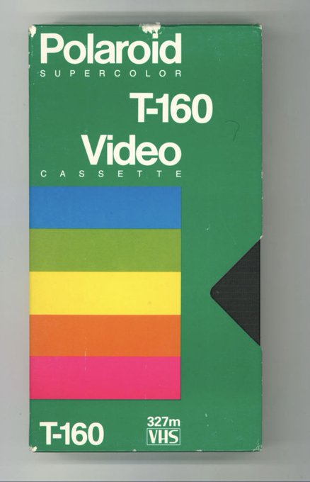
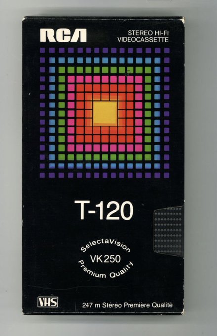
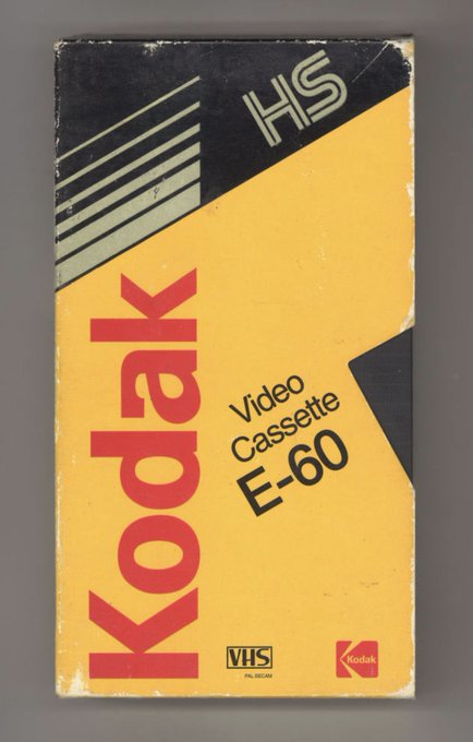
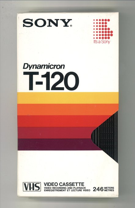
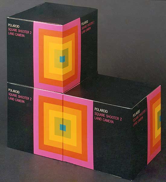
The lost art of VHS tape design. For Generation X, shelves of these tapes were our Netflix. The Polaroid designs are my favorite.
A large collection of covers here:
15
167
1K
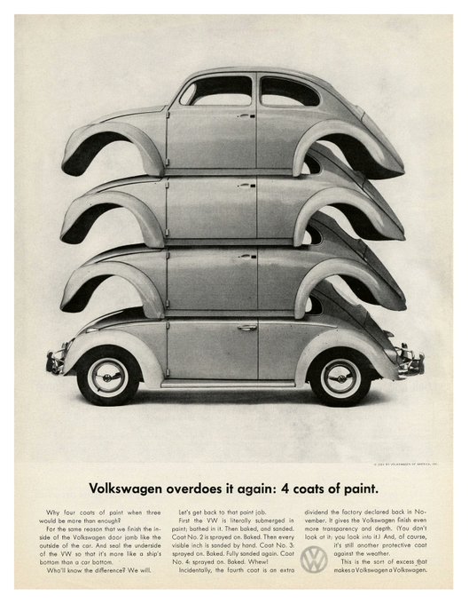
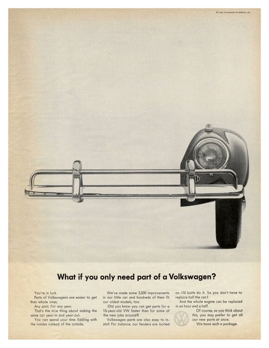
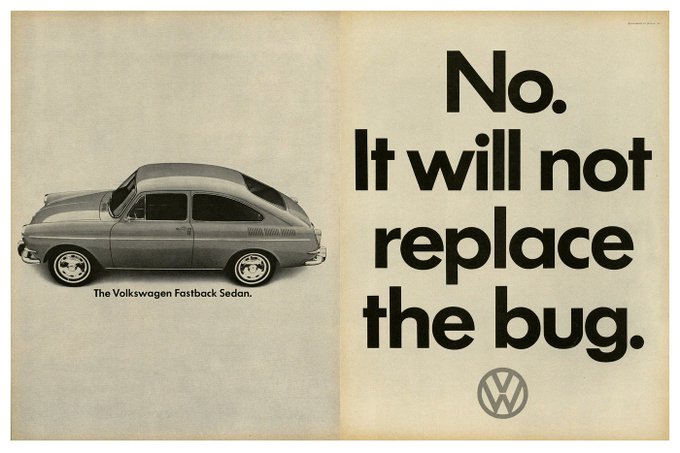
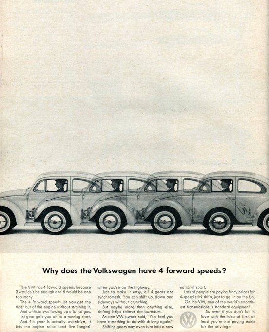
1960s ads for Volkswagen of America designed by Helmut Krone. My favorite bit is how he deliberately left widows and cut sentences in half to keep the text blocks from being solid.
More here:
8
129
1K
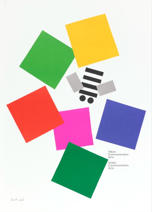
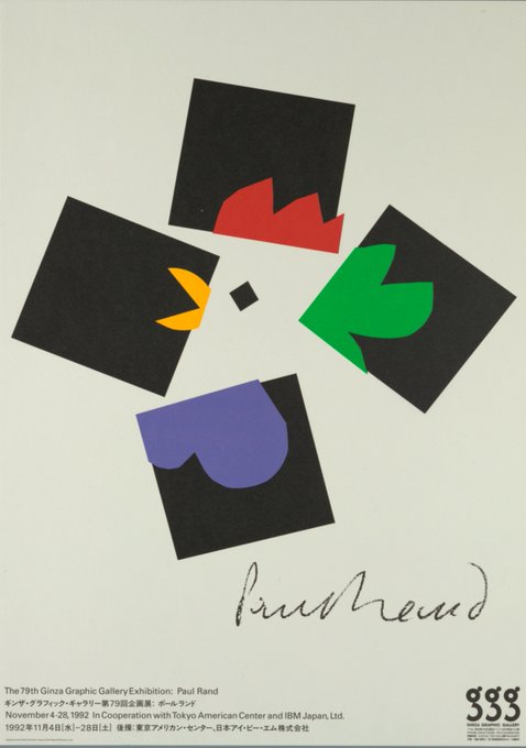
90s posters by Paul Rand that utilize squares as the main element.
1. Tokyo Communication Arts — 1991
2. 79th Ginza Graphic Gallery Exhibition — 1992
Source: Cooper Hewitt
3
99
1K
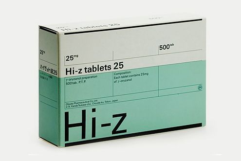
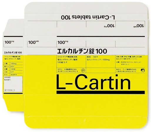
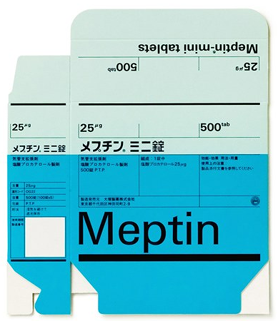
Pinterest collection of some of Helmut Schmid's work, including these nice Pharma packing designs.
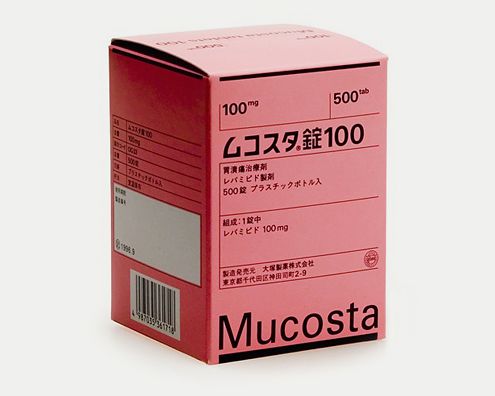
5
97
1K
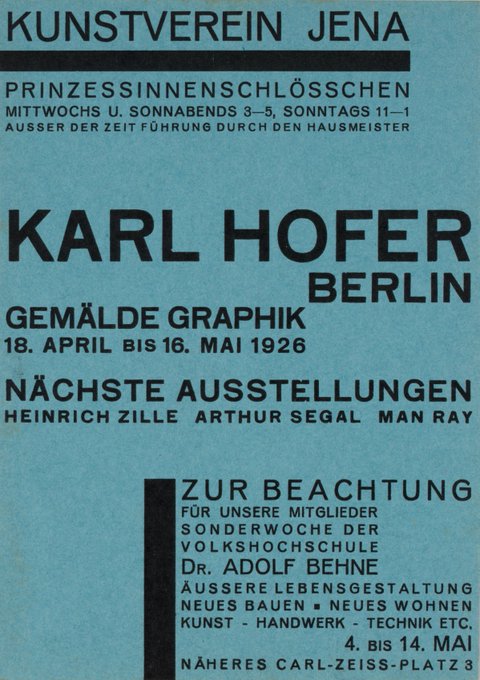
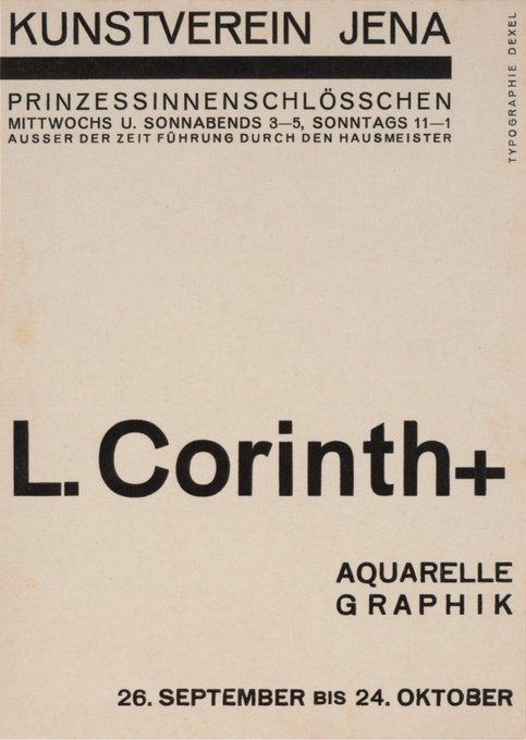
Walter Dexel did these typographic designs in the 1920s. I repeat these were designed in the 1920s!!! 🤯
More →

7
112
1K
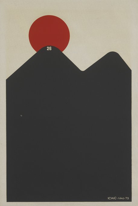
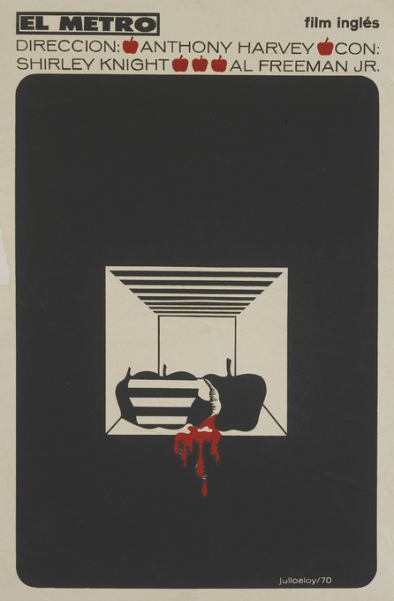
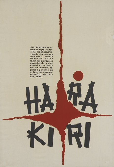
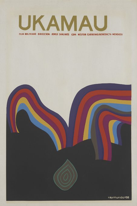
Here's a Flickr set of The Danish Film Institute's collection of Cuban film posters from the past 50 years.
4
130
996

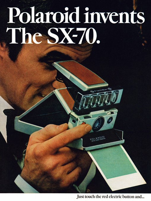
Polaroid packaging sketches and final designs created in the 70s by Paul Giambarba.
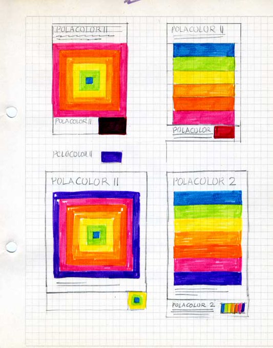
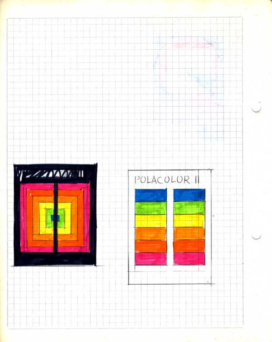
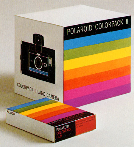
3
158
980
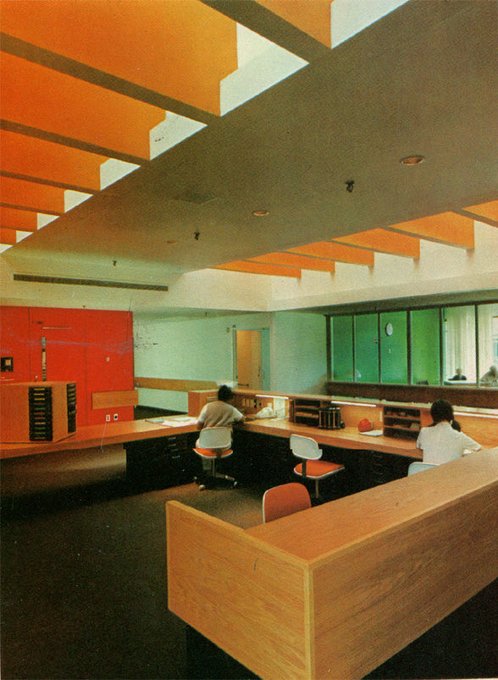
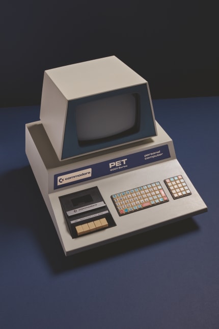
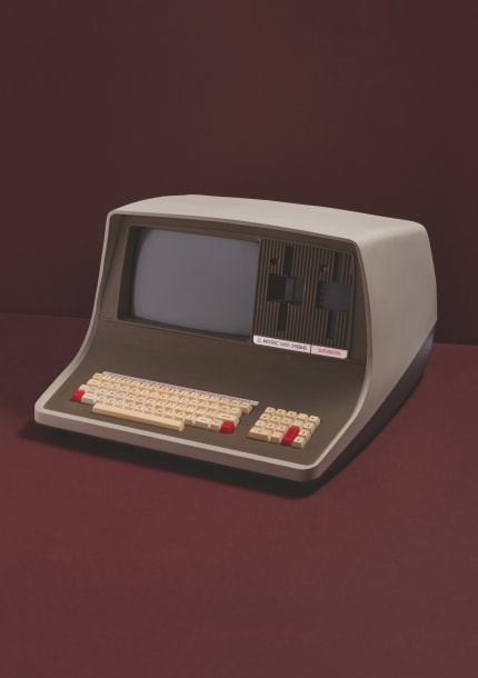
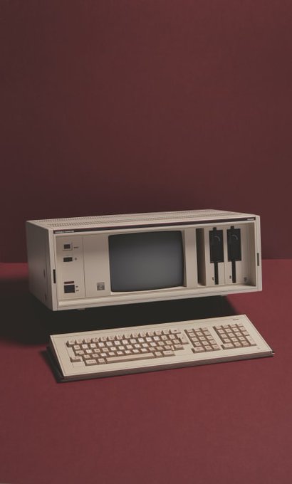
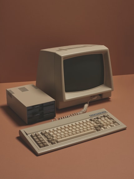
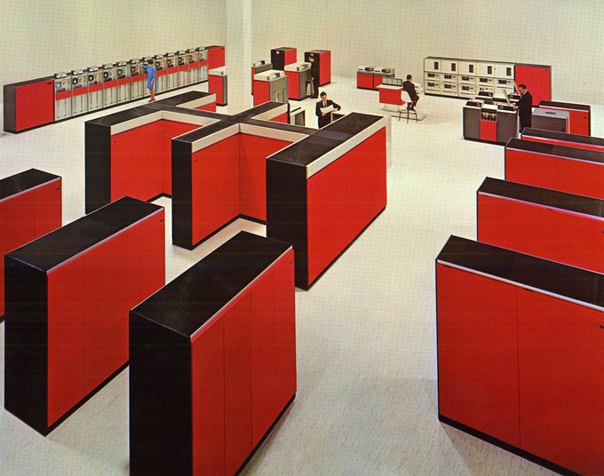
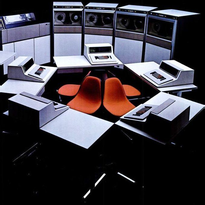
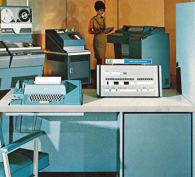
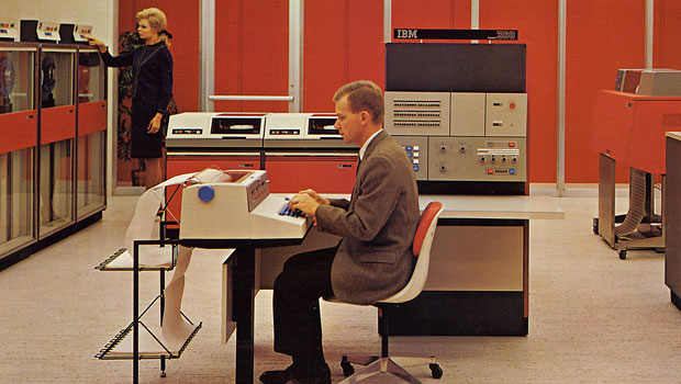
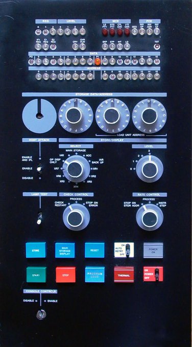
Some Friday night Pinterest finds of mid-century mainframe rooms. I want my office to look like this.
10
125
961

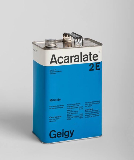
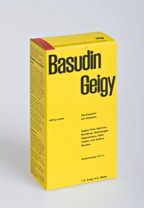
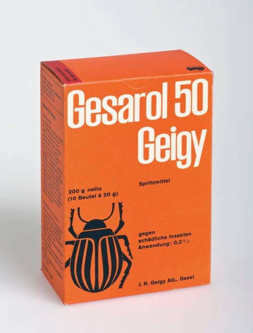
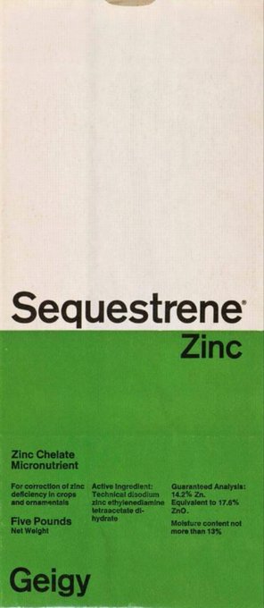
1950s and 1960s Geigy packaging designed by Markus Löw and Andreas His.
Source: Museum of Design Zurich
1
87
946

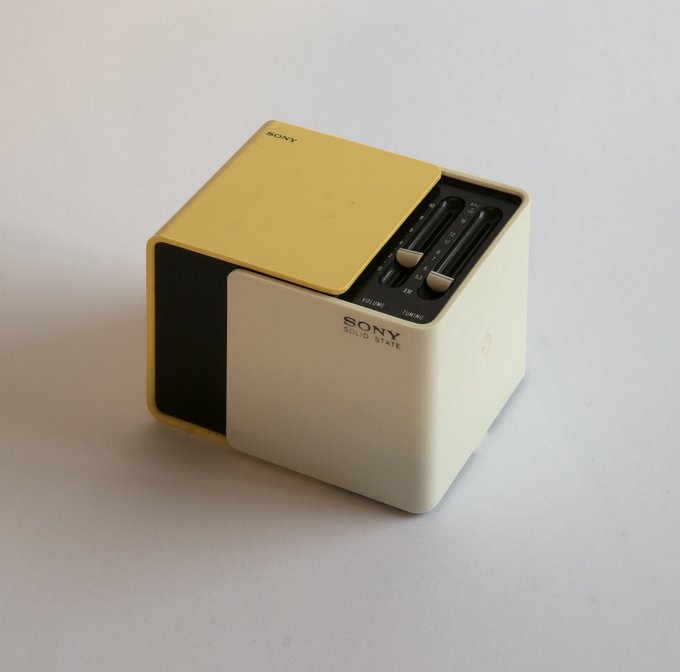
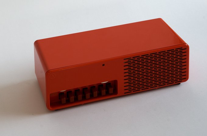
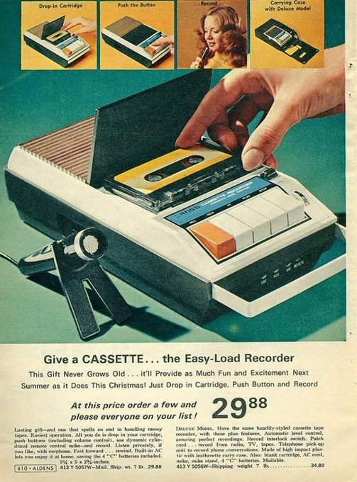
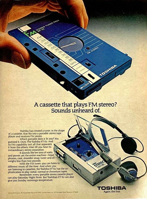
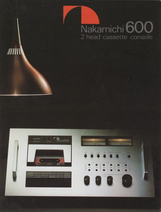
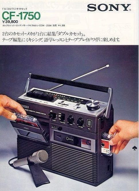
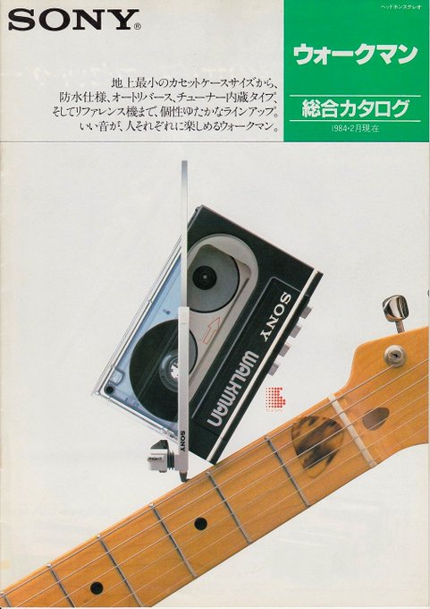
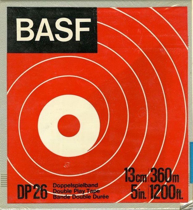
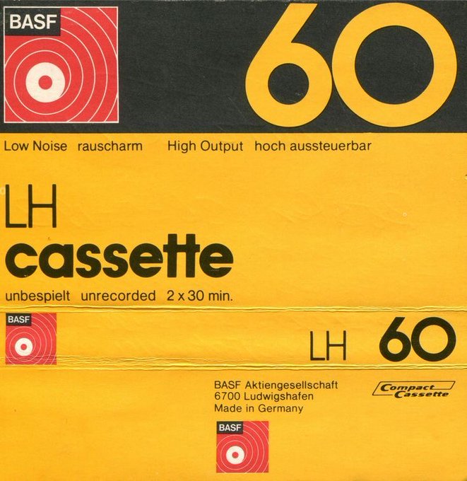
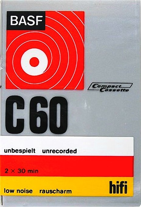
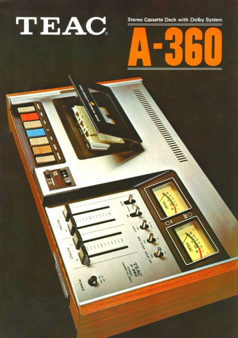
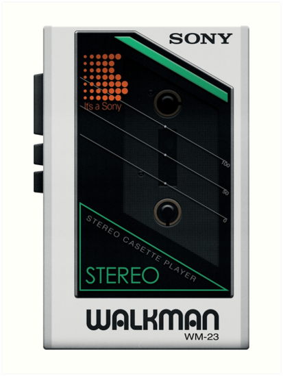
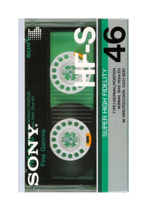
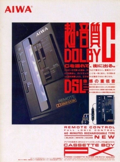
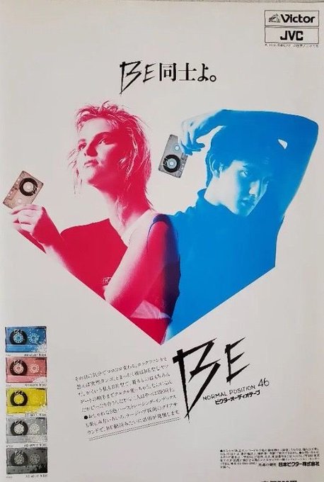
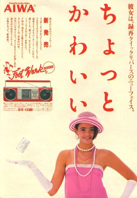
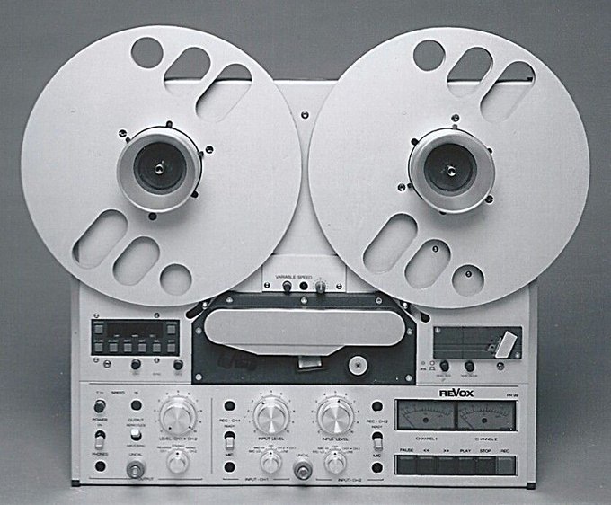
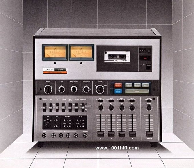
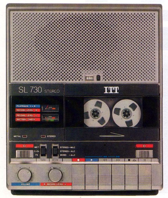
The aesthetic of the 80s Sony cassette experience was something special.
4
112
897
Initial sketches and final logo for the Centre Pompidou done in the late 70s by Jean Widmer. The logo is an abstraction of the building facade. Widmer devised the idea while sitting at a café facing the Center and sketched it on the tablecloth.
Source: Centre Pompidou

6
110
893
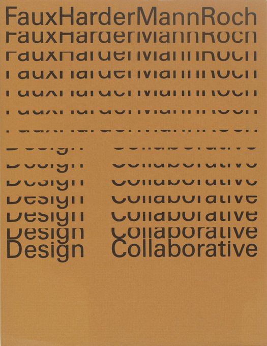
The "cascading type" aesthetic was developed over 50 years ago but is still popular today. Here are some excellent vintage examples of the style.
1. Burton Kramer — 1978
2. Rolf Harder — 1965
3. Wim Crouwel — 1974
4. Jacqueline S. Casey — 1968
Sources:
7
98
887

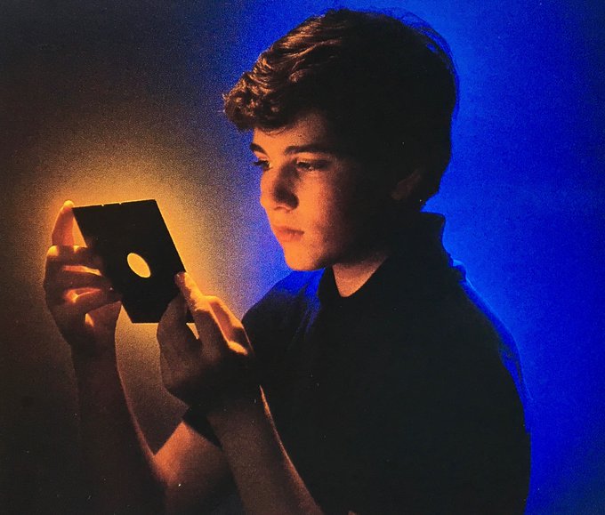
Call me crazy, but I love this 90s aesthetic. It's mostly nostalgic for me.
18
118
869
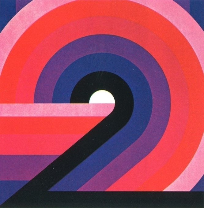
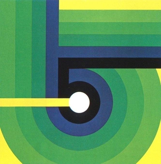
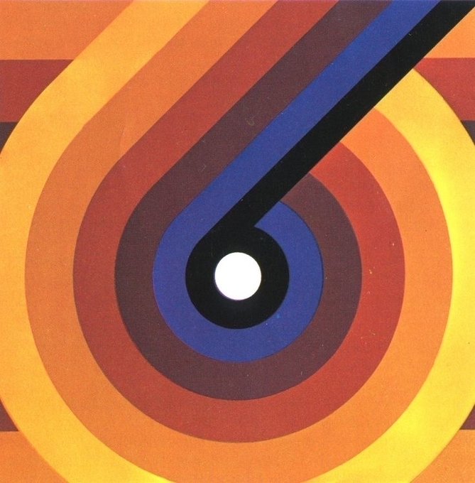
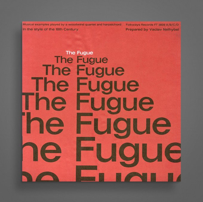
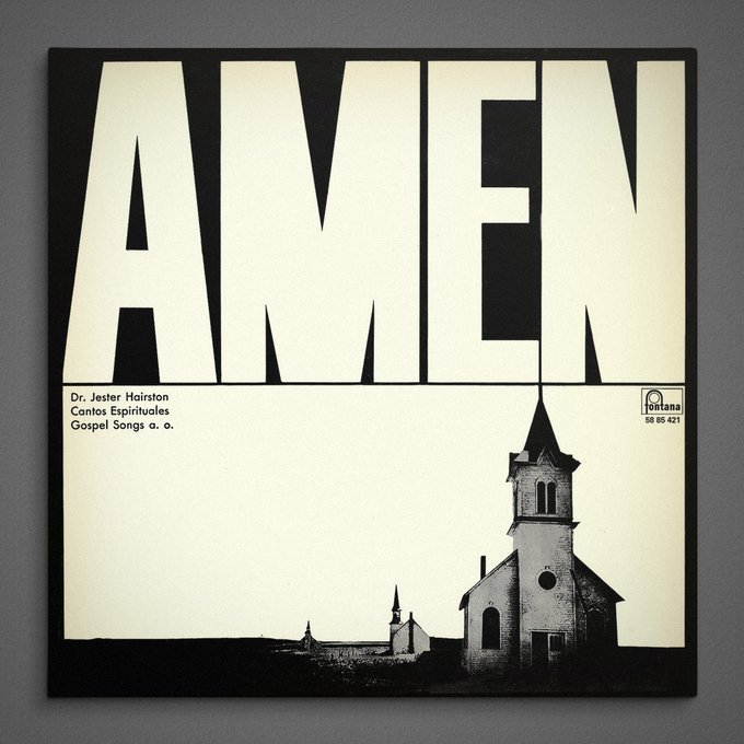
Some record cover designs from the blog Typophonic, a collection of 12-inch records from the 1950s through the 1980s featuring typographic designs.
5
69
866
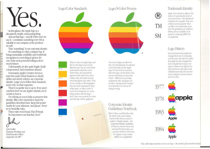
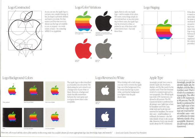
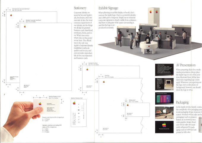
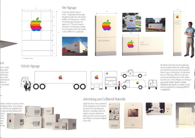
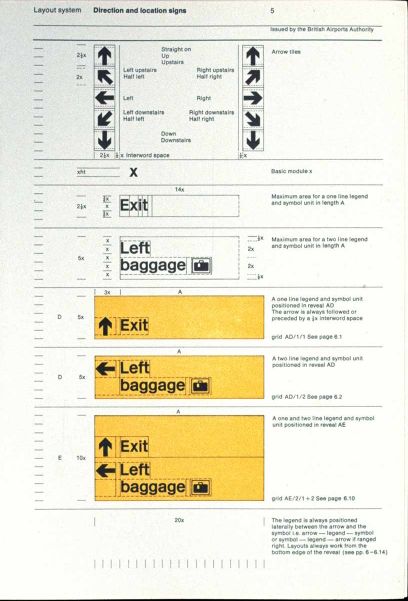
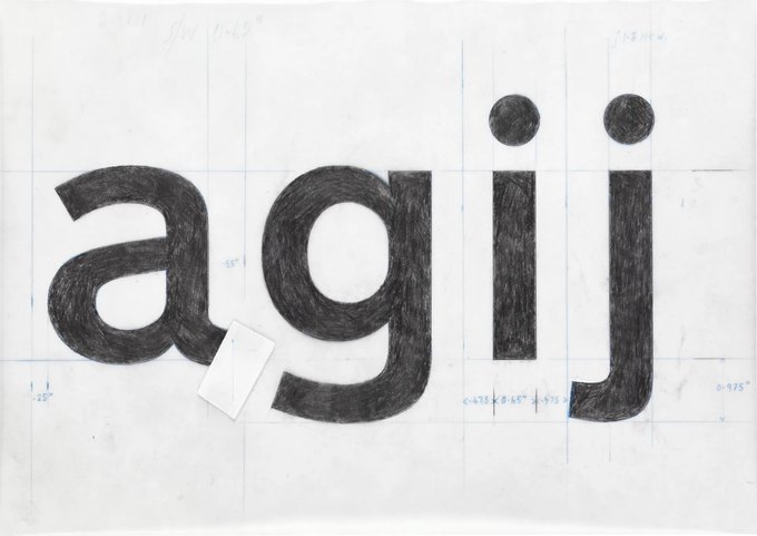
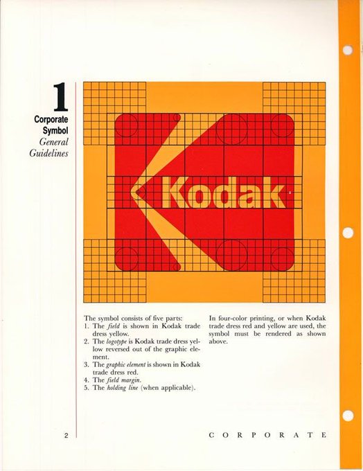
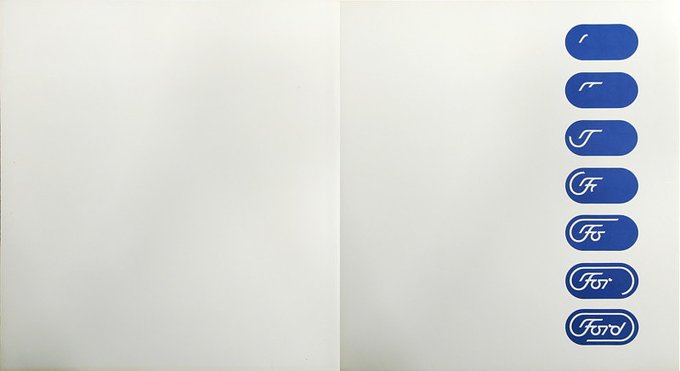
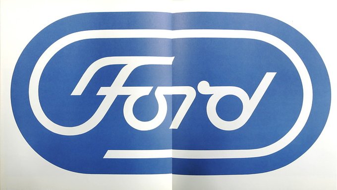
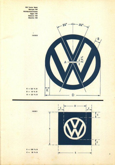
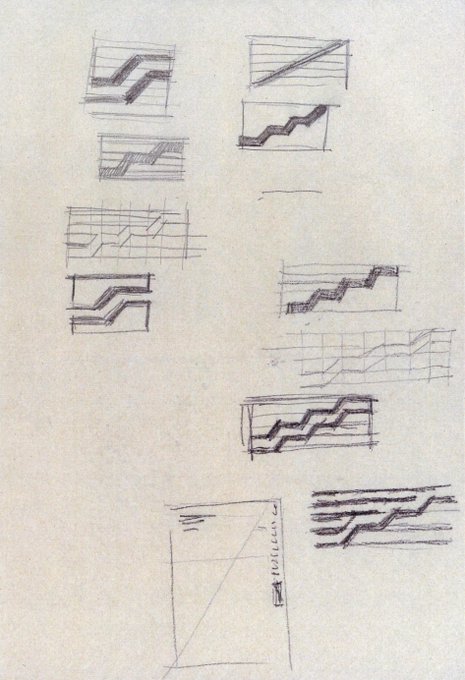
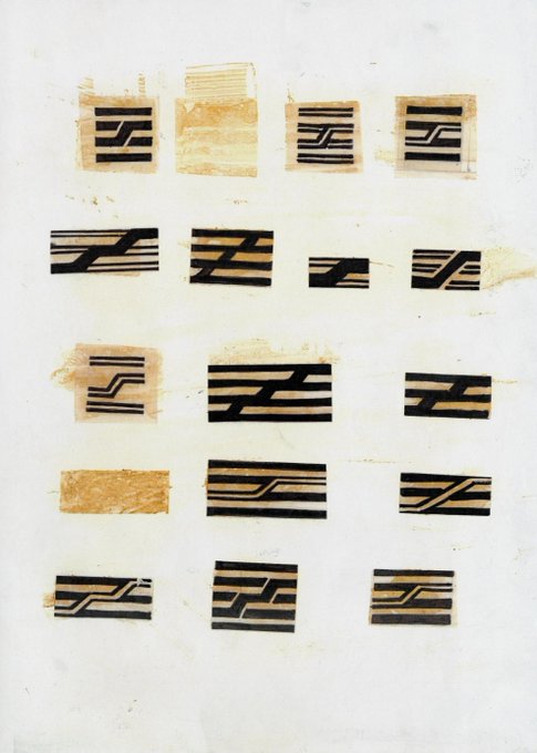
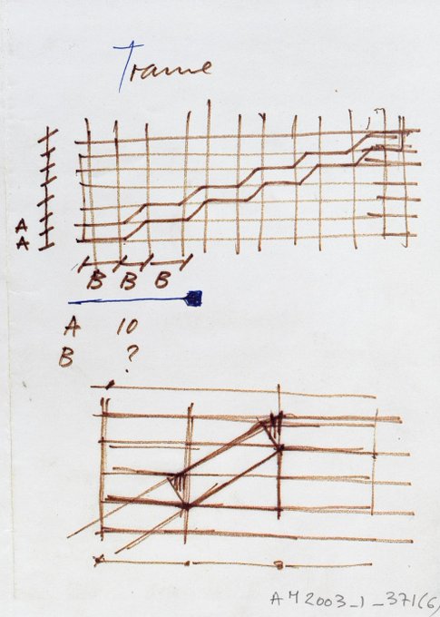
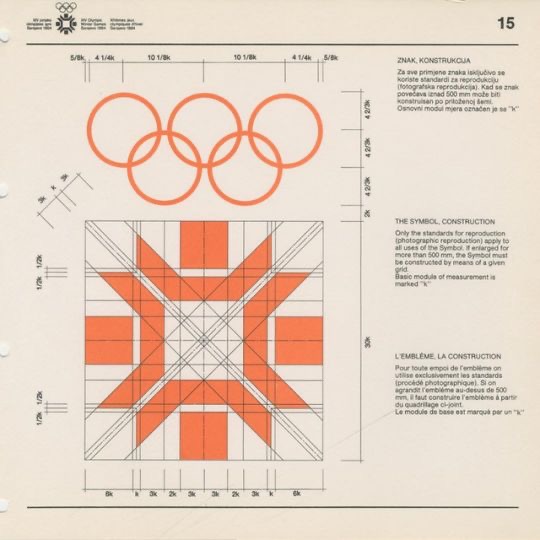
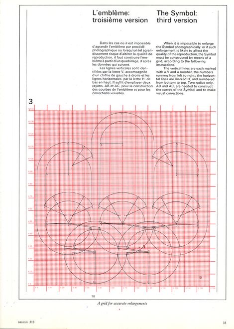
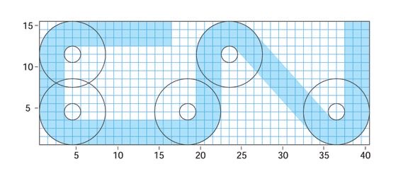
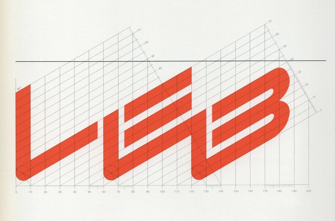
Real logo specs from back in the day. Notice how there are no golden ratios or random circles. That’s because these were actual specs on how to reproduce the logo, and not arbitrary shapes and measurements like you see today.
9
102
872
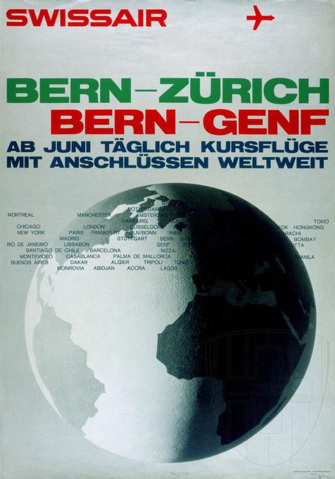
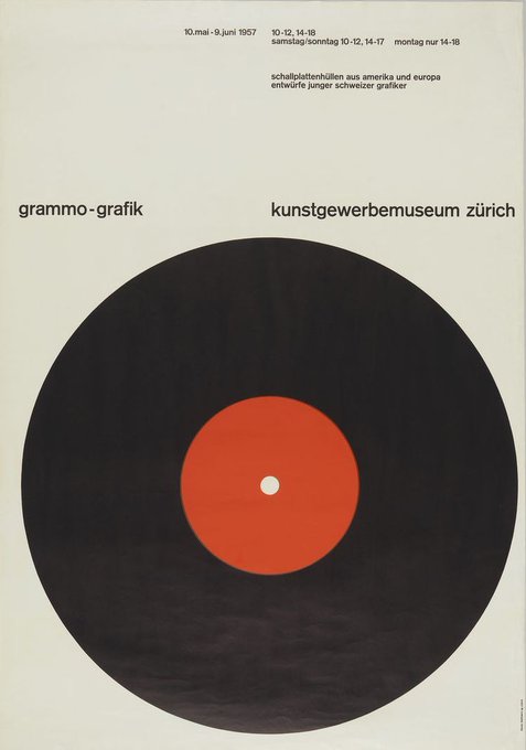
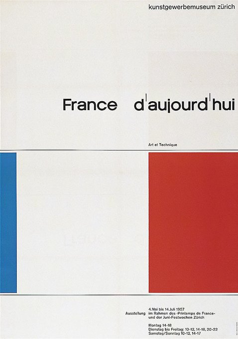
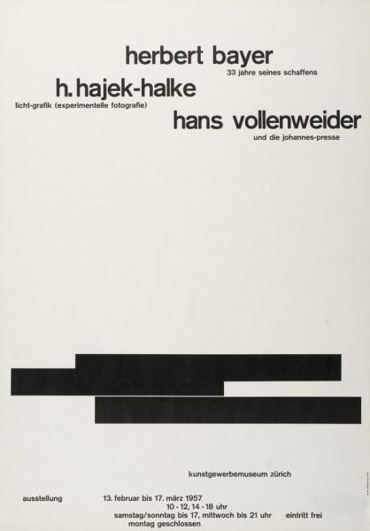
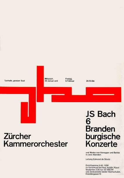
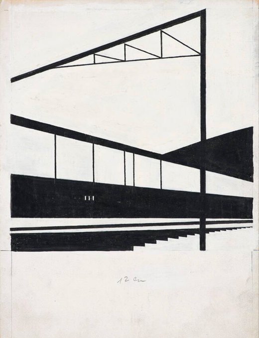
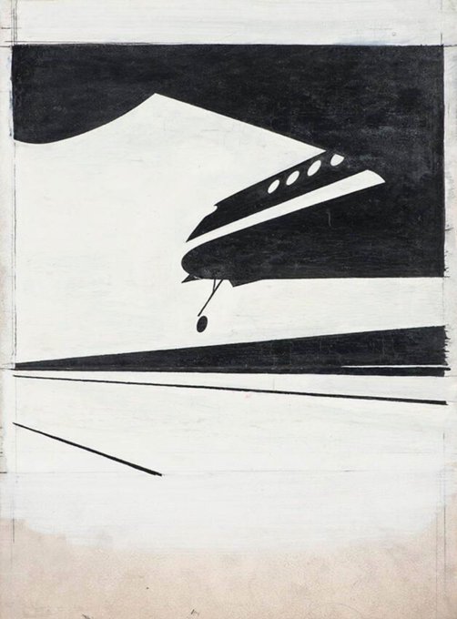
1955 drawings by Josef Müller-Brockmann for the Swiss Central Office for Transport Promotion.
Source: Museum of Design Zurich
3
97
868
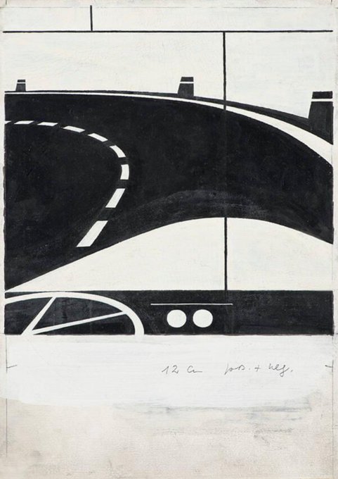
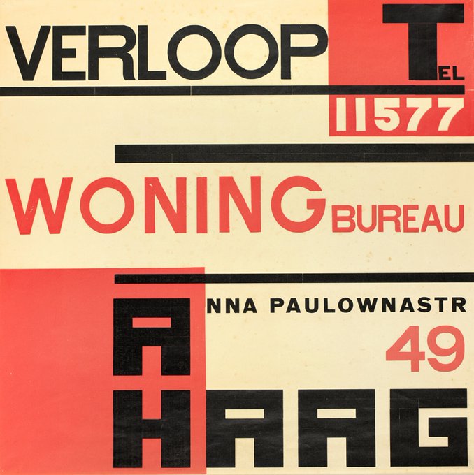
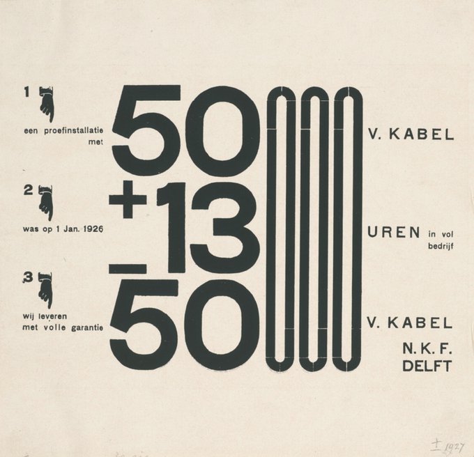
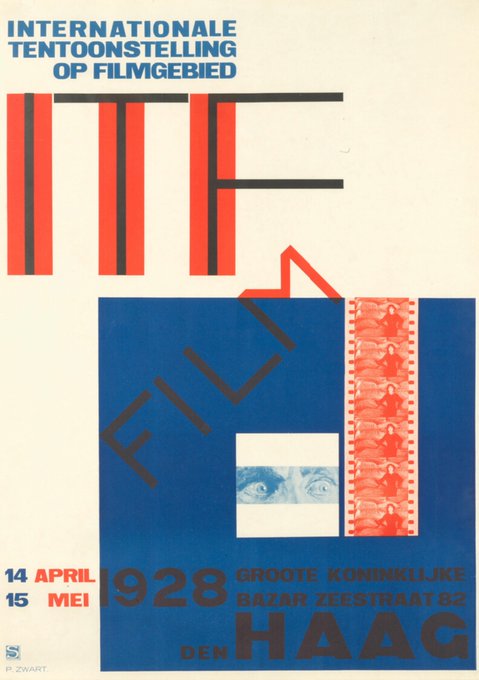
These were designed in the 1920s by Dutch designer Piet Zwart. He was ages ahead of his time, and there is much for us to learn from his work.
More here:
4
84
837
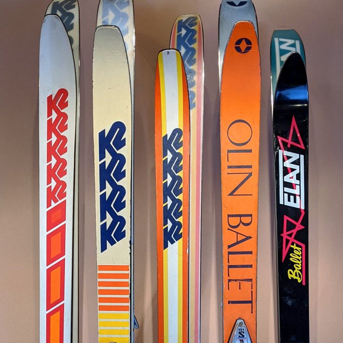
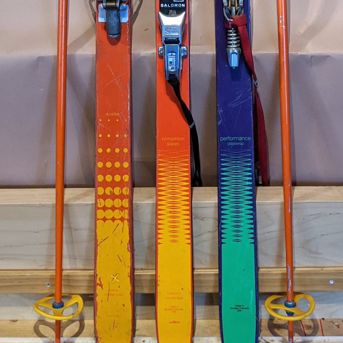
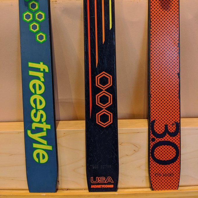
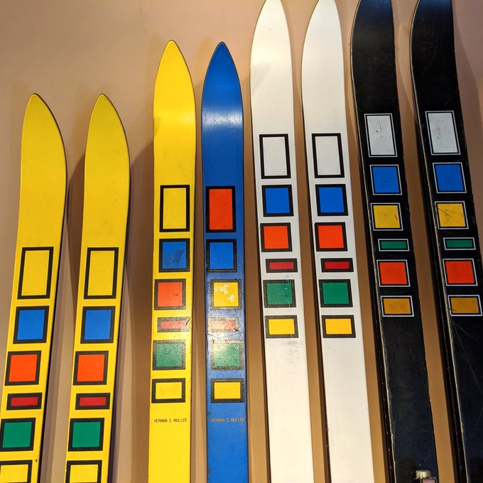
Here's a nice site of vintage ski graphics from the 70s, 80s, and 90s.
9
95
821
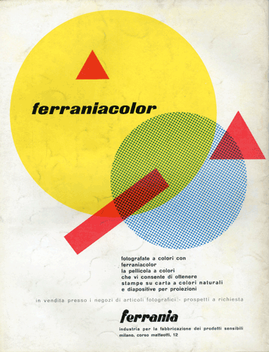
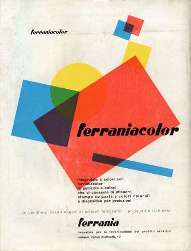
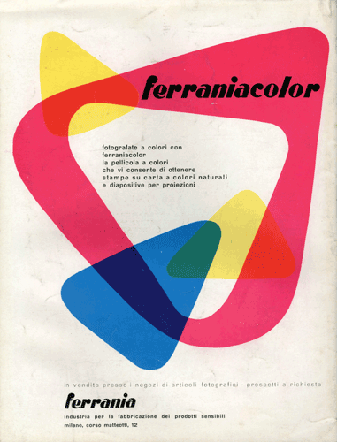
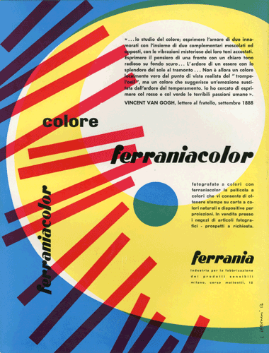
1950s ads designed by Luigi Veronesi for Italian photographic film company Ferrania.
More here:
2
123
798

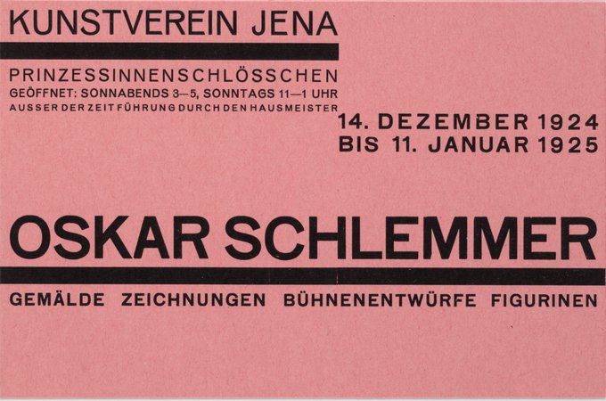
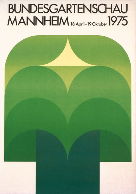
Poster for the 1975 Federal Horticultural Show (Bundesgartenschau). Designer unknown.
10
53
768
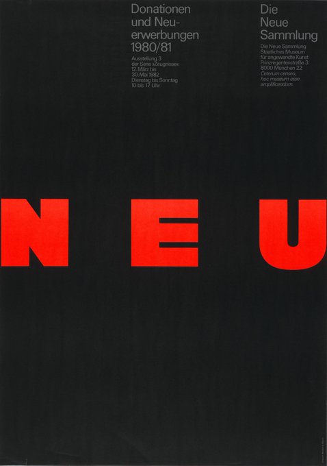
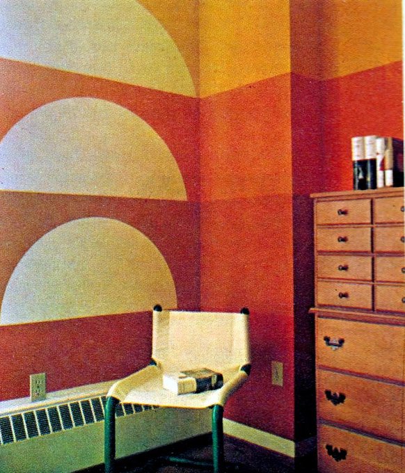
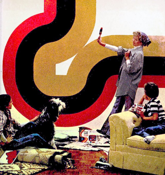
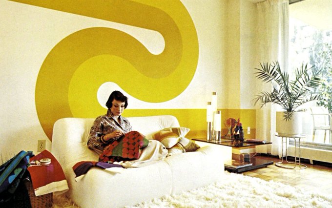
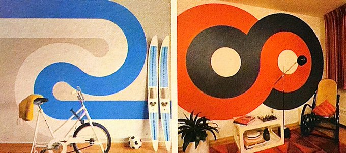
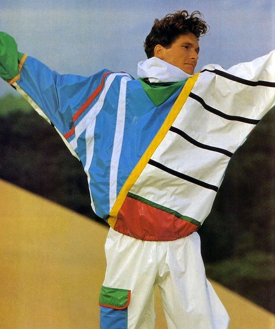
The colorful geometric graphic prints of 80s fashion were so good.

5
85
753
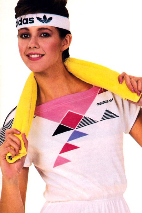
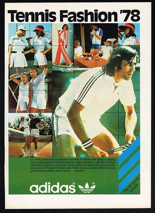
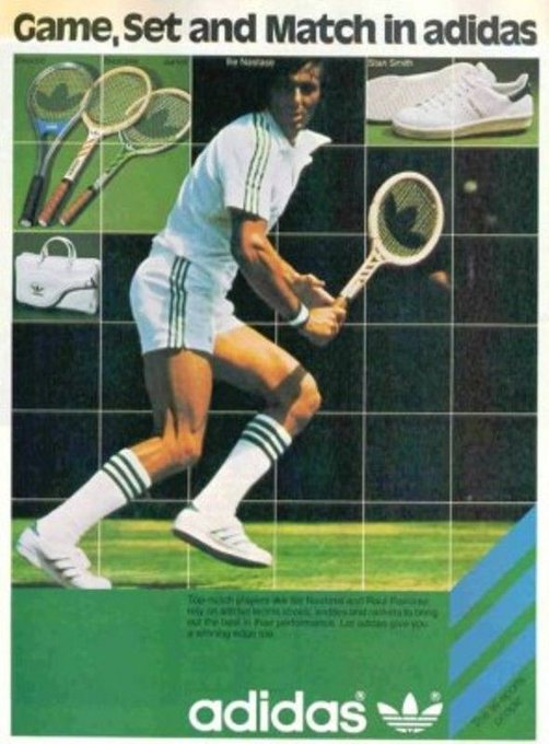
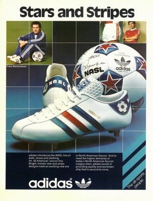
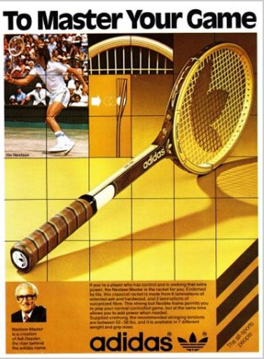
I just came across these vintage Adidas tennis ads on Pinterest using the same grid design. Kinda neat.
5
66
744
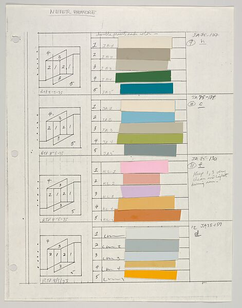
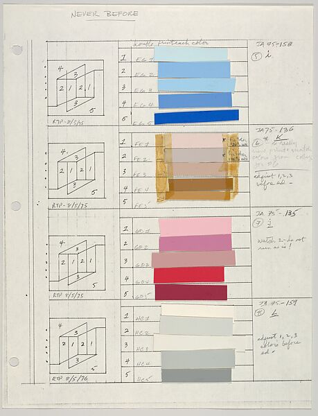
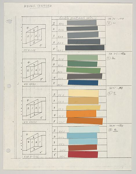
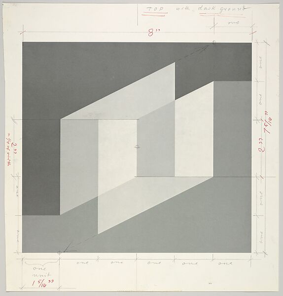
Josef Albers created these color charts and diagrams for his 1970s Never Before print series. Also pictured are specs for the series template.
More →
3
121
738