
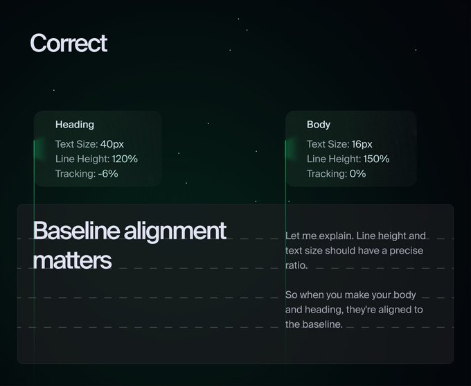
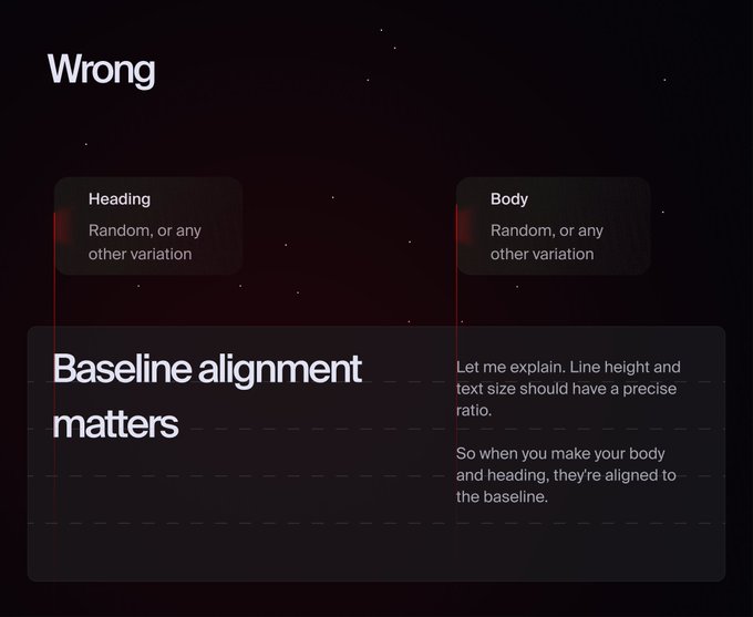
There are only two ways to align text in the UI
Correct and wrong:
P.S. The correct one uses a 4px baseline grid.
11
13
229
Replies

@dchernyshuk
4px is king, but -6 and 0 are a little extreme in my experience.
When using Inter, especially, I like -4 for headings and -2 for body, but some typefaces command looser tracking (or often tighter, especially for headings)
Great job display how you do it, Andrew!
1
0
2
@ryasendesign
I think I love extreme heading tracking because of this poster
And from my perspective, negative tracking in body texts becomes not legible. Or maybe it's just me
Thanks for leaving some feedback!

1
0
3

@dchernyshuk
It depends on the length of the text, especially the body. Therefore, there is no unified solution. However, understanding the scaling ratios is a great start to understanding typography and how to use it correctly. ✨
1
0
4


@dchernyshuk
Hmm. Not sure I agree with this - as an ex-typography-numbers-addict turned design-it-by-feel guy
1
0
1
