@dchernyshuk
Andrew Chernyshuk
5 months
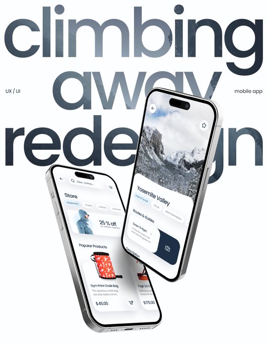
My first ever mobile design case study for Behance from 1 year ago. Does this cover image look old?
Tweet media one
19
8
260

Replies

@waltxwalt
WALT.
5 months
@dchernyshuk Shows that you’re leveling up.
1
0
1
@dchernyshuk
Andrew Chernyshuk
5 months
@waltxwalt Well, that's good news. Thank you!
0
0
0
@zelmanski_tom
Tomasz Zelmanski
5 months
@dchernyshuk I don't like the angle of the phone on the right (just personal taste), but… the whole cover looks fine👌
2
0
2
@dchernyshuk
Andrew Chernyshuk
5 months
@zelmanski_tom Yeah, it's a bit too steep haha Thank you for the feedback!
0
0
1
@rckaniskar
KANISKAR™
5 months
@dchernyshuk Yes, it's not clearly indicating what is inside. I don't like the angled showcase. The cover image should create the temptation to open the project or lead to making a purchase or some action.
1
0
1
@dchernyshuk
Andrew Chernyshuk
5 months
0
0
1
@alex_streza
Alex Streza
5 months
@dchernyshuk Love the text masking the image 🥹
1
0
1
@dchernyshuk
Andrew Chernyshuk
5 months
@alex_streza Thank you 🫶
0
0
1
@happydesign_
Jan
5 months
@dchernyshuk not for me
1
0
1
@dchernyshuk
Andrew Chernyshuk
5 months
@happydesign_ Thanks 🥰
1
0
1
@FaizanKing
Faizan | Design for startups 🪄
5 months
@dchernyshuk Looks good but the mockup's angles could've been better and there's too much white, a little dark color used would've enhanced the look even more.
1
0
1
@dchernyshuk
Andrew Chernyshuk
5 months
@FaizanKing Thanks for the feedback!
0
0
0
@spuxui
Smiling Pixels
5 months
@dchernyshuk Engaging design.
1
0
1
@dchernyshuk
Andrew Chernyshuk
5 months
0
0
0
@Ayoubka_
Ayoub kada
5 months
@dchernyshuk Dude it looks 🔥 and I agree with @zelmanski_tom about the phone on right, it looks weird
1
0
2
@dchernyshuk
Andrew Chernyshuk
5 months
0
0
1
@uix_Ugo
uix_Ugo
5 months
@dchernyshuk Looks good as a cover image. I also like the font type of the header
1
0
1
@dchernyshuk
Andrew Chernyshuk
5 months
@ugo_ai Thank you! The font is Poppins
0
0
1
@Otudor_Emmanuel
Emmanuel O’Tudor
5 months
@dchernyshuk Position of the phone on the right doesn't look great but in all it looks good.
1
0
1
@dchernyshuk
Andrew Chernyshuk
5 months
@the__futureman Thank you for the feedback. It’s interesting that so many people are pointing that out!
0
0
0