
Replies


@dchernyshuk
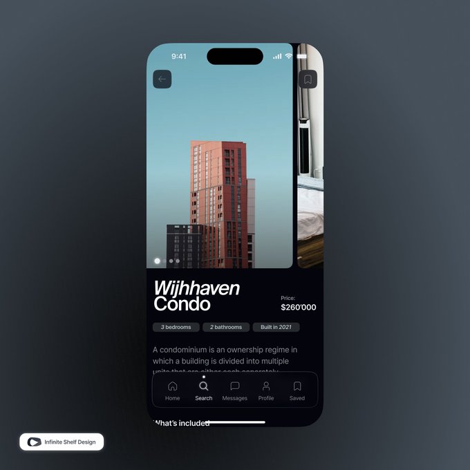
I prefer the dark. The contrast between the etext and the background just draws my eyes.
1
0
1


@dchernyshuk
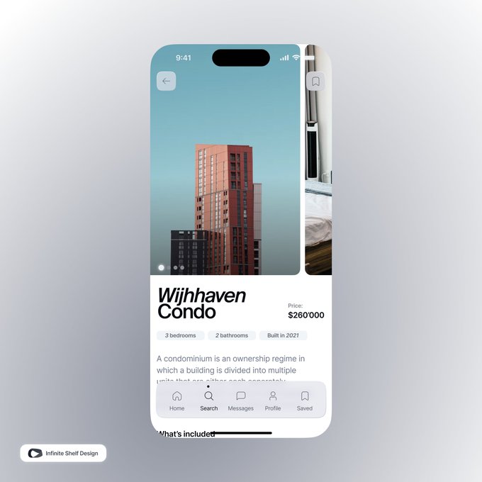
I prefer a light theme where there's more focus on the pictures and the tab bar doesn't blend in with the background.
1
0
1

@dchernyshuk
The second one would probably look better if you fixed the color difference in the levels of elevation. In the dark ui the nav is the same color as the bg, yet in the light this isn’t the case. Try making it the same or make the bg a bit more off-white
2
0
2