Replies

2 spots to design and develop your app with a fixed price are open for January.
Let's talk.
0
0
1


@dchernyshuk
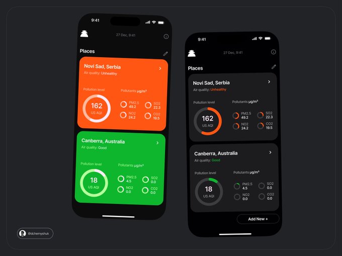
Right for sure bro.
Even do left one state clearly what is happening, it just hurt my eyes 😂
1
0
6


@dchernyshuk
If color scheme here is based on pollution statuses, then it supposed to be more than two colors (statuses).
So let’s imagine you have a yellow status color as well or other bright shade, then left concept will fail accessibility test because of bad contrast.
Right is better.
1
0
2