
sick and tired of these fuckers being gassed up by the entire FNAF fandom.
105
171
2K
Replies
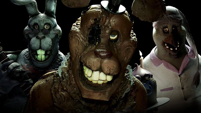
the JR's animatronics are the definition of overdesigned and overcomplicated. they're dowsed in several layers of dirt, grime, wrinkling, and stitching in an attempt at looking "real" yet have the most absurd builds you could ever think of for entertainment robots.


24
6
226
the mere concept of FNAF characters being scary due to their threatening nature contradicting their seemingly friendly looking exterior is forgone completely as everyone is intentionally made out to be as putrid as possible with their weird rotting-corpse-looking auras.
3
3
142
there's no attempt to try and even emulate the look of a real life family friendly mascot. the Puppet is an elongated monkey man, and fucking Balloon Boy is a weird smooth plastic mannequin boy with the deadest face imaginable. nobody would like this.


4
2
174
the "forced scary" complaint is a generic one and gets thrown around so much, it's mostly meaningless. but here, there is no intention with these designs other than to be large and imposing and nothing else.
1
1
100
the designs featured in the Battington FNAF VHS remake tapes all look the exact same, these are the same fucking proportions copy pasted and edited to resemble the original characters.


3
4
113
there's a vague attempt to resemble real life animatronics, but it falls flat as all of the characters copy the most bare bones surface level details. the overreliance on the latex face with no consideration on how they would actually fit each design is a good example of this.
2
1
82
eral mascots take into account the animals they're representing, Freddy Fazbear's is based off of Chuck E Cheese, and not every CEC character has the same face as him, same goes for Billy Bob from Rockafire, yet FNAF designs like this just commit to crippling sameface syndrome.


3
4
124
I mention Rockafire because you can tell most designs that do the latex face trope are based on a small pool of characters from the brand, this is a really weird commonality between these "realistic" designs in how they all reference the same few robots.
1
1
75
even in FNAF1, where Bonnie has what is basically Freddy's face but edited down, you can still reasonably believe that he is a different species from Freddy. meanwhile, barely anything distinguishes their redesigns between each other.


1
2
79
even Chica suffers from this, as from the beak up, it's the same facial structure as the others. Foxy's pretty much the only guy to actually look different from the rest of the gang.

1
0
69
not helping is the insistence on staying true to Scott Cawthon's weird modeling quirks, creating a look that is completely strange and uncanny but not at all in the good FNAF way.
1
0
66
between both of these redesigns is this weird and halfhearted emulation of real life animatronics without actually understanding what makes them either appealing or scary. seeing these get called "realistic" fucking boggles me, have you ever actually been to a parlor.
1
0
64
I could give the original designs a lot of shit, they're weird, poorly optimized, don't make a lot of sense in terms of robotics, and so on. but beyond the Cawthon jank, I can tell Scott at least knew what he was trying to parody with them. I cannot say the same for these.
3
0
54
there's your explanation, so I don't have to get any more replies that amount to basically "huh????"
6
0
59

@Return0fTheMari
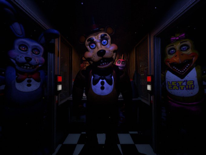
Battington I 100% agree with.
HOWEVER
Even if the JR's designs aren't necessarily your cup of tea, they're insanely well done from an objective standpoint. I gotta give kudos (plus I think they just work well in general as horror designs).
1
4
112
@LyraHorrorz
from what I've seen their rigging is like, goofy. but the detail is impressive yeah.
0
0
27

@HVVV333
they're fine, I don't think they're the best at the mascot angle, but things like actual arm joints do help.
I think they do best at extenuating each character's main scare factor, Freddy's gaze in the dark, Bonnie's wide eyes, and Chica's dead face.
also the clothes are weird.
1
0
7

