
Leni
@Leni88893923
Followers
48
Following
118
Media
0
Statuses
8

#CallForPapers📢VIS Workshop on Data Storytelling in the Era of #GenerativeAI Join us at #IEEEVIS in Oct to explore how AI enhances/challenges #datastory Due: Jul 9 Web: https://t.co/U3vp0sJXW1 By: @olivialan6 @Leni88893923 @zezhong_w @wyunnn @shidanqing & Sheelagh Carpendale
0
4
6
I am asked what the benefits of bringing VR to data stories are. I may now answer it with our IJHCI paper: how effective VR data story designs can increase people's situational awareness of the hidden threat in the air. @qian_hci @Iriskie_Xia @ Lingping https://t.co/FhfbaTryxm
0
1
3

Excited to share our work on immersive data stories @ijhcs_journal. We all know the potential impact of a data story. How can we create and unlock it in immersive spaces? This work provides one case, applied to the domain of public health. https://t.co/C3XizYCBZu
1
3
12

We updated one of our all-time favorites on our blog, "Your Friendly Guide to 🎨 Colors in Data Visualisation" with fresh new tools. If you don't know it yet, make sure to have a look (and bookmark it for later):
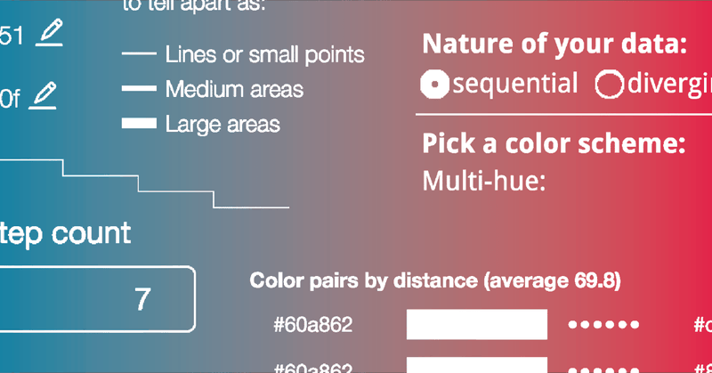
datawrapper.de
A collection of tools that help you deal with color gradients & color palettes, to design better data visualizations.
4
98
284

We use the term “data storytelling” all the time but we don’t always agree on the definition of story or storytelling. @data_jackalope tries to get at a more nuanced view of storytelling in this compelling piece. https://t.co/VQXTZdFGE7

medium.com
How I re-examined my work in terms of actual storytelling, not just information coherence.
0
33
120

Thank you @remotesynth for the mention on this great list of front-end dev newsletters!
dev.to
A summary of newsletter resources related to frontend development, JavaScript, CSS and more.
0
2
7
More than three months ago, @martintelefont started drawing #datavisualization comics as his #100days project. He looks at the response to his work and the effect it had on his own practice. Was the real #dataviz the friends he made along the way? https://t.co/mDqfCe7mnk
0
14
50
The rise of the #datavisualization style guide is a welcome phenomenon but what does it mean? Why have organizations started to make and publish these style guides? And how many are there exactly? @AmyCesal answers all that and more. #dataviz
https://t.co/9Kgk2e07ml
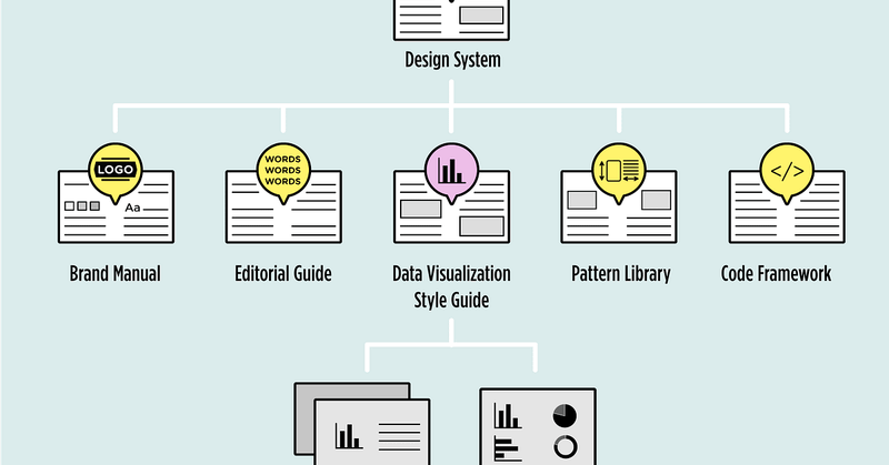
medium.com
Data visualization style guides are standards for formatting and designing representations of information.
2
72
268